Color Dare Design Team Challenge 676
How We Spend Our Days Is How We Spend Our Lives
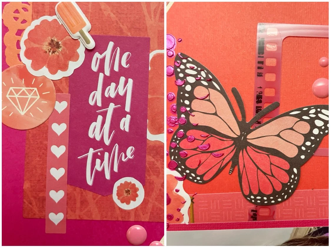
Orange, Yellow And Blue

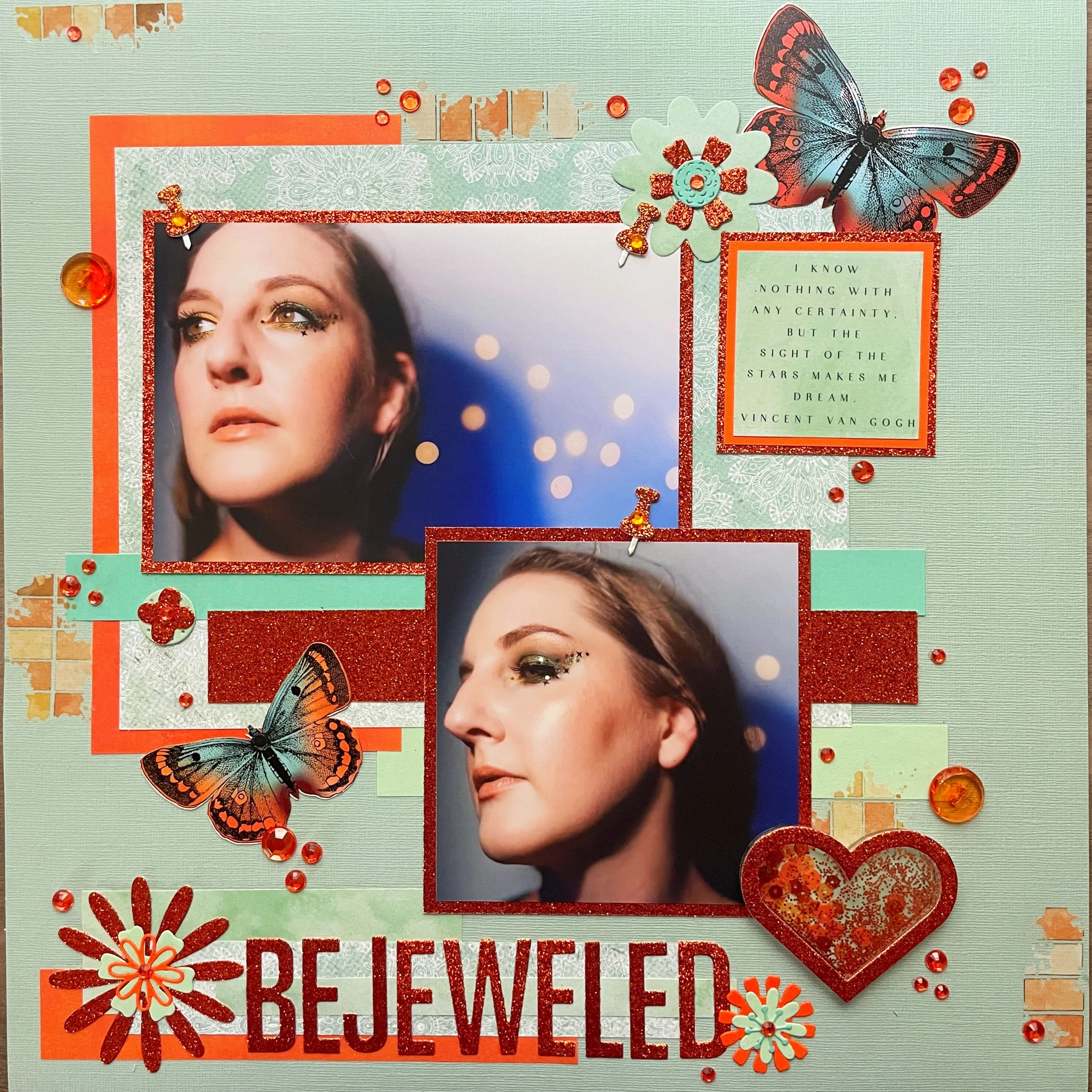
Hi scrappers! I’m back again with Color Dare with another color palette challenge! Read on to find out more and how to participate!
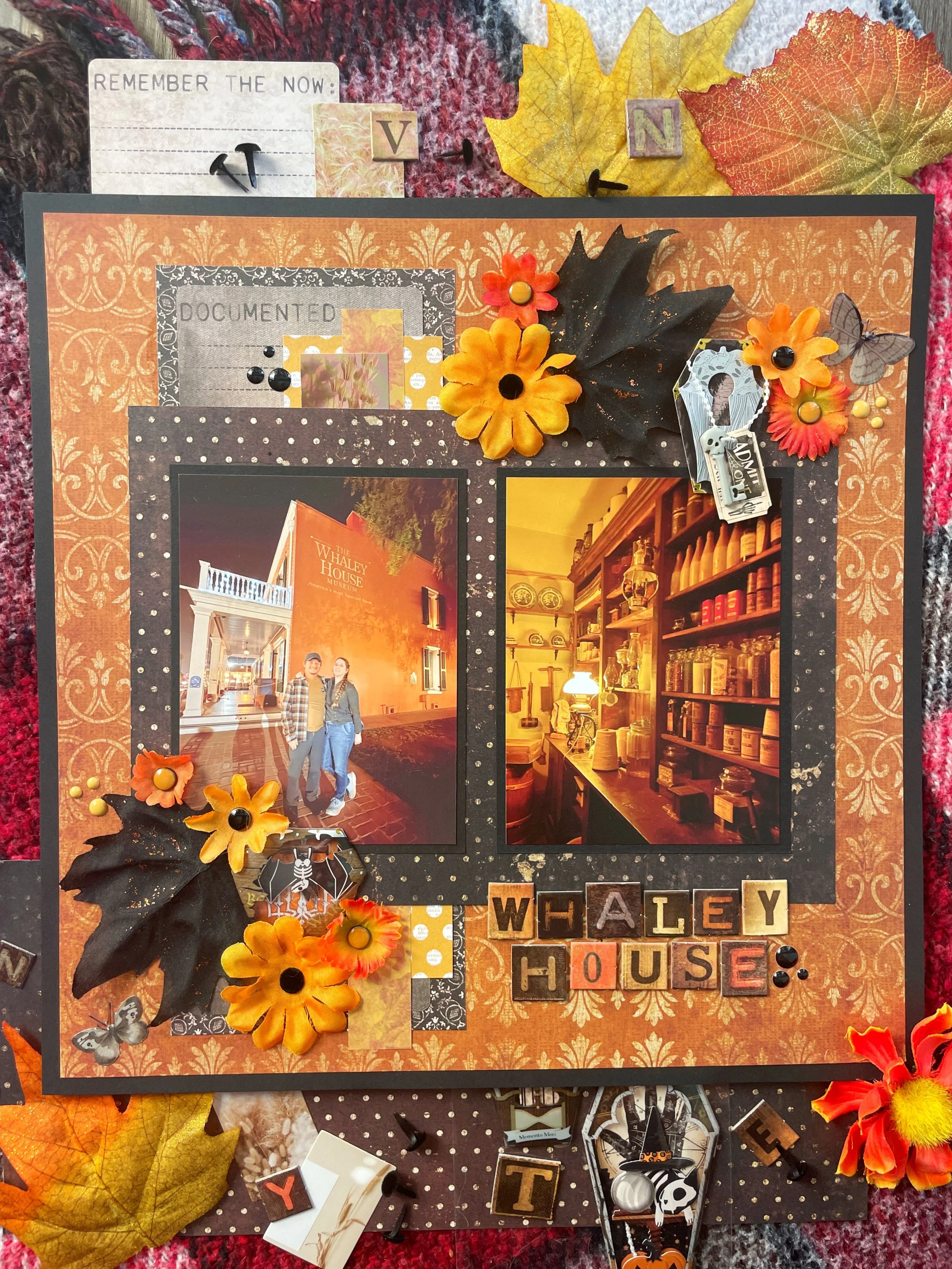
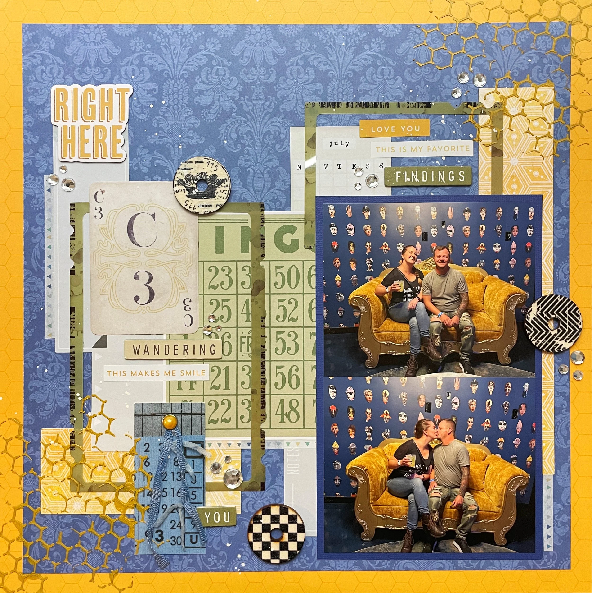
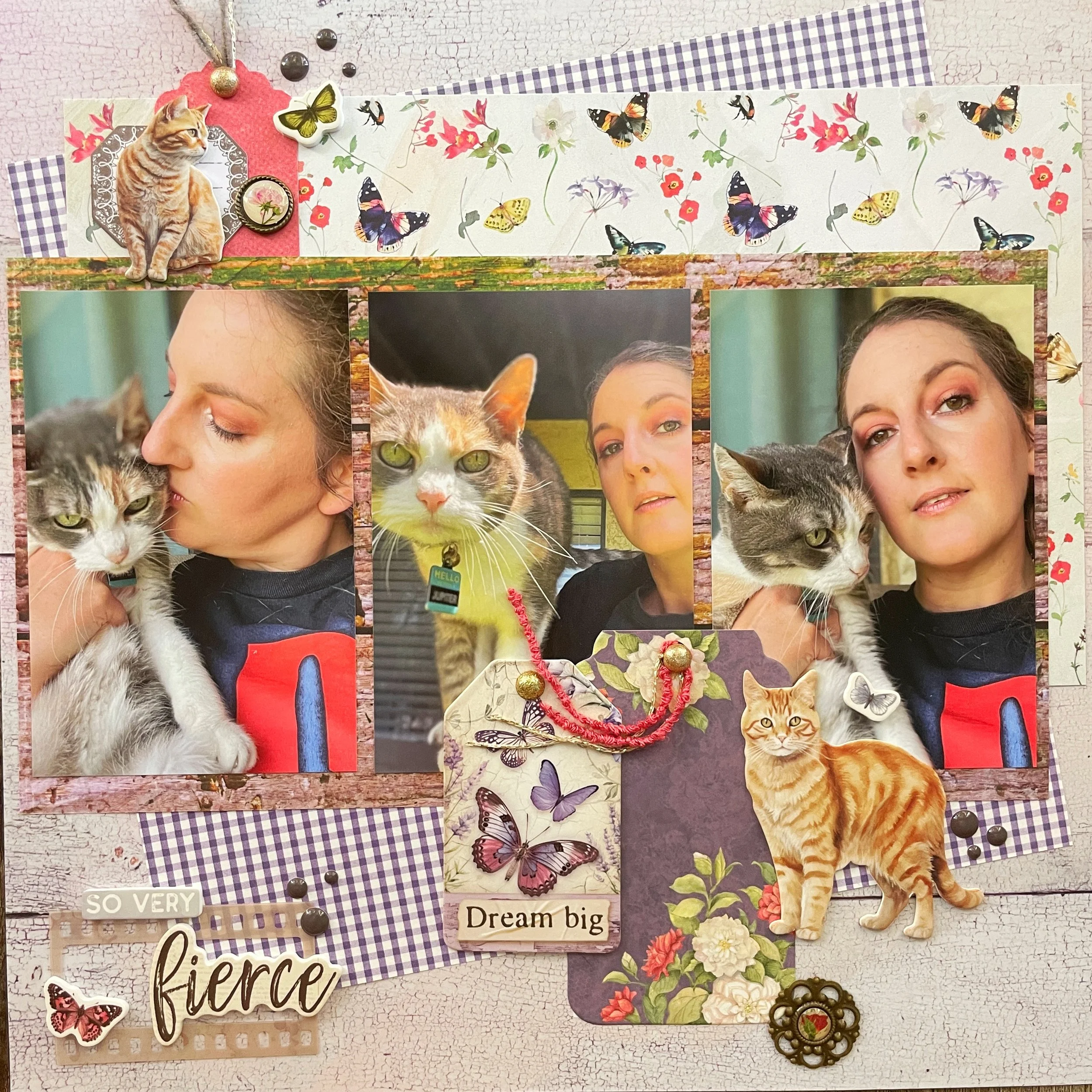
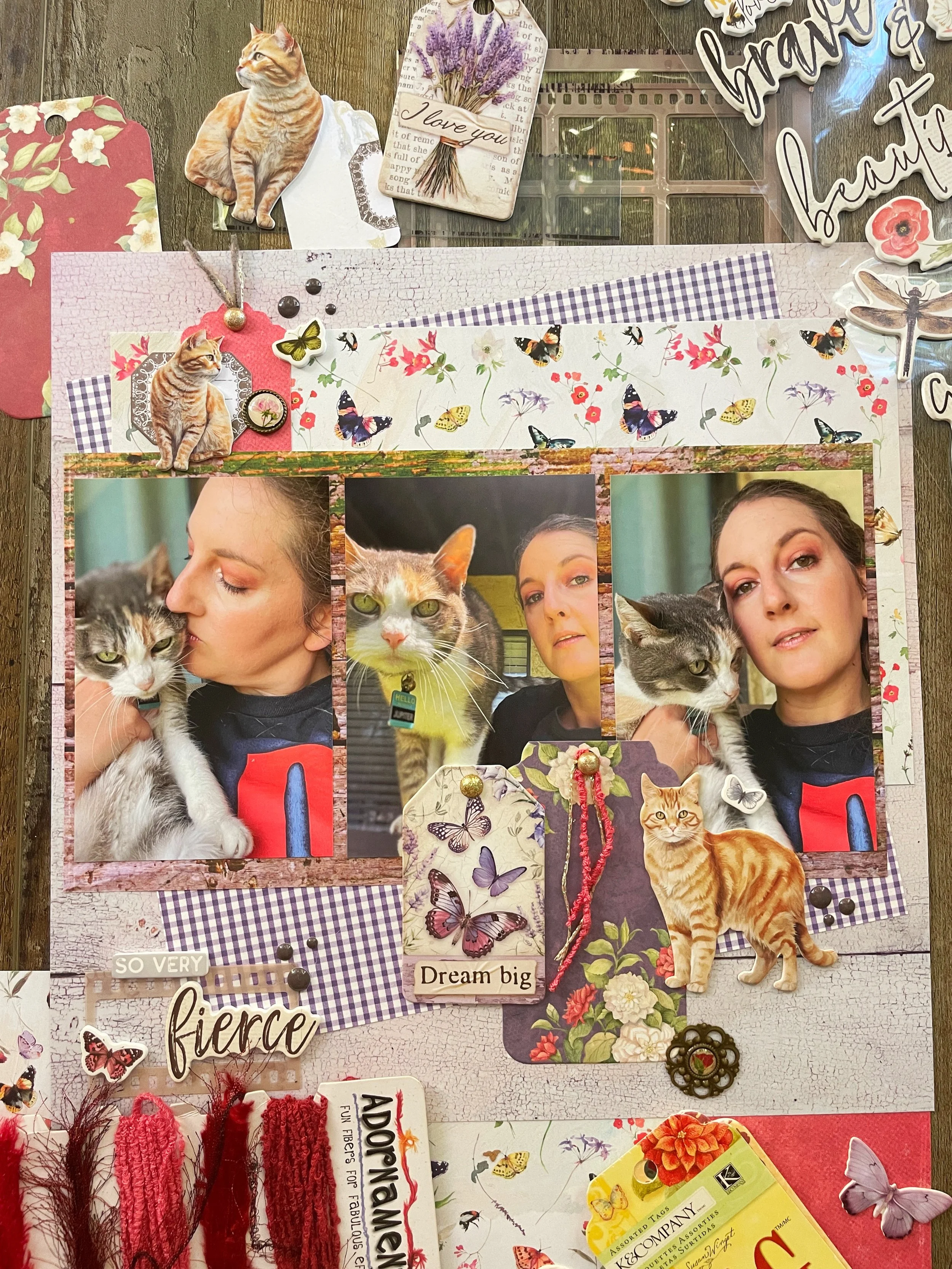
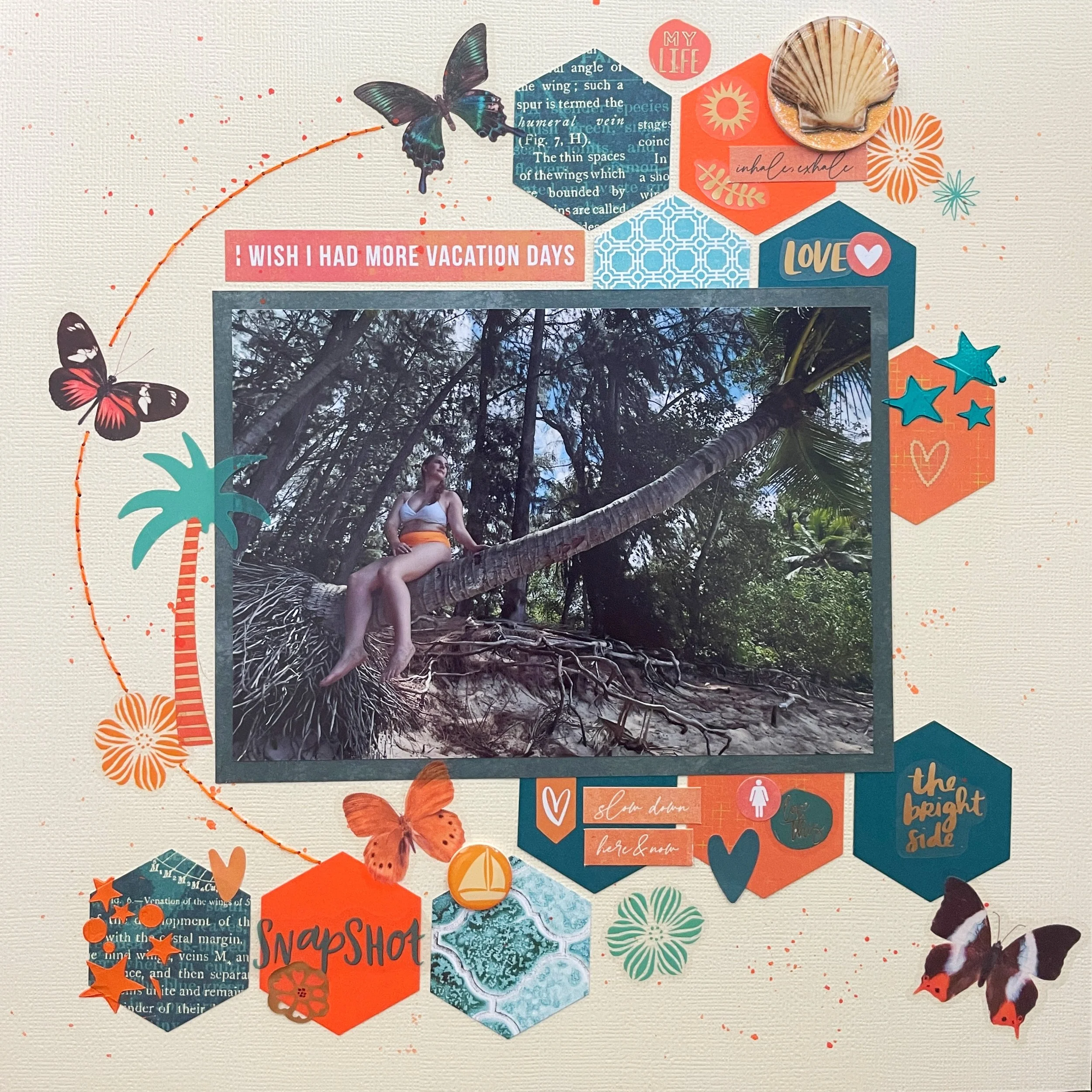
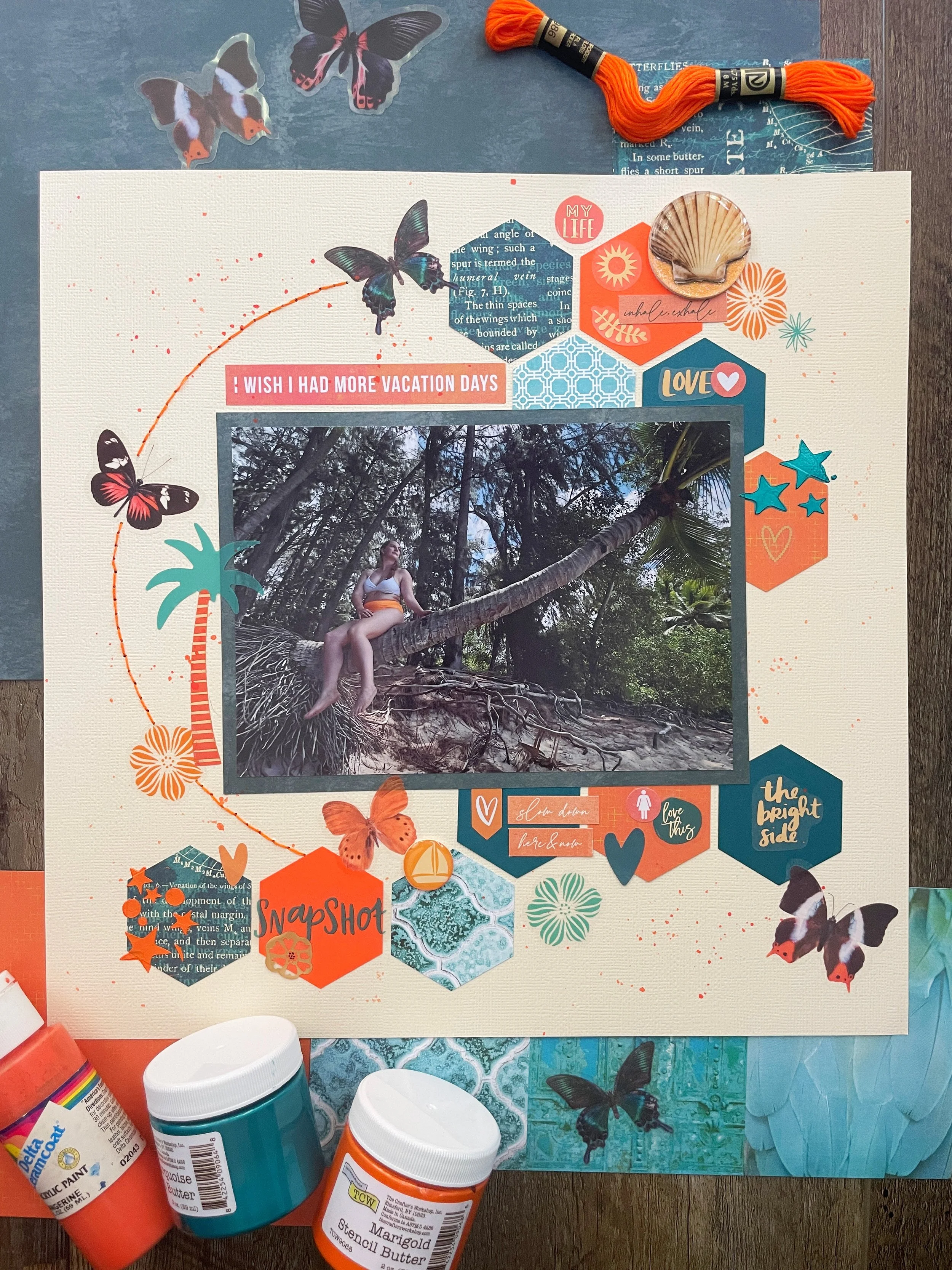
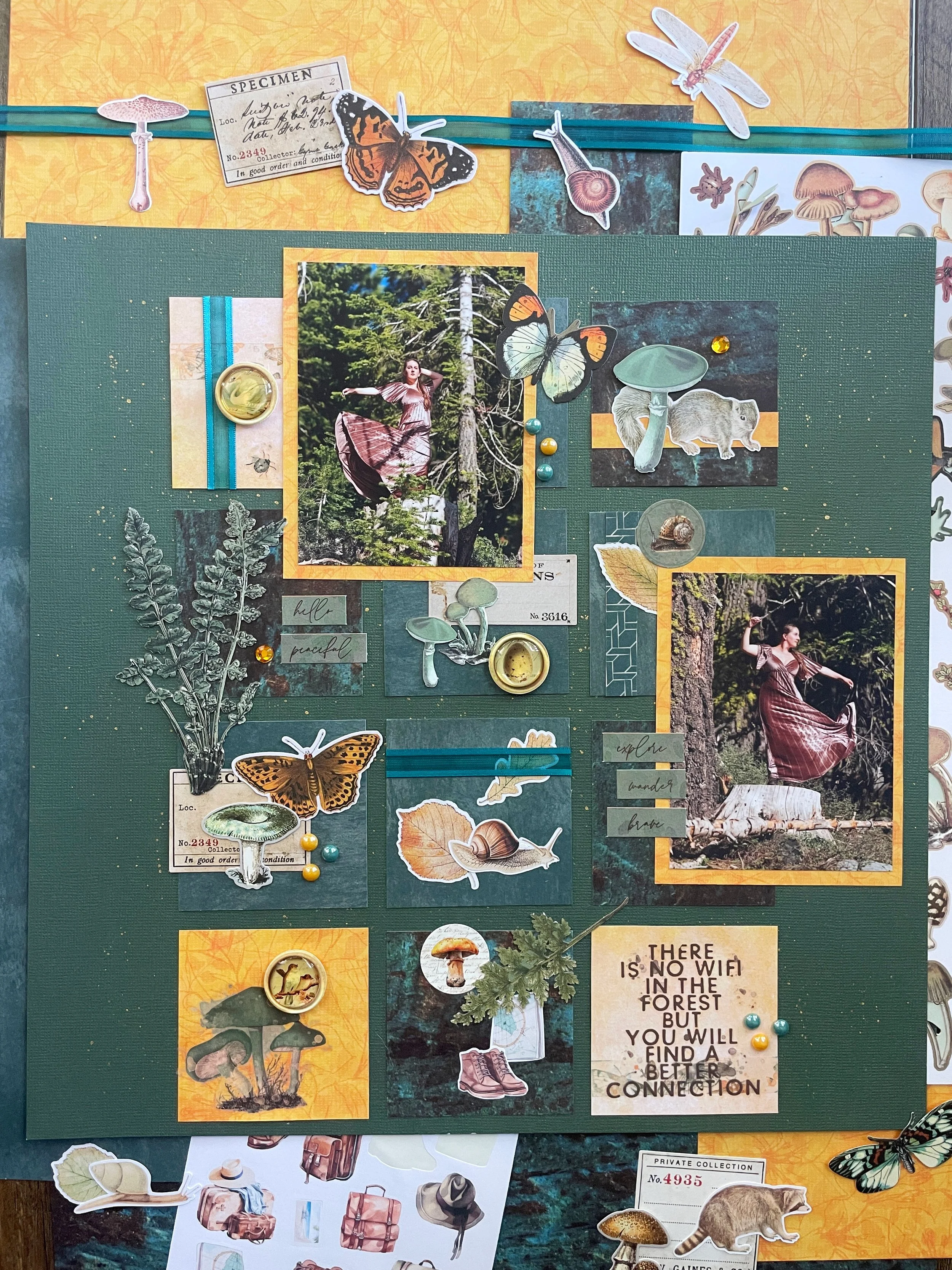
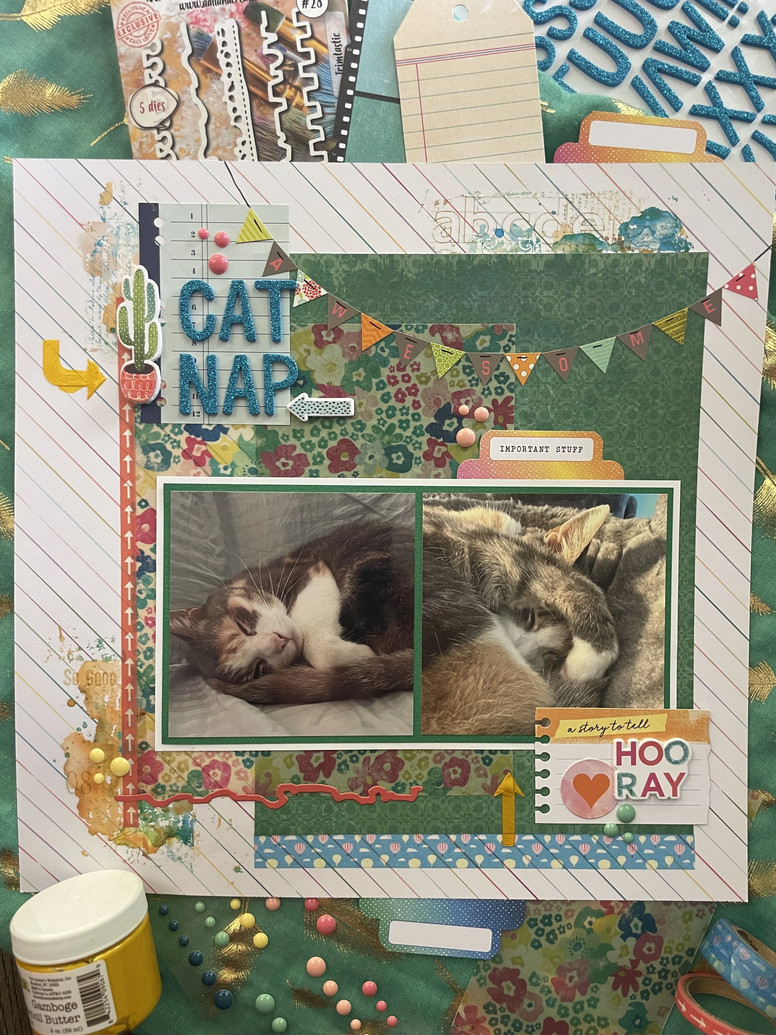
The image I used this time around was taken at an aquarium in San Diego. They had a room with a projector that was making all kinds of moving abstract shapes on the wall. My husband and I took a selfie and this unique photo was the result.
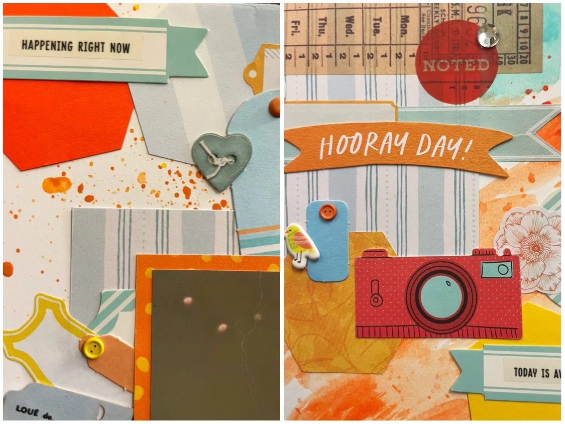

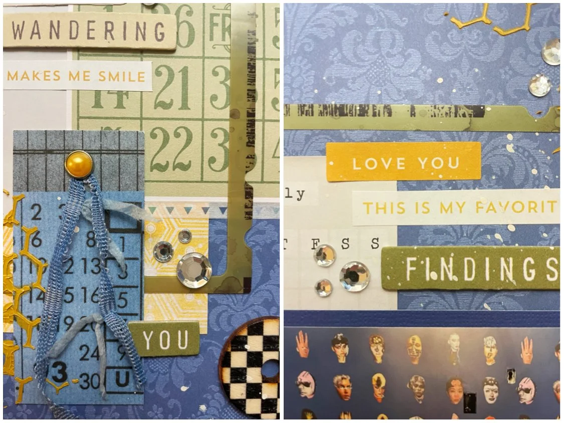
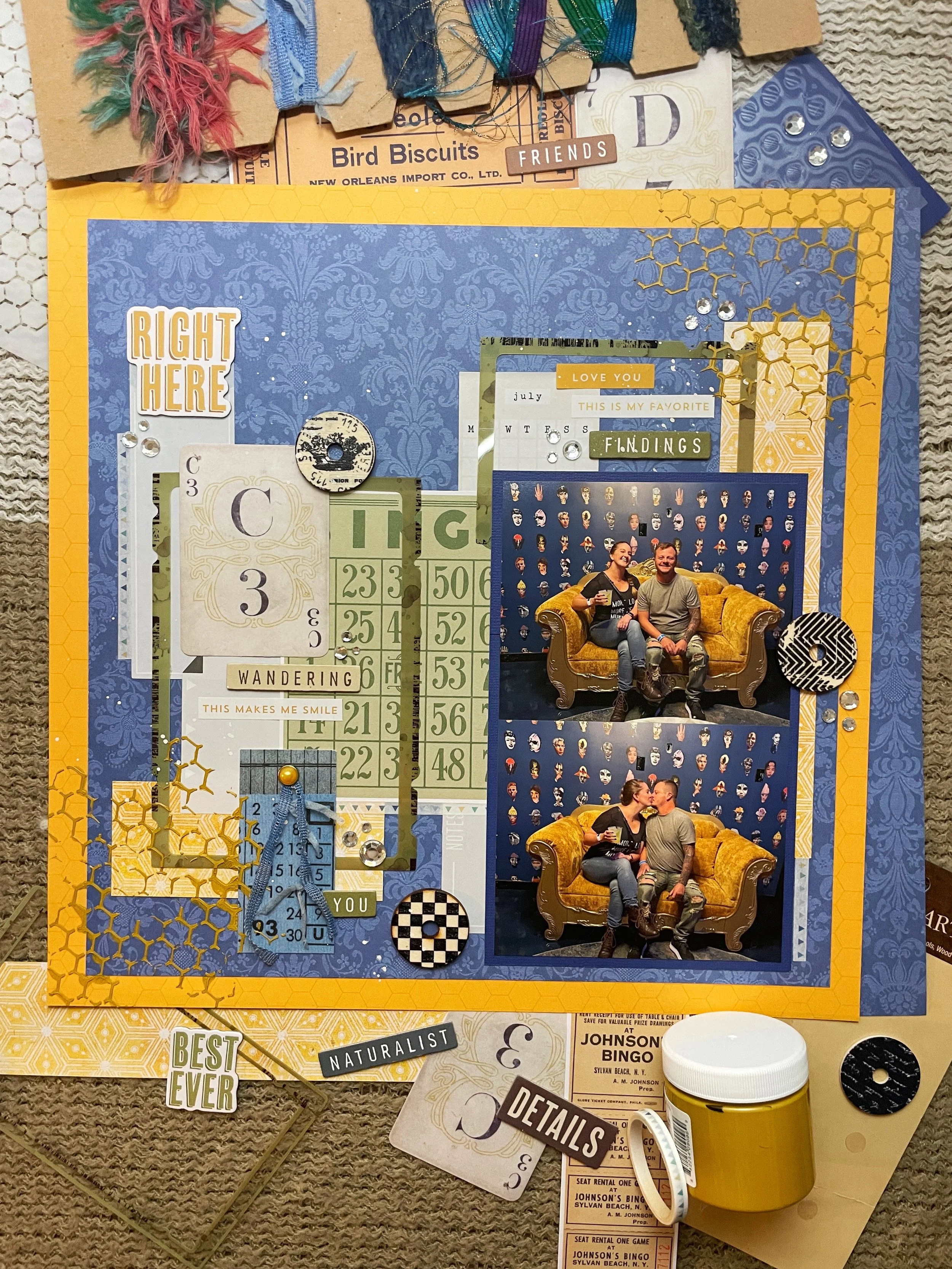
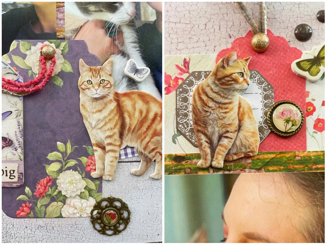
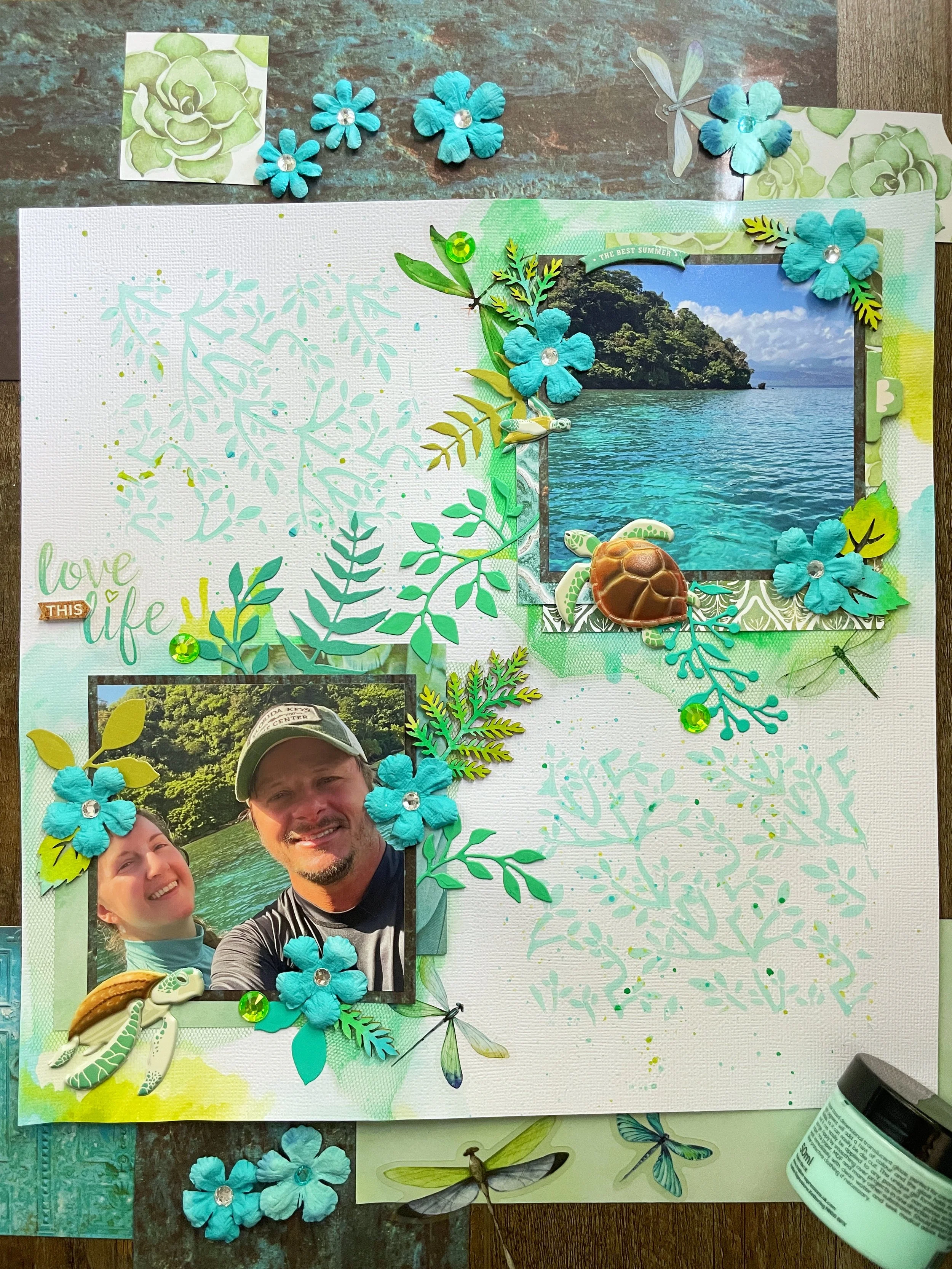
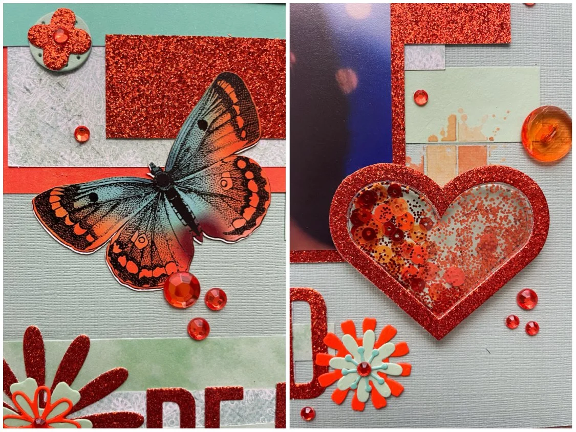
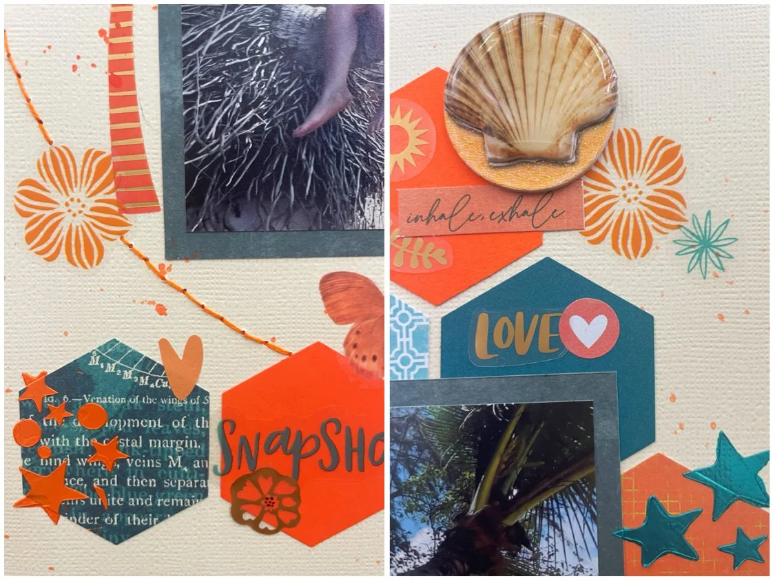
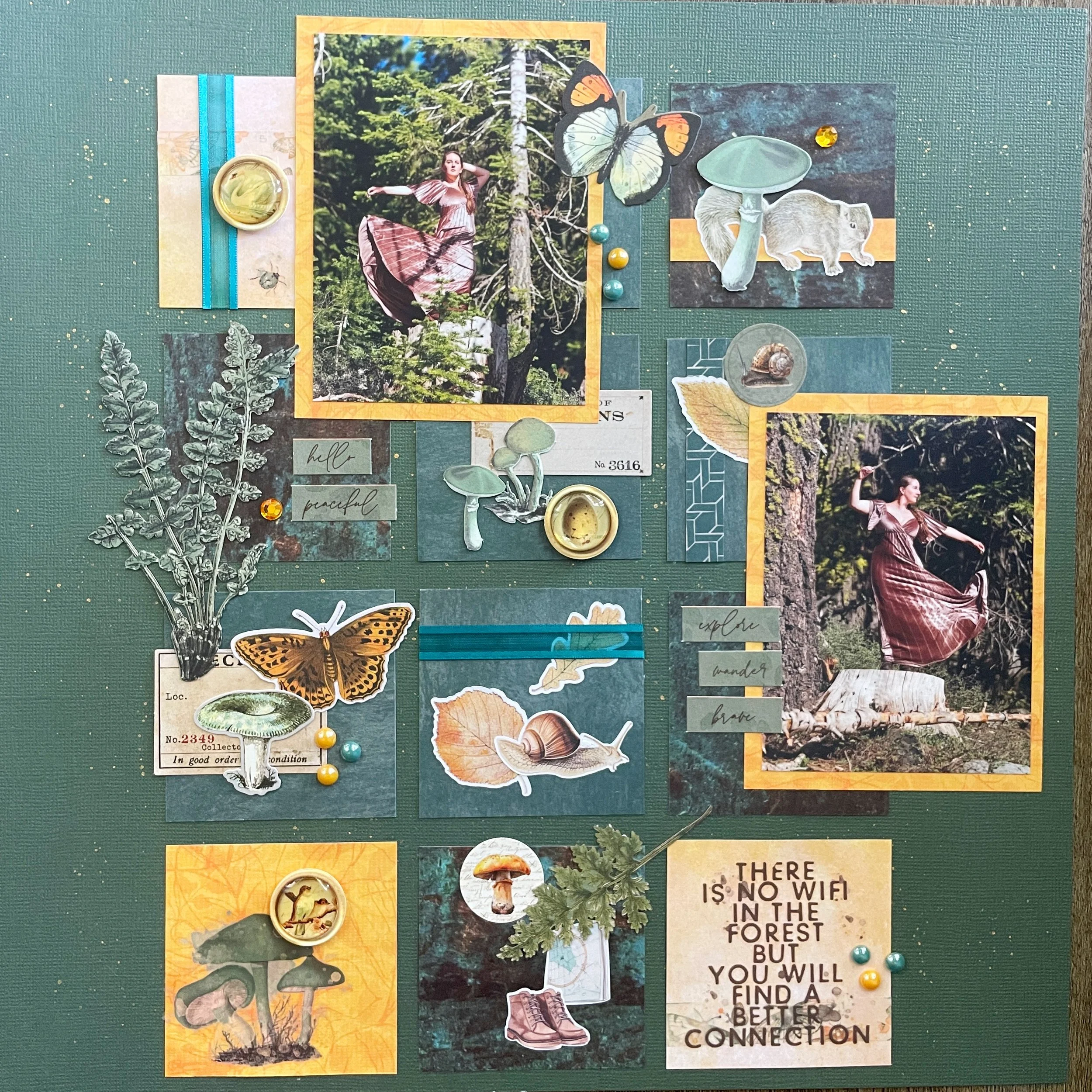
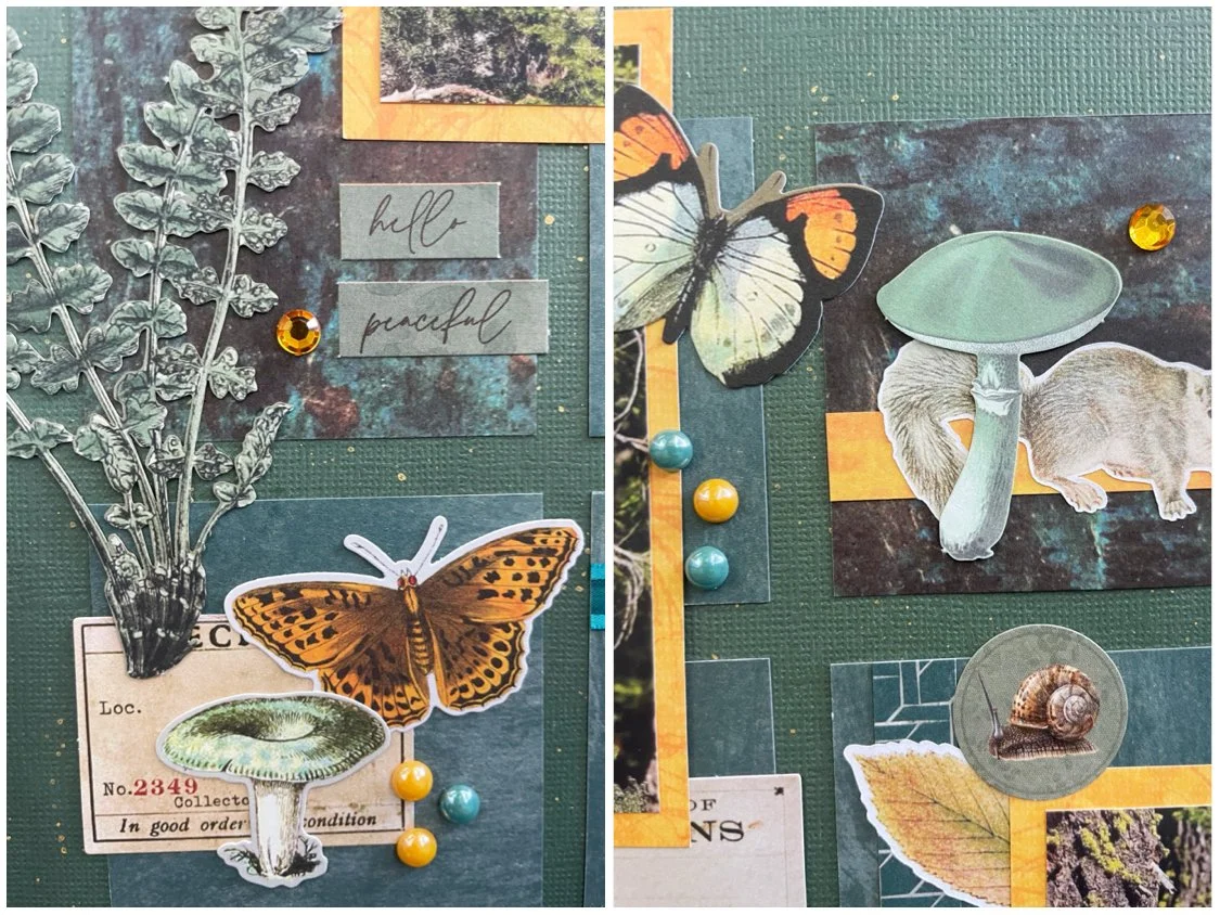
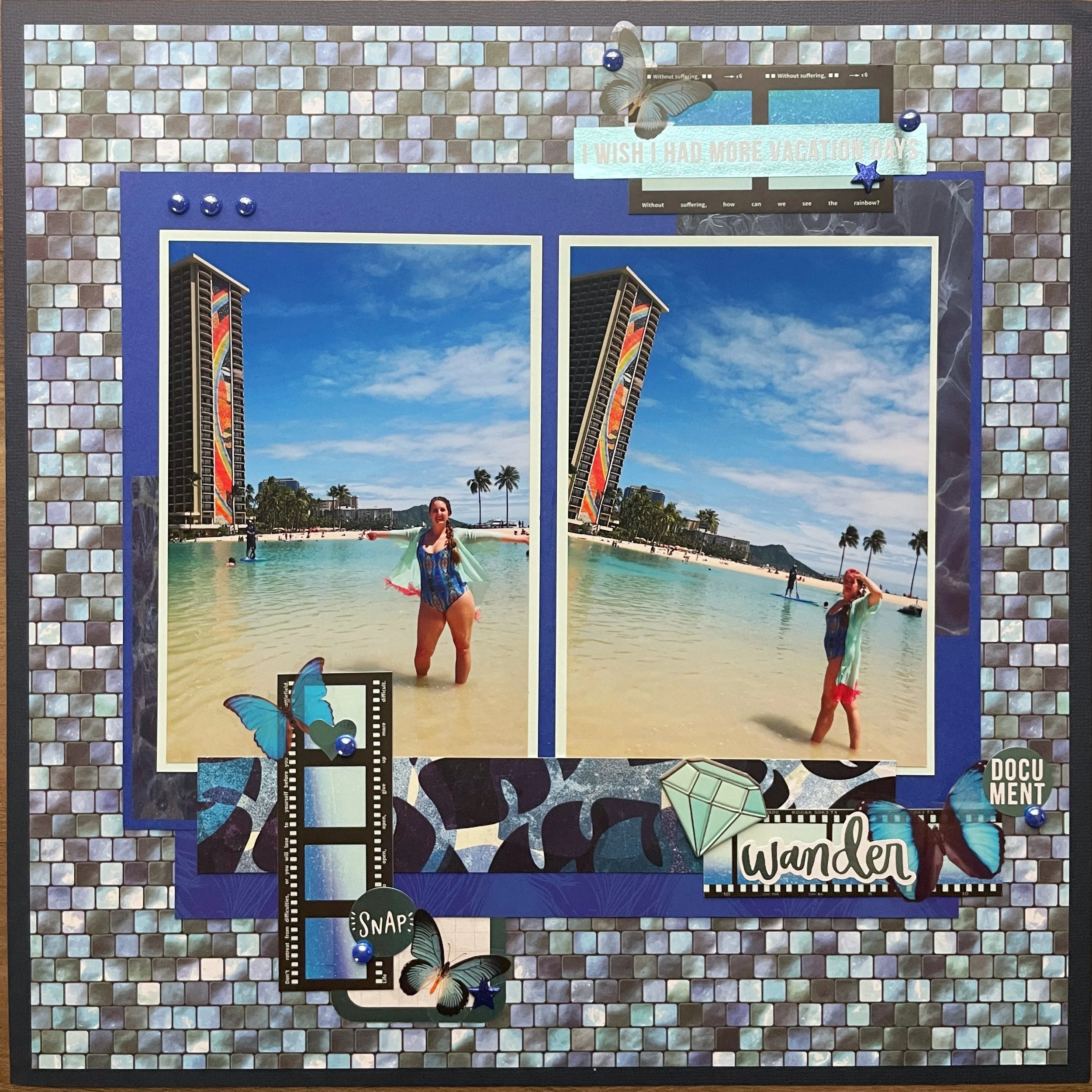
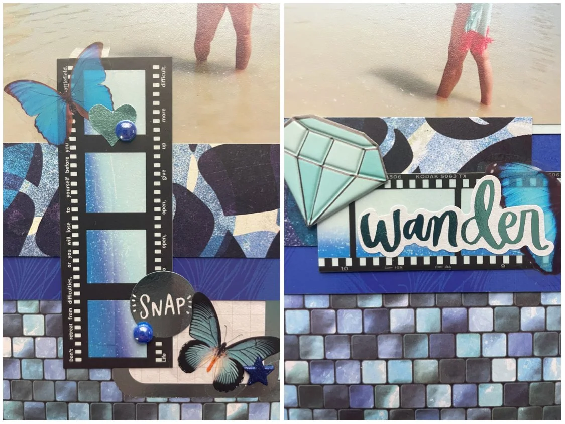
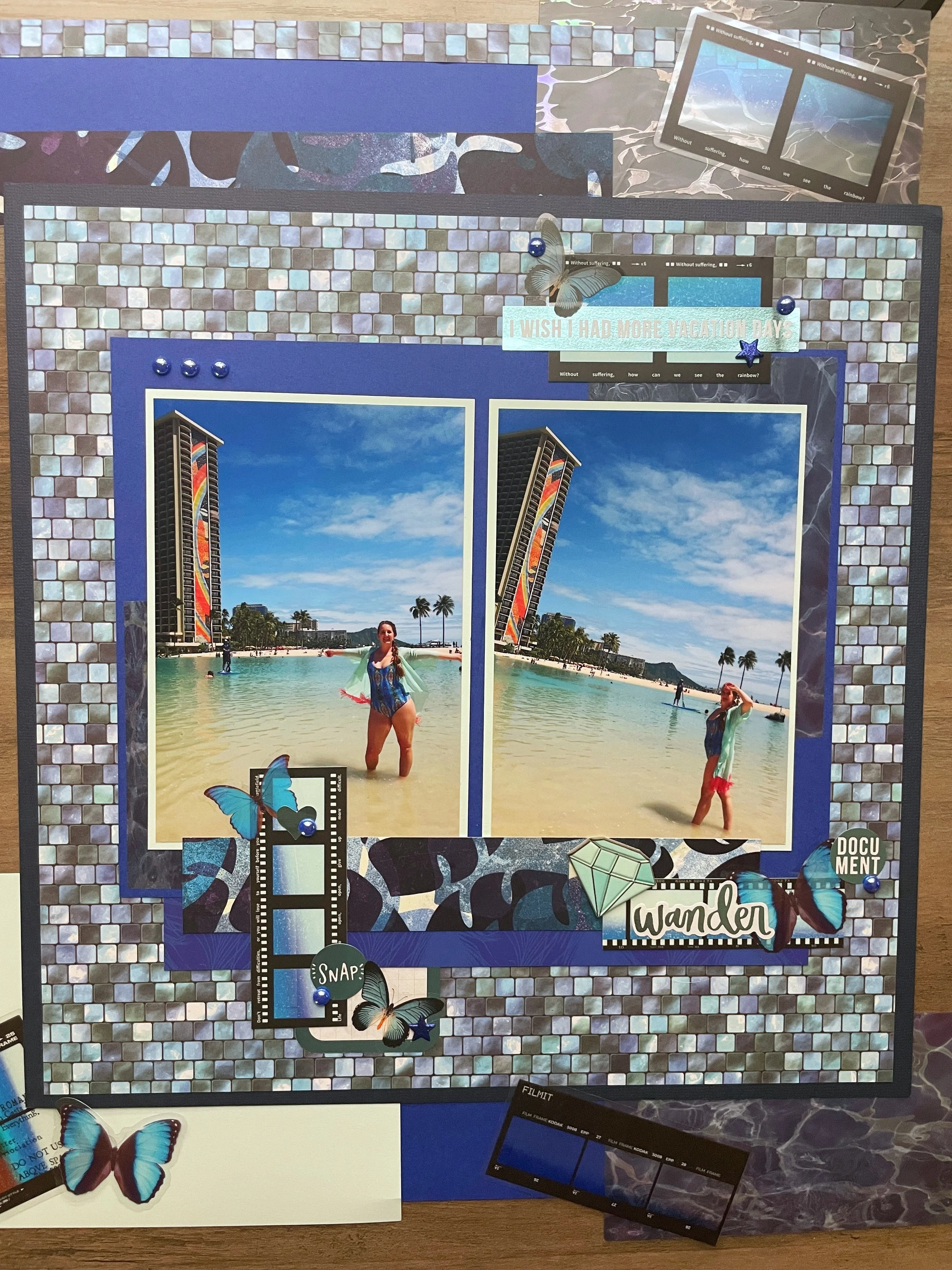
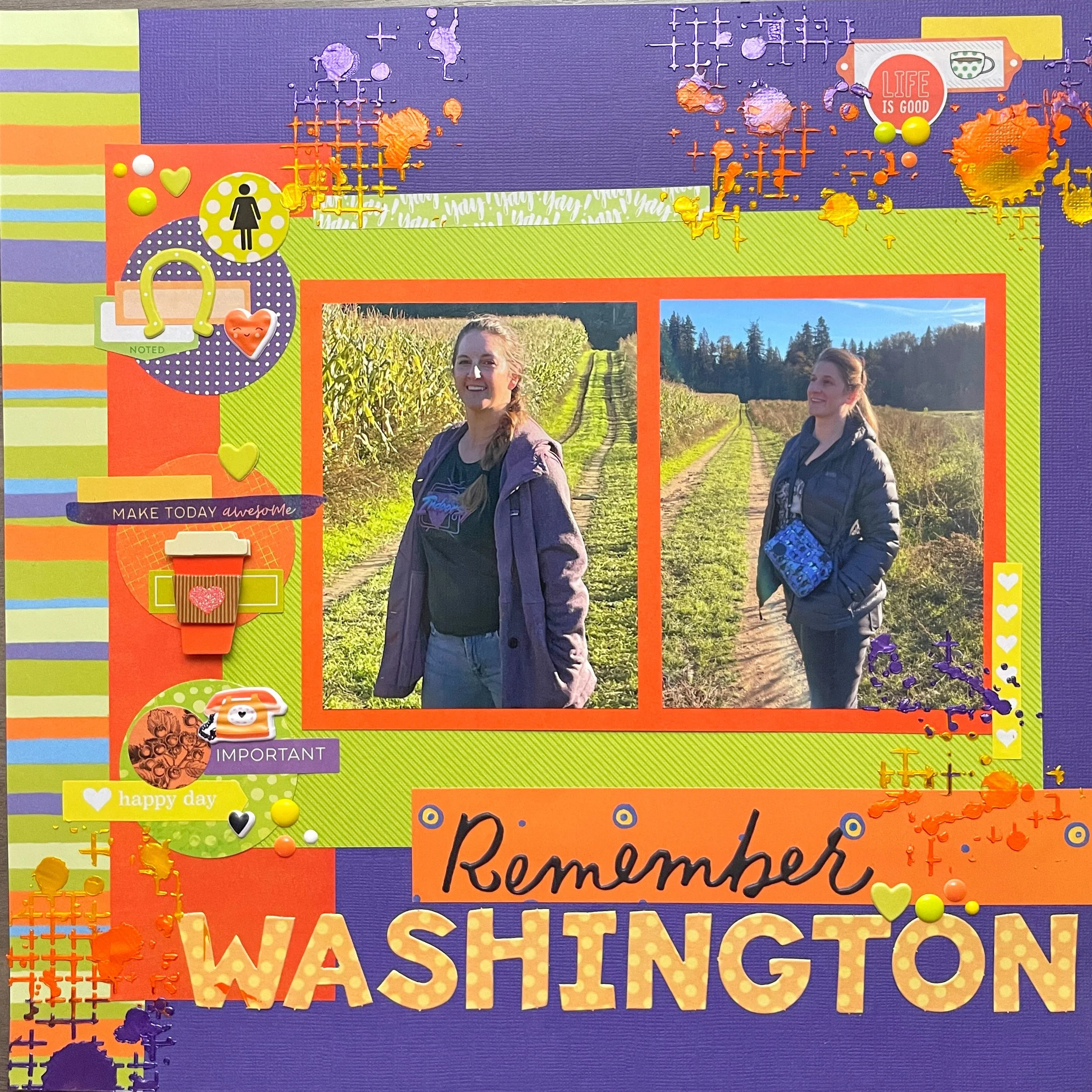
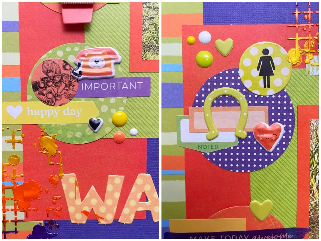
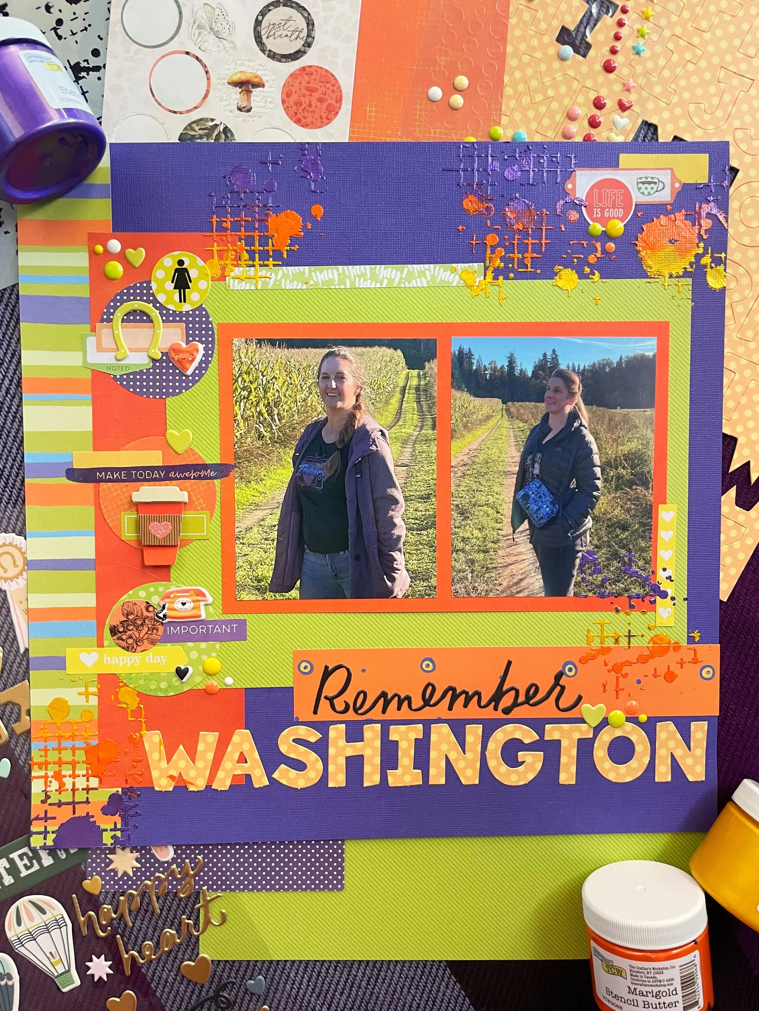
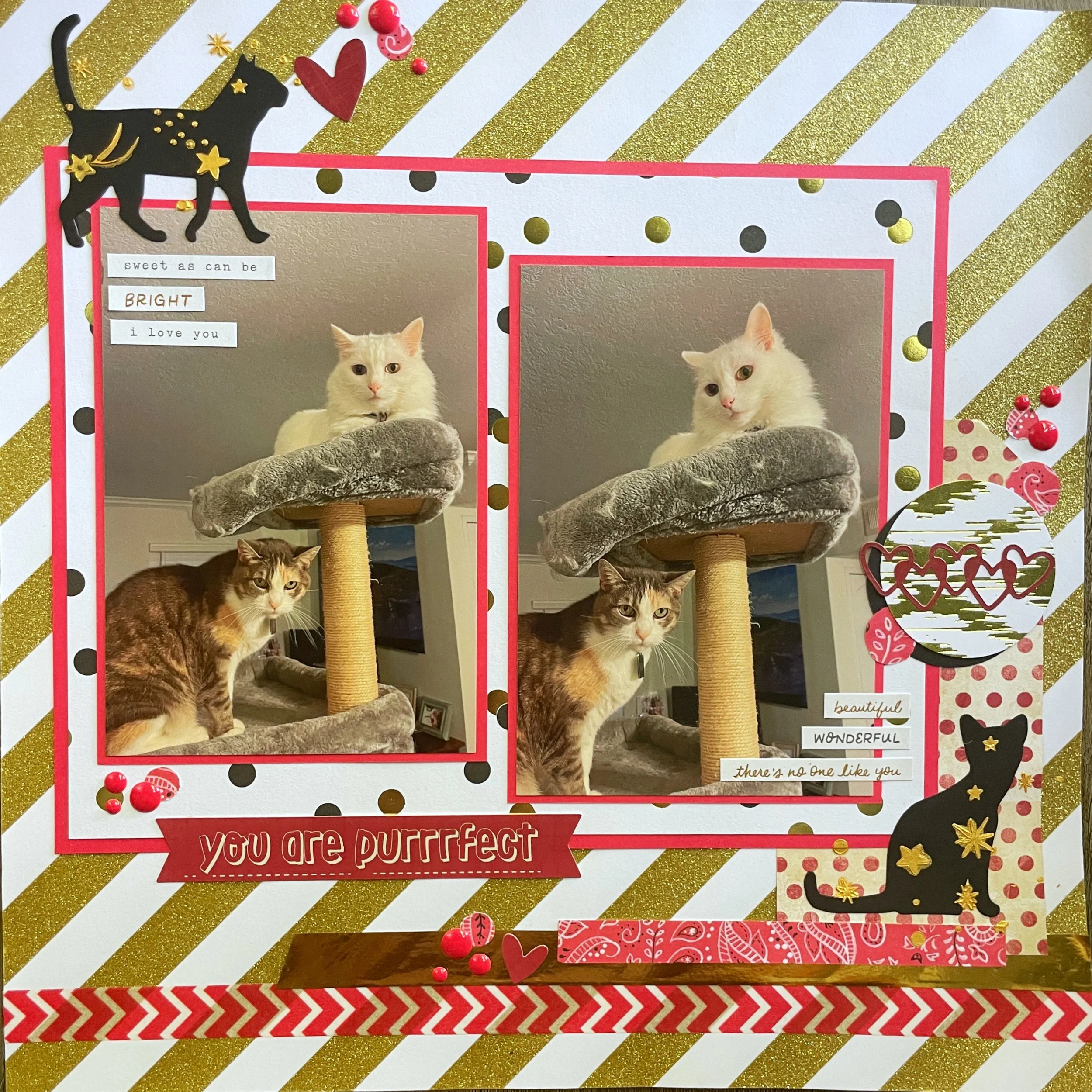
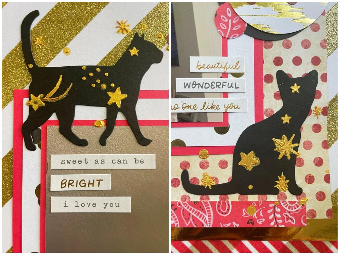
I used some thick Mixed Media paper by American Crafts because I knew I would be painting on my background. I watered down some acrylic paints and added some splotches and splatters in the corners. I then used some yellow and orange polka dot paper to mat my photo and then placed it on top of Crate Paper’s striped Be Kind paper. I used a hexagon punch and some paper scraps and added a few in the painted corners of my page. After that, I basically layered lots of embellishments using sticker books by Amy Tangerine and Vicki Boutin, laser elements by 49 and Market, puffy stickers, brads and ephemera by Heidi Swapp and Shimelle.

Join us at Color Dare for this week’s challenge. You must use shades of orange plus two non-neutral colors of your choice. I used yellow and light blue along with my orange tones to match the colors in my photo. Show us your paper projects and color choices!

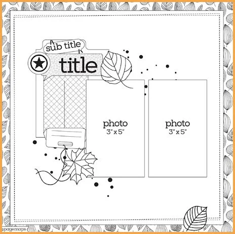
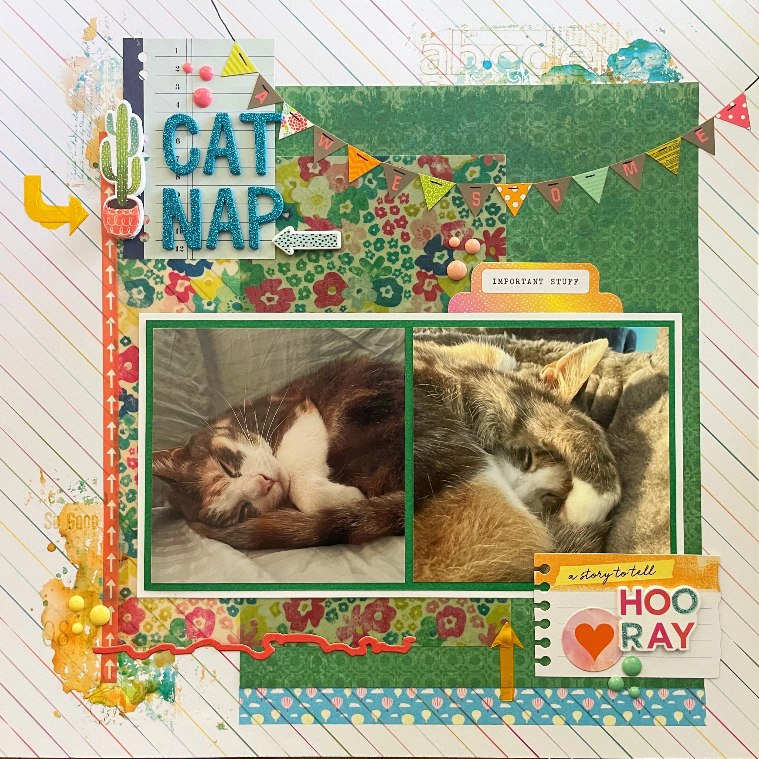
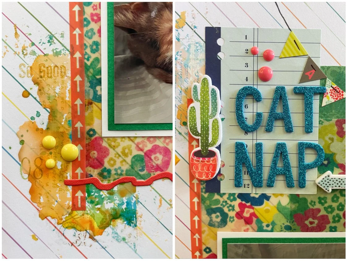
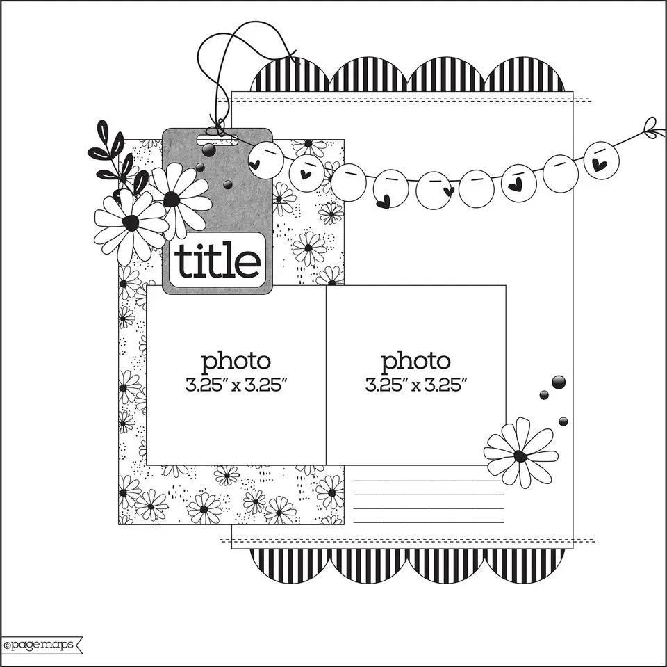
This page was also made for the October Cherry Lift challenge and I lifted this layout by Sara Scraps. I liked the white background and her use of inks. She also layered a lot of her embellishments like I do so I knew it would be a fun layout to lift!

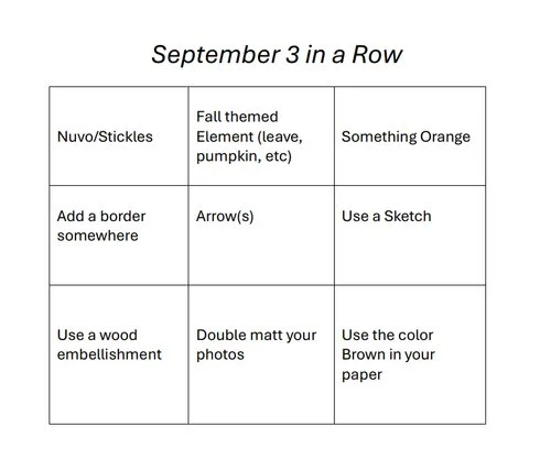
Lastly, this page was made for the October 3 in a Row challenge. I used the middle row which involved a punch (hexagons) a free space, and bling (adhesive rhinestones.)
That’s all for now. Join me on Instagram and YouTube if you are looking for more paper crafting content!