Scrapbook Challenge

Iceland Getaway

Baby Blue Hues

IMG_2634.jpg

Hi fellow scrappers. This week I bring you a feminine blue and white layout featuring a photo from my trip to Iceland last October. Almost every inch of Iceland is incredibly picturesque and my husband and I wanted to get some shots in some especially pretty places. I had my red dress on under layers of sweaters and jackets and we pulled over along this river, we got our photos as quickly as we could. It was both windy and freezing!

Untitled.png

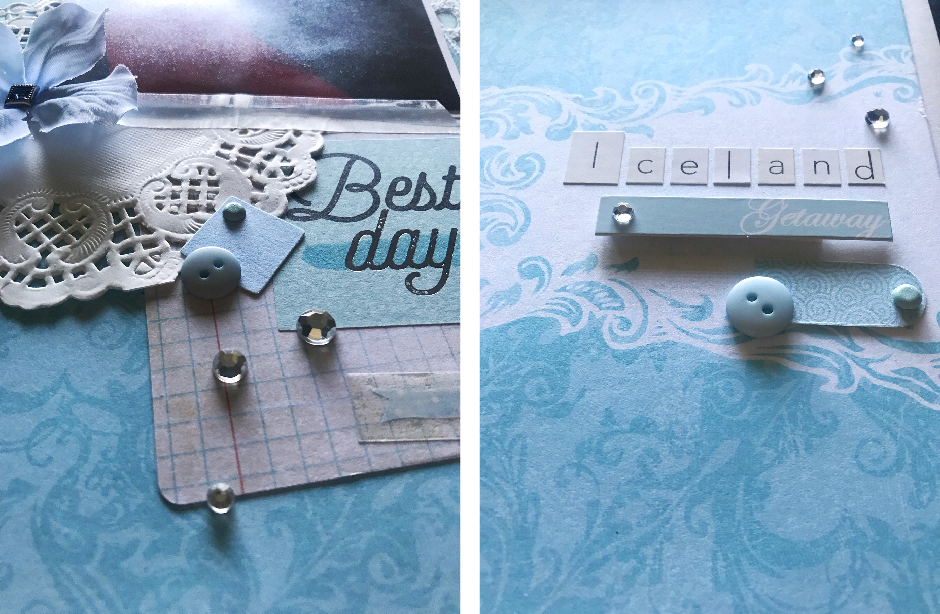
I started with some pale blue damask paper from DCWV’s Be Mine stack. Simple embellishments like white rhinestones, blue buttons and ribbon complete the page. I especially like the birds from K & Company’s Layered Accent collection.

June - Blue Shelter.jpg

This page was done for White with 1’s June challenge. Their color this month is a very pretty baby blue. They also had an accompanying sketch which I turned 90 degrees to work better with my vertical photo.

June sketch.jpg

That’s all for this time. Thanks for visiting my page!

Scrapbook Challenge

Oh What A Beautiful Day

All The Colors Of The Rainbow

Untitled.png

Today’s layout is a double pager. I don’t do many to page layouts but I really love how this one turned out. Photos are from the SoCal super bloom a few years back when the hills were covered in orange poppies. .

Untitled1.png
Untitled2.png

Once again, I used basic white card stock for the background. I found the absolute perfect paper by Recollections that I used 5 inch sections of on both pages. I divided the colors into warm and cool tones to create two pages that are similar but different. I used stickers from Mambi’s Happy Planner Memory Planner book for the title and other accents. I raided my stash for die cut cutouts and used items from following:

0519-PFS-MonthlyChallenge_1024x1024.jpg

This page was done for the Pinkfresh May Challenge where the only criteria was a rainbow palette. I drew inspiration from their example and used a white background too. It makes the colors pop even more.

Scrapbook Challenge

Jökulsárlón Iceland

Paint Splatters, Stamps And Embellishments Galore!

Is anybody else way WAY behind in scrapbooking their photos? My husband and I took a trip to Iceland this past October and I am just now getting around to working on them. This is the first of many layouts to come since we took So. Many. Photos!

IMG_2527.jpg

These photos were taken at Jökulsárlón, or Glacier Lagoon and was one of the coldest places we went! It was really amazing to hear the creaking and groaning of the giant icebergs and watch small pieces wash up on the beach. My husband was very cold but got some incredible shots. You can check them out on his Instagram @StanMoniz!

Untitled.png

I’ve been starting a lot of layouts with basic white card stock lately despite having an enormous stash of patterned paper. I used globe pattered paper from Echo Park Paper Company’s Getaway stack and matted it along with my photos with primary colored card stock. Tags, feather stamps and a whole lot of travel themed embellishments complete the page.

281 copy.jpg

This page was done for the May challenge at Color, Stories, Inspiration. I used the following clues:

  • Plain White Background

  • Cameras

  • Stamps

  • Hot Air Balloons, Airplanes

  • Owl

  • Globe

  • Feathered Things

  • Typewriter

  • Polaroid Frames

That’s all for now. Thanks for stopping by!

Scrapbook Challenge

J + J

A Perfect Wedding Gift

Facetune_28-04-2019-14-25-02.jpg

Hi scrappers. My husband and I have another wedding to attend next week and I put together a pretty layout with their invite and save the date card that I ill frame and give as a gift. The invite is very feminine so I used that as inspiration for both the color palette and the style of the page.

Untitled.png

I used basic white card stock as a base and painted the edges with acrylic paint and ink splatters. I used some pink and white floral paper scraps and some gray polka dot paper to break up the background and used pink and blue paper as photo mats for the invite and save the date card. I embellished further with lace, silk flowers and half circles from my Fiskars punch. The J +J title contains both the bride and groom’s initials and was created with Thickers Trinket chipboard letters.

This page was done for the Studio Challenges April challenge where ever letter of the word “spring” must have a corresponding element on the page.

S - Sewn Embellishments

P - Polka Dots

R - Ribbon

I - Ink

N - Numbers

G - Green

4_11_ColorView_lisa-1024x930.png

In addition to the color palette from the invite, I also drew inspiration from this palette on Design Seeds. I used more pastel pink as opposed to fuchsia but I like the addition of pale blue and gray.

Hopefully our friend’s like their gift! I’ll see you next time.

Scrapbook Challenge

Sunshine Day

Polka Dots With Simple Embellishments

IMG_2412.jpg

Hi scrappers! I bring you another sketch featuring photos from a SoCal super bloom a few years back. These photos were taken on a hillside off of the now infamous Lake Street in Lake Elsinore. With the explosive super bloom this year, Lake Elsinore has become a tourist destination. The hills painted orange with California poppies are visible from space! The super bloom a few years back was less publicized, but no less spectacular.

Untitled.png

I started with yellow striped paper and overlaid three panels of Recollection’s grey mini dot paper. Paper doilies, silk flowers and strips of assorted scrap paper make for simple, but effective embellishments.

53110716_2240223812762068_4246395901691559936_n.jpg

This page was created for the Scrap Our Stash April Challenge and it references a beloved 80’s cartoon: the Care Bears! I remember watching this show when I was a kid. Talk about a blast from the past! I chose sunshine bear and used the color yellow liberally through out my page and used some sunshine embellishments from Carpe Diem die cuts and Echo Park Paper Company decorative brads.

1_22_HeavenlyHues_elly-1024x932.png

The color scheme for this page came from Design Seeds. I love this site for color inspiration! I ended up using a little more blue and a more vibrant yellow, but still loved the way the page turned out. It actually reminds me a of a Family Guy quote where Stewie is planning a wedding and he says, “I know it’s been kinda overdone lately, but your colors should be yellow and grey.” (Insert laughing emoji here.) I remember when Pinterest boards were full of yellow and grey weddings!

IMG_2418.jpg

Thanks for dropping by friends!

Scrapbook Challenge

Green Day

Varied Greens, Golds And Hand-Sewn Embellishments

I feel like all of my pages have been gold-centric lately! This one comes with a Saint Patty’s Day twist; lots of green!

FullSizeRender(3).jpg

I started with basic white card stock and layered green and cream chevron paper by The Paper Studio. Pale green textured card stock adds interest without making the page too busy. While I used some green embellishments around the title and photos, my favorite part of the page is the hand-sewn bead and sequin embellishments on top of the green card stock.

Untitled.png

Other embellishments used:

50493325_2033380546746910_5546262264857755648_n.jpg

This layout was done for Scrap Our Stash’s March challenge which is inspired by March’s biggest holiday! I drew inspiration by using varied shades of green in both paper and embellishments, and lots of gold too! I used 2 photos instead of the 3 shown on the sketch. I loved the way the colors in the photos went with the rest of the layout!

That’s all for now. Thanks for dropping by!

Scrapbook Challenge

Super Bloom

Buttercream Floral And Black Accents

IMG_1996.jpg

Welcome back scrappers! Today’s page features some photos taken several years back when California had an incredible super bloom after El Niño rains in January. My husband and I went out to the desert and were completely surrounded by a sea of flowers. With all the rain California has gotten this year, we may get another super bloom this spring!

Untitled.png

I started with a piece of off white card stock and layered a cream and white hounds tooth print paper from The Paper Studio’s Affinity stack on one side. I used a piece of white, corrugated paper from 7 Gypsies Junk Journal Goodies pack and some scraps of floral patterned paper to add interest to the background. Silk flowers, buttons and lace add the final touches and continue the floral motif started in the photos.

sos2019pickyourside.jpg

This layout was inspired by Scrap Our Stash’s January challenge. I used the sketch on the left and rearranged my photos slightly. I actually found in my stash a piece of cardboard similar in shape to the one in the sketch and centered the title on it. In addition to the silk flowers, I used translucent floral punch-outs from Momenta’s Ephemera Collage Pack and burlap flowers by The Paper Studio.

Moodboard JAN.jpg

The color palette is inspired by White with 1’s January challenge of Buttercream. This was a unique color to pair with white since there isn’t much contrast. I do like that my photos are so colorful in contrast with the monochromatic background. I also used more black on this layout to add dimension.

That concludes this edition of Scrap Attack. Thanks for stopping by!

Scrapbook Challenge

Snow Day

Winter Blues And Browns

The holidays have come and gone and now we’re starting a whole new year! Can you guys believe it’s 2019??

IMG_1983.jpg

The majority of the photos in my stash are taken at sunny beaches, both local and abroad, but I was able to find this snowy photo which seemed fitting for a January layout. It was take in September several years back on the drive home from Yosemite and an unusually early snow storm had just come through the area.

Untitled.png

I used blue-gray card stock from Paper Studio’s Affinity card stock stack and used one inch strips of wood print paper from Paper Studio’s Dendrology stack to create an alternating pattern. I finally had an occasion to use my 6 X 6 Altitude stack by Bo Bunny which included the beautiful blue and white snowflake paper used. I used some vellum and metal square frames from JoAnn’s and decorated them with epoxy snowflake charms by Making Memories. Several years back, I bought an enormous mixed bag of buttons from Michael’s and keep finding uses for even the most random buttons, including the cute little deer and hedgehog on this page.

Jan-CE-Challenge.jpg

The color palette and winter theme for this page comes from Creative Embellishment’s January Challenge. I was looking for pine cones of some sort in my stash but unfortunately couldn’t find any, but I did utilize some snowflake items I had as well as the wood grain paper. I also based my color theme on the mood board, sticking to blues, bronzes and pink-toned grays.

January 1st.jpg

This layout comes from Let’s Get Sketchy’s January Challenge. This layout was was perfect for the single, landscape photo I had. I embellished further with mini tags by K & Company, adhesive rhinestones and silver coated leaves.

That’s all for this time. I wish you all happy scrapping and a happy new year!

Scrapbook Challenge

Sitting Pretty

All Gold Everything

IMG_1909.jpg

In making this page I played a game called “How Much Gold Can I Fit On A Page?” It’s hard to tell in this photo but there’s loads of metallic gold accents that make this page positively blinding. I started with basic white card stock and used pink ad mint geometric paper from the Paper Studio’s Mint To Be Fab stack along with metallic gold washi tape. Corresponding mint and pink card stock and gold polka dot paper made for fun layered photo mats.

Untitled.png

I used all the gold embellishments I could find like seashell washi tape by Little B and glittery tags by Pink Paislee. I used gold heart stickers by Stick-a-bilities to add more interest to small vellum tags and I just happened to have a golden metal owl who makes a very cute addition to this page.

December 1st.jpg

This month’s layout comes from Let’s Get Sketchy’s December challenge. I rotated the sketch 90 degrees and elaborated on the heart motif.

IMG_1912.jpg

This page was done for The Studio Challenges’ December Challenge which was, of course, to use gold! I enjoyed digging all the gold odds and ends out of my stash, some of which never seemed right for a page until now.

Other Products Used:

Scrapbook Challenge

Once Upon A Beach

Earthy Tones And Fairy Tale Trinkets

IMG_1893.jpg

It may be winter now in Southern California but I have plenty of summer photos that still need to be archived. This page features some photos taken by my fabulous photographer husband Stan Moniz on one of our many trips to Laguna Beach.

Untitled.jpg

There weren’t a lot of different papers used since this page is more about the embellishments. I used basic beige card stock and a floral patterned paper from the Paper Studio’s Affinity stack. The photos are matted on brown plaid paper from Recollections’ Regent Street stack, as well as some royal blue card stock that gives a pop of color and breaks up all the earth tones.

challenge.jpg

The fairy tale theme comes from Scrap the Girls’ November challenge and is the reason I chose these particular photos since they are dreamy and princess-like. The theme also inspired the storybook title which was made with Jim Holtz Idea-ology Alpha Tiles. Metal crown charms and tiny keys by Bead Treasures add to the fairy tale feel.

33344842_10214301457282456_2465878528659292160_n.jpg

The color palette was inspired by Creative Embellishments’ November challenge. I love how this fall theme is so different from the usual colors associated with princesses.

This page was super fun to create! It’s a beach page without any of the normal beach embellishments, fairy tale inspired but using more masculine colors and prints, and really matches the warm sunset tones in the photos!

Other products used:

Scrapbook Challenge

Hey Love

Pink Posies And Glittering Gold

Facetune_13-11-2018-14-44-34.jpg

Hi again friends! I wanted to share a double page spread I made as a wedding gift for a friend of mine. I saved her wedding invitation and printed some of her engagement photos off her wedding website to create this personalized layout. Framed scrapbook pages are my favorite gift to give a wedding couple because of their personal and handcrafted nature.

Untitled.png

I started this page with some white card stock and a sheet of pink and gold paper from the Paper Studio’s Mint To be Fab stack. I framed the photos with miscellaneous pink scraps and gold polka dot paper from the paper Studio’s Shoppe on the Square stack. I used my 2 inch Uchiha punch and assorted papers from DCVW Black and White Patterns stack to make a few tags. I found the perfect die cut title in Vicki Boutin’s Ephemera pack. Lots of silk flowers and brads complete the look.

draft 265.jpg

My page’s color palette was inspired by Color Story Inspiration’s November challenge.

Evidence Used:

  • Flowers

  • Metal

  • Something Shiny

  • Glitter

Nov 2018.jpg

This double page layout comes from Stick It Down’s November challenge. Instead of leaves, I filled the negative space with flowers and tags and die cuts from My Story collection by My Mind’s Eye.

That’s all for now scrappers. I hope next time you find yourself having to purchase a wedding gift, you’ll consider hand making something bespoke and personal to the happy couple. I guarantee it will warm their heart more than a lasagna dish or a gravy boat. :)

Scrapbook Challenge

Be Fierce, Be Wonderful

Pink And Purple and T-Rex

IMG_1749.jpg

Welcome back to my blog everyone. Today’s sketch uses more photos taken in Borrego Springs. The last post featured an amazing dragon stature, and today I bring you dinosaurs!

Untitled.png

This very girly page was made with a basic purple piece of card stock. All other paper was found in my stash of paper scraps. It totally pays to hang onto all your scraps from previous pages! You never know what will come in handy and it will save you a ton of money in the long run when one piece of paper can be stretched over multiple pages. I have a drawer for solids and a drawer for patterns. If you have the space, you could sort them by color too to make what you’re looking for even easier.

october mb.jpg

This page was done for Scrap the Girls October Challenge. Since October is breast cancer awareness month, their challenge prompts bravery, strength, and the color pink. I chose these photos because I like how the scary teeth and claws of the dinosaur are juxtaposed with feminine colors, butterflies and flowers. If a t-rex isn’t fierce, I don’t know what is!

Scrap Our Stash has been doing lots of blend-a-sketches lately which a really like. They really allow lots of creativity when giving two sketches to pull inspiration from. The diagonal patterned paper I used was for the smaller tag. The original print had circular patterned polka dots arranged diagonally, but the design doesn’t really translate in such a small piece.

IMG_1755.jpg

That’s it for today. Thanks for visiting my page. See you next time!

Scrapbook Challenge

Wanderlust

Paint Drips And Dragons

IMG_1347.jpg

Hi scrappers. This week’s page is simpler than most and lacks the usual embellishments that I tend to plaster my layouts with. That’s ok though because that means the focus of the page is really the photos. These were taken in Borrego Springs where the desert landscape is littered with these incredible metal statues that make for some really awesome pictures. Apparently there are over 100 statues in the area but I’ve only been to a few.

Untitled (Recovered).png

I started with a sheet of dark teal paper from DCWV’s All Chalked Up Stack. This paper has such a unique texture and actually feels like a chalkboard or something painted in chalkboard paint. I placed it on a mat of red floral print from Paper Studio’s Affinity stack. I used die cut alphabet stickers by Studio 112 which happened to be a very similar color to my background paper.

Sept Sketch.jpg

This layout was done for Scrap the Girls September challenge with the theme of “grunge princess.” I used watered down acrylic paint to create all the pain drips and splatters and brushed over various paper scraps. I felt the photos I used fit with the grunge theme.

9_29_ColorWander_sara.png

I used this color palette from Design Seeds to create this page’s color story. I liked the muted colors and felt it fit in with the grunge theme.

That’s all for this round scrappers! Thanks for stopping by!

Scrapbook Challenge

Peek-A-Boo

Duo-Chrome: Teal And White

FullSizeRender(6).jpg

Hi scrappers! Today I bring you another page featuring my fluffy kitty Europa. She often sleeps with her paw over her eyes and this photo was snapped as she was peeking at me.

Untitled.png

Basic white card stock is the background for this layout. I made it more interesting by spattering two shades of teal acrylic paint at the corners. I layered various teal paper scraps and raided my embellishment stash for items in teal and white. 

Sept-Moodboard.jpg

This page's teal and white theme was done for the White With 1 September challenge. The color theme woks really well with the blue in my photograph. There was a lot of variance in my teal items, some more blue, some more green, but I like the variety it brings to the page.

sep 1 sketch.png

The layout comes from Let's Get Sketchy's September challenge. I actually stayed pretty true to the original sketch and added embellishments as needed.

FullSizeRender(1).jpg

Products Used:

Scrapbook Challenge

Every Adventure Is Worthwhile

Kraft, Terracotta And Blues

FullSizeRender(5).jpg

Greetings scrappers! I bring you a page that I had intended to be mostly kraft colored, but as usual, the page ended up different than how I had imagined it.

These photos were taken on a trip up the 395 highway. We stopped on the side of the road to stretch our legs ad photograph some cows. While there, my husband snapped these photos as well. Can you name the movie my T-shirt is from?

Untitled.png

My base paper is from DCWV's embossed kraft stack. I had intended for more of it to show through but got carried away. A strip of blue wood grain paper from Paper Studio's Entirely Textures stack contrasted nicely with my photos while picking up the blue tones in my shirt. Assorted scraps in blue, teal and terracotta add visual interest. With so many colors and patterns, I only used a few embellishments, like a kraft chipboard tag decorated with Studio K Words and Phrases stickers, and a terracotta tag from Bo Bunny's Mama-Razzi sticker sheet.

august terracotta .jpg

This page was done for the Kraft Plus August challenge which was inspired by terracotta tones. I found a color palette on Design Seeds that I really liked and works well with the kraft.

383b80698843d52c86f9bcddb942edd6.jpg
sos bas aug.jpg

Scrap Our Stash was hosting another Blend A Sketch challenge for the month of August. I used the layout with three photos but turned it on its side to work with my vertical pictures. I loved the diagonal stripes in the first layout but wanted the kraft background to show so I only striped a third of the page. I included one little arrow can you spot it?

FullSizeRender.jpg

Other Products Used:

Scrapbook Challenge

Find Beauty In The Ordinary

Glitter and Gold and Handmade Trees

IMG_1060.jpg

This week I bring you something a little different than my usual stye of plentiful embellishments and carefully constructed color palettes. The photos themselves are a little different too. My husband wanted to take some photos where he could experiment with using back light. We went out to some hills behind our house at sunset and he shot these photos. I like how the light catches my transparent kimono while my face is in silhouette. 

Untitled.png

I used scrapbook paper by Recollections in Blue Ombre Canvas and used a colorful piece of paper by Fern Martin as a mat. The photos were matted on variegated orange paper from Paper Studio's BeaHUEtiful stack and then edged with Lumiere acrylic paint in Sunset Gold.  To create the tree branches, I hand drew and cut them from a piece of wood grain paper from Paper Studios' Dendrology stack. I used 2 sizes of leaf craft punches from Recollections and raided my stash of paper scraps to create the leaves. The titles is a sticker from Stickabilities Inspirational Quotes.

32077193_10216639864289537_1693261556181106688_n.jpg

This page was done for Creative Embellishment's August challenge. I absolutely love this oil painting by Leonid Afremov. I was really drawn to all the colors and used them as a basis for the color palette of my own page. I used blue as the primary color just like in the painting and layered other colors on top of it. I maintained the tree motif and incorporated the colorful leaves into my own page as well.

IMG_1064.jpg

That's all for now scrappers! I hope you enjoyed the page!

Scrapbook Challenge

Love, Proud, Shine

Pink And Girly!

IMG_1026.jpg

Hi scrappers. I bring you a page that seems better suited for Valentine's Day than for summer. This photo was taken outside B Sweet Bakery in West LA, an eatery known for their Ube (purple yam) flavored baked goods. If you're every in the neighborhood, I recommend checking them out! 

Untitled.png

Most of my pages start with a color scheme and a sketch. Apart from that, I don't really have  plan. I didn't expect this page to turn out so...pink. The butterfly and rose embellishments by My Mind's Eye made this page extra girly. The pink wood grain paper from My Mind's Eye's Bramble Rose stack  made for even more pink. The white floral paper is from Colorbok's Tracy Porter paper collection and is something that's been in my stash for probably over a decade.  forgot I had it!

257 copy.jpg

This color scheme was inspired by Color, Story, Inspiration's July challenge. While their inspo photos were quite summery, that didn't seem to translate to my page.

Evidence Used:

  • Floral Pattern
  • Flowers/Leaves
  • Woodgrain

Testimony Used:

  • Put your journaling on a circular journaling spot
July 15.jpg

This layout was done for the Let's Get Sketchy July 15th sketch. I used more ribbons and stripes than the single one in the sketch and took a cue from dedign team member Astrid's page with the torn paper details.

IMG_1033.jpg

Other Products Used:

Scrapbook Challenge

Love & Aloha

A Color Story In Red, Yellow And Green

IMG_1004.jpg

Hi scrappers! I bring you another project, this one with bold blocks of color and a summery feel. These photos were taken on Hawaii's North Shore at sunset. The pineapple patterned paper from Authentique's Utopia stack is a perfect nod to the photo's location. I used a Marvy Uchida punch to cut out hearts.

Untitled.png

I love the red paper from American Craft's Wildflower stack that I chose as a background. The text describing adventure and beauty seemed like a good fit for my outdoorsy photos. I used a subtle green print from Paper Studio's Entirely Textures stack so it wouldn't compete with the red paper. Solid and patterned yellow scraps separate and offset the red and green.

29571349_10155768582158096_7082416353504498063_n.jpg

This page was done for the challenge at Color My Heart. Their rules state I can only use the three colors provided plus black and white if desired. I really had to raid my stash looking for embellishments that fit the criteria. All of my Hawaiian themed items all had other colors besides the three needed. As a result, odd items like keys and buttons made the cut instead. As an added bonus, I noticed the colors for this challenge match the colors in my husband's shirt!

32847926_1695217737229861_1130139920032071680_n.jpg

Scrap Our Stash was hosting another Blend-A-Sketch challenge. These are so fun and give lots of leeway for creating a fun and unique sketch. I wanted to keep the heart motif from the sketch on the right and wanted to reposition the photos to show as much of the wording on the red paper as possible. I really like the result!

IMG_1010.jpg

Other Products Used

Scrapbook Challenge

Dream As If You'll Live Forever

Breezy Beachy Bits And Bobs

IMG_0771.jpg

Hi scrappers! I bring your anther summer-inspired page. This one includes some found objects from the beach like sea glass and tiny shells. The photos were taken by my husband in Laguna Beach a few months back and I had just gotten this romper with a train/cape thing. I felt so fancy wearing it!   

Untitled.png

I started with a white and mustard geometric print paper from Heidi Swapp and mounted it on black cardstock. I used book print paper from Recollections and stippled acrylic paid in tan black and gold around the edges. I recently purchased several packs of Junk Journal Goodies by Seven Gypsies and the way they are packaged makes it hard to tell what is actually included. Opening them up was like opening a surprise present. It turns out there were some great nautical pieces, one being the blue and white striped compass piece I used. There were also some assorted burlap pieces which I cut up to add some texture to my page. I used E6000 to glue on my buttons, glass bits, and tear drop embellishments by The Robin's Nest. A few silk flowers and bronzed brads complete the look.

MTW-201807-Main.jpg

This page was created for the More Than Words July challenge. The prompt was to draw inspiration from the words "beach" and "seashells." The results are pretty self explanatory. I also took inspiration from the color palette, including a black mat around the edges.

July JumpStart.jpg

This layout was done for the July challenge at The ScrapRoom. I actually had photos matching the same dimensions as the layout, but I left out a lot of the geometric shapes to focus more on the embellishments.

IMG_0777.jpg

Other Products Used:

  • Cottage Farm cutouts by Pink Paislee
  • Jolee's Boutique Waves Repeat stickers
  • Chevron Heart stickers by The Paper Studio

Scrapbook Challenge

Oahu 2018

Plums And Blues At The Beach

Guys. Can I just say it’s 97 degrees in Orange County right now and it was 110 yesterday! To distract myself from it being possibly the hottest summer on record, I’m posting another page I put together for a scrapbook challenge.

IMG_0746.jpg

Summer is here with a vengeance and the page I bring you definitely fits he mood. This photo was taken during our latest trip to Hawaii last April. The waters of Waikiki are crystal clear and made the perfect backdrop for a selfie.

Untitled.png

I started with purple patterned paper (sat that 3 times fast) from my new Violet Leaf Stack by DCWV. Side note: have any of you fellow scrappers heard of a store called Tuesday Morning? I just discovered one in my neighborhood and their scrapbooking section is unreal! I found embellishments, adhesives, paper stacks etc. all for seriously reduced prices. The Violet Leaf stack was $7! Most paper stacks a Michael's or Hobby Lobby are double that! I totally recommend checking out your local Tuesday Morning for fabulous scrapper finds!

I love going through my paper scrap drawer and finding pieces cut into odd shapes or have an edge that is torn or cut with fancy scissors. Sometimes I can use those as design elements that add unexpected interest.

This page was done for Lasting Memories July challenge whose theme was “selfies.” I just printed a new stack of photos to scrap and it was one of the only selfies in there!

6_16_FloraHues_anamarques210376-1024x932.png

This Design Seeds template was the inspiration for this page’s color scheme. The blues obviously complement the water colors in the photo and the purples match my lipstick. Making the background purple provided greater contrast for all the blues in the photo, really making it pop!

July 1.jpg

The layout for this page comes from ­­­­Let’s Get Sketchy’s July challenge. I altered it t fit my vertical photo instead of a horizontal one. I like the triangles in the corners of the page and feel they help frame my photo.

IMG_0754.jpg