Scrapbook Challenge

Oh, Hello There

Whimsical Prints and Vellum Embellishments

image_6483441-2.JPG

Hey everyone and welcome to July! This week I bring you a selfie I took a while back of me and my husband. This time I used a 5 X 7 rather than a 4 X 6 image so it really took up the majority of the page. I kept embellishments simple since I knew I would have less room than usual around my photo.

photo.JPG

I started with my background paper that had flowers and curly-cues. This came in a very old paper pack and might have been among some of the first scrapbook papers I bought over 20 years ago. The pattern has a whimsical feel so I chose some other papers with a similar vibe from my stash of scraps. I found some green vellum that matched particularly well. I had cut a large circle out of the original piece of vellum so the scrap had a distinct curve. This curve became a nice stylized element when I layered it over a kraft-colored tag. I found some other pretty vellum elements in a Heidi Swapp Ephemera pack.

Vellum requires some creativity to fasten it in place since it’s transparent and any stickers, glues or adhesives will show. Brads are my preferred method of attaching vellum and I used some on this page to tack down both my tag and the heart detail. The tiny hearts on the tag were too small for brads so I had to use some glue to stick them down.

Some enamel dots by Pinkfresh Studio and half of a paper doily add the final touches.

I’m excited to announce my all new YouTube channel! To watch how a created this page, check out the above ASMR inspired video!

This page was created for The Studio Challenges where the theme this month was cut file or punches. I used a large EK punch with a smaller heart cutout. The two small hearts from my larger cutouts were used to embellish my tag.

Screen Shot 2021-07-07 at 9.55.23 PM.png

This page was also created for Sketches In Thyme. I liked the paper layering and took it one step further by adding an additional layer behind my photo. I added a couple of tags and an embellishment cluster to display my heart punch.

Thank you for stopping by and I’ll see you next time!

Scrapbook Challenge

First Of All, You’re Really Pretty

Busy Florals And Vellum Shakers

image_6483441.JPG

Hi everyone! Today’s page features my kitty Europa who is a turkish angora mix. She’s very pretty and very fluffy. She’s also very photogenic so I can’t stop taking photos of her!

image_72192707.JPG

I started with some retro floral print paper by Recollections. This paper makes a bold statement but is also very busy. To be honest, I probably should have used smaller pieces as accents rather than the entire page, but that’s not what happened. Because my background paper has so much going on, I kept embellishments simple and only used a few.

Some deep blue paper from Paper Pizazz made a good mat for my photos and I used some paper scraps in colors that complimented my background paper. I like the metallic orange paper since it gives a different finish and the tan and white paper features an organic pattern that mimics the petals in the flowers.

I had some really old vellum tags in a green color that went well with my palette. I filled the pockets with some sequins and sealed the flaps with some stickers from a Dear Lizzy sticker book to create a custom shaker. Some embellishments from Bo Bunny’s Floral Spice collection also go well with my background paper.

sit june 2021.jpg

This page was created for the Sketches in Thyme June challenge (Sketch 473.) I kept the theme of multiple mats and stacking my photos vertically. However, I simplified the embellishment clusters by using tags instead along with a kitty and speech bubble stickers for my title.

That’s all for now. Thank you for stopping by and I’ll see you soon!

Scrapbook Challenge

Forever & Always

Torn Edges And Subtle Polka Dots

image_6483441-2.JPG

Hi scrappers! I’m sharing a very special page this week that I just made as a wedding gift for a good friend. I printed some their engagement photos that I found on Facebook and framed the page I made with them. I hope they love it!

I started with a piece of blue floral paper from DCWV’s Be Mine stack. This paper also has words like “Love” and “Sweetheart” in the pattern which is perfect for the theme. I also used some orange watercolor textured paper by Vicki Boutin and tore pieces of it to layer over the blue paper. I used my fingers to roll the torn edge back to make it more apparent and give a 3D effect. I then tore multiple layers of scrap paper and made layered mats for the photos. I used some paper flowers and stickers by Crate Paper Journal Studio finish the page.

357 copy.jpg

This page was created for the Color Stories Inspiration June challenge. I really liked the whimsical feel of the inspirational image and the fresh color scheme. I used the following “evidence”:

  • Polka Dots

  • Birds

  • Butterflies

  • Cursive

  • Vellum

jume remic.jpg

This page was also created for the Scrap Our Stash Challenge which was a scrap lift! I love the torn paper elements since that’s not an element I usually bring to my pages. I used some polk dot paper but not as extensively as in the inspiration page. My polka dots paper had golden dots which didn’t photograph well but I like the shine it added when viewing the page in person.

That’s all for now. As usual, thanks for stopping by my page and I’ll see you next time!

Scrapbook Challenge

You Are Capable Of Amazing Things

Kraft And Purple

Untitled 1.png

Hi scrappers! This week I bring you a page featuring an extreme close-up portrait my husband took of me several years ago. I think this photo was taken at the beach but I don’t remember for sure. Purple is my favorite color so I coupled Kraft with a pretty lavender color and some pale blue highlights. I really like how the page turned out.

Untitled.png

I started with a piece of grid printed paper from the Craft Smart Kraft Basics stack. This is a really great stack for people that gravitate towards kraft. It contains lots of patterns that make for interesting backgrounds while still having kraft as the prominent color.

I then used a white gel pen to draw some squiggles and doodles. I used a double-sided piece of paper by Bo Bunny and tore off the corner pieces to embellish the page. I cut some squares from the opposite side that featured purple roses and placed them behind my photos. I used a tag by Bo Bunny and placed a piece of purple cardstock behind it to make the laser-cut details easier to see. I added some stickers from a sticker book by Shimelle and a mini ruler embellishment along with a pale blue watering can by One Canoe Two. Some silk flowers and polka dot buttons complete the page.

May 21 inspiration.jpg

This page was created for Kraft Plus Challenges where the May prompt was faces. This inspired me to scrap the photo that featured my face so predominately as well as to use a page from a Bujo pad that had a face. I wish there was more than one because I would have added a second face to the layout if possible.

May-2021-Main-Faces-3.jpg

This page was also made for the More Than Words challenge blog which collaborated with Kraft Plus this month and featured the same prompt of faces.

That’s all for now. Thank you for visiting and I’ll see you next time.

Scrapbook Challenge

Hello Beautiful

Fuzzy Fibers And Floral Embellishments

Untitled 1.png

Hello everyone! I hope you’re all doing well! This week a bring you a layout featuring some photos that were taken a few years back during a super bloom after a heavy rain. Even in a desert environment, it’s amazing how many wildflowers can bloom after a little bit of rain.

Untitled.png

I started with a very old piece of blue polka dot paper and used some lavender cardstock as a mat. The teal dot and magenta swirl papers were in my stash of scraps and I layered some strips under my photos. I used some stickers from Amy Tangerine, Vicki Boutin, and Heidi Swapp as well as some paper flowers by The Paper Studio and some die cuts from Kaiser Craft’s Violet Crush collection.

Untitled.png

This page was created for the Double Trouble May challenge. Part one was to include flower and part 2 of the challenge was to use the provided color scheme. My photos already had plenty of flowers but I added more with paper flowers and stickers. I loved the color combination they used, especially the bright magenta mixed with the pastels.

Capture.PNG

This page was also create for the Scrap Our Stash challenge. For the month of May, they provided a layout to scrap lift. I rotated the layout 90 degrees to better fit my photos, but stayed pretty true to the original. Instead of twine, I threaded fluffy teal fiber through my tag and used a puffy sticker in the shape of a location marker as my traveling icon.

Thanks for visting my page and I’ll see you back here for the next layout. Bye scrappers!

Scrapbook Challenge

There’s Only One Like You

Teal And White

image_6483441(36).JPG

Welcome back everyone! As summer approaches in Southern California, my husband and I make the trip to Laguna Beach more and more frequently. These photos were taken a couple of years ago on one such beach day. Most of the time, even if the weather is nice, the ocean can be freezing but on this particular day, the water was warm enough to swim in without a wet suit.

Untitled.png

I started with some plain white card stock and then used some teal text paper from Heartfelt Creations’ Everyday Heroes collection. I cut a strip to use as my title and then another larger piece to place behind my photos. Some dark teal card stock scraps with a chalk-like finish continue the simple color theme but add a matte texture to the page. I also used a small scrap of vellum and some washi tape with similar colors.

NSD 2021 sketch.jpg

This page was created for the Sketch N Scrap May challenge. I flipped the sketch 180 degrees and used fewer scraps in larger pieces rather than the multiple smaller strips shown. I used some teal flowers from Bo Bunny’s Floral Spice ephemera since the original sketch contained some flowers too.

Rainforest-Green.jpg
Moodboard-May.jpg

This page was also made for White…With 1’s current challenge. Check out their color swatch and beautiful mood board! This is such a pretty shade of green and I had a lot of fun finding matching items from my stash. I incorporated some of the leafy elements by using a sticker from The Paper Studio’s Bottle Cap sticker book and a page from a Bujo (short for bullet journaling) pad.

I had never heard of bullet journaling but once I discovered an Instagram account featuring the practice, a saw a lot of parallels to scrapbooking. I immediately tracked down some of the little notepads with tear-out pages featuring nature scenes, famous artworks, and lots of other images perfect for adding to my pages. This one comes from a collection I found on Amazon.

Other Products Used:

Until next time, keep on scrappin’!

Guest Designer Layout

Find Joy In The Everyday

Fruits And Veggies And Muted Greens

Untitled1.png

Hello everyone! I hope you’re all having a good May. This week’s layout is a fun mix of avocado and teal tones and features a photo of my husband and I taken a few years back. Mustard flowers pop up every Spring in Southern California, turning entire hillsides an intense yellow green color. The flowers only last a couple of weeks before dying off. Since wildfires are getting more and more common, the local fire departments will often come out and cut down the brush near populated areas once it’s dry to decrease the danger of a blaze. My husband and I took advantage of the small window of times when the flowers were vibrant and went to a local hiking trail to get this shot. I happened to have a dress that matched!

Untitled.png

I started with the avocado-colored geometric print paper. Since this was paper that was stored loosely and not in a stack, it had somehow gotten folded which resulted in a huge crease along the top. To disguise this, I added a strip of pale teal cardstock to hide the defect and ended up really like this design element in the end.

I had ordered a set of 24 washi tapes off of Amazon and while the rolls are small and not the best quality, I really like the house design and the way it looks on this page. I pulled out pieces from various ephemera packs that matched my color theme and ended up with a fruit and veggie motif without initially intending to. I especially like the lettuce and radish piece from 7 Gypsies Junk Journal Goodies and the pears from Prima Marketing’s Fruit Paradise Ephemera. Some dark teal banner stickers from the Happy Planner’s Dream Seeker book made for a nice touch.

#467 by Jenessa Franco(1).jpg

I was invited to be a guest designer over at Sketches in Thyme for their May challenge. I was given this lovely sketch to work with. I used a gray paper frame by Recollections instead of a Polaroid frame and replaced the camera in the sketch with various ephemera. Rather than a traditional title and journaling, I used a cardstock pear and some text stickers instead which is a great trick if your handwriting isn’t very pretty like mine. A big thanks to Sketches in Thyme for letting me design for the month!

Thank you for visiting everyone! I’ll see you soon!

Scrapbook Challenge

Zen Achieved

Antiqued Metals And Sea Foam Green

Untitled1.png

HI everyone! This week’s page features my kitty Jupiter Like most cats, she’ll often sit with her eyes closed, almost like she’s meditating. I snapped some photos of her in this zen state. I love the way she always curls her tail around her toes.

Untitled.png

I started with some pale green paper by K & Company that was embossed with copper glitter. I added some teal patterned washi tape and some pink and gold botanical stickers from The Happy Planner’s Home is with You sticker book. Since my background paper was already so ornate, my page didn’t need too many more embellishments. I used some ribbon, some pink paper flowers by The Paper Studio and some butterflies by K & Company. I love the way all the colors look together.

353 copy.jpg

This page was created for the Color, Stories, Inspiration April challenge. Even though the inspo pic is Easter themed, some of it’s colors still inspired the page I made. Below are some of the criteria I chose to use to create my layout.

Product Clues:

  • Find older papers that match some of the colors in The Scene

  • Use distressed patterns

  • Use older wood-veneer shapes

  • Use lots of ribbon

Design Clues

  • Create a shabby-chic look on your page

april 2021 remix challenge.jpg

This page was also created for Scrap Our Stash. This month’s challenge was a scrap lift. Having a colorful background rather than a white one really changes the feel of the page!

I’ll see you next time everyone! Thanks for stopping by.

Scrapbook Challenge

Summer Vacation

Turquoise Beaches

Untitled1.png

Hi everyone! This week I have a fun and Summery layout featuring some photos taken a few years ago in Hawaii. I’m hoping we can travel freely again soon so I can go back!

Untitled.png

I used some turquoise cardstock from The Paper Studio’s Splash stack and added some turquoise polka dot paper that I had in my stash of scraps. I found some really old blue and yellow hibiscus print paper that worked really well with my photos and paired it with a blue paper tag and some turquoise paper to mat my photos. I just purchased some cool washi tape squares and found one with an ocean scene that matched my color palette. I added some palm frond washi tape from Crate Paper and added some Stickabilities Pineapple stickers in yellow and turquoise.

Sketch April 21.jpg

This page was made for the April sketch at Studio Challenges. I stuck with three cropped photos and used a sticker by EK Success for the title.

Untitled.png

This page was also created for Double Trouble’s April challenge. The criteria was to make a summer themed page and to add a speech bubble. I used a sticker from Shimelle’s sticker book for the speech bubble.

#516.jpg

Double Trouble teamed up with Cupcake Inspirations to share the April challenge. I hadn’t heard of this blog before but I look forward to participating in the future!

That’s all for this time. Thanks for stopping by and keep scrapping!

Scrapbook Challenge

Snapshot Story

Monochrome Orange

Untitled1.png

Hi everyone. Welcome to April! This week’s layout feature’s a monochromatic layout in a color I feel like I don’t work with a lot, especially in this quantity. However, I knew I wanted to bring out the yellow-orange dress I was wearing in these photos. I really love the result and since I used things like flowers and buttons rather than pumpkins and leaves, it doesn’t give overwhelming Fall vibes.

Untitled.png

I utilized some pretty old proudcts for this page. I used a piece of orange grid paper from Prima Marketing’s Rock Out Bro stack (yes, that’s really the name,) and some pale orange polka dotted paper from Recollections’ Pretty as a Peacock stack. After arranging my three photos, I basically just piled on the embellishments.

AP-CHAL-224x300.jpg

This page was created for the Creative Embellishments’ April Challenge. The theme for the month was monochrome and the color I obviously chose was orange. This was a really fun challenge since I seldom make monochromatic pages and usually stick with color themes of four to five colors. I also needed to use washi tape on the layout and used some orange and brown floral tape on the top and bottom of the page.

tammy.jpg

This page was also created for the Sketch-N-Scrap April challenge. I usually only feature one to two photos per layout so it was a challenge trying to fit three photos to a page and still have room for all the embellishments. I cut down two of the photos a little, but didn’t want to crop out too much of the beautiful Icelandic landscape. Since my photos were much larger than the sketch, my inner square doesn’t show quite as much. I substituted various embellishments for the doilies featured in the sketch and used some MAMBI travel stickers to make the title.

Other Products Used:

Thank you for visiting! See you next time :)

Scrapbook Challenge

Breathe It In

Torn Paper Motif

Untitled1.png

Hi everyone! I know I just posted but I was feeling inspired so I created another layout back to back. The photo I used was from my 2018 trip to Iceland. I still have so many photos from that trip left to scrapbook! This photo was taken on the side of the road during the long drive from the airport to Skógafoss where we were staying nearby. The rocky terrain was covered with the thickest moss I had ever seen and the green carpet was endless, covering almost everything. It was such a unique landscape. I had brought along some fancy-ish dresses with the sole intent of taking some pretty photos so I changed in the car and got some amazing pictures.

Untitled.png

I started with an old piece of mixed media print paper that already had a lot of interesting visual elements. I layered over some kraft, red and black solid paper because I felt any additional patterns would be too much and make the layout too busy. I used a mini banner by MAMBI that happened to have golden polka dots that perfectly matched my page. I used small gold alpha stickers from American Craft’s Journal Studio sticker book to make my title.

March 2021 inspiration.jpg

This page was created for the Kraft + March challenge where the theme is torn paper! Not only did my background paper have the image of torn paper printed on it, I added more torn paper around the edges of my photos and at the corners of my layout. The edges of the washi tape I used is torn too.

133784996_3543284369089846_3297325254649783791_o.jpg

This page was also created for Scrap Our Stash’s sketch challenge. I used one large photo instead of four smaller ones and downsized by tag on the left. The washi tape I used is from a ten piece set I bout from The Washi Tape Shop.

That’s all for now. I’ll see you back here in April!

Scrapbook Challenge

Hey Kitty

Double-Sided Girly-Girl Layout

image_6483441(22).JPG

Greetings scrappers! This week I bring you a layout featuring my little white fluff monster Europa. She’s sassy, photogenic, and effeminate. This double sided layout allowed me to put together several miscellaneous photos taken at different times but of the same subject.

Untitled1.png

I started with two pieces of pink squiggly-lined paper. These were part of a paper pack I bought in the early 2000s when I was just getting into scrapbooking. The designs in the pack were very pastel and girlish and I don’t think I would buy something like it now, but I still have al this paper to use up! Since my kitty is girly, white and fluffy, I felt that this paper was a good fit.

Untitled.png

I used a loose sheet of purple polka dot paper to break up all the pink. Various pink and purple paper scrap strips and lots of fake flowers made up the basic embellishments. I then raided my stash for everything else, pink, purple and girly!

Marie Jonsson-Harrison with Noahs-Ark.jpg

These pages were created for the ARTastic March challenge which is all about animals! Not only are cats the subject of my photos, but I used some chipboard cats from Stamperia’s Orchid and Cats collection. I love the pastel colors of the orchids and how the cats themselves stand out in my layout since they are black and white.

Sketch 2 Dbl.JPG

ARTastic also had a sketch challenge for the month. I don’t make double sides layouts very often so this was the perfect opportunity to put one together. I like how both sketches are very different but are tied together with similar embellishments.

Other Products Used:

  • Sticko Pink Newsprint Chipboard Alphabet Stickers

  • The Paper Studio Bottle Cap Stickers

  • Simple Stories Magical Birthday Enamel Dots

  • Doodlebug Designs Sprinkles in Lilac

  • Amy Tangerine Mini Puffy Stickers

  • Shimelle Holographic Sticker Book

  • The Happy Planner Colorful Boxes Sticker Book

  • Maggie Holmes Sticker Book

Thank you for stopping by. I’ll see you next time!

Scrapbook Challenge

Adventure With Me

Nature Inspired With Organic Embellishments

Untitled1.png

Hi everyone! I hope you’re all having an amazing day! This week I bring yo a photo my husband took of me last year at June Lake, California near Mammoth. The autumn colors were at their peak and I had packed a dress that ended up matching the leaves perfectly. We ended up crossing a shallow river (that was very cold!) to get to a secluded spot with some particularly vibrant trees. It was here my husband took some really gorgeous shots.

Untitled.png

I used a piece of birch tree print paper from Paper Studio that I had purchased individually. I don’t buy too many individual papers anymore. Even though I try to store them carefully the edges usually get bent up so I find i easier to buy a paper stack where the edges are protected. In this case, I knew I wanted to use this paper because it matched the trees in my photos so well. Since there were a few spots where the edges were crinkled, I cut the paper down slightly to remove them and used some yellow cardstock from The Paper Studio’s Affinity cardstock stack to mount it. No more crunched edges!

The leaves I used on this page are real! While at June Lake, I gathered some of the prettiest leaves from the ground and took them home where I pressed them in a paper towel between multiple paper stacks. I left the leaves there under pressure for several months and when I removed them, they were perfectly flat and dry. They are the perfect compliment to the page since they not only match in color, but were literally taken from the place featured in the photo. I don’t know how resilient the leaves will be over the years, but I plan to store it in an album where it won’t get handled much.

sit march 21 2021.jpg

This page was created for the Sketches In Thyme March challenge. Since my tree background was already so busy and textured, I didn’t add any paint splatter to my background. I added some paper doilies instead of gears and added some offset mats behind my photo since I liked the look in the sketch.

That’s all for now. Keep adventuring and keep scrappin and I’ll see you soon!

Scrapbook Challenge

Some Things Just Fill Your Heart Without Trying

Die Cuts And Busy Backgrounds

Untitled1.png

Welcome back everyone! This entire weekend was filled with very rainy weather here in Southern California so I spent it putting together another page. This one features my husband with our kitty Europa. She loves to cuddle when we’re in bed and my husband snapped this selfie while she was snuggled up next to him.

Untitled.png

I started with a piece of paper patterned with words and phrases from Pink Paislee’s Whimsical stack. I cut it down on all sides and mounted it on a piece of variegated pink paper from the same collection and used some solid colored paper scraps to mat my photos and break up he background a little. I painted some cat die cuts by Paper Studio white to match my layout and put them in some in some frames. A tag from Photoplay’s Roxie and Friends collection made for a fitting title.

march remix.jpg

This page was created for the Scrap Our Stash March challenge. This month, the challenge was a scrap lift. I didn’t use paint/ink on my layout like the original since I felt the word print was already so busy. I used plenty of tags as per the challenge criteria including some small ones by K & Company.

That’s all for now. Thanks for visiting and I’ll see you soon!

Scrapbook Challenge

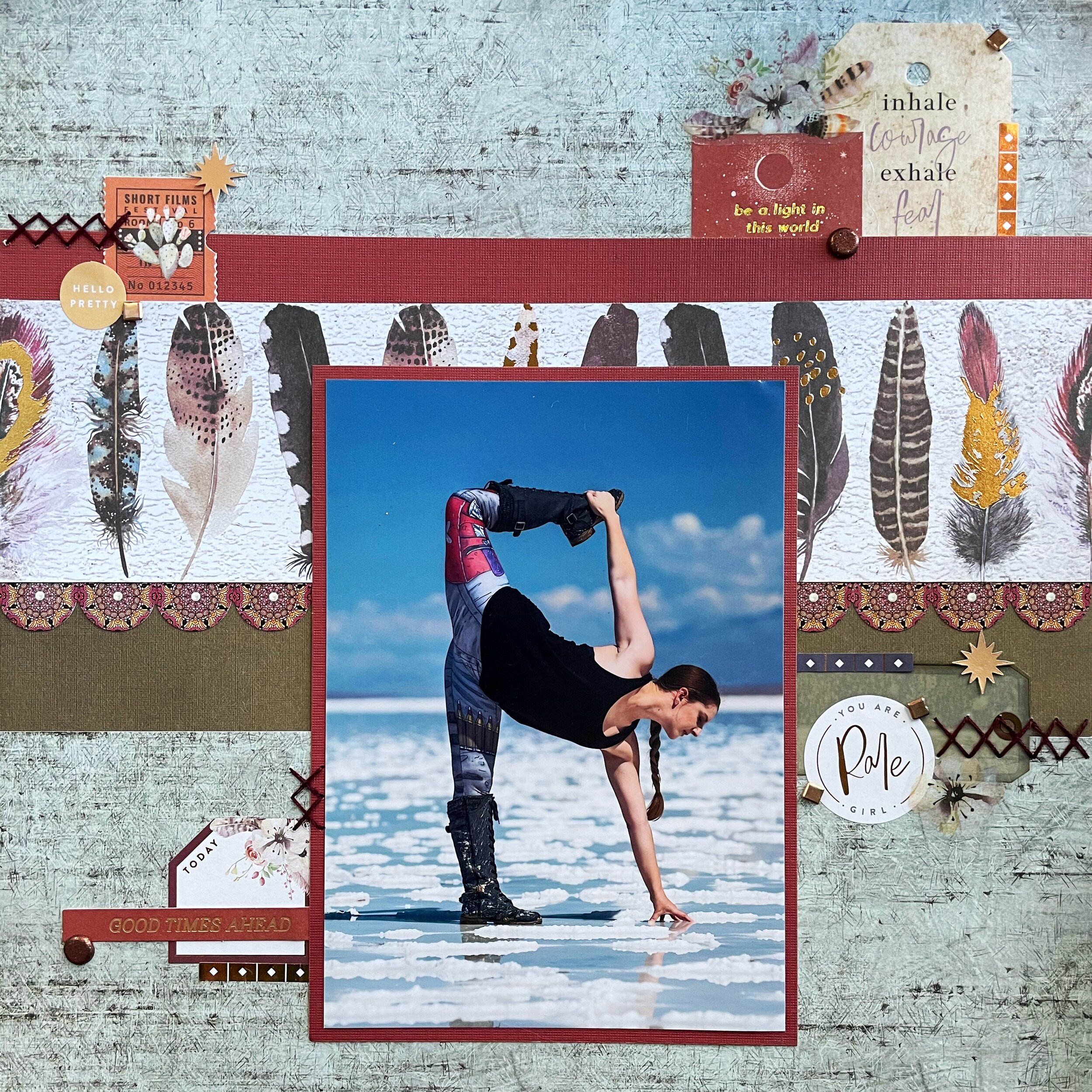
Inhale Courage, Exhale Fear

One Big Photo and Double-Sided Paper

IMG_0220.jpeg

Hi everyone! This week I bring you a layout with a very special photo that was taken in Death Valley, California. On this particular day, there was a little bit of water left in the Badwater Basin that reflected the sun. Combined with the salt that accumulates in crystals, it can look like snow and ice in the middle of the desert.

I’ve been practicing yoga for several years and thought it would be fun to strike a pose in such a unique location. The photo that resulted is one of my favorites!

Untitled.png

I started with some super pretty, double-sided paper from Prima Marketing’s Midnight Garden stack. I bought this on clearance months ago from Hobby Lobby but then never got around to using it. Oops. Does that happen to anyone else? I finally cracked it open for this page and loved the feather print paper with metallic accents. However, I felt that the page would be too busy if it was the primary background. Since the paper is double sided, I cut a strip that featured the feathers and then used the opposite side of the paper at the top and bottom of the page. The pale blue color and distressed texture went well with my chosen photo.

march-challenge-1.jpg

This page was created for the Creative Embellishments March challenge which was a really cool sketch. I used stickers from the Happy Planner Wild & Free sticker book for the title and some of the tags. Other embellishments came from Prima Marketing’s Golden Desert Ephemera. I didn’t have 3 photos that were that tall and narrow so I just used one big one instead. I added some cross stitching with some dark red embroidery floss.

That’s all for this time! Thank you for visiting!

Scrapbook Challenge

Let’s Go Somewhere Fun

Wood Print And Mixed Plaid

IMG_0208.jpeg

Hi friends! This week I bring you a warm and woodsy layout featuring some photos of my husband and me. We were driving home from Yosemite on highway 395 the in the fall. One hill was covered in brilliant yellow trees and my husband wanted to find a way to drive up to them to take some photos. After a few false starts and aimless driving, we found a road up to the hill where there was a river and lots of brilliant yellow foliage.My husband got some great photos as well as these selfie shots.

Untitled.png

I started with a piece of tree stump print paper from Paper Studio’s Dendrology stack. Since the paper in this collection is so thin, I matted it with some olive green cardstock from DCWV’s Neutrals stack. I used the same paper as a mat for my photos. Two inch squares of green tartan plaid from Recollections Regent Street stack and yellow-orange gingham plaid from DCWV’s Country Manor stack were arranged in an alternating pattern. I used some slightly transparent Soukou Leaf stickers and held them in place with Bo Bunny Emerald brads. Simple Stories Bits and Pieces made for the perfect forest-themed embellishments. I finished with some enamel dots by Echo Park. Does anyone else have a favorite embellishment that makes it way onto almost every page? I feel like my pages aren’t complete unless I scatter enamel dots all over everything!

image.png

This page was created for the Use Your Stuff March challenge which was all about the plaid!

Untitled.png

Use Your Stuff has collaborated this month with Double Trouble Challenge blog. I had not discovered their blog previously and I love their reference to Thing 1 and Thing 2! Their duel challenge for the month is using both plaid and the color green.

0730628ac5c7e8879d156facf45df620.jpg

Lastly, this page was created using a layout from the Lasting Memories March challenge. I changed it from a winter layout to more of a fall/forest vibe. Instead of a snowman, I used an embellishment with ferns and mushrooms and instead of star print paper, I used plaid.

That’s all for this installment. Stay safe and I’ll see you next time!

Scrapbook Challenge

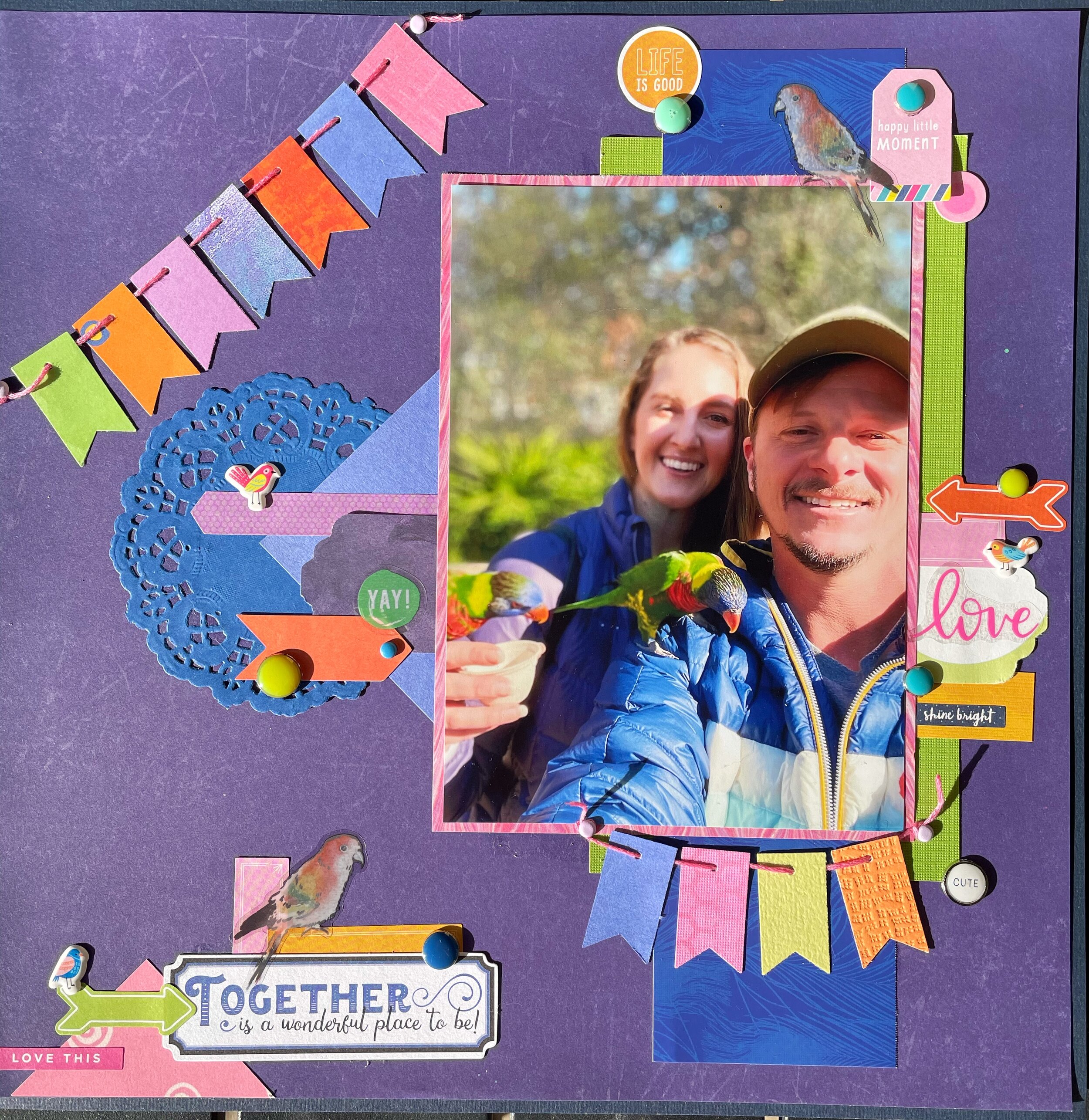
Together Is A Wonderful Place To Be

Purple And Parrots

IMG_0184.jpeg

Hello scrappers! Today I bring you a page featuring pictures of my husband and I when we took a trip to the Long Beach Aquarium. They have an aviary full of small parrots and you can pay for small cups of nectar to feed them as you walk through. The little birds were friendly and fearless and perched on both of us to drink out of the cups. It was a really fun experience!

Untitled.png

I used a piece of purple paper from Paper Studio’s Entirely Textures stack for my background and mounted it to some navy cardstock. Various paper scraps and a blue doily were layered. I used a punch to create the bunting detail and strung them on a piece of pink embroidery floss. Stickers from Shimelle and Vicki Boutin sticker books as well as My Mind’s Eye embellishments add pops of color.

Sarah Beetson with Purple Flamingos.jpeg

This page was created for the ARTastic February challenge. I love all the colors in their inspiration picture by Sarah Beetson, especially the purples which I incorporated into my page. My layout had to include birds somehow, so besides the birds in my photos, I used some parrot stickers by Stickabilities and some tiny puffy stickers by Amy Tangerine.

Thank you for stopping by and I’ll see you in March with a new page!

Scrapbook Challenge

Always Together

Magenta And Gray

IMG_0138.jpeg

Hi everyone! This week’s page explores using decorative paper that already contains quite a few embellishments. Sometimes it can be hard to add elements of your own without covering up the good stuff that’s already there or making sure your added elements are in harmony with the rest of the page.

Untitled.png

I used a piece of magenta paper with embossed stars from the DCWV Star Dust stack. In the photos, it looks more purple for some reason but in real life, it’s much more pink. I used paper from DCWV’s No Probllama stack to mat my photo and the layered on some random pieces of paper from my scrap stash. The floral paper with a dark gray background matched absolutely perfectly! I don’t even remember the original page I used it for but I’m glad I saved the small pieces that were left over. I finally cracked open some 49 Market Vintage Washi Tape in Lilac and added a couple of strips. I also used some die cuts from Kaiser Craft’s Violet Crush collection. A few brads and tiny tags complete the page.

I find the easiest way to work with pre-embellished paper is to find the part of it I would like to feature, in this case it was the gold stars. I then pulled items out of my stash and compared them both to the challenge color palette and the background paper to make sure the colors would be a good match. In this way, I was able to make the most of the existing embellishments while still being able to build upon them.

143177284_10221842004593495_4174003077109193347_n.jpg

This page was created for the 1 2 3 Challenge Blog. I loved their sketch for February and some of the printed embellishments on my background paper seemed to match the sketch really well. I focused on the darker magenta color (obviously) and used the gray and orchid colors to accent. The words Always Together fit well for my photo because my cat Jupiter always wants to be around m husband and I, even if it’s just in the same room.

That’s all for now. Thank you for visiting and I’ll see you next time!

Scrapbook Challenge

Explore Blue Lagoon

Stripes And Mixed Patterns

IMG_0117.jpeg

Hi everyone! I’m spending a cool and cloudy weekend putting together another page for you all. Today is the perfect day to stay inside and be cozy. I picked up crepes from a French restaurant down the street and made some hot tea for a perfect brunch. I can never choose between sweet and savory so I got one of each! What’s your favorite food to eat on a cloudy or rainy day?

The photos I used were from a trip to Iceland back in 2018 (remember international travel) and we took a trip to the famous Blue Lagoon spa. The pools are heated naturally by geothermal energy. Even in the chilly air the water bordered on uncomfortably hot if you stood too close to the vents. They offered free algae mud masks (which is what I have all over my face) and they had a bar IN the pool (hence the drinks.) When we can all travel safely again, I highly recommend visiting if you can!

Untitled.png

I started with a piece of pale blue striped paper and cut a diagonal stripe of gray and white scalloped paper. Since it was cut diagonally and longer than my 12 X 12 guillotine paper cutter, I had to cut it with scissors. I can never cut a straight line to save my life so I’m proud this time it doesn’t look too terribly crooked. I traced an upside-down bowl to make the circle and used some black and blue ribbon to embellish.

02Feb 8 SIT.jpg

This page was created for the Sketched in Thyme February challenge. I stayed pretty true to the sketch but added embellishment clusters like I normally do, complete with enamel dots (of course!) These ones were from My Mind’s Eye Tutti Frutti pack.

Other products used:

Thanks for visiting and I hope you’re enjoying crepes or whatever your favorite weekend treat is wherever you are!

Scrapbook Challenge

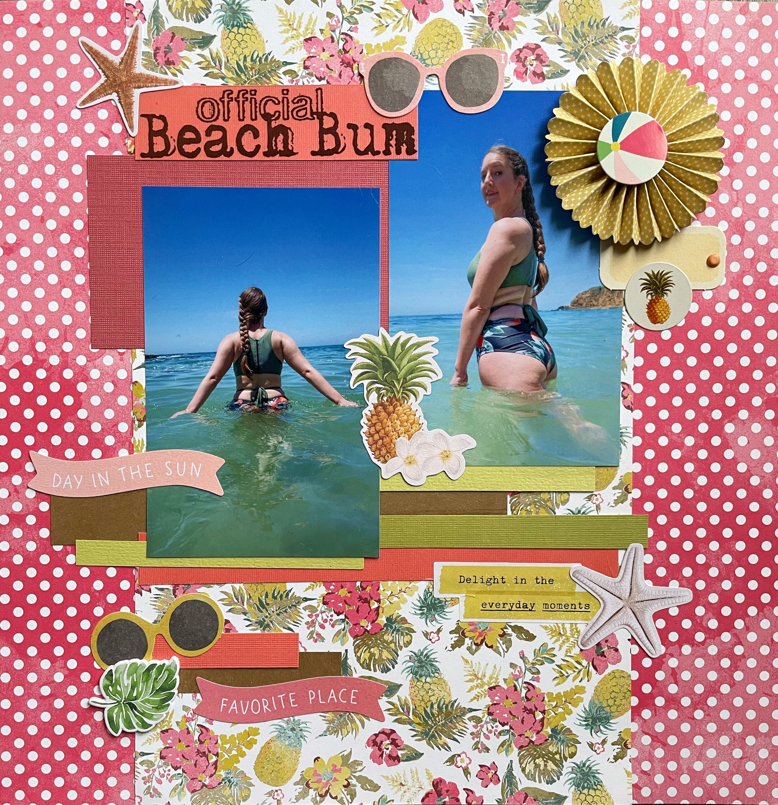
Official Beach Bum

Tropical Trends And Paper Scraps

IMG_0076.jpeg

Hi scrappers! Welcome back to my page! I stopped being lazy and finally put together another layout. I feel like I went into hyperdrive making pages last year when we were all locked down in quarantine. I was experiencing a little bit of scrapbook burnout, but finally got motivated over the weekend to put a page together.

These photos were taken pre pandemic in Laguna Beach on a day when the water was especially clear and not freezing cold. I had just gotten a new swimsuit from CupShe and wanted to try it out! These days the beaches are usually way too crowded on nice days to risk visiting, plus the water is absolutely frigid this time of year. I’m dreaming of summer, but with summer comes crowds so I don’t know when I’ll get to be a beach bum again.

Untitled.png

I had his piece of tropical print paper from Authentique’s Utopia stack picked out for a while but just hadn’t found a page to use it on yet. The whole stack features vintage tropical prints so I knew a beach photo would fit the theme perfectly. This paper is actually double-sided and I found a large scrap in my scrap collection of the same paper so I was able to feature both prints. This is why I always save my scraps! You never know when they will come in handy.

Speaking of scraps, all of the solid colored papers are from my scrap stash as well. I cut small strips and layered them along with some pink paper banners from Simple Stories Vintage Coastal Bits & Pieces. The starfish and pineapple with plumeria flowers comes from this collection too. A small paper fan from Echo Park’s Summer Fun collection matched the color scheme as well.

sketch #218.jpg

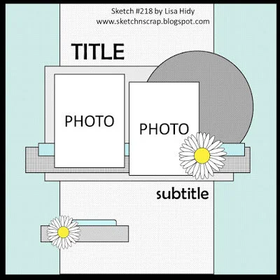
This page was made for the Sketch N Scrap February challenge. This layout was practically made for double sided paper so it worked really well with what I had. I coordinated the rest of the layout’s colors to match with the floral print so everything looked cohesive.

Thank you for visiting everyone! I’ll see you next time.