Scrapbook Challenge

Live Life

Paper Scraps, Buttons And Washi

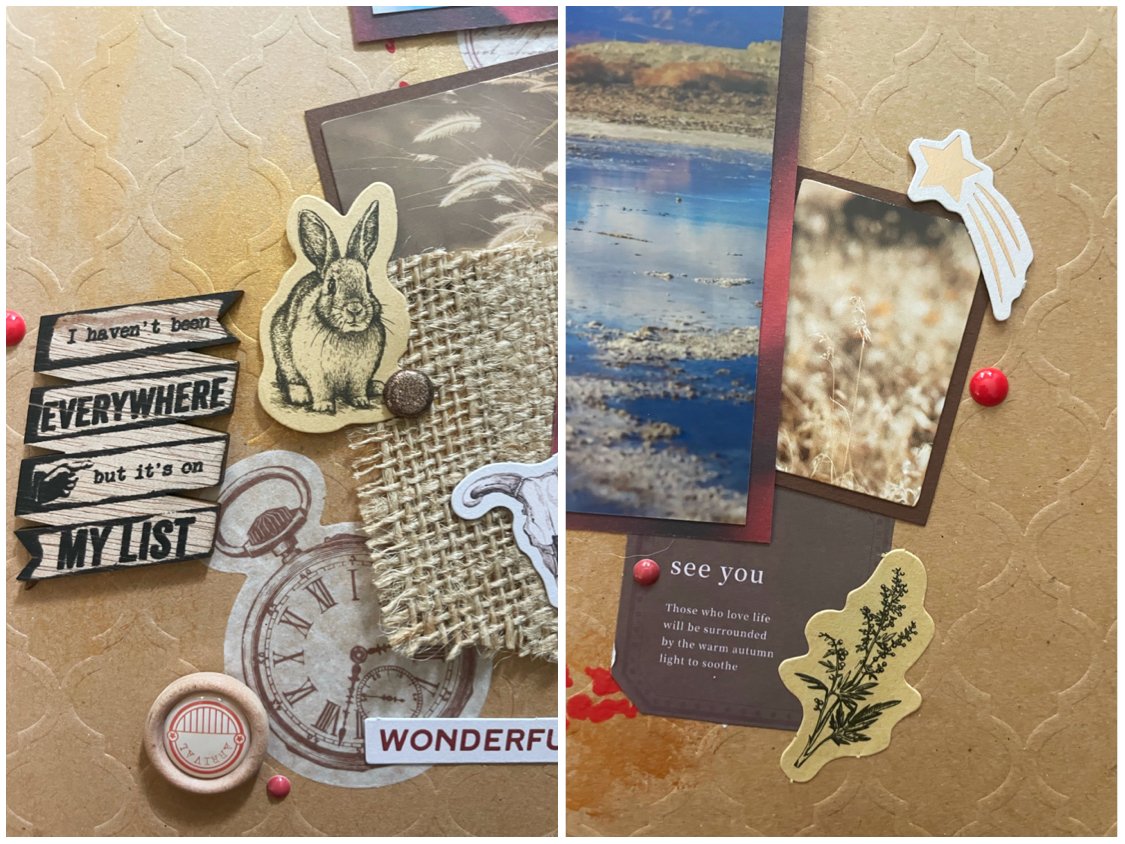
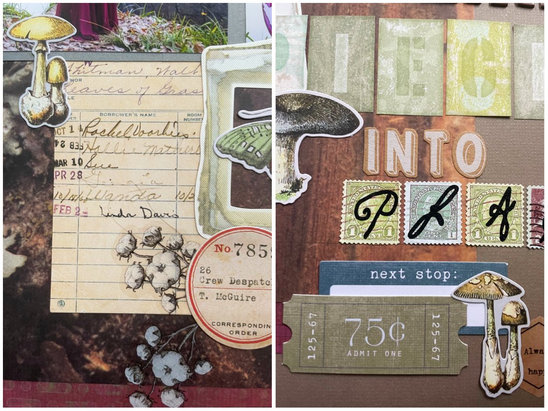
Hi scrappers! This This week I bring you a cozy fall page featuring a picture of my husband during a trip to the woods. This page came about because I challenged myself to pull a paper scrap out of my stash at random and create the whole page around it. After I had spread all the scraps across my coffee table, I ended up blindly picking the patterned paper with leaves on it. I can’t even remember the original page I made with the rest of the paper since I’ve had it so long.

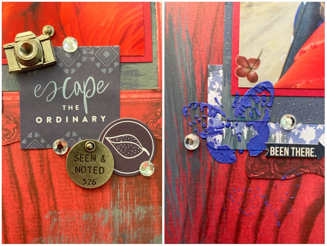
I used some dark brown cardstock from the DCWV Neutrals stack and splattered it with some white acrylic paint. It kind of reminds me of a speckled bird egg. I arranged some solid colored paper scraps around my photo and used a Marvy Uchida corner rounder on them. I found some mushrooms and labels from Tim Holtz’s Field Notes ephemera and some wood veneer buttons to match my forest theme. I cracked open some ginkgo leaf washi tape and used a long strip down the left as well as some smaller pieces near my photo.

This page was created for Becky Fleck #306 challenge over at A Cherry on Top. I didn’t have a punch to make the notebook edge or pinking shears, but I used the corner rounder to change up my solid colored paper scraps.

This page was also made for the December Grab 5 challenge, also at A Cherry on Top.

The 5 items I picked from the list to use on my page were:

  • Buttons

  • Wood Vaneer

  • Tiny Tags

  • Circle

  • White Splatters

That’s all for this week. Thanks for visiting my page and I will be back soon with a new layout!

Scrapbook Challenge

Escape The Ordinary

Mixed Media On Patterned Paper

Hi scrappers! This week I bring you a layout where I played with mixed media and a limited color palette to create this vibrant page.

I started with some red woodgrain paper from The Paper Studio’s Entirely Textures stack. Since the paper in this collection is very thin, I glued it to some black cardstock to give it some structure. I then mixed together some Delta Ceram Coat acrylic paints in Black, White and Blueberry to create some blue-gray accents with a wide, dry brush. I then mixed some Orchid Stencil Butter from The Crafter’s Workshop with American Crafts Texture Paste in Sour Blueberry to create a custom navy shade which I used with 6 X 6 Ledger and Specimen stencils, also from The Crafter’s Workshop. I found a box of Tim Holtz Idea-Ology pocket cards that had gotten buried in my stash that I forgot I had and used a blue floral card cut in half along with part of a red paper frame from Bo Bunny’s Star-Crossed Ephemera pack. I added some tags embellished with red and blue string as well as some metal Thought Tokens by Tim Holtz. I used a sticker from The Happy Planner’s Dream Seeker sticker book as my title and scattered some generic rhinestones over the page as a finishing touch.

This page was created for the December scrap lift over at A Cherry on Top Crafts. I chose this layout to lift by aheatfan because I liked the tag embellishments and mixed media look. I used stencils with texture paste in place of the leaf details and replicated the distressed paper look by dry brushing some gray paint in various direction.

This page was also made for A Cherry on Top’s November mood board. I love the moody colors featured here and ACOT always has the prettiest mood boards!

I drew additional inspiration by adding butterflies, adding in some purple-blue tones and including a floral print.

That’s all for this week. You can find more Scrap Attack content on both my Instagram and YouTube. Thanks for stopping by!

Scrapbook Challenge

I Haven’t Been Everywhere, But It’s On My List

Desert Views And Kraft

Season’s greetings scrappers! I know I say this every month but I can’t believe another month has passed, and now we are into December! I hope the holidays fine you all merry and bright and your camera rolls full of wonderful memories ready to be scrapbooked!

This week I bring you a page featuring some photos taken in Death Valley, California. These photos were take in January or February where there was snow on all the mountains surrounding the valley, but the valley itself was a pleasant 70 degrees, at least when we were there in the afternoon. I had just bought this dress from Free People and knew it would make for some dramatic photos. My husband was looking for water since he wanted to take some photos with reflections, but finding water in Death Valley is pretty rare. The only water we found was a shallow, muddy puddle. However, you would never guess when looking at the photos how shallow and gross the water actually was. Fortunately, all the mud and salt washed out of my dress (and the car upholstery) easily.

I started with some embossed kraft cardstock by DCWV and cut a quarter inch off two sides before matting it on some basic red cardstock. I sponged some Jacquard Lumiere paint in Sunset gold at random on my background and then used some Apple Barrel acrylic paint in Bright Red and a 12 X 12 stencil by The Crafter’s Workshop to make some circles. From there, I basically broke out all the embellishments that were kraft, brown or desert themed. I added in some burlap scraps from 7 Gypsies On the Road Junk Journal Goodies collection for some interesting texture. As you can see from the video, it took me a long time to move all the embellishments into a configuration I liked. I really spent a long time playing with the arrangement of all the elements. A list of what I used is below:

The color palette for this page came from Cupcake Inspirations 558 challenge.

This page was also made for the scrap lift challenge over at Kraft +. I used two photos instead of three and spread my embellishments out a little wider. I emulated their circle embellishments with a stencil, even though the one two the left on my page ended up mostly covered. I of course swapped out sea foam green for vibrant red that matched my dress in the photos.

That’s all for this time. If you’re reading this, thank you for stopping by in the midst of your holiday chaos. it is much appreciated. I will see you all next time.

Scrapbook Challenge

Swish

Botanical Die Cuts And Golden Accents

Hi scrappers! As November comes to a close, I bring you a layout with Fall vibes and a cute kitty belonging to my sister. His name is Pirate and he loves sleeping with a paw over his face. My sister says it looks like he just threw a basketball when he’s in this pose, hence the title “Swish.”

I used some warm gray cardstock from the DCWV Neutrals stack as my background paper and added in some leafy die cuts made with Tim Holtz Garden Greens Thinlits. I added some golden accents with stickers from Crate Paper’s Journal Studio and The Happy Planner’s Pressed Florals sticker books as well as some little flake seal cat stickers by BGM. Lastly, I added some journaling strips from Tim Holtz’s Chit Chat sticker book.

This page was created for the November sketch challenge at Lasting Memories. Instead of stars, I used lots of leafy die cuts.

This page was also created for Color, Stories, Inspiration’s November challenge.

“Evidence” Used:

  • Labels

  • Gold

  • Leaves

  • Flowers

  • Banner

That’s all for this time. Thank you for stopping by. For more Scrap Attack content, you can visit me at Instagram and YouTube.

Scrapbook Challenge

Thankful

Mountain Themes In Shades Of Blue

Hi scrappers! Thanksgiving is practically upon us so I thought I would post a layout this week that reflects on how thankful I am for the moments captured in all the photos I scrap. I’m thankful I live in a place where I can travel to so many beautiful places, both local and abroad. I’m thankful I’m happy and healthy and have the means to hike, dance, and pose in these photos and I am especially thankful for my husband and photographer who is the one who gets me off the couch and out of the house. Otherwise, all my photos would be of my cats or of me reading a book or sleeping in on the weekends. Not nearly as exciting. These particular photos where taken near Mount Whitney in California.

I used some blue cardstock from the Colorbok Ombre Energized stack as my background paper because it matched the blues in my dress. I paired it with some pale blue leafy paper from the Sara Papers collection from Paper Pizazz. These papers are so old I doubt they exist in any marketplace anymore. You can see in the video that the book is falling apart. I’m trying to use them up but I keep buying new pretty paper. I used a “Thankful” die cut from Pink Paislee’s Auburn Lane ephemera collection as my title. Some scrap pieces of paper were tuned into tags with some Momenta die cuts and my Sizzix machine. Stickers from Crate Paper’s sticker book and a Yuxian sticker book along with some wintery washi tape (brand unknown. I got it off Amazon.) add to the mountain theme.

This page was made for the November sketch over at Sketch N Scrap. The photos I had worked so perfectly since I only had three and was able to cut them down into squares.

This page was also created for the 3 in a Row challenge at A Cherry on Top crafts. I used Banner (little yellow banner sticker,) “Thankful,” and Any Shade of Green. It also qualifies for the November music challenge also at A Cherry on Top. The journaling “I go back to December all the time” is a lyric from a Taylor Swift song. These photos actually might have been taken in January or February. I can’t remember for sure, but the lyrics still seemed appropriate.

That’s all for this week. I’ll see you next week when it will almost be December. Can you believe it??

Scrapbook Challenge

Be A Rainbow

Incorporating Busy Collage Papers

Hi everyone! This week I created a page with some pictures taken about this time last year at the beach. I really loved the rainbow sweater I was wearing and made it the theme of the page.

I started with some really pretty collage paper from the Memory Place Welcome to Paradise collection. This paper is so pretty and detailed that it could really stand alone with just photos, but I can never make anything that simple! I cut down the paper a little and paired it with some deep teal cardstock from the DCWV Chalk it Up stack. This paper has a very unique texture, like an actual chalkboard! This was the perfect chance to crack open some watercolor washi tape by Bentoto House. It’s so pretty but I’ve never worked it into a layout until now. I did have some trouble getting it to stick to the chalkboard paper texture so I placed some of my other embellishments over it to help stick it down. I added some ocean images from some washi stickers books, including the Rimo Sunset Romance book. Some washi ticket stickers by Infeel Me me were in the perfect pastel colors and paired nicely with some Memory Place die cuts, Amy Tangerine and Dear Lizzy stickers, and a scattering of enamel dots.

The color palette was inspired by Color Dare challenge #521. I decided to use all 6 colors because they paired so nicely together. The melon accents on my page really stand out. I had a tough time finding something “mist” colored. In fact, the background cardstock I used was literally the only thing I had, which is astounding because I own enough scrapbook paper to practically open my own store! I felt like all my pastel colors needed the darker green color as contrast and I really like how it turned out.

This page was also created for Lasting Memories where this month they are hosting some layout challenges. I opted for a single page layout instead of a double page spread, using mostly elements from the left side but added in some journaling strips from the right using Heidi Swapp Hawthorne stickers.

Thank you for visiting my corner of the internet and I will see you next time with a brand new page!

Scrapbook Challenge

Autumn Leaves

Stickers, Brads And Tags

Hi scrappers. This week I bring you a autumn inspired page with vibrant colors, patterns, and botanical elements. I used photos taken at June Lake several years ago when the fall foliage was at their brightest. I paired the photos with bright pink and deep green papers that were a nice contrast to all the yellow tones in the photos.

I started with some deep green hexagon paper from the Recollection’s Green House stack and paired it with some pink paper from Paper Pizzazz’s Great Jewel Backgrounds collection. Some pale green paper from DCWV’s Copper Luxury palette made a good mat for my photos. I added in some tags and embellished with Yuxian forest stickers and plant washi bujo pads. For the title, I used Sadie alphabet die cuts by Echo Park Paper Company. I cut squares from an ombre piece of paper and labeled each with a letter of my title so I could keep them in sequence and preserve the ombre fade.

This page was made for the November scrap lift at A Cherry on Top. The above sketch by Sharman was the inspiration for my page. I also used a cursive die cut for my title as well as tags and journaling strips from the Cape Diem Beautiful Mini Sticker Tablet.

That’s all for this time. Thank you for visiting and for more Scrap Attack content, you can find me on Instagram and YouTube.

Scrapbook Challenge

Love You To Pieces

Patterns And Textures

Hi scrappers and welcome to November. This week I bring you a page featuring Ninja the kitty again. He’d fat and lovable and very sweet and has a very photogenic face. Like most cats, he spends a lot of time lounging in the sun so I scrapped some photos of Ninja doing what he does best.

I started with some red and cream striped paper from The Paper Studio’s Kellerkurtz & Company stack. This paper is very thin so I used some red cardstock to add some structural integrity. Th leaf paper I sed has been in my stash for easily over 10 years. I have no idea what the brand is but I would be surprised if it is still being sold anywhere. I layered over some orange die cuts and puffy stickers from the One Canoe Two Goldenrod collection along with some red Kimono washi taped some burlap flowers by The Paper Studio. I found a scrap or corrugated paper in one of my junk journal packs and it adds a lot of texture to the page.

This page was created for Becky Fleck sketch 300 over at A Cherry on Top. I didn’t have any apple, pear or lemon products that matched my color palette but the orange slices fit in perfectly.

This page was also created for Color, Story, Inspiration’s October challenge and I got it done just in time.

Evidence Used:

  • Textured Paper

  • Apples or Other Fruit

  • Wood

  • Flowers

  • Leaves

  • Something Tiny

  • Burlap

That’s all for now. Thank you for visiting and I’ll see you all next time when I start exploring all the fun new November challenges that were just posted!

Scrapbook Challenge

Live Loud

Utilizing Die Cuts

Hi scrappers! This week I bring you a layout featuring an impromptu selfie of my husband and I taken in Laguna Beach. The water was such a pretty color the day! It feels so good getting my favorite selfies printed and off my phone. Now I can put them in an album or hang them on my wall. Is. anyone else excited to get their prints in the mail, even though you already know what all your images look like?

I started with some basic beige paper by K & Company. This stack doesn’t appear to have a name, but it contains solids and polka dots. I had a scrap piece of paper I had embossed using the Mosaic Jewels embossing folder by Sizzix which I cut in half to span across the page.

One die cut really was front and center on this page. The Bee Hive die cut from Sizzix really came in handy and I love that it allowed me to mix and match hexagons since they were all cut the exact same size. There’s no way I could hand cut any of these and have them look the same. I also added in some hexagon stickers from the Carpe Diem Beautiful Mini Sticker Tablet and some Scrap Yard die cuts by Kaiser Craft.

This page was made for the October 123 Scrapbooking Challenge. These were colors I don’t think ever would have put together but that’s what made me want to try it. I also was drawn to all the hexagons, plus, that scrap piece of embossed paper was similar to the doily print in the sketch and it was the right color! The hexagons I used were small than the sketch so I used more of them. I love how this page turned out!

That’s all for this week. I’ve been busy posting on YouTube with their new Shorts feature so check that out here if you get the chance. I’ll see you all next time!

Scrapbook Challenge

Relax

Teal And Red

Hi scrappers! I’m back again with a new layout featuring my sister’s cute kitty named Pirate. I wanted to make her some scrapbook pages for Christmas so I am getting a head start and putting some pages together.

I started with some teal floral paper from the Eclectic Remix stack and some maroon paper from the Entirely Textures stack, both by The Paper Studio. I layered over some various paper scraps into some collages along with some stickers from Amy Tangerine’s Brave and Bold collection and from The Happy Planner Rainbow sticker book and the Vicki Boutin sticker book. I added some puffy kitten stickers by The Paper Studio and some journaling strips by Tim Holtz. I finished off with some enamel dots (as always) scattered throughout the page.

This page was made for the October scrap lift at A Cherry on Top where I had to choose a layout to remix by Amy Jo. I chose the one above and added a third picture to the bottom left corner. I liked all the little embellishment clusters since that’s something I already include on most of my pages.

This page was also made for the Cherry on Top October Mood Board. This month’s board is so beautiful and contains red and teal tones. I also incorporated the use of the color black since several of the photos include darker colors. I also was inspired to include the photo of Pirate sleeping on my mom’s knitting project because of the kitty photo on the mood board. Lastly, I chose the teal floral background paper because of all the foliage in the inspiration pictures.

That’s all for this week. You can find me on YouTube and Instagram with more content. See you next time!

Scrapbook Challenge

Cat Tree

Colorful Kitties

Hi scrappers! This week I bring you a layout featuring my kitty who loves lounging in the cat tree all day. She was particularly lazy and cute this day with her front leg dangling so I snapped a photo.

I started with some pastel tree paper from the Shingle Little by Little stack. I had no idea what I was going to do with this paper at first. It seemed to whimsical and childlike for the fall foliage photos I have and the colors didn’t really match. It ended up working perfectly here where I didn’t have a photo of a literal tree, but a cat tree.

I used some handmade paper that has some large wood particles in it. It added some nice texture but rubber cement absolutely does not work on it because it soaks it all up like a sponge. I used adhesive dots and mounting foam to tack down a photo frame from a Heidi Swapp ephemera pack and some butterfly trim that I cut into a couple pieces. I also used some Color Study stickers and Sweet Rush ephemera, both by Vicki Boutin and various stickers and embellishments by Amy Tangerine, Art C and Momenta. The title was made with some sparkly newsprint alpha stickers by Sticko. I added some little kitty brads by Eyelet Outlet to finish.

This page was made for Becky Fleck challenge 297 over at A Cherry on Top Crafts. I used one big picture and a picture frame rather than three smaller ones.

This page was also made for the 3 in a row challenge at the Cherry on Top message board. I ended up getting 3 in a row twice with Any Shade of Green, Free Space, 2 or More Photos and then Decorative Frame, Free Space and Journaling Strips.

That’s all for this week. Thank you for visiting and I will see you next time with a new scrapbook layout!

Scrapbook Challenge

Hello Love

Wildflower Die Cuts

Hi scrappers! Welcome to October! California weather is still in the 80s so it doesn’t feel remotely spooky here so instead of bringing out the Halloween themed pages right away, I’m kicking off the month with a page I made for a wedding we will be going to soon. I always keep the wedding invite or save the date card and try and create unique gifts like this. You don’t have to worry about someone else buying the same thing off their registry! Since I wasn’t sure if the couple wanted to keep their anonymity, I’ve blurred out their faces.

I started with some double-sided paper from My MInd’s Eye that’s probably ancient by now. So many of the products I use end up sitting in my stash for years before I use them. This is also true of the metal martini sticker by Momenta I used. I probably picked those up in the 2010’s!

A new toy I have been getting plenty of use out of is my Sizzix Big Shot machine and wildflower die cuts by Tim Holtz. This is yet another great way to use up random paper scraps. I tried to get as many die cut pieces out of my two chosen scraps as possible and arranged them with some junk journal tags which came with dried flowers (yes they’re real!) that I also used. The moon sticker I added is one of my favorite parts of this page!

I used some enamel stickers by 49 and Market for the title and finished off with some paint splatters.

This page was created for the October sketch over at Sketches in Thyme. I emulated the textured background by sponge painting with some acrylic paint and moved the title up higher. The floral patterns in the sketch inspired me to use the flower die cuts for a similar effect.

I used the color palette from the Lasting Memories October challenge. The blues and teals matched what the couple in the photos was wearing so it paired nicely. The dusty teal became the dominant color with dark blue, gray and white accents.

That’s all for this week. You can find more at Instagram and YouTube at thescrapattack. See you next time!

Scrapbook Challenge

Desert Dance

Shades Of Purple

Hi scrappers! This week I bring you a very purple page to wrap up September. These photos were taken out in Death Valley, California. I can see why so many movies are filmed there because the landscape is so unique. These shots were taken at Bad Water Basin and that white stuff on the ground is actually salt even though it looks like ice. Fun fact, Death Valley is the hottest place on the planet with a record of 134 degrees. Fortunately it was only in the high 90s when we visited.

I used some basic white cardstock as my background because the purple tile paper I used by Recollections was so busy. I paired it with a scrap of polka dot paper I had and and some very thin purple strips that I had saved even though they were so small. They ended up working out well on this page.

I used a 12 X 12 stencil and stencil butter in Orchid by The Crafter’s Workshop to add some circular details and then added stickers from The Happy Planner Pressed Flowers and Beauty in Florals sticker books. I finished with some enamel dots and word strips from Tim Holtz Idea-Ology Small Talk sticker book.

This page was created for the White…with 1 September challenge where the color for this month was purple. I was inspired by all the different shades of purple in the mood board and used paper that had lots of different purple tones.

This page was created as part of a scrap lift over on A Cherry on Top Crafts. This was the original sketch by CynthiaB that I was inspired by. I made stenciled circles rather than stitched ones and kept the big, bold, two word title.

That’s all for now. Thank you for visiting and I’ll see you next time in October. Can you believe September is already over? Spooky season awaits!

Scrapbook Challenge

Exhale

Plum And Chartreuse: An Unlikely Pair

Hi scrappers! This week I bring you a page with a very unusual color combo: plum and chartreuse. I never would have paired these two together but now that I look at the finished product, I really love how it turned out! I feel like it especially works with the dress I was wearing in my photos. In case you haven’t noticed in my previous posts, I love traveling to places with my pro photographer husband with a pretty dress in my bag and taking some fun pictures in exotic places. These particular photos were taken in Joshua Tree National Park.

I started with some circle-print paper from DCWV’s Violet Leaf stack. I couldn’t believe I already had paper in my stash with this exact color combo. What are the odds?! It paired really will with some glitter embossed paper from DCWV’s Dark Romance stack that was the same shade of plum. I used some washi strip from 49 and Market and some skinny polka dot washi tape (again, how did I have products in my stash already in this crazy color??) I found some chartreuse and plum embellishments in my stash including Memory Place’s Adventure Awaits Diecuts and One Canoe Two’s Goldenrod Diecuts. I really love the lime wedges. They fit with the page so well!

This page was inspired by the September Mood Board over at A Cherry on Top Craft’s chat forum. Isn’t this mood board the coolest?? I really love this unlikely color combo and was inspired to use succulents, a bird and flowers. I even included a pretty dress, although the one in the mood board is a full on ball gown and I wish I had more occasions to wear a dress that gorgeous.

I used Becky Fleck sketch 294 for this page. I was a little off on my proportions and cut my chartreuse cardstock too small. It ended up being ok though because it gave me even more room for embellishments.

That’s all for this week. Thank you for visiting my page and I will see you next time!

Scrapbook Challenge

Big Helper

Patterned Papers And Creative Titles

Hi everyone! I’m already back with another layout because there’s so many fun challenges on the internet for the month of September. I want to participate in more than one a week so let’s see how far I get!

This week I used some photos of my mom and a very fat cat named Ninja. He likes to sit on laps, especially if it’s inconvenient for the lap owner, and he’s so big that he doesn’t really fit anyways. I love his unimpressed expression in the second photo.

I started with some patterned kraft paper from The Shoppe on the Square stack from The PaperStudio. I layered over some blue paper from the Entirely Textures stack also by the Paper Studio and then cut up some leafy orange paper from Prima Marketing’s Rock Out Bro stack. Balancing crazy patterns with bold colors on this page was a little tricky. I had pulled some other papers initially that I ended up not using because it was just too much and my photos got lost in the shuffle.

Embellishments were kept to a minimum for a change, especially since I created a big title from some Sticks Tag Type circular stickers. I added brads to each sticker and threaded some red embroidery floss around them to make a banner with some tiny cat brads by Eyelet Outlet on each side. Some cat die cuts from The Paper Studio made the biggest impact and I added an orange paw print frame from Photo Play’s Cat Ephemera pack to keep with the theme. I like how the orange matches the other orange paper I used.

I only used one scrap from my left over paper stash on this page which was the yellow tiger stripe piece on the right. I try and use more each page before I drown in paper scraps but this time I created more new ones than I did use up old ones. Oh well.


This page was made for the September challenge at Kraft + Challenge. I really liked the bright colors in contrast to the neutral kraft. I didn’t use bird on my layout but I did keep an animal theme.

This page was made using Becky Fleck challenge 293 at A Cherry on Top Crafts. I turned the garland into my title and threw in some big silk flowers, other than that it’s pretty similar, right down to the ribbon trim in the bottom left corner.

That’s all for this week. Thank you for visiting you soon and I’ll see you all with another page for another challenge.

Scrapbook Challenge

Live Life Happy

Sponge Painting And Die Cuts

Hi scrappers! This week I bring you a vibrant pastel palette and delicate leafy die cuts. I used some photos taken at a wedding last summer. My friend got married at a gorgeous mansion and my husband snapped a few photos on his phone of me in front of it. I tried to match my color palette to the bright greens and blues in the photos and also used papers that mirrored the pinks and corals in my dress.

I started with some bright green paper from the Spring Inks stack by Recollections. I used some acrylic paint and a makeup sponge to make a soft, impressionist background. I had initially only added some paint splatters but I’m glad I added more with the sponge. It came out so pretty! I used leaf and stem die cuts from the Sizzix Bold Flora Thinlits to form embellishment clusters. I love how delicate they are but it also makes them tough to glue down. I used an acid free glue pen and squeezed some glue out onto the Tupperware lid I use as a palette. I dipped the blunt end of my paint brush into the glue and applied it that way. It allows me to better control where I put the glue and to spread it evenly over the small, thin pieces of the die cuts.

I’ve recently discovered A Cherry on Top’s message board and there are so many fun challenged there every month. I’m so excited to try and participate in as many of them as possible.

This page was made for a 3 in a row challenge. I love a good tic tac toe/bingo challenge. Bonus points were awarded if I could use all nine elements. So I did!

  • Buttons/Enamel Dots: Enamel dots by Echo Park Paper Co. and Pink Fresh plus a pink button in the bottom right hand corner

  • Any Shade Turquoise: Thin stripes in the glitter paper and the paper behind it

  • 2+ Photos: I used two photos on this layout

  • Paint or Ink: I used Apple Barrel paint in Pink Polish and Bleu Regence and Delta Ceramcoat in Azure Blue to create the background

  • Cloud or Water: there is a strip of cloud print paper along the bottom near the title as well as a washi sticker from a Yuxian sticker book

  • Puffy Stickers: I used New Day stickers from Echo Park Paper Company and Thickers puffy alpha stickers tomato my title. Both came from a previous Cherry Box

  • Triangles (1 large or 3 small): I used three small, two blue ones as photo corners and a pink one near the green camera sticker

  • The word “Fun”: I used a sticker with the phrase “Fun Times” on the left from the Carpe Diem Beautiful Mini Sticker tablet

  • Tag: I cut a vellum tag in half from Heidi Swapp’s Care Free ephemera pack. The bottom half is the bottom right hand corner

I used a sketch for this page from Sketch N Scrap. The layout was simple but allowed me to embellish and add to it to really make the finished page my own.

That’s all for this week. Thank you so much for visiting! You can find me over on YouTube and Instagram @thescrapattack. See you soon!

Scrapbook Challenge

Autumn Leaves Falling Down…

Name That Music Quote!

Hi scrappers! I feel like I just posted, but so many cool challenges on various websites were posted on the first of the month that I couldn’t wait to get started!

It may be September and basically fall, but it’s still over 100 degrees where I live. In fact, we’re in the middle of a record heat wave. I usually love summer and would lament its end every year (maybe that’s because back then I looked better in a bikini and I didn’t live so close to the beach where it gets insanely humid) but now I am really craving some sweater weather and colorful leaves. I decided that if I can’t have fall right now, I’ll live vicariously through this page where I used photos from a trip to Yosemite National Park a few years back.

I started with some brown cardstock from The Paper Studio Affinity stack. I layered over some lichen and wood paper from The Paper Studio’s Dendrology stack that really matched the forest theme. The majority of my embellishments came from the Tim Holtz Field Notes Ephemera Pack but I also used some Heidi Swapp Ephemera, some stickers from an infeelME sticker book, and some vintage frame stickers from an unknown brand. Although I didn’t use as may different embellishments as I do on most of my pages, the few I decided to use I struggled with a little bit as far as finding the perfect placement. You can see in the video that I rearranged things quite a few times before finding a configuration I liked. Sometimes I had to move things after I glued them down (which is never fun) because my oversized title took up more space that I thought. Once this page was finished, I realized I didn't use a single brad or enamel dot, which is truly unusual for me!

I also used a variety of alpha stickers I had in my stash to spell out the Taylor Swift quote that I used as a title (can anyone guess the song it’s from??) Mixing and matching alpha stickers is a great way to create longer titles when you don’t have a ton of vowels left in a particular sticker sheet. I need to find a way to use up a bunch of my excess Z’s, J’s and other leftover letters because once the vowels are gone, I don’t know what to do with the rest but don’t want to throw them all away.

I used the Becky Fleck 292 sketch at A Cherry on Top Crafts for this page, although I went off script pretty quickly. Instead of a circular detail, I used a rectangular frame, and my title ended up taking the entire righthand side of my page so I shifted everything to the left. The photos I used were a little bigger because I didn't;t want to cut them down too much and loose all of the lakeside background.

This page was also made for the More Than Words September challenge which was Ephemera and Playlist. I feel like I use some sort of ephemera on most of my pages. It’s one of my favorite things to shop for! Lately my playlists have always included Taylor Swift tracks, or I just listen to her albums start to finish. The quote “Autumn leaves falling down like pieces into place” from All too Well was so perfect for this page because in one of my photos, I am literally throwing autumn leaves into the air and letting them fall down around me.

That’s all for this week. There’s so many cool challenges on so many scrapbook groups/blogs this month. I’ll never be able to do them all but I’m really excited to try! See you all next week (or maybe even sooner!)

Scrapbook Challenge

Summer Smiles

Tropical Punch

Hi scrappers! I bring young more sketch this month and it embodies beachy, summer vibes. My husband and I spent a week in the Bahamas and took some great photos. I selected a few for this page that really summed up the feeling of the whole trip.

I started with some palm tree sunset paper from Craft Smith’s Summer Dream stack. Some neon teal paper from Recollection’s Spring Ink made a jumbo mat for my two smaller photos. Some Twilight Beach tape by Mind Wave was the perfect accent for this page, both in color and theme. I made some streamers with baker’s twine and K & Company’s Tags to Go. I don’t know if these are still in production, but if they are, I highly recommend them because I have had this batch for years and still have plenty left despite using them all the time.

Other Products Used:

  • Pastel Mini Round Brads - Creative Impressions

  • Teal Enamel Dots - The Paper Studio

  • Magical Birthday Enamel Dots - Simple Stories

  • Baby Boy Enamel Dots - Echo Park Paper Co.

  • Light and Shadow Washi Album - Mo Card

  • Simple Vintage Coastal Bits & Pieces - Simple Stories

  • Stick-a-bilities Travel Stickers - The Paper Studio

  • Mixed Media Stickers - Momenta

  • Globe Stickers - Recollections

  • Seashore Brads - Eyelet Outlet

  • Hello Gorgeous Mixed Bad Ephemera -My Mind’s Eye

  • Amy Tangerine Accent and Phrase Stickers - American Crafts

  • Vicki Boutin Sticker Book - American Crafts

This page was made for the Cherry on Top Crafts Becky Fleck 290 challenge. I emulated the bunting that was shown in this sketch and placed my photos in a similar configuration. This sketch didn’t have a title so I added one in the lower right hand corner.

This page was also made for the Color, Stories, Inspiration August challenge. I loved the summer theme and the color scheme really went well with the photos I had.

Evidence Used:

  • Multiple Photos

  • Beah Accents

  • Fish, Flamingos or Other Animals

  • Vehicles

  • Palm Trees

  • Ferris Wheel

  • Arrows

  • Twine

That’s all for this time. Thank you for stopping by my blog and I will see you soon for a new month of pages!

Scrapbook Challenge

Grow Through What You Go Through

Purple and Gray

Hi scrappers! Thanks for joining me again. This week I faced the challenge of using a very bizarre background paper and finding balance between showcasing the paper and making my photo the focus. We all have those paper packs where there’s at least one or two designs that we don’t know what to do with. I challenged myself to use one of those papers this week in combination with a selfie I took near my house.

I started with my background paper from DCWV’s Royal Garden stack which featured an albino peacock. Photorealistic papers are always hard for me to work with since I am conflicted on covering up pretty details but also don’t want the paper to overwhelm my photos. This paper had an obvious focal point with the peacock head so I shifted my photo to the left to allow them both to be seen. I added some paper scraps to the left side to add more color and interest. I love how the glittery silver adds texture and sparkle. From there, I focused all of my embellishments around the edges of my photo.

Products Used:

This page was created for the Sketch N Scrap August challenge. I like the trip color background in this sketch because it provided inspiration of how to add additional papers to my layout without covering up too much of the peacock image. I only used one photo instead of two on my page and used a vertical photo rather than horizontal.

This page was also made for the Color my Heart Color Dare challenge which was gray plus another color. I paired grey with purple since my dress in the photo had purple elements as well as my makeup. This was the perfect challenge for the background paper I hd the varied in shades of grey, black and white. Using this grayscale background made my purple elements even more impactful.

Thank you for visiting once again. You can find more content on YouTube and Instagram @thescrapattack

Scrapbook Challenge

XOXO

Junk Journal Vibes

Hello everyone! This week I continue the August trend of making neutral pages. Usually my pages are pretty colorful but the recent batch of 49 and Market products I received has me loving these more subdued pages.

I made this page as a wedding present for two friends who will be getting married soon. I like creating these kind of personalized presents for the new couple with photos of them and possibly the wedding invite or save the date card if they send one out. Even if it wasn’t something on their registry, it’s a one of a kind gift I hope they will cherish.

I started with a sheet of Savor Paper by 49 and Market. I liked that the background already had a collage-like quality that I could build upon. The vintage and worn aesthetic paired nicely with some philosopher tags, thrift shop ephemera and alpha tiles, all by Tim Holtz. I also used some In the Kitchen Junk Journal Goodies from 7 Gypsies and finally broke in my wildflower stem Sizzix dies to add some delicate die cuts. I love all the fine details in these dies but it makes them very hard to adhere to the page. To help, I used some Wishing Bubbles stickers from 49 and Market’s Vintage Artistry Essentials collection and stuck a few along the edges of the diets to help hold them down. Clock and key 3D stickers add the final touch.

This page was made for the August Scrap Our Stash scraplift challenge. I didn’t want to use a border that spanned the entire background paper so I used some smaller borders along two edges of my photos in the form of some words and definitions. This was actually the throw-away strip cut off from the top of my background paper. If it’s an interesting print, I tend to save these and this one I was able to up-cycle by cutting pieces roughly the length of my photos. They blend into the collage more but still add interest and the words seemed so appropriate for the photos. The numbers I used were 2 and 5 on pieces of ephemera.

That’s all for this week. Maybe next week will bring a more colorful layout…or maybe I’ll continue playing with all these neutral products. Who’s to say?! Thank you for visiting and I will see you next time!