Scrapbook Challenge

Cherish

Icy Blue With Bling

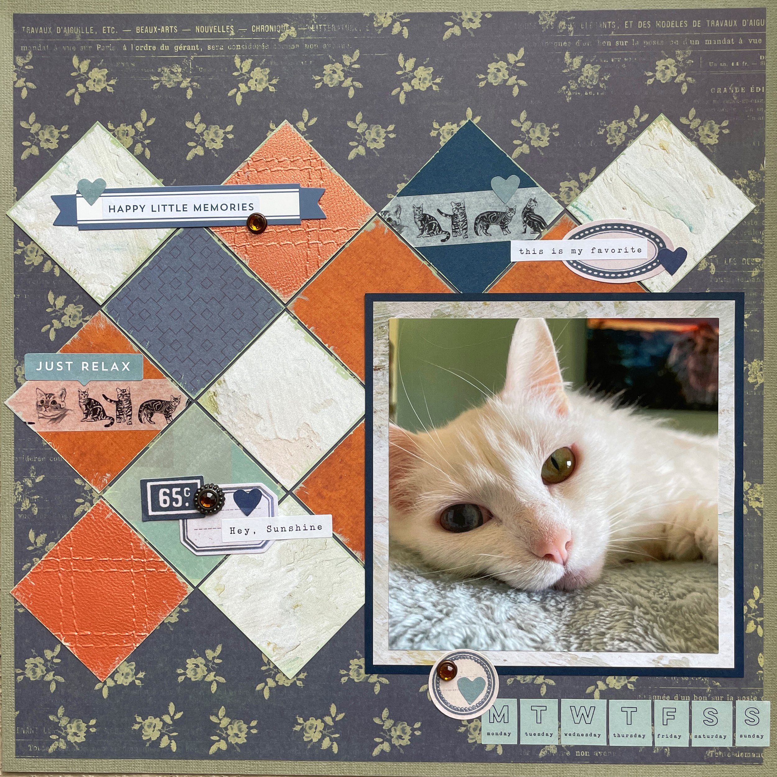
Hi scrappers! This week I’ve created a duo chrome layout in shades of light blue and white. This was actually a color a didn’t think I would have a lot of in my stash but in the end I found more than enough items to make a cohesive page. I definitely cracked open a few items I’ve had for years but never used.

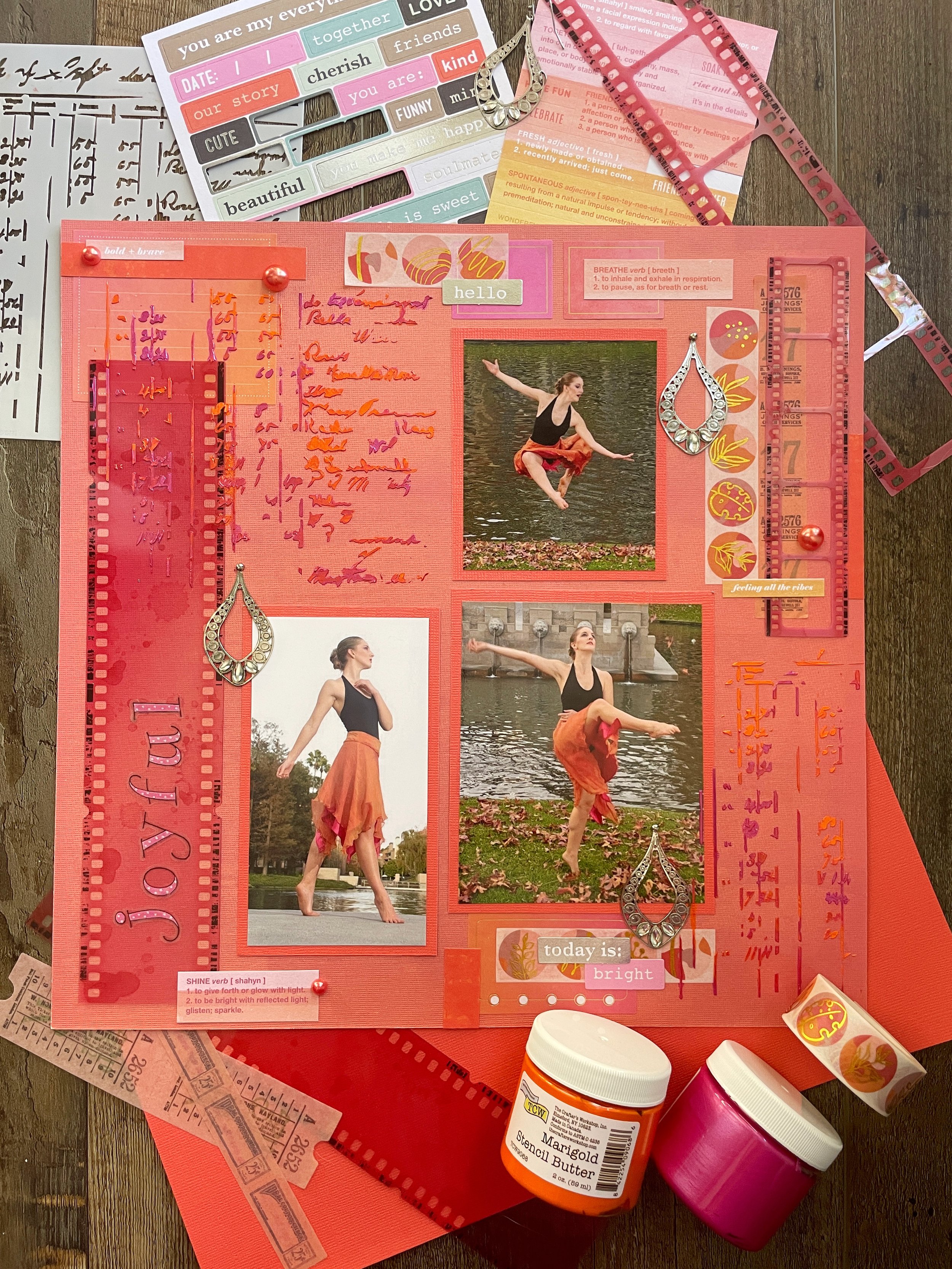
I used basic white cardstock as my background and then cut a stripe of double-sided paper from the Tracy Porter collection by Colorbok. This is a collection of papers I’ve had for at lease a decade, possibly two, so every time I use one up, it’s a win! I added a thin sticker border by Me & My Big Ideas that’s also absolutely ancient. I used some old paper scraps to mat my photo and then used a smattering of blue and white embellishments to make a collage. I hand painted some chipboard photo garlands by P13 as well as some little wooden pieces so they would match my color palette. I added some stickers by The Happy Planner and some blue and white enamel dots by Altenew. The title comes from a book of rub-on quotes by DCWV, also purchased in the early 2000s and so old, the book has fallen apart!

The color palette this month came from the June challenge at White…with 1. Besides the very pretty color combo, I was also inspired to use florals, paint (on the wooden and chipboard pieces) and text like on the book spines (the definition Ruben I used for my title.) These color challenges are always so fun because I’m usually amazed how many items of a specific color I can find in my stash.

This layout was also part of a monthly scrap lift challenge over at A Cherry on Top Crafts. I lifted this particular sketch by Aztam since I liked the collage she created around the photo.

Color Dare Design Team Challenge #604

Every Day May Not Be Good, But There Is Something Good In Every Day

Shades Of Pink And Green

Hi scrappers! Welcome to my first layout June! These photos are part of a series that my husband took last year when the wild mustard was in bloom. There were so many good shots from that session that I’m still working my way through scrapping them all!

I only used a handful of products on this page which is unusual for me. The majority of papers used came from the Copper Luxury stack by DCWV. This collection has lots of floral and succulent patterns in pink and green tones so I felt it would work well with my photos. The paper is also double-sided so both the accent stripe and the large pink patterned mat behind my photo are two sides of the same paper. The title also comes from the same paper collections as well as the succulents which I fussy cut. Some were adhered with foam core tape to give them some dimension. I also used some gilded botanical washi tape and some washi succulent stickers along the right side. I finished with some rub-ons by 49 and Market and some enamel dots by Simple Stories.

I used sketch 379 from A Cherry on Top Crafts for this page. Instead of a large circle under the title, I used a large succulent and scattered smaller ones around my photo.

This page was also made for challenge 604 over at Color Dare Challenges. I mostly used the colors Ballerina and Limeade but all six colors are all represented throughout the page. I hope you’ll join us with your own creation.

That’s all for this week. If you’re looking for more video’s showing how I put my pages together, I have quite I large library on my YouTube channel featuring ASMR style videos, time lapses and unboxings. I’d love to see you there!

Scrapbook Challenge

Always Believe Something Wonderful Is Going To Happen

Three Of A Kind

Hi scrappers! I’m here with one more layout for the month of May! I used some photos taken at a Winter festival last year where there are lots of holiday lights, including this fun tunnel of twinkling LEDs. My husband and I took some silly selfies while walking through. I think my favorite one is the one where I’m a little blurry because it makes me laugh every time I see it.

Despite the photos being taken in a wintery/Christmasy setting, there really isn’t anything about them that indicates “Holiday.” I decided to go a totally different direction and instead of using traditional red and green, I matched the blue/purple tones and added in the unlikely combo of black, gray, yellow and spring green.

I used some indigo chevron print cardstock by Momenta for my background. This paper is nice and thick and holds up well no matter how many things I layer on top of it. I cut my photos down to 4 X 4 and mounted them on black cardstock. From there, I used all paper scraps in my stash to make a collage behind them and used some green ledger paper from the Echo Park For the Record 2 6 X 6 stack as a background for my title. This might be the longest title ever but I loved the phrase printed on the Shimelle wooden embellishment so I decided to go with it. I used a Marvy Uchida punch and Fishers squeeze punch to make some additional embellishments that matched the Kaiser Craft and Recollections stars and pennants. I added in some fun little brads that look like screws and used both a stencil and stencil paste in Fern to add some chicken wire patterns to the page.

I used the sketch from the May Sketch with a Twist challenge over at A Cherry on Top. I don’t usually have three photos in a series but in this case I not only had a set, but they could easily be cut down to the 4 X 4 that the sketch recommended. Instead of paper doilies, I used stars and other bits and pieces around the page. The twist was to use some sort of mixed media so I added the chicken wire texture in three places.

This page was also made using case file 435 from Color, Stories Inspiration. Beside using the provided color palette, I used the following “evidence:”

  • Floral pattern

  • Wooden accents

  • Circular elements

  • Use 3 photos

  • Small metallic brads

That’s all for this week. Thank you for stopping by and I will be back in June!

Scrapbook Challenge

Thriving

Kraft And Berry

Hi scrappers! This week I created a page using all kinds of odds and ends from my stash. I scrapped a selfie I took in front of a wall full of paper flowers at a local macaroon shop. Don’t you love it when both your winged eyeliner and highlighter look good on the same day?

I started with some white lined Kraft paper from the Kraft Basics stack by Craft Smart. I then I cut a strip from a piece of variegated paper from the Ombre Energized stack as well as used it as one of the mats for my photo. Another mat was made using some polka dot paper from the DCWV Gold & Kraft stack. I layered a giant tag and some frame stickers under my photo along with various paper scraps from my stash. I cut a up a large rub on and added it under my photo collage and then added in some chipboard and ephemera, all from the 49 and Market Plum Grove collection. I recently purchased several products from P13, including some chipboard polaroid embellishments and some frames which both matched the color scheme for this page. I used some other odds and ends that were all kraft or berry colored.

This page was made for the May challenge over at Kraft +. I really liked the color combo and as soon as I saw this challenge I knew I wanted to try it. I’m glad I was able to get it in my the deadline!

This page was also made for the May Title challenge over at A Cherry on Top Crafts. There was a large list of options for page titles, all flower/garden related in honor of the month of May. I used the option “Thriving” for this page.

That’s all for this time! You can find more Scrap Attack content on Instagram and YouTube. I’d love to see you there!

Color Dare Design Team Challenge #602

I Was Enchanted To Meet You

Periwinkle, Royal And Wisteria

Hi everyone. I’m back after short but amazing vacation! My husband and I took some really great picks on our travels so I hope to be scrapping some of those soon, (among the hundreds already in the backlog.) Speaking of backlog, it’s taken me nearly a year to even scrape the surface of the pictures I took at the Taylor Swift Eras tour. Good think I can’t scrap videos or I would literally never catch up!

I had to zoom in pretty far on my phone in low light, hence the noisy pixelation, but I wanted to scrap it anyway! This is when she was singing “Enchanted” in the Speak Now era in a big, gorgeous ballgown. I follow an KFilson Art on Instagram who has made it her mission to draw every outfit Taylor has worn on this tour (a huge task considering all the variations, even more now with the European leg.) I checked out her Etsy shop and purchased several stickers that corresponded with the outfits she wore the night I saw her, knowing they would be fun embellishments on future pages. I love that she even included the detail of the purple microphone she had for this particular set.

I started with some purple cardstock from the Splash stack by The Paper Studio. I feel like I have been using this stack a lot lately! It contains pretty shades of pink, blue, green, teal and purple. I flattered some watered down acrylic to make my background more interesting and then created a circle with some Vicki Boutin Creative FX paste and a mandala stencil by The Crafter’s Workshop. The paste was actually a pretty periwinkle blue color but due to it being pearlescent on a dark surface, it almost looks peachy or silver in certain light, but I swear its periwinkle!

As is my bad habit, I covered up the majority of the texture paste (a shame since it took half a day to dry!) and added some paper scraps behind my photo. Thank goodness for alpha die cuts (I used a set by Tim Holtz) because there are not enough vowels on any sticker sheet for my title, which is a lyric from the song she was singing. I’m glad the dies were small too or the title would have taken up most of the page! I like how the word in glitter cardstock really stood out. However, since the paper was thicker, the dies had a harder time cutting through! In the future, I will run the dies through my Big Shot machine twice on paper like this.

From there, I added a tag by Paige Evans with some Stamperia clear die cut phrases as well as some paper flowers. I added some chipboard by 49 and Market and decorated them with heart-shaped enamel dots by Altenew. I also incorporated a few handmade circular die cuts from albumlovehandmade since they were the perfect color! As I finishing touch, both my photo and the sticker of Taylor are affixed with foam core mounting tape to make them look 3D.

This is a very special Color Dare Color Challenge since it is the 12 year anniversary! The challenge starts 5/24 so I hope you will join us and play along! I added some silver metallic elements and of course the neutral colors of Taylor’s dress to this pretty and soft color palette.

I used sketch 613 from Sketches in Thyme. I loved the uniqueness of the photo being set on an angle. I moved where my title was and also where the triangular corner pieces were (mostly because I cut them wrong so they faces the other way. Oops.)

That’s all for this time. I’m going to try and squeeze in one more page for the month of May so I will see you soon!

Scrapbook Challenge

Bloom & Grow

Purple And Olive Florals

Hi scrappers! I am continuing to try and participate in as many National Scrapbooking Day challenges as possible! Cherry on Top Crafts has a ton so this week’s page was made for one of those. This photo was taken a couple of years ago when there was a big spring bloom in the Southern California deserts. The rams behind me are actually metal statues and there are a ton of different animal sculptures by the same artist dotting the landscape.

I started with some purple patterned paper from the Violet Leaf stack by DCWV. I then used some olive green cardstock by The Paper Studio since it matched some of the green tones in my photo. I used some rub on transfers by 49 and Market since they also matched the color palette and cut them up to spread them around the page. I used some gilded washi tape by London Gifties as a border around my photo which is not something that I normally do but I love how it looks.

I wanted some additional gold accents so I used both a stencil and stencil butter by The Crafter’s Workshop to add some abstract shapes around the page. I then used some 49 and Market laser cutouts, chipboard and ephemera in various shades of purple. I finished with various brads and some green enamel dots by Altenew.

The challenge I made this page for was a scrap lift hosted at A Cherry on Top Crafts. I ended up using this sweet layout by Art_Teacher. I knew it would work well for the big photo I planned to use. I emulated the scattering of confetti by adding lots of brads and enamel dots and rather than a rectangle to journal in, I used some text strips from the Color Swatch Lavender collection.

That’s all for now! Thank you for visiting and I will be back with yet another page soon!

Scrapbook Challenge

Joyful

Pink, Orange And Poppy

Hi scrappers! My page today features some very special photos that I found on one of my social media sites. The original files have been lost to time but I was able to download these photos and print them even though they are pretty low res. I was a dancer for most of my young life and majored in dance in college. An injury forced me to step away from that career path but I miss it every day. These photos remind me of how much joy I found in dance!

I started with some orangey cardstock by Momenta and then used some red-orange cardstock by The Paper Studio as a mat for my photos. I added some box stickers by The Happy Planner, some with gold accents that matched the gold in the washi tape by London Gifties I added. I really liked the abstract design with gold botanical images. The filmstrips are from 49 and Market’s Rouge collection and the alpha stickers are by Me &My Big Ideas. I almost never position my titles vertically so this was a changeup for me.

I think what really makes the page stand out are the big stenciled patches (possibly the biggest patches I’ve ever put on a page) made using a ledger stencil and Marigold and Fuchsia stencil butters by The Crafter’s Workshop. I like how the two colors mixed together to created a marbled effect.

Lastly, the jeweled metallic pieces are actually from an old chandelier earring I had in my stash. I broubably bought them in the early 2000s from Charlotte Russe or Wet Seal or some other staple store of Y2K fashion. I lost its mate at some point but kept the one earring for some reason. I took it apart and used both Glue Dots and teeny tiny brads to adhere them to the page.

This page was made for the May challenge at Cupcake Inspirations. This was a fun color palette that I probably never would have come up with on my own audit ended up matching the skirt I was wearing in my photos so well!

I used sketch 611 from Sketches in Thyme for this page. This sketch seemed like a fun challenge and kind of different from others I’ve done due to the big vertical title and patchwork feel with all the different odds and ends. Instead of journaling, I used a stencil with letters and numbers as a stand in and used three photos instead of four. My pieces didn’t end up fitting together nearly as well but I tried to fake it anyway!

That’s all for now. There are still so many fun challenges calling my name due to National Scrapbooking Day so I am hoping to get a few more pages out before I take a short vacation. See you all soon!

Color Dare Design Team Challenge #600

Happy Little Memories

Shades of Pumpkin, Mist And Sapphire

Hi scrappers! As I write this, it is National Scrapbooking Day! I spent the day celebrating by making this pretty page as a part of the design team for Color My Heart Color Dare. I hope you’ll head on over to their site and submit your own creations!

I started with some deep blue floral print paper from the Kellerkurtz & Company stack and pasted it over some some muted green cardstock from the Affinity stack, both by The Paper Studio. I used some origami paper from the Enchanted collection by Memory Place as a mat for my photo and then cut assorted paper scraps from my stash into two inch squares. I hand painted all the edges for a distressed look and to make them stand out against my background paper. There were two squares of metallic cardstock and I used a quilt pattern embossing folder to add some texture to them. I added so cat washi tape, some Tim Holtz ephemera and stickers from the Journal Studio sticker book by Crate Paper.

This page was made for the Cherry Lift challenge over at A Cherry on Top Crafts. I chose this layout by njr007 as a reference and went for a pet theme rather than winter.

This page was made for Color Dare challenge 600 which starts May 10th. For this tic-tac-tow challenge, I used the top row with colors pumpkin, mist and sapphire. I think there’s also a few rosemary tones on the page as well. I love these challenges because I always end up with a color combo I never would have created on my own.

That’s all for this time! I’m hoping to do more scrapping than normal to celebrate National Scrapbooking Day and will try to submit in all the fun challenges going on around the internet. I hope to see you all soon!

Scrapbook Challenge

Spring

Blush Pink Florals

Hi scrappers! This page was technically my last layout of April but I didn't get around to posting until now. I used some photos taken last spring when the mustard flowers were in bloom. Fun fact: mustard is actually considered a noxious weed around here since it is so prolific is crowds out indigenous vegetation. Despite local habitat rehabilitators pulling them up every year, they still continue to flourish and paint all the hillsides vibrant yellow when they bloom.

I started with some baby pink cardstock from the DCWV Blush Kraft and Rose Gold stack. I then cut down a piece of antique looking floral and text paper from the Kellerkurtz & Company stack by The Paper Studio. I found some pink lace print paper from an ancient collection by Paper Pizzazz called Pretty Papers. I used it as a thick mat around my photos so at least a little of the pace pattern showed. I had some bits of old lace and beads in my stash so I sewed some sequins, pearls and beads onto the lace scraps to add a little sparkle.

I then opened up several new products I bought from the albumlovehandmade Etsy shop. I had admired her handmade paper creations on Instagram for a while and finally put in an order! I was so thrilled with what I received and will probably upload an unboxing video to my YouTube soon. I highly recommend you go check out her beautiful items if you scrapbook or keep an art journal. I guarantee you’ll want one of everything!

I pulled out a few blush pink/peach tags and labels from the assortments I bought. I really like the long skinny one with the phases of the moon on it! I think the die cuts I bought were my favorite purchase from her shop and used a little scale, leaf and flower on this page. I scattered some bird stickers on the upper right and finished off with some brads by Recollections through some of the tags.

I used sketch 375 from the weekly sketch challenge over at A Cherry on Top Crafts. I followed the sketch pretty closely, just with totally different elements like birds instead of balloons and layered tags and ephemera instead of presents.

That’s all for this week. Thank you for visiting my page and I will see you all soon for all new scrapbook challenges in May!

Scrapbook Challenge

Lovely

Lilac And Mint

Hi scrappers! This week I bring a page that is in some of my favorite colors. Purple and turquoise are colors I have always been drawn to and these colors of lilac and mint are very close. I used a photo taken of my husband and I at a local arts festival!

I started with some solid mint cardstock from the Splash stack by The Paper Studio and splattered some purple paint over it. I layered some leaf pattern washi tape and some fabric tape by 49 and Market on either side of some pale purple flower print paper. This paper is from a scrapbooking kit by Colorbok that included some Flower Fairies stickers. I have probably had this kit since high school but never used it much. All of the stickers were still intact! I layered some laser cutouts from the Viken and Color Swatch Lavender collections by 49 and Market along with a Color Swatch Lavender frame around my photo. I used a stencil from the Vicki Boutin Color Study collection with some Finnabair paste in multiple patches around the page. This paste has big holographic flakes in it, most too big for the small holes in my stencil but a few ended up sticking here and there.

The Mood Board challenge over at A Cherry on Top Crafts featured this gorgeous mood board! The colors and the flowing fabric pattern of the woman on the left hand side of the mood board inspired me to use one of the flower fairy stickers on my layout since the colors and flowing fabric pattern felt similar.

This page was created for the Lasting Memories April challenge. I chose this sketch since I knew I had some film strips I could use. I added some from 49 and Market’s Color Swatch Lavender collection and kept the same big title and botanical elements. I didn’t have anything with scalloped edges but used double rows of tape instead.

That’s all for this time! You can find more Scrap Attack content on Instagram and YouTube. I’d love to see you there!

Color Dare Design Team Challenge #598

Shine Bright

Shades Of Pink, Yellow And Green

Hi everyone! I’m here with another Color my Heart Color Dare challenge! This one starts 4/26 so I hope you will head over to their site and play along!

I started with some yellow ombre paper from the Paige Evans Whimsical paper stack. I then cut down some floral paper from the Maggie Holmes stack by Crate Paper. I layered a pink striped paper scrap and paper from the 6 X 6 Bloom stack, also by Crate Paper. I used some clear die cuts by Stamperia. These are unique since they are made from plastic rather than paper die cuts. They remind me a little of Shrinky Dinks from childhood. I used Mini Glue Dots to tac them down since the adhesive is clear and some of the die cuts were slightly transparent. I added some glittery bird accents by K & Company. I’ve have had these a very long time and am still nowhere near using them up but I am one step closer! I splattered some white acrylic and shimmery watercolor paint over the whole page as a finishing touch.

The color dare challenge this time gave a little freedom in what shade or tone of pink, green and yellow were used. I ended up using multiple shades of all three colors plus some white and cream. I hope you’ll join us at Color Dare with your own take on the challenge!

This page was also made for the 3 in a Row challenge over at A Cherry on Top Crafts. I ended up completing a column, row and a diagonal by incorporating the following:

  • Yellow

  • Spring Critter (Bird)

  • Paint Splatters

  • Pink

  • Floral Patterned Paper

That’s all for this week! Thank you for stopping by my page and I will see you soon with a brand new layout to share.

Scrapbook Challenge

Meow

Using Silly Stickers

Hi scrappers! This week I made a silly little page featuring my cat Jupiter. She’s so goofy sometimes, and her personality really comes out in this photo so I made an equally silly page.

I started with some red paper that had the word “meow” all over it from the Roxie & Friends collection by Photo Play. Although I don’t even remember purchasing them, I have several products from this collection that really worked well on this page. The title sticker was from their 12 X 12 sticker sheet and I used a few pieces of matching ephemera too. The best part of this page though is the little sarcastic animal stickers by Sticko. I love all the sassy quotes because I feel like cats would absolutely say something like it if they could. I tried to use up the whole sheet but had a few to spare. I think the hedgehog is my favorite.

I used sketch 373 over at A Cherry on Top Crafts. I was inspired by the speech bubble elements to use the animal stickers since they also had little speech bubbles. I was lucky that I happen to have a big speech bubble sticker that I was able to use as the title. Instead of polka dots, I used some rainbow star print paper by Recollections.

That’s all for this week. Short and sweet! If you are interested in quiet ASMR unboxing videos, I have posted a few on my YouTube page. There is a playlist for unboxings, time lapse videos, ASMR scrapbooking videos, etc. I hope you’ll drop by!

Scrapbook Challenge

Happy In A Million Little Ways

Leafy Greens, Peaches And Teals

Hi scrappers! This week my page features a photo that was taken at our friend’s wedding. They had a photo booth there that printed the images for the guests on the spot which was really cool! Other photo booths I’ve seen with usually just email or text a digital image. They had lots of fun props too but my favorite was the speech bubble I am holding.

I started with some brick patterned paper by Maggie Holmes as my background. I then cut down some Honeysuckle paper by Memory Place and rounded the corners with a Marvy Uchida punch. All other paper used was out of my stash of scraps.

I used several text rub-ons from 49 and Market’s Nature Study Foliage set and used a sticker from Crate Paper’s Modern Farmhouse sticker book as my title. I feel like I ended up covering the majority of the rub-ons by accident. Why do I always do that?? I opened up a layered embellishment set by 49 and Market that I’ve had for a long time but never used so I tried to add as many leaves, cameras and enamel dots as I could. I love the heart-shaped wooden sign and feel like it’s perfect for a page with my husband and I!

This page was made for the music challenge over at A Cherry on Top. I chose this album cover from Stevie Nick’s Trouble in Shangri-La album. I loved the colors and the mystique of the image. I used peaches and teals like in the image and replicated the archway shape by using a chipboard window from the Stamperia Cats and Orchids collection.

This page was also made for the April Sketch with a Twist challenge. The twist was to add leaf embellishments which I definitely had plenty of! I didn’t have a sticker or a die cut that would replicate the lacy, cut-out detail at the bottom of the page so I just used a paper scrap and added a solid blog along the bottom with a non-decorative edge.

That’a all for this week! If you’re looking for a scrapbook or card making challenge to participate in, consider dropping by Color Dare Challenges. The current challenge is running until 4/18/24!

Scrapbook Challenge

Fabulous

Purple, Pink And Gray

Hi everyone! This week, I made a page with some bright, fun photos that were taken at brunch in Laguna Beach.

I used some gray text print paper from the Colorbok Mixed Media stack and mounted it on dark pink cardstock since it was very thin. I used paper scraps for the vertical accent on the left as well as the mats for my photos. The title comes from a Shimelle sticker book and I embellished with some puffy stickers and enamel dots by Simple Stories. I added some washi cocktail stickers which fit this theme perfectly and used some pink and purple acrylic paint to add lots of splatters.

This page was made for the April Video Game Challenge at A Cherry on Top Crafts. Purple is my favorite color so I was excited about this color combo! I tried to adhere pretty strictly to the color palette, making gray my main base and then added colorful accents.

This page was also made for the Cherry Lift challenge. I chose this adorable layout to lift since I liked the detail on the lefthand side and the hexagon details. I added some camera stickers as well by Navy Peony as a nod to the original layout.

That’s all for this week! I’ve been having a blast with the various scrapbooking challenges around the net this month! If you are looking for one more to participate in, join me at the Taylor Swift challenge I host every month at A Cherry on Top! See you all soon!

Color Dare Design Team Challenge #596

No Wifi Here

Black, Brown And Pale Green

Hi scrappers! I’m back again with a page I created as a part of the design team over at Color my Heart Color Dare Challenges. Please drop by and take a look at all the beautiful entries our participants submit. This particular challenge will start 4/12.

I used some photos my husband took of me in Joshua Tree. I grew up with dance being a big part of my life and while I don’t teach or take classes now, I will revert to my dance lexicon when posing for the fun landscape photos my husband will sometimes take. I love how the rainbow dress I wore contrasts with all the brown of the landscape. Having lots of brown in my layout makes those bright rainbow colors pop even more.

Since I have been collecting scrapbooking products for so long, I have more paper than I’ll ever be able to use and I keep telling myself I won’t buy anymore. However, I saw this Naturalist paper stack by P13 and broke my own rule. Every paper in the collection is gorgeous and the quality is top notch with the paper being nice and thick. I used the brown paper as my background since the little branch designs matched the texture of the foliage in my photo.

The green paper is from Vickie Boutin’s Evergreen & Holly stack by American Crafts. I received this stack in a blind box and didn’t think I would get a lot of use out of it since I didn’t have very many Christmas photos on file. I’ve ended up using this stack lots of times and usually not for Christmas themed pages! The paper really works well here too and the design is abstract enough that it doesn’t look overtly like snowflakes.

Most of the embellishments are either ephemera bits or laser cut elements from the 49 and Market Nature Study collection. This collection has been getting lots of use since so many of my photos are taken outdoors. They really look great here and there were lots of brown embellishments to choose from.

I finally found a home for the corrugated tag I’d had in my stash forever and added some Heidi Swapp definition stickers as well as (you guessed it) enamel dots by Altenew and Simple Stories.

The Color Dare challenge this time allowed for a little more freedom since I could choose any color I wanted to go with black and brown. I chose a light spring green which contrasted beautifully. I don’t think I ever would have put together this color combo on my own. I don’t use a ton of black in my layouts anyway even though I have tons of black paper since it usually comes as filler in the 12 X 12 albums I buy to house all my finished pages. Black looks great here as an accent color in the text stickers and photo mats and isn’t too overwhelming. Why don’t I use black like this more??

I used sketch 294 from Sketch N Scrap. This sketch was so simple but allowed me so much room to play! Instead of a large flower, I used a circular twig embellishment and layered additional embellishments all over the place (but what else is new?) This was a perfect opportunity to use a series of three photos and I just happened to have this trio in the stash.

That’ll for this week. Thanks for giving my page a peek and I will be back soon with a whole new page. I think I’m in the mood for something bright and colorful after this brown-toned page. See you there!

Scrapbook Challenge

This Forever

Peacock Colors And Sparkles

Hi scrappers! I was digging through my stack of photos and found this old picture from when my husband and I were first dating. We were both much younger and skinnier!

I started with some teal peacock feather paper from the Summer Dream stack by Craft Smith. I embellished with laser cut elements and ephemera bits from the 49 and Market Viken collection. For some reason I had some peacock feathers in my stash so I cut one down and used a Sizzix shaker pane and corresponding die cuts to create a shaker. I had a ton of random beads and sequins so I added some inside the shaker before sealing it and then hand-stitched various sparkles all over the page.

I used the weekly sketch from A Cherry on Top Crafts for this page. Since I didn’t have three small photos, I improvised with a medium sized photo and shaker. I used Viken fabric tape by 49 and Market for the stripes down the right side and lots of flower ephemera instead of hearts.

I used the color palette from challenge #123 over at Challenge Yourself. This color combo was so pretty and I was able to incorporate peacock feather paper and an actual peacock feather on my page!

That’s all for this week! You can find more Scrap Attack content on Instagram and YouTube. I’d love to see you there!

Scrapbook Challenge

The Midnight

Primary Colors With Cocoa Brown

Hi scrappers! This week I used some primary colors and a brown background and even my photos matched the color palette! These photos were taken when I went to go see the band The Midnight live in downtown Los Angeles. I had seen this band once before at a music festival but this was their own show and they were amazing! If you like electronic music with a new wave flare and epic saxophone solos, you should give them a listen!

I used a piece of brown cardstock from the Affinity stack by The Paper Studio. I had a scrap of primary color finger paint paper that has been in my stash for years (maybe decades?) and I used up a chunk of it by cutting some two inch squares. I used various strips of washi tape, both by Kimono and Crate Paper and used some varnish stickers for my title. The arrow came from the same sticker sheet. I added a few crushed velvet brads by Doodlebug Designs to hold down some square tags and some brads and stickers from the Go See Explore collection by EchoPark Paper. I added some enamel dots by Carta Bella to finish.

This page was created for the March Video Game challenge at A Cherry on Top Crafts. I usually don’t use all primary colors too often so this was a challenge! I was excited to find those photos in my stash that were the perfect shades of red and blue.

I used Becky Fleck sketch 370 as inspiration for this page. I liked how some of the squares had rounded corners and some did not. I decided to add washi tape strips rather than journaling on the right side

That’s all for this week. Thank you for stopping by and I will be back, probably in April with a brand new page!

Scrapbook Challenge

Twins Today

Peacock Teal

Hi everyone! This week I scrapped a photo of my cat and I. She has two different colored eyes so I did my makeup to match. My husband took these fun portrait shots and I think they turned out really nice!

I started with some basic white card stock as my background and added some teal paper byPaper House. One side had the botanical damask pattern I used on the right. Theater had stripes of different patterns that I cut apart and placed under my photo on the left. I wish I had cut the strips a little longer so more of the different patterns could be seen! I hand stitched a row of sequins at the bottom and placed some adhesive rhinestones in a line across the top. I had some peacock embellishments by Jolee’s in my stash forever that worked perfectly on this page. I also used some peacock brads (and one that says “cat’s meow”) by Bo Bunny. I finished up with some rhinestones and gemstone encrusted flowers.

This page was made for the March 2024 scrap life challenge at A Cherry on Top Crafts. I used this sketch by Celeste B as my template. I liked all the paper strips and the rows of brads and sequins and wanted to recreate that on my own page.

This page was also made for the White with One March challenge This month’s color was teal and their mood board is absolutely gorgeous! I was inspired to use peacock elements and, of course, to feature a cat. The challenge also called for lots of bling, which I tried to incorporate through all the rhinestones and sequins.

That’s all for this time! Thank you for for visiting my page and I will be back soon to share another page!

Color Dare Design Team Challenge #594

The Great Escape

Scarlet, Periwinkle and Sapphire

Hi scrappers! I’m back with another Color Dare challenge! I used a selfie that was taken in Death Valley National Park. My husband took some really cool landscape portraits of me while we were there so hopefully I’ll get around to scrapping those soon!

I found an old piece of pale bluish paper with the circular dot pattern and cut that down a little. Both the background red paper and the red star paper are from the Vickie Boutin Evergreen & Holly paper stack. I had already used part of the red frame from the Bo-Bunny Star-Crossed collection on another page but had plenty left over for this page. I added another frame and filmstrip from the 49 and Market Nature Study collection. Lastly, I scattered lots of red and blue ephemera by Tim Holtz and splattered the finished page with acrylic paint in white and phthalo blue.

This is the challenge from Color Dare of which I am a proud design team member! Of the six colors, I used the three on the top row, scarlet, periwinkle and sapphire. This challenge starts 3/29 so make sure you stop by the site to play!

I used sketch 369 by Becky Fleck which is a current challenge over at A Cherry on Top Crafts! I really liked the stripe accents which I replicated with washi tape and a paper scrap!

That’s all for this week! I feel like there’s not enough weeks in this month for all the challenges I want to participate in! I will be back soon with a new page and I hope you’ll join me.

Scrapbook Challenge

Focus On The Happy

Maximalist Layout

Hi scrappers! This week I bring you page that’s a little bit over the top. I normally use a lot of embellishments on my page but went a little crazy on this one. I layered lots of stickers on top of some patterned papers to there is a lot to look at! I still think my kitty Europa is still the star of the page. Look at those eyes!

I started with Brave Spirit and Precious papers from the Maggie Holmes Parasol collection. From there, I added a paper doily and a big jar embellishment from My Mind’s Eye’s My Story ephemera pack and layered lots of stickers from the Maggie Holmes sticker book. I had some stamps (I think they are real stamps from around the world!) that have cats on them and used a couple of those. Lastly, I used some wood pieces by Shimelle, including the large one I used for my title.

This page was made for case file 430 at Color, Stories, Inspiration. As soon as I saw the color palette, I knew Maggie Holmes products would be perfect for it! I used the following “evidence” for this page:

  • Floral Pattern

  • Wood

  • Light Bulb

  • Jar

  • Eyeglasses

  • Gold Elements

This page was also made using using sketch 604 from Sketches in Thyme. I used two big photos instead of four little ones, but really liked the placement of the photos over the two strips of paper. I went a little overboard with the embellishments and with all the gold accents, it really feels like maximalist scrapbooking!

That’s all for this week. Thank you so much for visiting and I will be back soon with yet another layout!