Guest Designer With Lasting Memories Week 5

Love Stretches Your Heart And Makes You Big Inside

Pink And Kraft

Hi scrappers! I’m a little late getting this page posted but I still wanted to share! This is the last page I made as a guest designer for the month of September at Lasting Memories. I delved into my stash of paper scraps and found all kinds of papers that worked well!

I used some basic kraft paper from the Craft Smart and then added embellishments to my paper scraps including some sakura flowers by The Paper Studio, chipboard leaves by The Dusty Attic, stickers by Shimelle and enamel dots by Altenew. The title comes from DCWV’s Love and Friendship vellum quote stack.

Here is the final color palette Lasting Memories provided. I was inspired by all the flowers and made sure to include some on the final page.

I used sketch 394 from A Cherry on Top Crafts but turned it 90 degrees. I didn’t have three little photos but used scraps of paper to make a triptych design element instead.

Short and sweet this week, I know. But I will be back with a whole new month of challenges. Thank you for checking out my page and I will see you soon!

Color Dare Design Team Challenge #620

Friends ‘Til The End

Mulberry, Sage And Shortbread With Gold

Hi scrappers! I’m back again with Color Dare as part of their design tea, with an all new color challenge! I used some photos of my husband with our cat Jupiter since the green, pink and yellow tones really worked well with the three colors I ended up using.

I used some basic white cardstock by American Crafts as my background. I used some gel pens by Making Memories to draw some wavy lines in gold and copper that would become the base for my banners. These pens are so old and I can’t believe they haven’t dried up already!

From there, I got maximum use out of my Fiskers squeeze punch and used paper scraps to make a ton of little pennant pieces. I love this punch and probably use it more than any other I own. I wish there was a way to sharpen it because it’s already starting to dull and I think this particular shape has been discontinued!! There is no way I would attempt this page if I had to hand cut all these pieces!

I used some mottled green paper from the Bo Bunny Botanical Journal stack as a mat for my photos. I liked how this paper made my cat’s green eyes pop. I added some leafy diecuts by Albumlovehandmade and some gilded kitty stickers by Recollections. I added. could ephemera pieces from Prima’s The Plant Department collection and as a finishing touch, hand-sewed some golden sequins and beads around the cat stickers. The rub on title comes from an ancient DCWV stack of rub on quotes about friendship.

Here is the newest challenge at Color Dare. When I first saw this, I was sure I would use Wisteria as my color of choice since I love purple, but Shortbread worked with my chosen photos much better. Head on over to Color Dare’s site to upload your own creation using Mulberry, Sage, and your third color of choice.

As soon as I saw this sketch over at Sketches in Thyme, I knew I wanted to try it! My punch was integral here since there were so many banners. Instead of adding sequins all over the page like the sketch, I used a few accents around my page since the ones I had were much smaller.

That’s all for the week! There’s still a few days to participate in the Taylor Swift themed scrapbook challenge I host here! I hope you’ll join us for this month’s moodboard challenge! I will see you all soon!

Guest Designer With Lasting Memories Week 4

Walk In The Woods

Golden Beams And Autumn Leaves

Hi scrappers. I’m back again as a guest designer for Lasting Memories. This month is all about color palette challenge, which I love! This weeks palette was inspired by bright autumn leaves, so I used some photos taken near Mammoth Lakes a few years back.

I used some dark gray cardstock by American Crafts as my background and splattered it with paint in red, orange, yellow and gold. I used a piece of dark red cardsdtock from the DCWV Brights stack and then stacked paper strips and washi tape in an alternating pattern. Some autumn leaf stickers by The Paper Studio made a big, bold statement, and I added in some little woodland creature cutouts from Albumlovehandmade. Some metallic leaf brads were the perfect finishing touch to this page!

The inspiration palette for this week at Lasting Memories is so pretty! I was inspired by the image of leaves as well as the colors and made that a big part for my page.

I used this sketch that’s part of the Sketchtober celebration at A Cherry on Top crafts. If you’re looking for some inspiration sketches, you won’t be disappointed with the collection they have put together!

That’ll for this week! Thanks for dropping by and I will be back soon with a brand new layout!

Scrapbook Challenge

Bewitching

Spooky Papers For A Spooky Photo

Hi scrappers! It has finally started to cool down where I live so it’s beginning to feel like fall! I’m actually drinking an autumnal coffee drink as we speak!

The photo I used was taken a few years back at Knott’s Scary Farm (Knott’s Berry Farm’s Halloween event.) They do a great job creating ambiance with strategically placed fog machines and mood lighting and my husband snapped a photo of me that turned out super spooky!

Almost all the photos used are from DCWV’s Dark Romance stack. This is a collection of papers that I never know what to do with since they are so stylized but I ended up using it exclusively here, including the title! I added some ephemera from the Tim Holtz Field Notes pack and then used some recently purchased Distress Mica Stain spray in the color Hocus Pocus. Beware, this spray took forever to dry and even when I let it sit overnight, I still had to blot it lithesome paper towels because there were some spots that refused to dry. I think it’s because the finish on these papers is more glossy and wasn’t absorbing the spray at all. However, the end result was pretty metallic shimmer in my favorite shade of purple!

I had just bought some wax seal stickers that worked well here as well as some holographic clock faces (they are actually gray but when photographed, were reflecting crazy rainbow colors.) Some Halloween brads by My Mind’s Eye added the final spooky touch.

I used sketch 393 from A Cherry on Top’s weekly sketch challenge. Instead of two little photos, I just made one big cluster and shifted my title to the left since it was so long.

That’s all for this week! Join me soon as I cook up more fall-inspired scrapbook pages!

Guest Designer With Lasting Memories Week 3

Fiji Dreams

Yellow And Green Collage

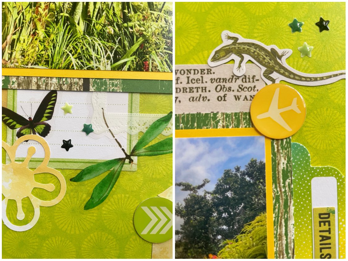
Hi everyone! I’m back for week three of guest designing with Lasting Memories. For this layout, I used two photos taken during a recent trip to Fiji. I had never been there before and the resort we stayed at was a wonderful experience with amazing food, kind and welcoming employees and beautiful views. They specialize in diving excursions so we went out on a boat several days and I snorkeled around some incredible coral reefs.

I used some neon green paper from the Vicki Boutin Kaleidoscope collection. Every time I get a weird paper in a pack where I don’t think I’ll every use it, I’m proved wrong! I didn’t think I would use this paper as a background since it’s so loud, but it ended up working here since my photos contain this color as well! I layered in some paper scraps, the woodgrain paper being left over from a recent page!

I just ordered some supplies from Obujo, and used some brand new butterfly and dragonfly stickers on my page along with some yellow-green paper flowers and a PET frame. I had a big pack of paper punch-out letters and used some dark green ones along with some Loopy Love alpha stickers by Doodlebug to make my title.

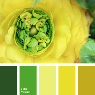
The color palette at Lasting Memories for this week is in these vibrant green and yellow colors. I was also inspired by the botanical elements so I used photos with lots of foliage and included flowers on my layout.

I used the sketch from this month’s Sketch with a Twist challenge. The twist was to use stars and I included lots of little stars from a sheet of enamel dots by Altenew.

This page was also made for the September 3 in a Row challenge. I used the diagonal selection of woodgrain paper, free choice and any shade of yellow.

That’s all for this week. If you’re looking for a new one to compete in, check out the one I host over at A Cherry on Top. This month’s is a mood board. Hope to see you there!

Color Dare Design Team Challenge #618

Home Is With You

Journey, Flamingo And Sage

Hi scrappers! I’m back again with the Color Dare Design Team to bring you a tri-color challenge layout. I made the page using a photo of my husband and I at the Pageant of the Masters in Laguna Beach which is an outdoor venue used for art shows and events.

I used some muted teal cardstock as my base and then used a slightly cut down piece of paper from the Kellerkurtz & Co. stack by The Paper Studio. I cut a three inch strip of green lattice paper by Echo Park Paper and then added some scraps of antique camera paper by P13. I used a few tags and a frame by 49 and Market and added a sticker onto one of the tags from the Modern Farmhouse sticker book. This acted as my title and was the perfect color combo.

I accented the page with some gilded green washi tape and added a few 3D golbe stickers by Recollections that were also the perfect colors for my color palette. Lastly, I added a few botanical rub-on transfers to decorate the tags and circular stickers I had already glued down.

The newest challenge at Lasting Memories provided this color palette. I mixed these with neutral, antique tan and some gold accents. Come join us and share your project inspired by this challenge!

I also used sketch 392 over at A Cherry Top Crafts. I turned the sketch 90 degrees and used a rectangular frame instead of a large circular element. I used only one photo but added square paper scraps above and below my photos in the spirit of the sketch. Instead of skinny, scalloped trim, I used strips of washi tape. This page turned out pretty different from the original but you can sort of see the resemblance if you squint!

That’ll for this week! Thank you for visiting me here and if you’re in the neighborhood on Instagram or YouTube, look me up at TheScrapAttack!

Guest Designer With Lasting Memories Week 2

Adventure Is Calling

Shades Of Blue

Hi scrappers! I’m back with another layout created as a guest designer for Lasting Memories. I used a photo my husband took of me at the beach. A lot of times he will take photos on a weird diagonal. I think it’s weird and would prefer a straight shot but he insists it makes the picture more interesting. What do you guys think?

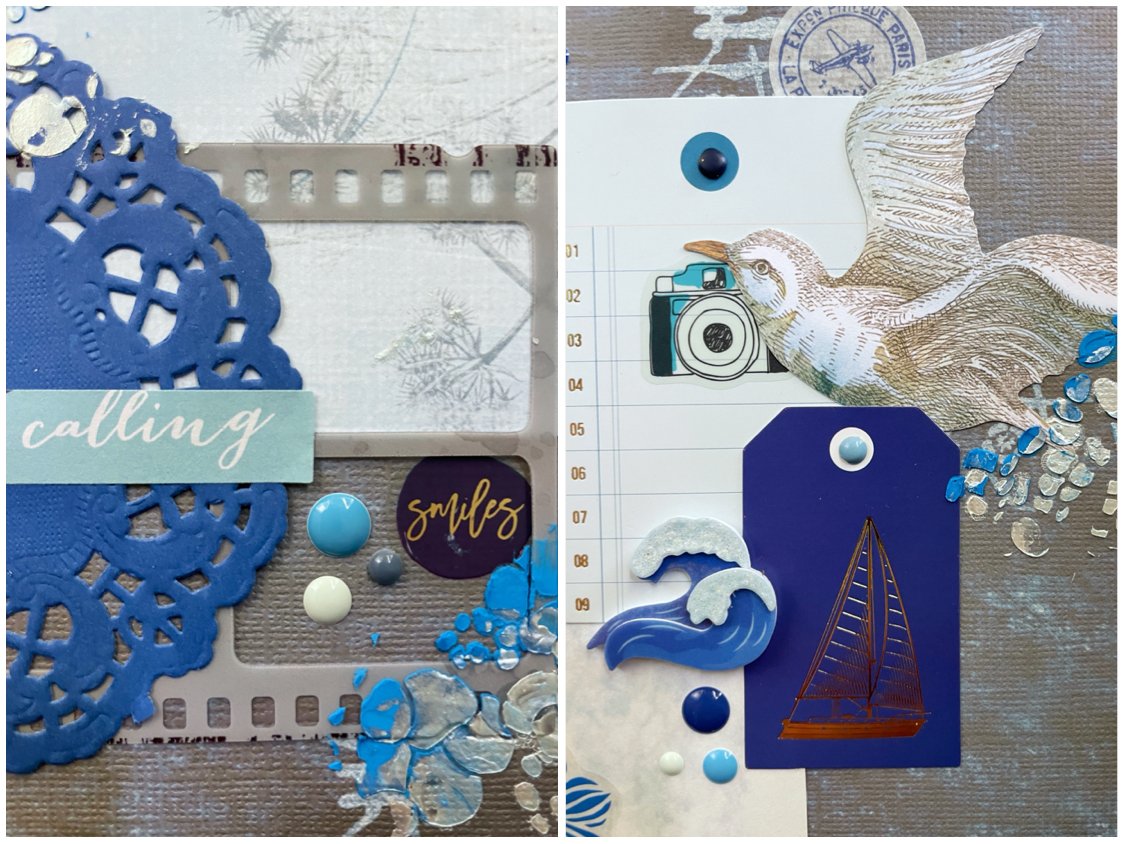
I used a piece of paper from the DCWV Far East stack. I bought this paper stack in the early 2000s since I wanted to scrap a bunch of photos I took while on a trip to Japan. I still have plenty paper from the collection left over so I figured I should try to use it up. I have no idea what the kanji on my background paper means but hopefully it’s relevant to the rest of the layout.

I used a big blue tag from a 7 Gypsies junk journal pack and scattered some Amy Tangerine stickers over it. I cut a strip of 49 and Market paper with a subtle botanical pattern template behind my photo. Some ephemera by Heidi Swapp and K& Company matched the ocean theme and added more blue tones with a few golden accents. I used a 6 X 6 stencil by The Crafter’s Workshop and two different texture pastes to add some mixed media details around the page. I finished with some brads in the tags and a scattering of enamel dots.

Lasting Memories provided this color palette. I used all the shades of blue and was inspired by the ocean theme as well an made sure I chose a photo taken at the beach since I have quite a few.

The sketch used for this page was weekly sketch 391 from A Cherry on Top Crafts. I turned it 90 degrees to better fit my photo. Instead of a tag in an envelope, I layered several tags in various sizes and added additional embellishments, like I always do.

This page was also created for the Grab 5 challenge. The elements I used were the following:

  • Doily

  • Brads

  • Floral Patterned Paper

  • Mixed Media

  • Color Blue

That’s all for this week. More ScrapAttack content can be found on Instagram and YouTube if you are looking for more video content showing how I make my pages.

Scrapbook Challenge

No 75356

Forest Pink And Sage

Hi scrappers! This week I created a pretty page in shades of muted pink and green. I used some photos taken in Lake Tahoe and the greens of the forest and taupe color of my dress matched the color palette I already had in mind.

I used minimal products for this page, but most were from the Peony Garden collection by Minty Papers. I used two sheets of double sided paper and cut them into smaller rectangles. I used some very thin, brown damask paper from the Kellerkurtz & Company stack by The Paper Studio to mat each rectangle to provide greater contrast. I glued everything down on a piece of sage colored cardstock and then embellished with some hexagon stickers by albumlovehandmade and die cuts from the same Peony Garden collection. I had already completed this page when I realized I hadn’t added a title like I always do. The only text on the page was the number on a tag I added so by default, I guess that’s now the page title.

This page was made for the September Mood Board challenge at A Cherry on Top Crafts. The inspiration photos were so pretty and as soon as I saw it I thought of these papers in my collection and knew I wanted to use them. I was also inspired by these additional elements in the mood board:

  • Bird (Added House)

  • Teapot (Added Tea Cup)

  • Pink Flowers and Leaves

I used this sketch from Sketch N Scrap. I liked all the layers it had and knew it would be perfect to showcase the double sided papers I wanted to use.

Lastly, this page was made for this month’s Book Lover’s challenge. The challenge was to create a page about an activity you do in the woods. My husband is a photographer and likes to take landscape photos. Occasionally I will go on trips with him and sometimes bring a pretty dress so I can get some fun photos to scrap like these.

That’s all for this week. Thank you for joining me in my corner of the internet and I will be back soon with another layout!

Guest Designer With Lasting Memories Week 1

This Is The Good Stuff

Pink, Red And Green

Hi scrappers! I’m kicking off September with a page made for Lasting Memories. They were kind enough to invite me to be a guest designer for the whole month so you will see more layouts made for their weekly challenges throughout September!

The photos I chose are very silly, but also contained shades of green that matched the color palette. My kitty Europa loves catnip and I grow some in a to of my patio. Here she is trying to snack on some and looking pretty ridiculous while doing so.

I used some mottled pink cardstock from the Craft Consortium Over the Rainbow paper stack. This cardstock is nice and thick and made a great base for the green paper by The Paper Studio that is extremely thin. I also had a scrap of Happy and Bright paper which is part of a Christmas collection but worked well on this page. I also had a thin scrap of green striped paper which also was from a Christmas paper but you would never know!

I added some floral laser cutouts by 49 and Market as well as some rose ephemera from Memory-Place. Used foam core tape to pop up the photos and most of the flowers (and actually ended up using up the rest of my roll! 😞) A pale pink tag from the Heidi Swapp Set Sail collection provided nice contrast to the butterfly rub-ons and the silly title comes from the Vicki Boutin All the Good Things collection. It seemed appropriate for this page, plus it was the right color!

This month’s series of challenges at Lasting Memories will all be color palettes, which I love! Not only did I use the provided colors, but I also incorporated lots of florals since the inspiration picture was poinsettias.

I used this sketch from Sketch N Scrap. I didn’t get my entry in on time but I figured I would still feature my inspiration sketch here.

That’s all for this week. As always, the first of the month brings lots of new and exciting paper craft challenges. If you’re looking for a new one to compete in, check out the one I host over at A Cherry on Top. This month’s is a mood board. Hope to see you there!

Scrapbook Challenge

Seattle Aquarium

Hexagons and Nintendo Characters

Hi scrappers! This week I made a page featuring a photo taken when my sister and I went to visit the Seattle Aquarium. I was lucky enough that our visit happened to coincide with when they were doing a collaboration with Animal Crossing, a very popular game made by Nintendo. Both my sister and I have enjoyed the many installments in the series going back to the IP’s debut on the Game Cube. The event is touring American museums nationwide and features photo ops with standees of game characters, a scavenger hunt for aquatic creatures in the aquarium and more! To see if it’s coming to a city near you, check out their page! Also, can you see the dance team child in me coming out in this picture? It’s too much.

I used some pale blue cardstock from the American Crafts Spring cardstock stack as my background. I cut a piece of tiny square patterned paper to lay along the bottom and then used some paper scraps to double mat my photo. I used a 2 inch hexagon punch and a whole lot of paper scraps to make lots of identical shapes to place throughout my layout.

The big eye-catching embellishments are of course the pictures of Tom Nook and his nephews Tommy and Timmy. I found these online, and when I sent off my latest batch of photos to be printed, I included them so I would have high quality images on photo paper. I carefully cut them out and attached them with foam core mounting tape so they would stand out a little. They are characters from Animal Crossing in case you didn’t know!

The embellishments were pretty minimal since there were so many patters and colors in the hexagons already. I stuck to mostly word stickers by Heidi Swapp and Hazel & Ruby. I also included clusters of enamel dots by Simple Stories and Altenew.

Video Block
Double-click here to add a video by URL or embed code. Learn more

This page was made as part of a scrap lift challenge on A Cherry on Top Crafts. I chose this cute layout by lilkoala3. I happened to have a hexagon punch the same size as the original and followed the placement of the hexagons fairly closely. I moved the title a little and didn’t have a little photo to include the way the original did, but I emulated the word sticker embellishments and the use of enamel dots like the original had.

This page was also made for the August Video Game challenge and this month’s game was absolutely perfect! I was hoping this game would be chosen sooner or later since I knew I had these photos waiting to be scrapped!

That’s all for now. I’m going to try and cram some last minute entries for the month into my free time so hopefully I’ll be back in a few days with another layout!

Color Dare Design Team Challenge #616

It's The Little Things That Make Life Big

Brown, White and Gray

Hi scrappers. I’m back again as a design team member for Color Dare challenges. I chose to use a picture my photographer husband took of himself. This one was taken while he was in the water where he often photographs waves.

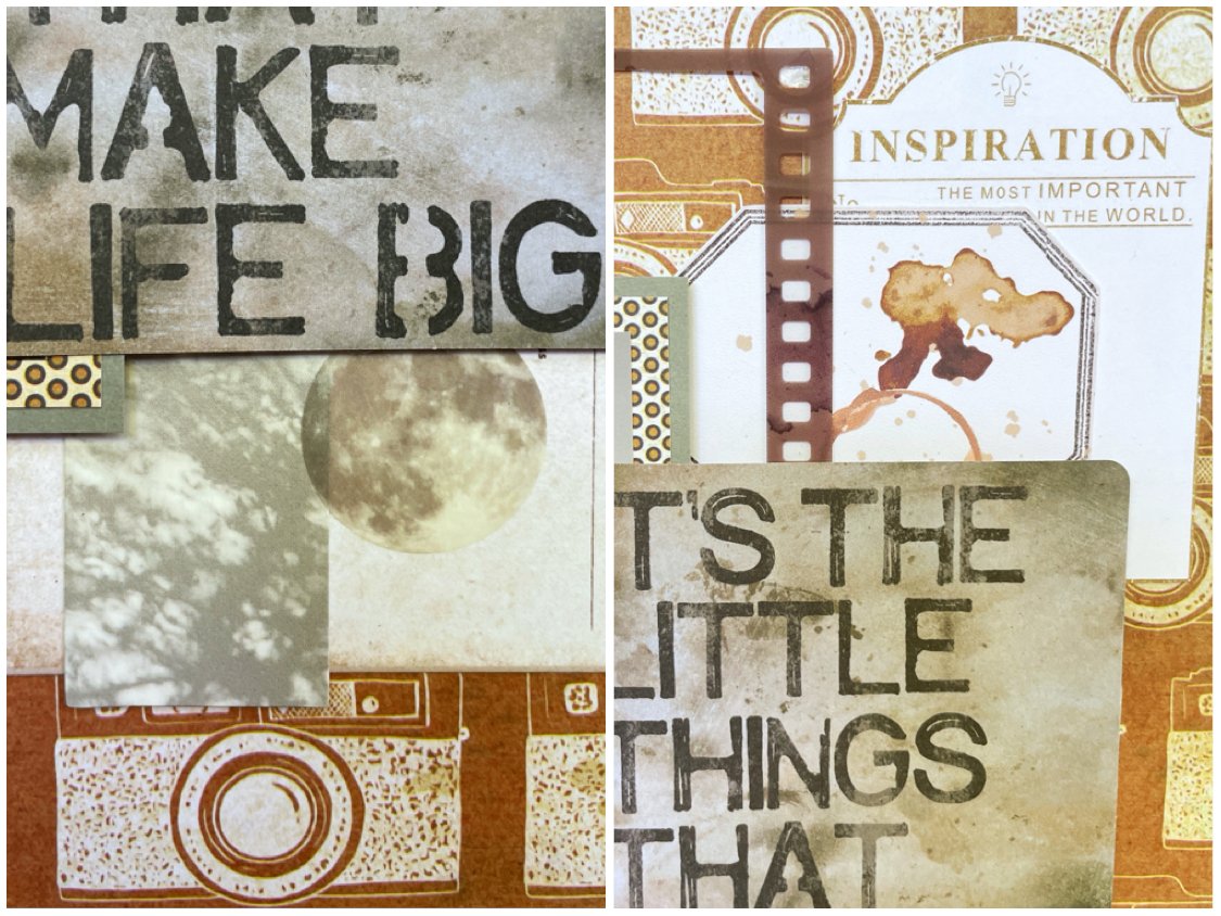
Since my husband is a photographer, I knew I wanted to use this Vicki Boutin Say Cheese paper as my base. I double matted my photo with a scrap of dotted paper and some gray cardstock and used an Idea-Ology pocket card as a big bold title. I then layered in some film strips and ephemera from the Nature Study Collection by 49 and Market. I broke out some pretty, handmade tags I bought from albumlovehandmade on Etsy since the brown tones matched the look I wanted. I also used some little cardboard picture cards by Moking that were all in shades of pale brown and gray

The challenge for Color Dare #616 is to use brown and white plus one other color. I obviously chose gray which is an unusual choice for me, but I felt matched the black and white photo and I also wanted to make a more masculine page. Join us and submit your own creation! I want to see the color you chose!

This page was also made using Cherry on Top sketch 390. I chose one big photo instead of two small ones, but liked where the title was since I already had a big bold title in mind.

That’s all for this week. Thank you so much for stopping by and I hope you’ll come join us at Color Dare too!

Scrapbook Challenge

Hello Beautiful

Florals With A Little Woodgrain

Hi scrappers! This week I created a triple photo layout featuring my cat Europa. She likes to sit on the patio sometimes and when she’s out in natural light, the colors of her eyes really pop. In this series of photos, it looks like she was posing for the camera!

I started with some double-sided Promenade paper from the Bo Bunny Brighton collection. I cut it into three sections and flipped on piece so both patterns would be displayed (a trick I have been doing a lot lately.) I glued it all down to a piece of cardstock and then used a large scrap of coral colored chevron print paper to mount my photos on. I also used a skinny scrap of green woodgrain paper as an accent on the right.

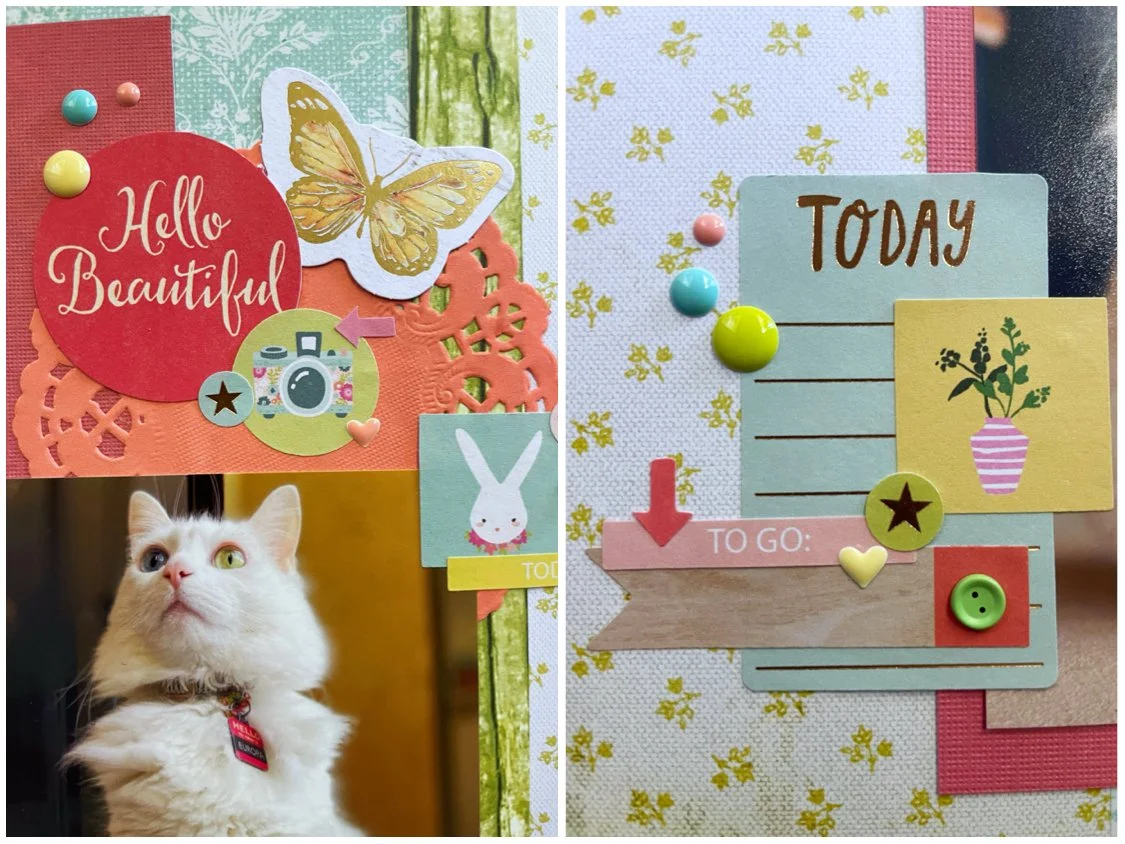
From there, I embellished with lots of stickers from the Dear Lizzy sticker book, some ephemera by Heidi Swapp and Prima Marketing, and used a piece of ephemera from the Hello Gorgeous collection by My Mind’s Eye as my title. Some Altenew enamel dots from the Fruity Colors collection matched the color palette perfectly.

I used sketch 389 from A Cherry on Top’s weekly sketch challenge. I liked the three panels making up the background because I knew that would be a good fit for my double sided paper.

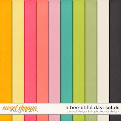
This page was also created for the Counterfeit Kit August challenge. The kit chosen for this month had the color palette above. I really liked the colors and used just about all of them except black. They also had a challenge of making a layout featuring woodgrain and florals. This page is really heavy on the florals but I did incorporate a little woodgrain by using the strip of green patterned paper as well as a small pennant sticker in the lower left corner.

That wraps it up for this week. As always, there’s still so many challenges I want to participate in and not enough days in the month! I will be back soon with a new layout as soon as time permits.

Scrapbook Challenge

Breathtaking

So Much Purple!

Hi scrappers! This week I used a picture from a few years back that was taken in Laguna Beach in California. Since the photo already had lots of purple tones, I extended that to my page and made a monochrome layout in my favorite color.

I started with some pretty swirly paper from the 49 and Market Color Swatch Lavender collection. I used a scrap of purple cardstock from the last page I made and cut a wide strip which I decorated with some flower stickers from the Happy Planner Pressed Florals Sticker Book. I layered some frames and laser cut elements, both by 49 and Market, and then made a heart-shaped shaker using a shaker kit and die cuts sets by Sizzix. I filled it with various glitters, including some that are actually unicorn-shaped! This was one of those products that I knew I had to have when I saw it but had no idea how I was going to use it. Filling a shaker with glittery unicorns is such a fun little detail!

I used a few chipboard shapes from the Stamperia Lavender collection and then finished off with a few enamel dots. I really love how all of the different shades and tones of purple come together with my photo.

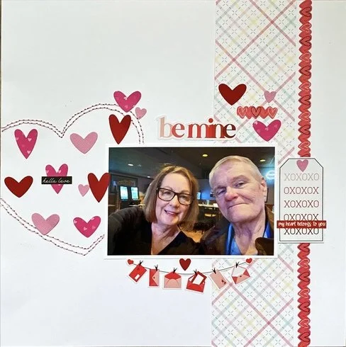
This page was a scrap lift from the layout above from the Cherry on Top Birthday Bash contest. I knew I wanted to make a shaker in place of the big heart detail on the page. I arranged some butterflies to emulate the garland that the original layout had below the photo and instead of a tag on the right, I added a frame filled with embellishments.

This page was also made for the August Picture Yourself contest which challenged participants to make a page in at least 90% of our favorite color. My favorite color is, of course, purple, so I combined lots of shades and patterns to make a very purple page!

That’s all for the week! If you are a fellow paper crafter looking for a new challenge to play along in, check out the Taylor Swift themed one I host here! I will see you all soon!

Color Dare Design Team Challenge #614

Your Vibe Attracts Your Tribe

Rainbows on Black

Hi scrappers, I’m back again with a page made for Color Dare Challenges. I chose to use a picture taken at an old, historic movie theater. The picture was taken at a low angle to show the beautiful light fixture on the ceiling that looked like a giant star. The light created a little rainbow blur in the picture so I decided to run with that theme and make an incredibly colorful page.

I knew immediately I wanted to use the scrap of rainbow print paper that had been in my stash literally since the early 2000s. I can’t even remember the original project I used the first half of the paper on, but was finally able to use up the rest of it! I like how it looks like pastel or colored pencil art. I pasted in on some black cardstock by American Crafts so the colors would really pop and paired it with some lavender paper from the AC Spring stack since it was a color present in the patterned paper scrap.

I used a handful of embellishments by Memory-Place and Vicki Boutin. I especially love the butterfly die cuts from Aall & Create since they are so vibrant. I added in a few stickers from the Color Study Sticker Book by American Crafts and finished off with stenciled clusters of stars. I used 6 different colors of Stencil Butter along with an Aall & Create stencil.

Challenge number 614 at Color Dare is also a collaboration with Double Trouble. The ask was to use at least three colors from the ice cream image at Color Dare paired with the recipe at Double Trouble. I ended up using just about every color possible and completed the recipe with some tweaks. To use only two embellishments on my page would be too minimalist for my taste so instead I used two types of embellishments: die cuts and stickers. The three layers on top of my black cardstock are papers, photo and embellishments and my single image is, of course, my photo.

I used sketch 302 from Sketch N Scrap and rotated it 90 degrees. I used one photo instead of two.

That’s all for now. Thank you for stopping by and I’ll be back soon to bring you the last few scrapbook layouts of the summer!

Scrapbook Challenge

In The Garden

Peachy Florals

Hi everyone! This week I created a page using some photos from several years back. My husband and I went to a commercial flower farm where they open to the public a couple weeks during peak season. They had several props you could take photos with including this old tractor. The pictures came out so pretty!

I used some paper from the DCWV Copper Luxury stack. I feel like I’ve been using this stack a lot lately! Thesis another collection of double-sided papers so I used my usual trick of cutting the paper into threes and glued all panels on some black cardstock. I used black simply because I have a ton in my stash and I don’t use it very often so I might as well use it up somehow.

I cut a washi ticket sticker to use as a border on the right of my accent panel and then used a large scrap from stash that is from the same collection of papers so the colors matched perfectly. I then added in some circles and rings made from handmade paper as well as a tag and some animal die cuts, all by albumlovehandmade.

I actually used a stamp on this layout which is something I never do. I feel like I’m not very good at it because the image didn’t come out super clear. Maybe my ink pad is too old and dried up! I stamped the image of birds on a wire on some white cardstock and used a Marvy Uchida punch to make a tag. I stamped one of the paper circles as well but it didn’t show up very well. Why am I so bad with stamps??

Lastly, I opened up some pink and team floral stickers by The Paper Studio that I have had for years and years and added three of them to the layout as well as some enamel dots by Simple Stories.

This page was made for the August 3 in a Row challenge at A Cherry on Top. I had started out meaning to complete the middle column with Green, Free and Stamping. I realized after the page was done I had accidentally completed most of the board! I was only an animal embellishment and some torn paper away from a full blackout!

I also used sketch 387 from A Cherry on Top’s weekly sketch challenge. Didn’t have a collection of smaller photos so I used two big ones and added a ton of extra embellishments as usual.

That’s all for this week. Thanks for stopping by and if you are looking for another paper crafting challenge to participate in, you can check out the monthly one that I host here. See you all soon!

Scrapbook Challenge

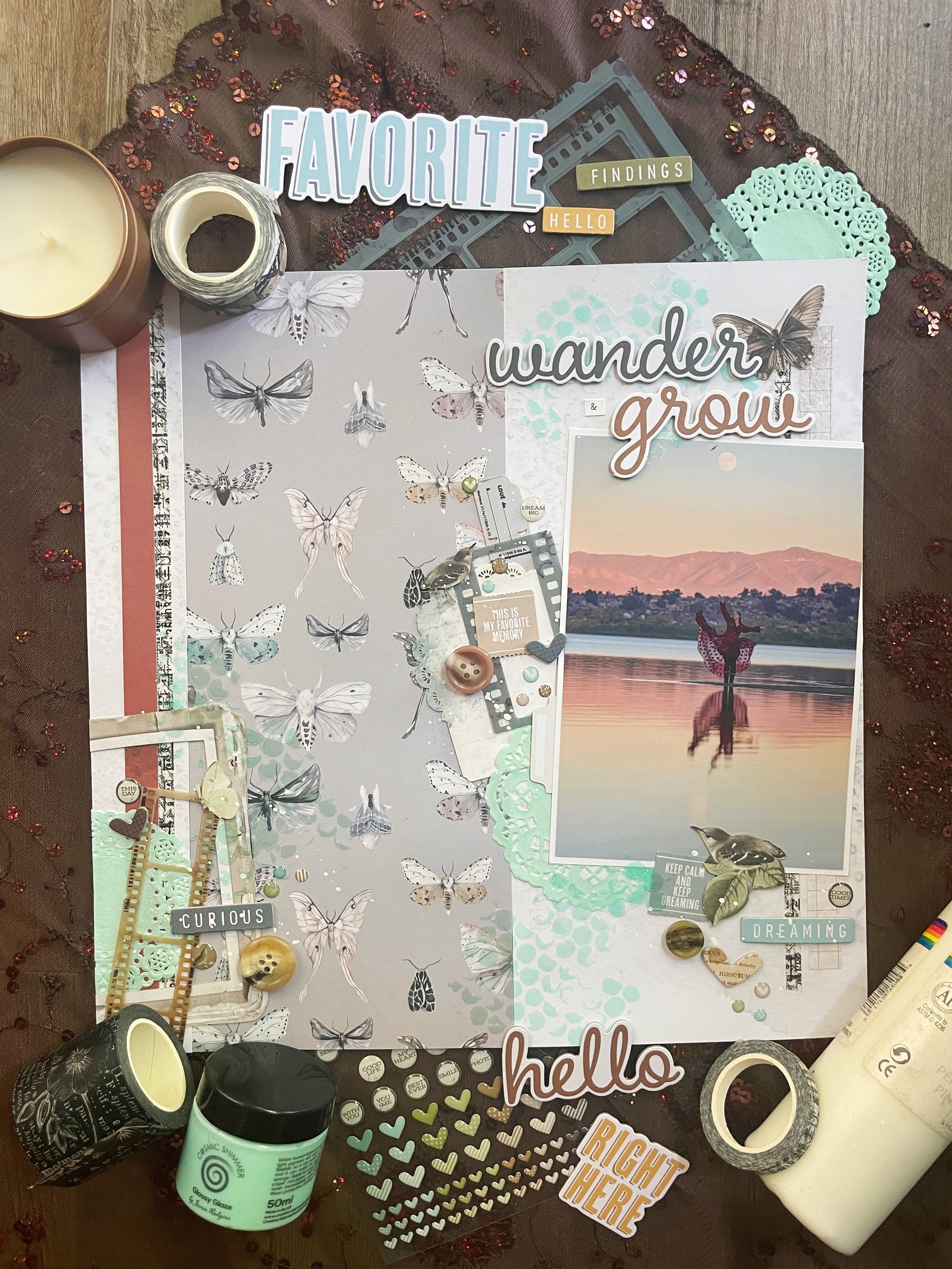
Wander & Grow

Mixed Media And Moths

Hi everyone! This week I scrapped a beautiful photo my husband took of me at a lake during an autumn sunset. The reflection makes this such a cool photo and he even captured a bird flying near the moon.

I based this entire page around the beautiful moth-print paper by Fancy Pants Designs. The paper is double-sided so I cut it into three parts, making the middle part an accent panel and the other two a more subdued background. I added some strips of 49 and Market’s Moonlit Garden Washi tape as well as a narrow strip of rust-colored paper from by collection of scraps. I also used some laser cut elements and wishing bubbles also from the Moonlit Garden collection as well as some film strips and chipboard words from the Nature Study collection that I used to make my title. I added in a couple of teal doilies made by Bo Bunny and then splattered all my clusters with some white acrylic paint. Lastly, I used some mint green glossy glaze with a stencil by The Crafter’s Workshop to add some color and texture.

This page was made as part of a scrap life challenge over at A Cherry on Top. I lifted the above layout I liked the doily accent and kept that inky version. Since I was only using on photo, I turned the spot where her second photo was into a framed cluster.

This page was also made as part of the August Grab 5 challenge. I chose the following 5 from a list of options:

  • White Paint

  • Film Strip

  • 3 Buttons

  • Chipboard

  • Texture Paste

That’s all for this week. Thank you for stopping by and taking a look at my page. More ScrapAttack content on Instagram and YouTube if you are looking for more video content showing how I make my pages.

Color Dare Design Team Challenge #612

Cat Yoga

Sapphire, Lagoon and Sundance

Hi scrappers! I am back again with a post featuring a page I made for Color Dare Challenges. I used some photos of my sister I took when we took a cat yoga class together. I highly recommend doing this if you get the chance. It was so much fun and all of the cats at this location were up for adoption!

I had recently purchased a 12 X 12 paper grab bag from A Cherry on Top. I received lots of soon-to-be-discontinued papers for a fraction of the price. This double-sided Royal paper by Bo Bunny was one of them. I cut the paper into three pieces and mounted it on some basic black cardstock, showing both sides of the paper. I used some goldenrod cardstock to mat my photos and used a new die cut by Lawn Fawn to make a scalloped border above them.

I added some 49 and Market striped washi tape but adhered it to some white paper first to keep the colors vibrant. I had some tiger striped paper scraps which I added behind my title, above my photo and to the top of the page. I like how the animal print fit the theme of the page! I layered some vellum pieces on top of a vellum tag, but used the same white paper trick so the colors would pop. A few pieces of ephemera from the PhotoPlay Cat Lover collection were in the perfect shade of blue and I added a few more cats by using cat-shaped brads by Eyelet Outlet.

I created some circular elements using some Sizzix die cuts and some bright blue paper scraps and added a few puffy stickers both by The Happy Planner and The Paper House. I scattered a few enamel dots around the page as a finishing touch.

This page uses sketch 386 from the weekly sketch challenge at A Cherry on Top. This page design provided the perfect opportunity to showcase both sides of my patterned paper.

August’s first challenge at Color Dare involves a tic-tac-toe challenge! I chose the right column with Sundance, Lagoon and Sapphire. Please join us and share your project created using three colors from this grid. We’d love to see what you create!

Lastly, this was made for the Grab 5 challenge where my project has to include five items from a monthly list of options. I chose the following:

  • Rings

  • Puffy Stickers

  • Baker’s Twine

  • Striped Paper

  • Washi Tape

That’s all for this week! Thank you for visiting and you can find more ScrapAttack content on Instagram and YouTube. I’d love to see you there!

Scrapbook Challenge

Sweet Baby Love

Tans And Browns

Hi scrappers! Thank you for joining me again for another scrapbooking layout! My past dozen or so layouts have been colorful and bright so this week I made something a little more subdued in tones of tan and brown. My cat Jupiter is also various shades of brown so I used some photos of her looking out the window as the subject of this page.

I used some wood print paper from the Dendrology stack by The Paper Studio. I tend to use this stack a lot since woodgrain seems to go with everything! It worked especially well on this brown-toned page. I rounded the corners of a square of white cardstock with a Marvy Uchida punch and then used some scraps of some P13 paper I had. I used the opposite side on a previous page and this time I featured the gray-brown leaf side. I love the little ladybug details! I added some matching ephemera from the same collection as well as some ephemera by Asuka Studio. I used up several tiny paper scraps by making a banner with a pennant punch and added a large cat sticker by Recollections. I cracked open some botanical chipboard by P13 and used up some burlap and paper flowers had in my stash. My title was a mashup of stickers, chipboard tiles and ephemera.

This page was made using sketch 385 at A Cherry on Top Crafts. I really liked the little banner details and the circular element around the title. I used a paper doily instead to keep the round shape and replaced the scalloped detail on the bottom with a piece of brown washi tape.

This page was also made for the July White with 1 challenge. I loved their cozy mood board and was inspired by the following:

  • Bunnies (Bunny Brads)

  • Logs (Border Paper)

  • Words “Sweet” and “Love” (Used in Title)

That’s all for this week! Thank you so much for paying me a visit. I host a Taylor Swift inspired crafting challenge every month and this month is all about black cardstock backgrounds. There’s still a few more days to play if you want to join in!

Color Dare Design Team Challenge #610

I Feel The Happiest Here

Desert Tones And Handmade Embellishments

I used some dusty green cardstock as my background and sponge painted some pink acrylic over it to break up the solid color. I cut a broad strip of Mirabelle Floral paper by The Paper Studio since it had the same green shade as my background. I added in a scrap of green paper with a torn edge and double matted my photo with more paper scraps.

I found a pretty piece of handmade paper by Albumlovehandmade that worked well and then proceeded to layer lots of embellishments! I had two separate packs of Golden Desert ephemera that were perfect for this page and I used one of them for the title. The ephemera even had Joshua trees on it, just like my photo! I also used some Heidi Swapp Carefree ephemera by American Crafts since many pieces had the same peachy pink tones as my floral paper. The white tags, green diet shapes and floral and butterfly stickers are also all by Albumlovehandmade. I really love the products she lovingly handcrafts so you guys should absolutely check out her store!

I added three large decorative brads by Teresa Collins and wanted some other bright pink elements to match the trim on my photo and handmade paper. I used a stencil by Aall & Create and some stencil butter by The Crafter’s Workshop and created some botanical elements. I had to be really careful with my texture paste placement since I wanted one “branch” in each section and the pattern with other branches was all pretty close together.

I am proudly part of the design team over at Color Dare Challenges and this page was made for challenge 610. I used all colors but Lagoon in my project. I hope you’ll join us and share your own creations using this color palette!

I used sketch 384 from the Cherry on Top weekly sketch challenge. I only used one photo and added ephemera Rostand in for the two smaller ones.

Thank you for stopping by. I am busily working on my next project and will be back soon to share it with all of you!

Scrapbook Challenge

Love This

Big Decorative Tag

Hi scrappers! This week I chose to scrap this photo of my kitty Jupiter. Her eyes look so big and bright in this photo! She was sitting on my husband’s office chair looking very cute so I napped a picture with my phone.

I started with some purple paper from the Over the Rainbow stack by Craft Consortium as my background. I cut down a piece of pretty teal vintage camera paper by P13. The pattern on this paper is so cool but then I ended up covering most of it. Oh well. I added in a giant tag from the Vicki Boutin Sweet Rush collection and added some vibrant flower die cuts by Aall & Create. The title comes from a sticker out of the Amy Tangerine sticker book and I added a wreath around it as well as some other punch out elements from the 49 and Market Plum Grove collection. I made two little banners using a Fishers squeeze punch and added in some enamel dots by Simple Stories and Altenew.

I used the sketch from this month’s Sketch with a Twist challenge over at A Cherry on Top Crafts. The twist was to create a banner like the one in the sketch. I made two using some baker’s twine and some small brads.

This page was also made for this month’s Video Game challenge. This was the color palette provided, inspired by the cover of this Spyro game! Purple and teal are some of my favorites, but I never would have thought to pair them with orange and yellow. I really like how the finished page turned out.

That’s all for this week! Thank you for stopping by andI will see you all soon!