Scrapbook Challenge

Sister

Pretty And Macabre

IMG_3805.jpg

Hey everyone! Halloween is a long way off, but this week I bring you a slightly spooky page featuring my younger sister. My sister is an amazing artist and has always been inspired and fascinated by dinosaurs, monsters, and all things macabre. This page is a representation of how I see her: beautiful, unique, and wonderfully quirky,

Untitled.png

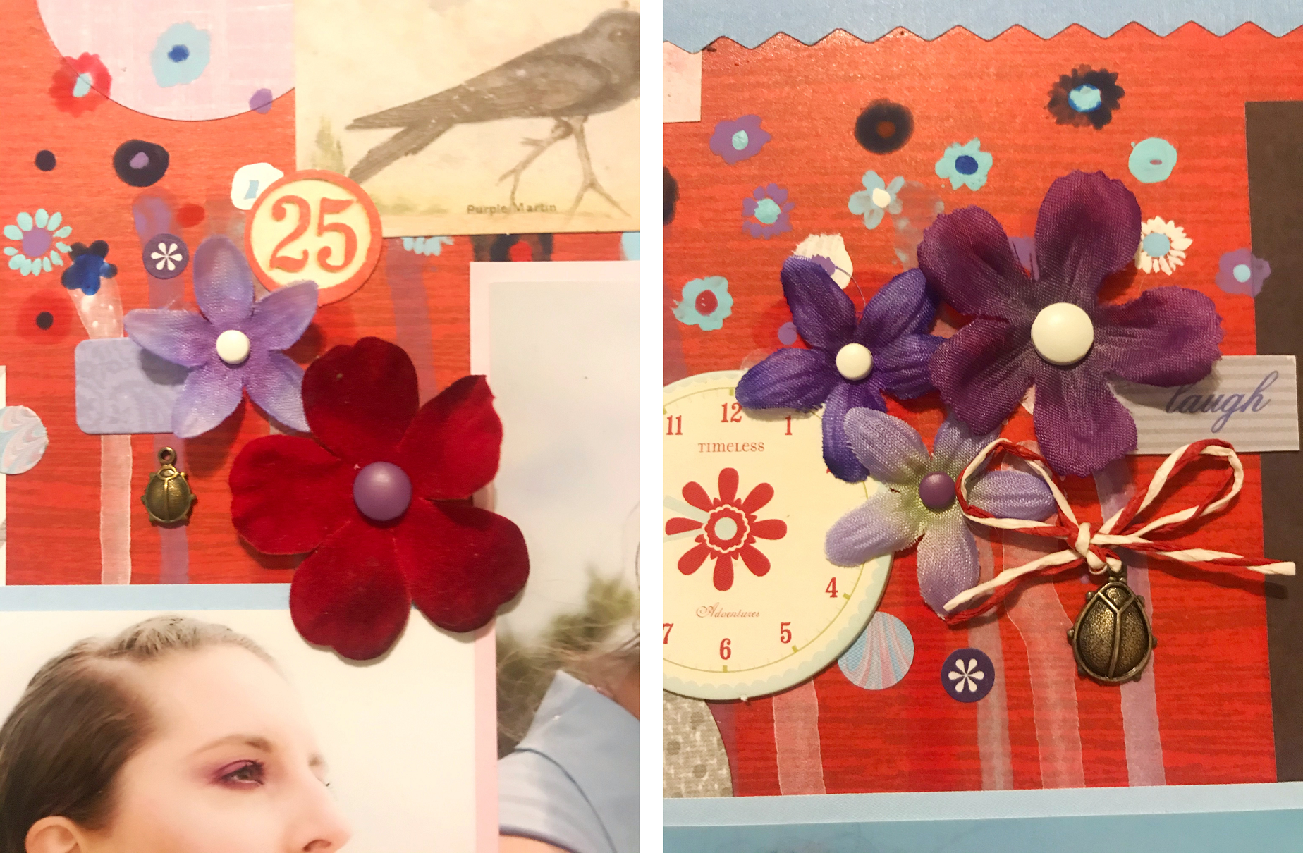
I started with a piece of subtly printed skeleton paper from the DCWV Dark Romance stack. I used it as my background and layered over paper scraps of old typography and antique keys to give the page an old fashioned feel. It reminds me of the Victorian era since people of that time were fascinated by the occult and the strange. In fact, check out this link for other weird things the Victorians were into!

March Challenge 2020.jpg

This page was created for the March challenge at Scrap The Girls. Isn’t their mood board amazing? I love the juxtaposition of life and death in the same photo. I took inspiration both from some of the colors and incorporating flowers and feathers with the skeletons.

This page was also created for the February challenge at Studio Challenges. The goal was to use an element on the page that started with each of the letters of the word “Heart.” My choices are as follows:

Capture.PNG

The color palette above that I used for my page comes from a really cool website called Color Space. You can select any color and the site will create multiple color pallets featuring that color. The best part is it’s all free! I recommend you check it out!

That’s all for now. Thanks for stopping by!

Scrapbook Challenge

Remember Spring

Dripping Paint And Hand-Painted Florals

IMG_3774.jpg

Hi everyone! I bring you another layout during the month of February. I’m on a roll! I can’t remember the last time I was able to make a page a week for a whle month! This page features photos my husband took of me back in 2014 during a massive super bloom. I had just bought this amazing lipstick by Kat Von D that I’m wearing in these photos. My husband is not a fan of the purple lipstick but I really like it!

Untitled.png

I’ve been continuing a trend of choosing one paper I use on each page at random. It forces me to use up paper in bulk stacks I wouldn’t normally use and to really get creative to intigrate the paper with other objects in my stash. In this case, the random paper was the red woodgrain print from Paper Studio’s Entirely Textures stack. I paired the red with purple, blue and gray that really contrasts and highlights the yellow flowers in my photos. I was able to incorporate and finally use up some ancient items in my stash like the ladybug charms and the chipboard clockface piece. I also used some bird details from Tim Holtz Emphemera pack and some stickers from a MAMBI Happy Planner sticker book.

Emma Uber Lady in a blue hat.jpeg

This page was created for ARTastic’s February Challenge and featured this image by Emma Uber as inspiraton. The challenge required both paint and flowers to be used on the page. I really liked all the intricate hand-painted flowers in Emma’s painting so I created similar ones of my own. I also liked the paint drips so I replicated the effect on my page as well. I threw in a few more silk flowers for good measure.

7_21_SweetTones_vanesaconunaese_Vanesa1-1024x934.png

I used Design Seeds to find a color pallet for my page and settled on this one. Blue, purple and pale gray are unexpected colors to go with my photos, but I like the end result. That picture is making me crave sme sort oof raspberry ice cream dessert!

That’s it for this installment. Thanks for visiting my page!

Scrapbook Challenge

Jelly Bean Toes

Antique Browns And Pale Pinks

IMG_3759.jpg

Hi everyone! This week’s page make me feel cozy and warm just looking at it. Is there anything better than snuggling up the family pet? I love the warm, brown tones that match my kitty’s fur contrasted with the light pink of her little toe beans. There’s lots of texture going on with this page; everything from the fur in the photo to the rough burlap to the steel and wood of my embellishments. This page has it all!

Untitled.png

I started with some antique button patterned paper from the Recollections Regent Street stack. This is one of those patterns that can only work on a very specific page. I feel like it found the perfect home with this layout!. I had scraps of brown plaid paper from the same Regent Street stack that framed the page nicely along with some bits of lace. I made the title from small gray stickers by Hazel & Ruby and Thickers patterned chipboard stickers.

82264153_501593510481100_317271171185770496_n.jpg

This page was created for the Let’s Get Sketchy February Challenge. I decided to use one big photo instead of two smaller ones and moved my title up higher since it ended up being so big. I substituted the triangle details for a chipboard pennant and burlap square which I covered in brown and pink embellishments.

Other Products Used:

That’s all for this time. Thanks for visiting and keep scrapping everyone!

Scrapbook Challenge

Hello Blue Skies

Brilliant Blues And Sparkles

IMG_3733.jpg

Hi scrappers! This week’s layout is very blue and very sparkly. The photos featured were taken during last year’s superbloom. It’s not often you find a field of flowers next to the beach. It was gorgeous!

Untitled.png

I had the super sparkly blue paper in my stash and basically based the whole layout around it. Those little sparkles are now all over my house and I’m sure I’ll be finding them on the floor for weeks! I used some paper flowers by Recollections along with some jewel studded flowers by Paper Studio. I found some blue buttons and brads that matched perfectly and used some Amy Tangerine glitter foam stickers for the title.

Azure-Blue.jpg

This page was created for the White…with 1 February challenge. I actually didn’t have a lot of items in my stash that were this color so I went out and bought some stuff…which I ended up using very little of. Does that happen to anybody else?? I just can’t help going overboard in Michael’s. I did end up using the sheer satin ribbon and the washi tape. I love how this color matched the sky in my photos but contrasted so nicely with the yellow.

Feb 20.jpg

The challenge also had a corresponding sketch which I turned 90 degrees to better fit my vertical photos. The sketch had a lot of circles but Ii used flowers instead.

That’s all for this very blue entry. Thanks for stopping by!

Scrapbook Challenge

Cherish

Valentine’s XOXOs

IMG_3708.jpg

Hi everyone! Valentine’s Day is around the corner so I bring you an over-the-top pink, red and heart-studded page. I don’t think I’ve ever created a Valentine’s Day themed page before but had accumulated lots of appropriately themed materials in my stash. I had way too much for one page!

Untitled.png

I started with a piece of glittery embossed cupid paper from DCWV’s Be Mine stack. I doubled matted it with red and white paper and used a piece of pink vellum to add color without covering up too much of the cupid detail. Stripes of ribbon and washi tape are visible behind the vellum and various pink and red stickers embellish further. I recently purchased a bunch of sticker books by Me & My Big Ideas and American Crafts (more great Tuesday Morning finds!) and used some on this page. The title “Cherish” is a rub on from SEI that I’ve probably had in my stash for over 10 years and I finally found a place to use it!

84617158_2919597204771598_6880691793222959104_o.jpg

This page was made for the 123 Challenge blog February challenge. It was the perfect opportunity to make a Valentine’s themed layout.

Other Products Used:

That’s all for this time. Thanks for visiting and happy Valentine’s Day!

Scrapbook Challenge

Adore Adventure

Epic Embellishments

IMG_3689.jpg

Hi everyone! This week I bring you a page that features a photo of a very special memory. Last year I went out to Death Valley with my husband for the first time. It had just rained so the salt flats were full of water that reflected the light of the sunset. The crystallized salt looked like ice and made this photo we took together magic!

Untitled.png

I used a page from the Recollections Pretty as a Peacock stack for my background. I splattered acrylic paint and used the same paint to edge numerous paper scraps . I arranged numerous embellishments around my photo including tags, doilies and stickers, all in shades of purple, blue and pale green.

sos jan 2020 wmyc.jpg

This page was done for the January challenge at Scrap Our Stash. Bingo challenges are some of my favorite to participate in. I chose the squares “Washi Tape,” “Mist/Ink Sprays,” “Doily” and “Bling.”

10_15_FreshHues_anndavis.png

This page’s color palette was inspired by this photo at Design Seeds. I absolutely love this site. It’s a great way to jump start my creativity. Whether you’re putting together an outfit, decor for a room or a scrapbook page, this website holds lots of great color ideas!

IMG_3693.jpg

Other Products Used:

That’s all for now. Thanks for visiting!

Scrapbook Challenge

Hello Hawaii

Tri-Color Tropics

IMG_3673.jpg

Hi scrappers! This week’s layout has me feeling warm and sunny just by looking at it. The page feature’s photos from a trip to Oahu last September. These photos were taken at a fabulous beach on the North Shore near where we stayed. It was so nice to get into warm water. The oceans of California beaches here at home are usually freezing year round!

Untitled.png

I started with a piece of sunny yellow paper from Paper Studio’s Entirely Textures stack. I like how subtle the pattern is so it doesn’t detract from the rest of the page. The blue wood grain paper is from the same Paper Studio stack. I used polka dot washi tape and wave stickers as well as paper scraps which I cut into two pennant tags. I found the perfect blue and yellow pineapple in La Petites Watercolor Fun Dimensional Stickers.

123 Challenge January 2020.jpg

This page was created for 123 Challenge Blog’s January challenge. This time around, we had the option to choose one of the three colors. I chose bright marigold because it matched my swimsuit and really brought a summer vibe to the page. Summer Time was also the 2 word prompt for this challenge, and my layout definitely feels like summer time!

Thanks for stopping by by blog and happy scrapping!

Scrapbook Challenge

Color Story

Olive Green With Pops Of Pink

IMG_3596.jpg

Greetings everyone! Christmas has come and gone and as New Years approaches, I bring you a fun green and pink layout to ring in 2020. This page features some photos taken at Flutter Experience in Los Angeles. Flutter Experience is a pop-up art exhibit to promote mental wellness in youth in an era where the bombardment of social media can lead to depression. I went with a friend and really enjoyed the interactive exhibits and imaginative rooms. This particular room created by Jillian Mayer and was covered in colorful glaze-like paint. A bench, a chair and even a vase of flowers were all painted in this colorful style.

Untitled.png

I started with a piece of olive green paper from One Canoe Two’s Saturday Afternoon stack. I liked all the little brush strokes in it and the color matched shades of green in my photos. I raided my stash of leftover paper scraps. (I seriously recommend saving all your scraps. You can make so many pages out of one sheet of paper and it gives you so many options once you’ve built up your stash!) I especially like the light green embossed card stock I used and how the pattern mirrors the polka dots on the pink piece of card stock. I used a variety of stickers from Maggie Holmes’ Sticker Book by American Crafts. The olive green paper flowers were the last two left in an ancient pack from The Paper Studio. I love it when things work out!

72246447_2665427583575020_6859389090442248192_n-1.jpg

This page was done for the December Scrap Our Stash Challenge. I had the option of picking the left or the right side of the provided layout. As you can see, I replicated the right side down to the oversized brads and title placement.

12_11_SeasonalCreation_carrie_paperroseco-1024x935.png

I used the above post from Design Seeds for color palette inspiration. I love this site and highly recommend it for finding color palettes for everything from scrapbook layouts to home decor.

That’s all for now. Happy New Year and here’s to a wonderful 2020!

Guest Designer Layout

Sweet Kitty

Succulents And Shades Of Green

IMG_4201.jpg

Hi scrappers! This week I bring you a fresh and feline-inspired layout. The photo I used features my kitty Jupiter who was not nearly as interested in posing the photo as I was. She looks more like she’s plotting her escape!

Untitled.png

The show-stopper element on this page is of course the succulent print paper from DCWV’s Copper Luxury stack. It’s one of those papers I couldn’t wait to use but had to find the perfect page for. I used a page from Paper Studio’s Tattered and Worn stack as a mat for both my photo and the succulent paper. It was perfect since it had some of the same green tones as my featured patterned paper, but was still dark enough to provide contrast. The title was assembled from stickers from American Crafts Maggie Holmes sticker book and Paper Studios Cat Phrases.

Christmas Green 1.jpg

I’m thrilled to announce I’m a guest designer this month for White…With 1. This page was created for their December challenge and the color this month is Christmas green. I found a piece of card stock that was the same color and used it as a photo mat and some tags. In my photos, the paper looks much bluer than in person.

December.jpg

White…With 1 also had a sketch for the month. Instead of tree embellishments I cut more succulents from the same sheet of paper and layered them. Kitty stickers and some puffy succulent stickers tie the page together.

That’s all for this time everyone. Thanks for visiting!

Scrapbook Challenge

Do You Want To Build A Snowman?

Bright Winter Florals

IMG_3556.jpg

Greetings everyone! Today is the winter solstice here in the USA. I bring you a snowy, wintery page featuring a photo fro a trip to Julian, California. It’s pretty rare that I make the trek to see snow so it was really fun to take a day trip to the mountains. Disclaimer: I didn’t actually build the snowman. We found it just off the road and it was too cute not to take a picture with.

Untitled.png

I started with a piece of blue and teal paper from the Paper Studio Affinity stack. A solid blue piece of paper makes a great backdrop for the more vibrant reds and yellows. Matching flowers with snowflake brads are both an unexpected element and an addition to the winter theme. I made pennant flags with scrap paper and used silver alphabet stickers to spell out “snowman.”

IMG_3564(1).jpg

This page was created for the Pinkfresh Studio December challenge. The theme was “All Things Holiday” but the color palette provide was super bold and bright. The photo I chose was very winter and holiday oriented, but the pink jacket I was wearing matched the provided palette well. I love the unexpected mix of yellow and pink in with traditional holiday colors.

That’s al for this time scrappers. Thanks for visiting and happy holidays!

Scrapbook Challenge

Happy Napper

Colors, Lines And Shapes

IMG_3462.jpg

Hi scrappers! This week I bring you a funky, fun layout with lots of geometric shapes and bright colors. The photos featured are of my kitty Jupiter who loves to sunbathe on our patio. I snapped some photos of her enjoying a nap and I love her sleepy little face!

Untitled.png

I started with lime green plaid paper from Echo Park’s Everyday Eclectic stack. This paper is double sided, and while I knew I wanted to prominently feature the green paper, I didn’t want to waste the colorful hexagon print on the other side. I cut a strip of paper and flipped it to make a perfectly color coordinated accent and mounted both sides to basic white paper. I used fun embellishments like washi tape by Crate Paper and enamel dots by My Mind’s Eye as well as some die cut tags .

69675106_2387324164685878_4066732562091868160_o.jpg

This page was done by Scrap Our Stash’s November challenge. I chose the right side of the layout kept it similar down to the tags and ribbons. Scalloped embellishments were required so I used some paper doilies with scalloped edges and a circular tag from My Mind’s Eye’s Hello Gorgeous Mixed Bag. I found some fun brads by Jeteho to fasten down all the tags.

This page was also done for Lasting Memories November challenge where the name of the game is plaid! While the plaid paper I used is more subtle, there’s definitely lots of it in this layout but it doesn’t compete with with other patterns on the page.

That’s all for this installment. Thanks for stopping by!

Scrapbook Challenge

Art Is Life

Kraft And Berry

IMG_3279.jpg

Hi everyone. Welcome back to my page! This time I bring you a layout with a twist on fall tones. Shades of taupe, kraft and berry make for a pretty combo that I don’t think I’ve used before. After making this page, I’m totally inspired to do a makeup look with a brown/taupe smokey eye and mauve lip! Is anyone else excited to finally wear all their fall sweaters and cozy boots?

The photos on this page were taken in downtown Honolulu this past September when my husband and I took a vacation to visit his family. There are a couple of blocks in the city where there murals on almost every wall by different artists. This one is painted by one of my favorite artists, Audrey Kawasaki and when I saw her work, I knew we had to pull over and get a photo!

I started with a piece of embossed kraft paper from DCWV. The dark background is from the Paper Studio’s Kellerkurtz & Company stack which has a nice variety of vintage inspire papers, but the paper is very thin and must be mounted on thicker ca…

I started with a piece of embossed kraft paper from DCWV. The dark background is from the Paper Studio’s Kellerkurtz & Company stack which has a nice variety of vintage inspire papers, but the paper is very thin and must be mounted on thicker card stock. I mounted my photos on patterned lavender card stock by Momenta and used kraft tags and a mini bag to embellish.

Aug.jpg

This layout was done for Let’s Get Sketchy’s November challenge. I liked the stylistic element of stripes in the corners and cut strips of kraft paper in various thicknesses to duplicate it.

November 2019 challenge.jpg

This page was also done for the Kraft+ November Challenge. My background paper features an understated floral and I used kraft accents as opposed to papers to make the color stand out.

Other Products Used:

  • Spare Parts Printed wood Buttons

  • Jim Holtz Idea-Ology Adornments

  • 7 Gypsies Vintage Market tags

  • BoBunny Brads

That’s all for now. Thanks for visiting!

Scrapbook Challenge

Growing More Everyday

Citrus Colors and Spring Flowers

IMG_3215.jpg

Hi scrappers! This week’s layout features some photos from the California super bloom back in 2014. All the hills overlooking the ocean were covered in yellow flowers. It made for a really fantastic view! Is anybody else super behind in scrapping their huge backlog of photos??

Untitled.png

The white graph paper, yellow floral paper and yellow ombre paper all came from the Wildflower paper stack by American Crafts.I had a scrap of striped paper from the MME sunshine stack and I turned it into the perfect decorative tag. A wooden button, bits of ribbon and Bo Bunny Citrus brads were used to embellish.

Citrus Combo 1.jpg

This page was done for White…With 1’s October Challenge. The color this month is a citrus orange-yellow. The color ties in great with the flowers in my photos but doesn’t mirror it exactly.

Oct.jpg

White…With 1 also provided a sketch for the challenge. I used two photos instead of 3 and kept the flower motif that was in the sketch.

Other products used:

  • Vicki Boutin Diecut Frames

  • My Mind’s Eye Enamel Dots

  • Carpe Diem Bits and Pieces

  • Spare Parts Rainbow Gem Paper Flowers

  • Studio K Label Word Strip Stickers

  • Doodlebug Card Stock Stickers

Scrapbook Challenge

Yosemite

Fall Embellishments And Earth Tones

IMG_3203.jpg

Hi scrappers! Fall is here and this time I bring you a layout that’s got me craving flannel and boots and pumpkin spice. These photos were taken in September a couple of years back at Yosemite National Park. The papers and embellishments I used were influenced both by forests and fall.

Untitled.png

I started with a piece of brown-gray damask print paper, but since it was so thin, I mounted it on sturdier tan card stock. I mounted my photos on peachy card stock from Paper Studio’s Affinity stack. Purple-gray alphabet print paper from DCWV’s Old World Stack ties in great with the color palette and contrasts nicely with my photos.

50583715_1874160656025690_8496859764477657088_o.jpg
50210467_1874158026025953_1076970574254702592_o.jpg

This layout was done for Let’s Get Sketchy’s October Challenge. Isn’t their mood board gorgeous? I really love the color palette in the upper left corner and used that as inspiration for my page. Fall leaves, foxes and quotes were also derived from the mood board.

I slightly altered the layout and used 2 photos instead of 3 and shifted the title up. I also added some embellishments in the upper left corner to help fill the negative space.

This page was also created for Lasting Memories October Challenge. The word challenge this time was to add elements to the page that start with the letters in “CRISP.”

C - Chip Board

  • American Crafts chip board alphabet stickers

R - Round embellishments

I - Indigo

  • Indigo tones in the photos, fall leaves and wooden mountain button

S - Stickers

  • Recollections dimensional fox stickers

  • Paper Studio Eclectic Phrases stickers

  • Simple Stories Urban Traveler stickers

  • Mambi travel sticker book

P - Punch

  • Recollections leaf lever punch

Happy Fall to all and thanks for stopping by!

Scrapbook Challenge

Rock On

Animal Print And Torn Edges

IMG_3181.jpg

Hi everyone! This week’s layout features a photo of my husband playing guitar at a show in Hawaii last year. His old band National Product got together for a reunion when one of the members got married. It was the first time I had heard them play together and he rocked it!

Untitled.png

I created a mix of textures by using red wood grain paper and scraps of zebra print card stock. I also used paper from the Prima Marketing Rock Out Bro stack which ties in to the zebra theme. Torn edges and tags give the page some personality.

This layout was created by Lasting Memories October Challenge. The key was to include torn edges on the layout. I made sure to layer lots of paper and tore various edges. It worked well with the rock and roll theme!

Scrapbook Challenge

Life Is Good

Red Dress, Red Details

IMG_3110.jpg

Greetings scrappers. This week I bring you another layout featuring some photos from last year’s trip to Iceland. We were driving from the airport to where we were staying near the famous Skogafass waterfall. On the way, we drove through miles and miles of rocky, mossy countryside. The landscape was so unique looking that we pulled over and took these amazing shots. I had brought some dresses along for photo ops like this!

Untitled.png

The base for this page is a piece of embossed kraft card stock from DCWV’s Premium stack. From there, I raided my stash for scraps of paper that were either black, white, red or kraft colored and glued assorted pieces to make a patchwork background. The photos were matted on red and black card stock and a piece of black and white geometric paper from Heidi Swapp’s Wanderlust stack. I rotated the paper so the pattern is vertical on one photo and horizontal on the other. Various embellishments in red, white, black and kraft complete the page.

September 2019 challenge.jpg

This page was created for the Kraft + September challenge. Their inspiration board is so awesome! I don’t think I ever would have come up with this color scheme or layout on my own but I love the results with this page!

Other products used:

  • Stickabilities Chevron Heart Stickers

  • Momenta Mixed Media Stickers

  • Stickabilities Eclectic Icons Stickers

  • Prima Marketing handmade butterflies

  • Vicki Boutin All The Good Things Diecuts

  • 7 Gypsies Junk Journal Goodies

Scrapbook Challenge

Happiness Found

Fruity, Glittery, Pink

IMG_2914.jpg

Hi everyone. Welcome back to my blog! This time I bring you a very pink layout that features a selfie I took on a day I liked my makeup. Does anybody else do that? I also like the shirt I as wearing that day. It has little cats.

Untitled.png

I did something different this time where I chose my background paper at random and tailored the rest of the page to fit around it. I ended up with a pink striped paper from the Everyday Tango stack by My Mind’s Eye. It was a fun challenge because we all buy those paper packs and end up with the weird print that we never end up using. I will definitely be using this method again! From there I raided my stash for paper scraps and embellishments that matched the color scheme.

September 2019.jpg

This page was created for Scrap The Girls September layout challenge. I flipped the sketch for my vertical photo used both acrylic paint and Mod Podge mixed with glitter to replicate the splotches in the sketch.

IMG_2917.jpg

This layout was also created for Lasting Memories September challenge where the prompt was “fruit.” I specifically chose I patterned paper featuring green apples from my collection of paper scraps. I’ve probably had these scraps for over 10 years and can’t even remember the original project I used the paper for. It’s amazing what I find in my scrap stash! However, this paper fits perfectly since the shade of green is a great math to the details in my background paper and definitely represents “fruit” on the layout.

Other products used:

Scrapbook Challenge

Count The Happies

Wood Grain And Summer Garden

IMG_2886.jpg

Welcome back to my corner of the internet. It has been oppressively hot in Southern California lately, even at the beach, but this layout brings fresh florals and the garden party feel of Spring. These photos were taken in a brewery of all places but with its bespoke wooden walls, live plants and plenty of sunlight, it felt a little like being in a garden.

Untitled.png

I started with a perfect leafy patterned paper from The Paper Studio’s Affinity stack. Lace, ribbons and various stickers were used to embellish the page. A selection from The Paper Studio’s Eclectic Icons Stickers made for a simple title.

aug.jpg

This layout was creative for Creative Embellishments August challenge. They provided a gorgeous mood board and required that flowers be added to the layout. I really loved the magenta colored door and used a similar color for a photo mat. I was inspired by the photo with the lemons so I incorporated that element by using two Recollections lever punches in different leaf sizes. I then added puffy lemon stickers by Amy Tangerine to make my very own lemon grove. I added all kinds of floral embellishments as well including circular stickers with real pressed flowers.

That’s all for now friends. Thank for visiting The Scrap Attack!

Scrapbook Challenge

Sisters Enjoy The Moments That Make You Smile

Teal, Stripes And Summer Vibes

IMG_2827.jpg

Summer is at its peak in sunny Southern California. I can’t tell you how much I wish I could get wifi at the pool so I can bog and get some sun.

This page definitely has summery vibes and I’m loving it! These photos are from when my little sister came to visit me and we took advantage of the nice weather by going to an outdoor mall. We took some selfies in front of a beach-themed backdrop, laughing (grimacing) when the sun got in our eyes.

Untitled.png

The first piece of paper I pulled for this layout was the striped patterned paper I found in my scrap paper stash. I love how it matched the background of my photos and it really dictated the color palette for the page. I had some textured card stock in my collection that was the perfect shade of teal. More papers in shades ranging from bright orange to highlighter-yellow were pulled from my scrap paper pile and used as photo mats, accents or turned into tiny dots with my McGill paper punch.

August Sketch.jpg

This layout comes from Let’s Get Sketchy’s August sketch. I turned the sketch 90 degrees since my photos are vertical.

August Mood Board.jpg

Let’s Get Sketchy also had a coinciding mood board for the month which epitomizes summer vibes. I was especially inspired by the first image of colorful dots which sparked the idea for all the circles on my page. I was inspired to include additional elements as well like fruit and beachy memorabilia.

Other products used:

That’s all for now. Keep cool scrappers and thanks for dropping by!

Scrapbook Challenge

Magic Moments

Fantastic Dragons And Holographic Paper

IMG_2689.jpg

Hi scrappers! I’m thrilled to bring you this unique page featuring some fun photos of my mom and me. These photos were taken at Green Thumb Nursery where they had this fantastic dragon statue for sale. Of course we had to take advantage of the photo op!

Untitled.png

I had the most amazing “Mermaid Scales” paper in my stash for a long time but never had a chance to use it. For this page, it makes the perfect dragon scale backdrop with wonderfully vibrant colors and holographic accents. I even had tiny, glittery dragon stickers by Jolee’s Boutique that matched the theme perfectly. Gold Wordfetti stickers by American Crafts and Sticko watercolor stickers add to the glitz and glam!

July 2019 Challenge.jpg

This page was created for the Kraft Plus July Challenge. This month’s theme is Bollywood! I drew inspiration from the mood board’s beautiful color palette. I added a large piece of embossed kraft paper and matted it with deep red card stock. I also added plenty of beads and hand sewed them as embellishments in the center of all my flowers. I love how this page turned out and how the color palette really compliments the dragon in the photos.

That’s all for this time. Thanks for visiting my page!