Scrapbook Challenge

We Are Family

Citrus Brights And Polka Dots

IMG_4789.jpg

Hello everyone and welcome back. It’s good to see you again This week I made a layout with some rare photos of an extended family outing. My sister who is a fantastic artist had an art show at Linsday Wildlife Experience. Lots of family I don’t get to see often got together to celebrate her collection of wonderful work. You can check out some of the pieces that were featured and more at my sister’s shop at Red Bubble.

Untitled.png

I started with a piece of tan cardstock and some green spotted paper by Vicki Boutin. I used a wide range of products, but only a few items of each; a sticker here, a paper scrap there. I use some large polka dot stickers from Happy Planner’s Rainbow sticker book and a chipboard lemon slice by Echo Park to set the color and playful tone of the page.

120579337_10220958414904305_6515553886892179881_o.jpg

This page was created for the 123 Challenge Blog’s October challenge. I like the pretty fall inspired colors and the word prompt was perfect to turn into a title about family.

That’s all for this time. Thanks for visiting and stay safe!

Scrapook Challenge

Iceland Selfies

Fall And Foil

IMG_4756.jpg

Greetings scrappers! I hope it’s starting to feel like fall where you are because here in Southern California, it’s still in the 80s or 90s most days! These photos definitely feel more like fall and were taken in October 2018 in Iceland.

Untitled.png

I started with piece of light yellow paper from K & Company and matted it with a gray piece of cardstock. Some paper scraps and silk fall foliage make up this simple page. I added the unexpected element of gold/copper foil. I adhered it by painting thin layer of rubber cement and pressing the foil over the top. I added it to the corners of my leaves along with the perimeter of my page. I’d never used it before on a page but I like how it looks!

lisa.jpg

This page was created for the October challenge at Sketch-N-Scrap. I changed the orientation and amount of photos, but kept the tags and leaves. I added a few more fall-inspired embellishments like the the tag from MAMBI’s Soft Spoken collection and stickers from The Happy Planner’s Wild and Free sticker book.

hello+october.jpg

This page was also created for Scrap Our Stash’s October Challenge. I drew inspiration from the color palette and fall leaves. The mood board had a cute little squirrel so I added my own woodland creature from Bo Bunny brads.

That’s all for this time. Happy fall and happy scappin’!

Scrapbook Challenge

Take Risks Manly Man

Army Green And Masculine Prints

IMG_4680.jpg

Hi everyone! As September draws to a close, I bring you a decidedly more masculine layout than my usual flowery and feminine pages. These photos were a couple of selfies my husband sent me while on one of his many photography excursions. The road to quitting his day job and becoming a self employed photographer was not easy, but my faith in his work ethic and talent never wavered. A sticker with a quote from the Happy Planner Modern Famhouse sticker book says it perfectly: “You were made to do hard things, so just believe in yourself.”

Untitled.png

I started with a piece of metallic olive green paper from DCWV’s Shimmer Stack. From there I raided my stash of paper scraps for green and brown papers. I used prints that are more masculine, like plaids and distressed chevrons. I added some metallic travel-themed washi tape by the Paper Studio and used Thickers chipboard wood grain alphabet letters for the title.

118518465_10220743009839313_3675796670540123510_n.jpg

This page was created for 123 Challenge Blog’s September Challenge. Check them out on Facebook! I kept my layout pretty similar to the original sketch, except I switched out any floral embellishments and added some extra tags.

That’s all for now. Thanks for coming by!

Scrapbook Challenge

Stand Tall My Dear

Yellow-Orange Tones In Iceland

IMG_4669.jpg

Hi everyone! Welcome back to another scrapbook layout. This time I bring you a very fall inspired page, which is appropriate sine October is almost here and these photos were taken in October of 2018. These photos were taken at the same waterfall as the photo I used on my last page. In a country full of gorgeous places, this was probably the most beautiful place we found in Iceland.

Untitled.png

I used a piece of basic white cardstock as my base and added some orange floral paper to half the page. I used a large piece of metallic orange paper from DCWVs Shimmer stack as well as some micro houndstooth and text paper from My Mind’s Eye’s Sunshine paper pad. I used a flower sticker from a pack made for laptops as my title and raided my stash for other embellishments that matched this color. A lot of stuff was either too yellow or too orange, but I was able to utilize the following:

  • Kaiser Crafts Scrap Yard Die Cuts

  • MAMBI Soft Spoken Travel Stickers

  • Recollections Fox Stickers

  • Echo Park Go See Explore Brads

  • Love + Lemons Main Squeeze Brads

  • Carpe Diem Epoxy Metal Clips

  • Vicki Boutin Sticker Book

sketch in thyme sept 21 2020.jpg

This page was created for the Sketches In Thyme week 3 September Challenge . I took some creative liberties by using 2 different sized photos and offsetting them dramatically. I used a smaller circular doily than what is shown in the sketch and added more tags and embellishment clusters per my usual style.

Mandarin.jpg
September-Moodboard.jpg

This page was also created for the White…with 1 September challenge. Look how pretty their mood board is! As soon as I saw this month’s color, I knew I wanted to use photos where I was in this yellow dress. I really like how it turned out.

Thanks for stopping by. I’ll see you all again soon!

Scrapbook Challenge

The Journey To Iceland

Photo Focused With Organic Embellishments

IMG_4637.jpg

Hi everyone! Can you believe September is almost over?! I feel this year has been one quarantine blur from March until now. I guess time still flies even when you’re not having fun!

This week’s photo comes from the trip to Iceland I took with my husband in 2018. We found a little known waterfall tucked away in the hills and proceeded to have the most magical experience of the whole trip. The surroundings looked like it came straight from the pages of a Tolkien novel. I had a dress in my backpack in case we found some especially picturesque scenery and we ended up getting some of my favorite photos ever! Epic vacation photos are definitely one of the perks of marrying a professional photographer.

Untitled.png

I started with a piece of brown cardstock and paired it with some photo realistic woodgrain paper from The Paper Studio’s Dendrology stack.I love this particular print because of the red-orange paint on one edge of the paper which picks up the warm tones in my dress. I used a piece of double-sided paper from Vicki Boutin’s Color Kaleidoscope stack. I wanted to feature both the butterfly and teal floral sides of the paper so I used one as a photo mat and the other as an accent behind my woodgrain paper. I then took some watered down acrylic paint and splattered some droplets around the edges for added interest. I cracked open some Bo Bunny Floral Spice brads and ephemera that I had for a while but never used, The teal colors match my navy and teal floral print and the organic designs continue the nature theme of my wood paper and photo. I also use some wood a cork embellishments from Momenta’s Mixed Media stickers because or their organic material feel.

sos sept sketch.jpg

This page was created for Scrap Our Stash’s September challenge. The criteria was to use a wodgrain patterned paper and an animal embellishment. I found some hummingbird stickers by Little B that worked nicely with my photos.

Other products used:

  • MAMBI Travel Sticker Book

  • Thickers Chipboard Alphabet Stickers

  • Art C Tag Pack

Scrapbook Challenge

One For The Books

Text Prints And Wood Grain

IMG_4594.jpg

Hi everyone! Welcome back to The Scrap Attack! The photo featured in this layout was taken several years ago at Mobius Arch in Alabama Hills, CA. My husband will come here often to take photos of the stars and I came with him on this particular trip. I was reading by the light of my phone to pass the time and he decided to take a shot with me sitting in the arch.

Untitled.png

I started with some blue color block paper from Paper Pizazz’s Tone on Tone Color Block stack. I raided my paper scrap drawer for all other papers and layered them accordingly.

09 Sep - Books and Book Paper.jpg

This page was created for the More Than Words September challenge. Not only does my photo feature a book, but I was able to utilize two papers with text/book print. I had bought a pack of random stickers made for laptops, skateboards, etc and it contained the stack of books sticker which was a perfect fit for this page.

332 copy.jpg

This page was also created for Color, Stories, Inspirations. I absolutely love the challenges they’ve been posting that encourage using up old items in my stash. I have TONS of old stuff, some of it not even opened. However, this does not prevent me from buying new stuff.

I used the following “Product Clues”:

  • Find older papers that match some of the colors in the scene (My background paper comes from a stack that’s at least a decade old and the paper scraps used vary in age, but many of them are ancient too!)

  • Use old papers with a text pattern (Both text papers were originally bough loose leaf from Micheal’s or Joanne’s ages ago. It feels so good using up scraps!)

  • Use older patterns that have a nature theme (I used some tree bark paper from Paper Studio’s Dendrology.)

  • Use older or never-used punches (There was a time when every other layout I made had rounded corners. Then my corner punch got dull and I stopped using it. I discovered I had another one in my stash and I’m not even sure when I bought it! I definitely broke it in on this page and rounded almost everything.)

  • Use older wood elements (I used some wooden buttons by Prima Marketing that I’ve had for a very long time. I also used some tiny wooden clothespins that were originally bought as part of a wedding centerpiece. I also used some more recent chipboard alphabet stickers by Thickers that has a wooden print.

  • Choose an unopened package of something and use as much of what’s in there as you can (Disclaimer: I actually bought these hedgehog stickers by Mrs. Grossman’s not that long ago. Even at the time I thought “when am I ever going to use these?” But they were so cute so I bought them anyway. I was so excited when I saw there was a hedgehog in the inspo pic so I could break these out. I didn’t use very many because I didn’t want a hedgehog invasion, but I’m glad I got to use up a few.

  • Got any older products by 7 Gypsies? Use them! (I had a Junk Journal pack from 7 Gypsies that I hadn’t used very much of. The big tag with stamps matched the color palette so I added it to the page.)

That’s all for now. Thank you for stopping by and keep scappin’!

Scrapbook Challenge

Everything Is Awesome When I Travel

Vibrant Color Palette

IMG_4579.jpg

Hi everyone and welcome to September. As hurricane, tornado AND wildfire season is upon us on top of a global pandemic, I hope everyone is remaining safe and healthy.

The photos I used were from a road trip to Death Valley, CA last year. I’m standing in a normally dry lake bed. It had rained the night before so there was a small amount of standing water that reflected the sky. Since the lake bed is clay, very little water seeps into the group but the daytime temperatures can easily surpass 100 degrees F. In the summer, the water may not last longer than a day, even after a torrential downpour because Death Valley has some of the highest recorded temperatures on earth. My husband and I visited in the spring, but we were still lucky to catch the water when we did. And that white stuff on the ground? It’s not ice. It’s salt! It’s left over from a time when the valley was at the bottom of the ocean. It builds up in striking geometric shapes and reflects the light in amazing ways.

Untitled.png

I started with a piece of soft blue textured paper from an absolutely ancient stack by Paper Pizazz. I’m not sure the company even exists anymore and I’m trying to use up old products. I layered in more purple-blue paper scraps that match the colors in my photos and embellished mainly with stickers and enamel dots.

lisa.jpg

This page was created for Sketch N Scrap’s September challenge. I used 2 photos instead of 3 and downsized the title. I added multiple embellishments to add interest.

This page was also created for Lasting Memories. The theme this month is “around the world” and the word “travel” needed to be used somewhere in my title. I delineated my subtitle from my title by making it smaller and placing it in a tag-shaped sticker.

Sticker books were the product of choice for this layout. The products used are listed below:

IMG_4566.jpeg

This color palette was designed with the Coolers app. I like the red that matches my leggings and the periwinkle that picks up the environment in my photo. Since these palettes randomly generate, the addition of teal is an unexpected surprise that I felt worked great with the other colors.

Scrapbook Challenge

Listen To Your Soul

Marine Metallics

IMG_4550.jpg

Hi everyone! Welcome back for a very summery edition! These photos were taken last year in Oahu (back when traveling was still an option!) My husband took some really fun pictures while we were wading out in the ocean.

Untitled.png

I started with a piece of turquoise and gold patterned paper from DCWV’s Violet Leaf stack. It reminds me of retro metallic wallpaper and matched the teal tones in my photos. I used teal and gray cardstock from Recollections Cool Water collection for photo mats. I also used a piece of gold and white feather print paper from Paper Studio’s Shoppe on the Square stack, but since such small parts are showing, the design almost looks like palm fronds. I used stickers from The Happy Planner’s Colorful Boxes sticker books. I used some gold foil triangles by Paper Studio as well as feather stickers by Recollections to embellish.

August 20 Sketch.jpg

This page was created for The Studio Challenge’s August contest. I liked the multiple photo mats at different angles an kept that element in my final layout. The white hexagon print paper I used had a quote printed on it that I decided to use as a title, even though it is small.

august.PNG

This page was also created for Lindy’s Gang. I loved the color combo and beachy vibes of their inspo picture. I used all three colors and incorporated some stars by Jolee’s Boutique. I also incorporated the hexagon print in the paper I used by My Mind’s Eye.

Thanks for visiting everyone! I’ll see you next time.

Scrapbook Challenge

Smart Cookie

Polka Dots And Sprinkles

IMG_4523.jpg

Hi scrappers! This week’s page combines two of my favorite things: cats and confectionaries. I featured a photo of my kitty Europa (don’t you love how she crosses her paws?!) and paired is with a dessert theme.

Untitled.png

I started with a piece of circus animal cookie paper from the Yummy Papers stack by Paper Pizazz. This collection features photo realistic food prints and while I’ve had this for at east 15 years, I’ve only used a page or two. I was determined to use the cookie paper in my layout, but had to figure out how to make it work. Using it as my background would make the page too busy so I used a simple piece of patterned gray cardstock from Momenta’s Black and White stack. I also used a piece of bright pink paper from Paper Studio’s Entirely Textures sack and placed it behind the cookie paper at a slight different angle. I used Thickers Prismatic alphabet stickers for the title, which brings the cookie theme together.

89053440_541000456543401_5611867662670888960_n.jpg

This page was created for Let’s Get Sketchy’s August challenge. For the pennants, I used a combination of ribbon and paper, all with polka dots. The polka dots mirror the motif of the sprinkles on the animal cookies. I also used colored brads around the edges of the paper that also looked like sprinkles.

That’s all for this round scrappers. See you next time!

Scrapbook Challenge

Curious

Vellum Galore

IMG_4492.jpg

Hi everyone! I don’t know about you but it is HOT here in Southern California. Wildfire season is almost here and I can definitely feel it in the air. I’m trying to keep from melting as I’m writing this post!

This post features my kitty Jupiter who is sweet but also very feisty. Her eyes really stand out in the photos and I wanted my color scheme to emphasize them.

Untitled.png

I started with a piece of honeycomb print paper by Recollections. There’s a lot going on with this page so I like that the honeycomb design is small and subtle. I cut up some checkered floral print vellum and fastened them with golden brads. I used some miscellaneous paper and vellum scraps to layer and add depth.

sketch in thyme aug 21 20.jpg

This page was created for the Sketches in Thyme August challenge. I used a large dinner plate as a template and painted around the edge with a mix of acrylic paints to recreate the circular element in the sketch. I used pieces of teal floral washi tape and placed them vertically to help stick down the vellum where it was gaping.

329 copy.jpg

This page was also created for Color, Stories, Inspiration’s August challenge. I made a custom color palette based on the inspiration image, mainly focusing on dark teals. I love that this challenge focuses on using up old stuff. The floral vellum I used has been in my stash for at least a decade. I tend to not use vellum much because I don’t always know what to do with it, but it looks great on this page. I opened up a pack of Momenta cat stickers which I have had for some time. I’ve never been able to make them work on other pages but the color palette matched these perfectly! I also added some heart, floral and butterfly stickers from Maggie Holmes sticker book.

Product Clues:

  • Older papers that match the colors of the scene

  • Use washi tape that’s older

  • Use metal accents

  • Use older elements that contain flowers, butterflies or hearts

  • Choose an unopened package of something and add something surprising

IMG_4484.jpg

I discovered Coolers has a mobile app! This is a great tool make custom color palettes. If you’re like me and you’re too lazy to sign in and make an account, you can just screenshot it like me to save it. This is the palette I created for this particular layout.

That’s all for now! Thanks for visiting and do your best to stay out of the heat!

Scrapbook Challenge

Travel And Chill

Maps And Doodles

IMG_4473.jpg

Greetings scrappers! How is everyone’s summer going? I just got back from my first ever trip to Lake Tahoe. The weather was great and the scenery was beautiful! Pictures hopefully to follow soon!

This week’s page feature’s yet another photo from the Blue Lagoon in Iceland. The trend of scrapping of these photos will probably continue because I haven’t even really made a dent in all the photos we took! That’s what happens I guess when everything around you is so beautiful and photogenic!

Untitled.png

I started with some simple gray cardstock from DCWV’s Neutrals stack. I layered a smaller piece of gold and red paper from Paper Studio’s Tattered and Worn stack over the top and then added in a paper doily and a scrap of black and white floral paper.

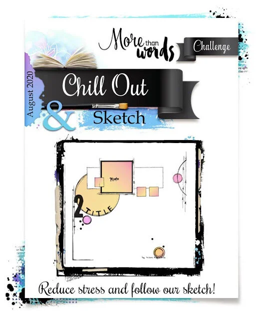
08 Aug Chill out and Follow Sketch.jpg

This page was created for More Than Words August challenge. They provided a sketch as well as the word prompt “Chill Out.” I used this prompt in my title and photo selection since hanging out at Iceland’s premier spa was definitely relaxing. I replicated the details around the edges by doodling with a fine tipped Sharpie. I usually am not crazy about doodling because I never like how it turns out. I’m too much of a perfectionist I guess. However, I do like the results on this page. It made it easier since I had a circular stencil and a picture to reference. How do you guys feel about doodling?

327 copy.jpg

This page was also created for Color, Stories, Inspiration’s August challenge. This was the perfect challenge for making a page with vacation photos! I incorporated gold in my layout even though it wasn’t in the original color palette. It was in the map in the inspiration photo and I felt all the colors worked well together.

Evidence Used:

  • Map Print - Recollections Paper Frames, Art-C Tag Pack

  • Cork - Art-C Tag Pack

  • Travel-Themed Elements - Jolee’s Boutique Travel Tags,

  • Metal

  • Clock/Watch - Michael’s Metal Clock Charms

  • Sunglasses - Jolee’s Boutique

  • Cursive Font - MAMBI Travel Sticker Book

  • Camera - Paper Studio Vintage Camera Brads

  • Triangles - Sharpie Doodles

That concludes this entry! Thanks for visiting my page and see you next time. Happy scapping!

Scrapbook Challenge

The World Is A Beautiful Place

Baby Pink And Butterflies

IMG_4396.jpg

Hi everyone! Welcome back to my page! This week’s layout feature’s another photo taken at Iceland’s Blue Lagoon. We were there during sunset and the clouds started turning pink in the background. It’s a good thing my husband had a small waterproof camera!

Untitled.png

I started with a piece of pink and blue butterfly print paper from DCWV’s Far East stack. I used some ribbon and paper scraps to embellish and a chipboard sticker by Mambi for the title. Adhesive gems by Jolee’s Boutique add the final touch.

August 1 Sketch #431 Laura W.jpg

This page was created for Sketches in Thyme’s August challenge. I cut a paper doily in half as a stand in for one large circle and kept embellishments simple since I wanted as much of my background paper to show as possible.

10 October Adrian Feint with The Green Hen.jpg

This page was also created for ARTastic’s August challenge where I needed to include something that flies of my layout. The criteria was the perfect for the paper I had in my stash.

That’s all for now scrappers. Thanks for visiting and I’ll see you next time!

Scrapbook Challenge

Explore Everything

Shades Of Cranberry

IMG_4371.jpg

Hi everyone! This week’s layout combines various shades of cranberry with a start white background. The photo I used is from my 2018 trip to Iceland when my husband and I spent an afternoon at the Blue Lagoon. I still have so many photos from that trip to scrap! Since I won’t be traveling any time soon, maybe I’ll actually catch u with all my photos.

Untitled.png

I used basic white cardstock for my background and mixed a custom burgundy color of acrylic paint to splatter around. I used a piece of burgundy print paper from the My Mind’s Eye’s Everyday Tango stack and supplemented it with some paper scraps and ribbon of similar color. I painted some small wood pieces and I swear in person they are dark burgundy even though in the photos they look almost black.

Moodboard-JULY.jpg

This page was created for the July challenge at White…With 1. I love their pretty mood board and the fact that cranberry usually reminds me of winter and Christmas, but it was the color chosen for summer. I never would have paired the photo I used with this color since you wouldn’t usually pair water or summery scenes with cranberry. That’s what I love about challenges! I often come up with such unique pages while fulfilling challenge criteria.

07July 8 SIT.jpg

This page was also created for the Sketches in Thyme July challenge. I definitely drew inspiration from the watercolor effect in the background and layering of lace and patterned paper behind the photo. I chose to use one photo instead of three and substituted a metallic embellishment along the left of my photo. I used an epoxy sticker by the Paper Studio for my title as well as a metal reddish-copper tag by Tim Holtz.

Thank you so much for visiting everyone! Stay safe, stay scrappy and I’ll see you next time!

Scrapbook Challenge

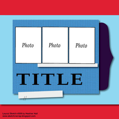
The Beach Life

Beachy And Bohemian

IMG_4325.jpg

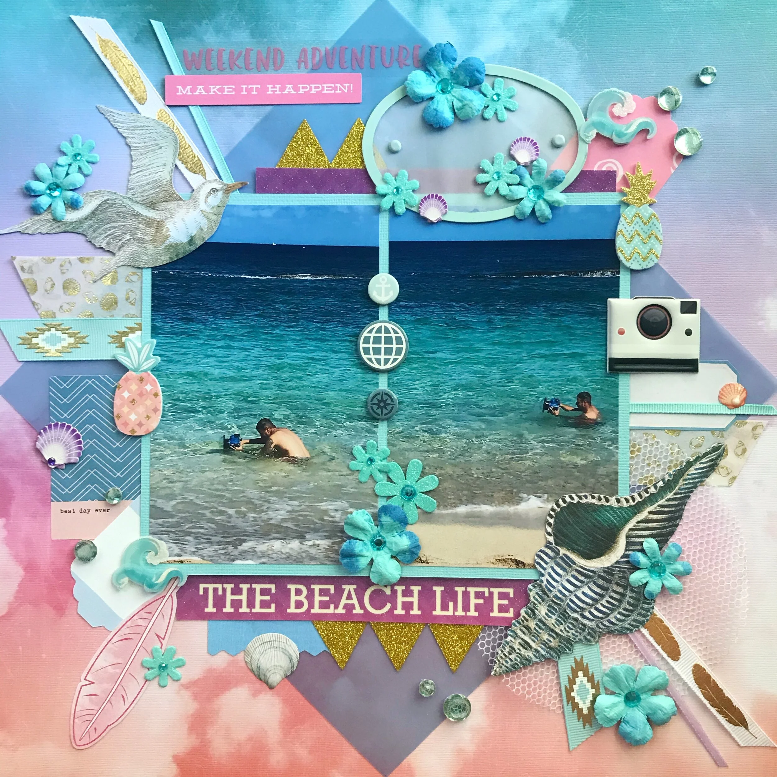
Happy July scrappers! I hope everyone is enjoying their summer. This week’s page is summery indeed, featuring some photos I took of my husband in Hawaii. He’s a professional landscape and waterscape photographer. He has a special waterproof housing for his camera that allows him to take photos of the ocean waves. These pics show him doing his thing! You can see his photography here!

Untitled.png

I started with a gorgeous piece of pastel cloud print paper from The Paper Studio’s Bea-Hue-Tiful stack. I cut a square of blue vellum and turned it at an angle and placed my photos over it. I used beach embellishments like K & Company’s travel diecuts and some waves and shells by Jolee’s Boutique. Stickers by Maggie Holmes and several types of ribbon add lots of detail.

Untitled-28.jpg

This page was created for Scrap the Boys July challenge. I really like the colors in their mood board this month and it seemed to fit with my tropical theme. I liked all the feminine elements even though the photos featured boys and I reflected that in my page.

Thank you everyone for stopping by. I’ll see you next time!

Scrapbook Challenge

Double Trouble

Bright And Cheerful

IMG_4314.jpg

Hello everyone! Welcome to July. I hope everyone is enjoying their summer (or winter, depending where you live.) This week’s layout includes summery yellow and other bright colors. The photos featured are of my two kitties Jupiter and Europa. These sweet babies make my life so much butter with their crazy antics and affection. They are double the fun, but also double the trouble when they misbehave.

Untitled.png

I started with a piece or floral striped paper from the Shimelle Little by Little stack. I based my color palette around this paper and made yellow the primary color. I used yellow cardstock from DCWV’s Brights stack. I cut down my 4X6 photos to fit on my page and used some pale blue AC cardstock to mat them. Thickers chipboard letter stickers make up one park of my title and some ancient stickers by Creative Imaginations made up the other. I mounted the word ‘trouble’ on a mini MAMBI banner. I used some cute kitty mixed media stickers by Paper House and some floral ephemera from My Mind’s Eye Hello Gorgeous collection.

LM #505 - 6 photo sketch.jpg

This page was creating for Lasting Memories July layout challenge. stayed pretty true to the original sketch, using a tag from K & Company’s Tag Pad near the title. Stickers from Shimelle’s sticker book makes up the subtitle and some Paper Shapers decorative scissors gave me a fancy edge along the red cardstock at the bottom, just like in the sketch.

That’s all for now. Thank you for visiting. Until next time, keep scrappin’ everyone!

Scrapbook Challenge

This Is Love

Rainbow Brights

IMG_4283.jpg

Hi everyone! This week’s page features COLOR! The photo I used is from last year’s trip to Hawaii. My husband and I are outside a venue in downtown Honolulu called The Republik where he played a show with his old band.

Untitled.png

As soon as I knew I was doing a rainbow page, I knew I wanted to used paper from the Vicki Boutin Mixed Media stack. I think I bought this stack just for the rainbow heart paper, but there’s lots of other fun prints too. I contrasted all the color with a piece of taupe cardstock from the DCWV Neutral stack. I made a triple mat frame for my photo with some colorful paper scraps and lined the left side of the rainbow heart insert with some Amy Tangerine washi tape.

100900965_3176505682372667_241057122547138560_n.png

This page was created for the Facebook group My Little Scrapbook Store. They post challenges throughout the month and when I saw this one, I knew I had to give it a try. I pulled a plethora of bright colored embellishments from my stash for this one!

This page was also created for the ARTastic Challenge. This month’s challenge focused on the words! I interpreted that by making a big title with watercolor alphabet stickers by Sticko.

That’s all for this very colorful edition. Thank you for visiting!

Scrapbook Challenge

Sneaky Creep

Pastel Textures

IMG_4272.jpg

Welcome back to my blog everyone! This week I’ve created a soft and playful layout featuring my kitty. She always has to be in the same room as me, even if she doesn’t want to interact. She’s always watching like a little creeper.

Untitled.png

I started with a piece of double sided paper from an unused paper collection in my stash that I forgot I even had. Does that ever happen to anyone else? I made a diagonal cut and flipped one half to display both sides. I used some velour ribbon, paper scraps and some kitty embellishments that were also a very old selection from my stash. A piece of polka dot paper from my collection of scraps ties it all together.

89566113_570372656887910_7098953222227755008_n.jpg

That page was created for Let’s Get Sketchy’s June challenge. I love how the diagonal is not from corner to corner but is asymmetrical. I used flower brads in place of all the little dots

Thanks for dropping by friends! See you next time!

Scrapbook Challenge

Forever Yours

Vintage Blue and Yellow

IMG_4260.jpg

Greetings scrappers! This week I bring you a sketch with a lot going on. I didn’t intend to mix so many patterns, but I like how it turned out. The photo I used is of my husband and I in the Mojave. We were driving home from a trip to Borrego Springs and saw a ton of pretty yellow flowers on the side of the road. We pulled over in front of some windmills and took this photo together.

Untitled.png

I started with a piece of blue-gray floral patterned paper from The Paper Studio’s Theodosia Square stack. This stack has a lot of great vintage looking prints but the paper is very thin so I mounted it on some gray-brown kraft paper from The Paper Studio’s Affinity stack. I used a combination of paper scraps and Tim Holtz pocket cards and Idea-Ology Ephemera to create a layered collage. Everything in the Tim Holtz collection has a vintage, Victorian feel and matched my background paper perfectly.

June 2020 inspiration.jpg

This page was created for the June challenge at Kraft +. Isn’t their mood board gorgeous?! I think yellow and navy would make for some stunning wedding colors! It reminds me of that episode of Family Guy where Stewie says “I know it’s been overdone, but your colors should be yellow and gray.” I laughed so hard because at the time, yellow and gray weddings were on ever wedding blog and Pinterest page. Maybe yellow and navy will be the next big trend!

sketch 202.jpg

This page was also made for Sketch and Scrap’s June challenge. I liked that layered collage look in the sketch and elaborated on it by adding more components and detail. I used one big photo instead of the two smaller ones. I kept the title where it was and used Thickers chipboard alphabet stickers and kraft and white stickers by Amy Tangerine.

Other Products Used:

Thank you for visiting and have a wonderful week!

Scrapbook Challenge

Fur Baby

Neon Meets Pastel

IMG_4247.jpg

Hi everyone. How has everyone been doing amid the chaos? My layout this week features a peaceful moment with my kitty Jupiter. For whatever reason, these photos came out very washed out and don’t convey the true colors of the page.

Untitled.png

I started with a piece of pale pink paper from DCWV’s Blush Kraft & Rose Gold stack. I used lots of stickers from the Animal Friends and Shimelle sticker books by American Crafts. All the little cat details work really well with my photos and they just happen to be in blue which matches my color palette. I used a Fiskars squeeze punch and some bakers twine to make some pennants and ties the twine around some heart brads to finish the ends.

July.jpg

This page was created for the Scrap The Girls July challenge. I kept the idea of having pennants on a string but omitted the balloon motif.

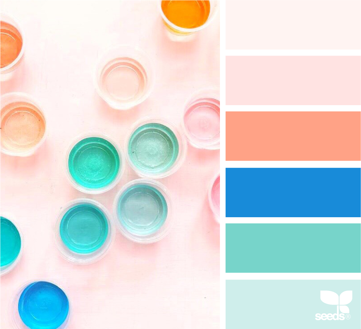
ColorCreate_craftplanter_hanni_.png

I used Design Seeds once again for color inspiration. I love the vibrant colors on a pale pink background that I mirrored in my layout.

That’s all for now Here’s to a fun and SAFE summer!

Scrapbook Challenge

I Love You…Now Feed Me

Peachy Pink Flowers

IMG_4217.jpg

Hey everyone! I hope you’re enjoying June so far! My layout for the week features my fluffy kitty Europa. She sleeps on her back often and tucks in her little paws. She looks so cute and playful and oh so photogenic!

Untitled.png

I started with some double-sided paper by Colorbok and cut it in half and flipped one side so I could display both the floral pattern and the solid. I used paper doily’s and paper scraps to surround the photo and embellished with stickers, brads, tiny tags and enamel dots.

Celebration Bingo.jpg

This page was created for the Lasting Memories June challenge. I love bingo challenges and always have so much fun doing them. This one was even more challenging because I had to incorporate 5 elements instead of the usual 3 with smaller bingo boards. I chose Doily, Stitching, Tag, Stickers and Glitter.

Capture.PNG

The palette for this page was created at Coolors. I’ve talked about them before, but I can’t stop raving about this great, free palette generator. love the feature that let’s you lock in colors that you love, and randomly swap out others utill you find the perfect pallet. You can see the colors that I locked in the screen grab above. The bright, fresh colors chosen gave me a beautiful result.

Thank you for stopping by. I’ll see you next time for a brand new page!