Scrapbook Challenge

Sweet Baby Love

Tans And Browns

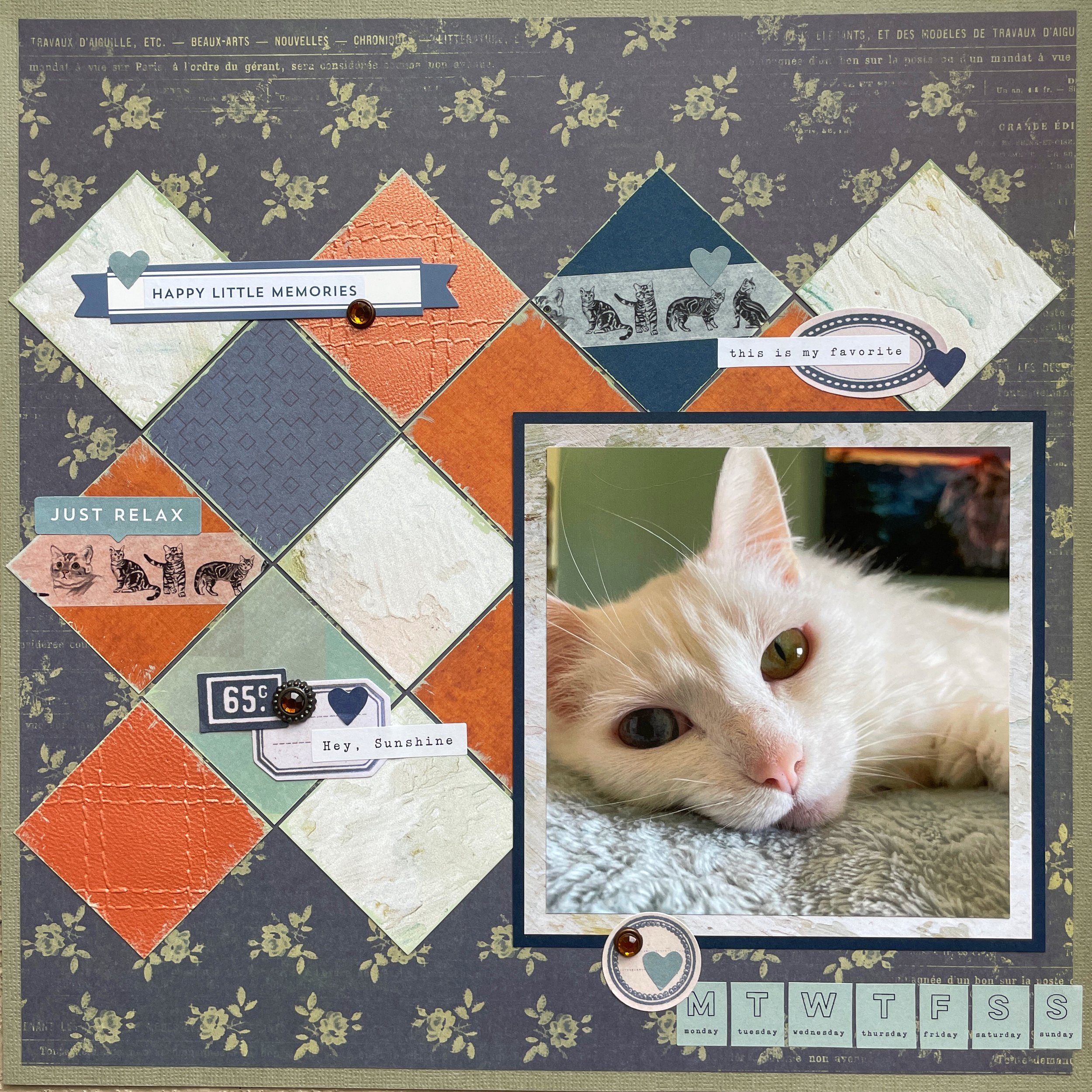
Hi scrappers! Thank you for joining me again for another scrapbooking layout! My past dozen or so layouts have been colorful and bright so this week I made something a little more subdued in tones of tan and brown. My cat Jupiter is also various shades of brown so I used some photos of her looking out the window as the subject of this page.

I used some wood print paper from the Dendrology stack by The Paper Studio. I tend to use this stack a lot since woodgrain seems to go with everything! It worked especially well on this brown-toned page. I rounded the corners of a square of white cardstock with a Marvy Uchida punch and then used some scraps of some P13 paper I had. I used the opposite side on a previous page and this time I featured the gray-brown leaf side. I love the little ladybug details! I added some matching ephemera from the same collection as well as some ephemera by Asuka Studio. I used up several tiny paper scraps by making a banner with a pennant punch and added a large cat sticker by Recollections. I cracked open some botanical chipboard by P13 and used up some burlap and paper flowers had in my stash. My title was a mashup of stickers, chipboard tiles and ephemera.

This page was made using sketch 385 at A Cherry on Top Crafts. I really liked the little banner details and the circular element around the title. I used a paper doily instead to keep the round shape and replaced the scalloped detail on the bottom with a piece of brown washi tape.

This page was also made for the July White with 1 challenge. I loved their cozy mood board and was inspired by the following:

  • Bunnies (Bunny Brads)

  • Logs (Border Paper)

  • Words “Sweet” and “Love” (Used in Title)

That’s all for this week! Thank you so much for paying me a visit. I host a Taylor Swift inspired crafting challenge every month and this month is all about black cardstock backgrounds. There’s still a few more days to play if you want to join in!

Color Dare Design Team Challenge #610

I Feel The Happiest Here

Desert Tones And Handmade Embellishments

I used some dusty green cardstock as my background and sponge painted some pink acrylic over it to break up the solid color. I cut a broad strip of Mirabelle Floral paper by The Paper Studio since it had the same green shade as my background. I added in a scrap of green paper with a torn edge and double matted my photo with more paper scraps.

I found a pretty piece of handmade paper by Albumlovehandmade that worked well and then proceeded to layer lots of embellishments! I had two separate packs of Golden Desert ephemera that were perfect for this page and I used one of them for the title. The ephemera even had Joshua trees on it, just like my photo! I also used some Heidi Swapp Carefree ephemera by American Crafts since many pieces had the same peachy pink tones as my floral paper. The white tags, green diet shapes and floral and butterfly stickers are also all by Albumlovehandmade. I really love the products she lovingly handcrafts so you guys should absolutely check out her store!

I added three large decorative brads by Teresa Collins and wanted some other bright pink elements to match the trim on my photo and handmade paper. I used a stencil by Aall & Create and some stencil butter by The Crafter’s Workshop and created some botanical elements. I had to be really careful with my texture paste placement since I wanted one “branch” in each section and the pattern with other branches was all pretty close together.

I am proudly part of the design team over at Color Dare Challenges and this page was made for challenge 610. I used all colors but Lagoon in my project. I hope you’ll join us and share your own creations using this color palette!

I used sketch 384 from the Cherry on Top weekly sketch challenge. I only used one photo and added ephemera Rostand in for the two smaller ones.

Thank you for stopping by. I am busily working on my next project and will be back soon to share it with all of you!

Scrapbook Challenge

Love This

Big Decorative Tag

Hi scrappers! This week I chose to scrap this photo of my kitty Jupiter. Her eyes look so big and bright in this photo! She was sitting on my husband’s office chair looking very cute so I napped a picture with my phone.

I started with some purple paper from the Over the Rainbow stack by Craft Consortium as my background. I cut down a piece of pretty teal vintage camera paper by P13. The pattern on this paper is so cool but then I ended up covering most of it. Oh well. I added in a giant tag from the Vicki Boutin Sweet Rush collection and added some vibrant flower die cuts by Aall & Create. The title comes from a sticker out of the Amy Tangerine sticker book and I added a wreath around it as well as some other punch out elements from the 49 and Market Plum Grove collection. I made two little banners using a Fishers squeeze punch and added in some enamel dots by Simple Stories and Altenew.

I used the sketch from this month’s Sketch with a Twist challenge over at A Cherry on Top Crafts. The twist was to create a banner like the one in the sketch. I made two using some baker’s twine and some small brads.

This page was also made for this month’s Video Game challenge. This was the color palette provided, inspired by the cover of this Spyro game! Purple and teal are some of my favorites, but I never would have thought to pair them with orange and yellow. I really like how the finished page turned out.

That’s all for this week! Thank you for stopping by andI will see you all soon!

Scrapbook Challenge

Wild Dreams

Animal Print And Layered Ephemera

Hi everyone! I was digging through my collection of photos and found these great shots taken by my husband. We were in the desert and it was a very windy day!I think these shots are so unique!

I started with some bright yellow cardstock. One side of it was a little creased so I knew I would need to covert up. I did so using some giraffe print paper from DCWV’s Gone Wild stack and cit a piece on a diagonal. I used a narrow strip from my scraps stash to cover the edge between the two papers and used various scraps and some ephemera from a couple of junk journal packs to layer behind my photos. I also used some Tim Holtz Field Notes ephemera and some translucent floral stickers by Mind Wave. I used up some paper flowers by Prima and affixed them with some bronze brads by Recollections. I added some chipboard words by 49 and Market and some chipboard feathers by Scrapmatts. I finished by scattering some rhinestones and some yellow and orange enamel dots by Craft Consortium.

I found my own sketch for this particular layout. This one came up on Pinterest. I rotated it 90 degrees and used three photos instead of two.

This page was also made for challenge 709 at Lasting Memories. The challenge was to use a technique or product for each letter in the word “winter.”

  • W - “Wild” in title

  • I - Insects

  • N - Nature Theme (bugs, bird, feathers and flowers)

  • T - Tag

  • E - Enamel Dots

  • R - Rhinestones

This page was also made for the newest Cupcake Inspirations challenge which was all about Jungle Animals! I used animal print, rather than the animal itself and I don’t think giraffes technically live in the jungle, but I see them grouped in with jungle animals all the time so I hope it counts!

That’s all for this week! You can find more Scrap Attack content on Instagram and YouTube. I’d love to see you there!

Scrapbook Challenge

Life Is Good

Vibrant Colors With Black Outlines

Hi everyone! This week’s page features photos taken on a trip to Hawaii several years ago. We went in summer when the waters were much calmer. Usually we go in winter when the waves are so huge I can barely get in the water!

I found some glittery, embossed paper from the Gone Wild stack by DCWV. This collection is all different animal print. I think this one is supposed to be scales of some sort but it reminded me of the surface of water and the color worked well with my photos.

I cracked open my new Over the Rainbow stack by Craft Consortium and cut some two inch strips of yellow paper. I glued it all down on some black cardstock as well as some narrow strips of black along the teal paper and around my photos. I liked the contrast of the bright colors with the black and the outline really made everything pop!

From there, I embellished with some ephemera and stickers from both the Vicki Boutin All Good Things and Color Study collections. I also used some stickers from the Vicki Boutin sticker book. I also threw in some Amy Tangerine travel stickers and used my Sizzix Big Shot machine with a Momenta die cut to make a little tag. I also used an embossing folder on a paper scrap to decorate the tag and added an eyelet and some braided fiber. Lastly, I scattered some little yellow and orange buttons around the page instead of enamel dots for a change.

I used sketch 300 from Sketch and Scrap. I liked the bold outline around the edge of the page and the center paper piece. I also outlined my photos too.

This page was also made using the color palette and prompts from case file 438 at Color, Stories, Inspiration. I used the following “evidence” prompts:

  • Solids

  • Circles

  • Numbers (on the washi tape strip on the bottom third of the page)

  • Flowers

  • Plane

  • Different Font

This page was also made for the MMC challenge at A Cherry on Top Crafts. We were provided a list of tools and techniques to choose from. I used the following:

  • Punch (Circle in upper right)

  • Die Cut (Yellow Tag)

  • Embossing (Blue paper on tag)

  • Shapes Buttons

  • Decorated Tag

  • Fiber (Braided orange fiber on tag)

That’s all for this time! I love the beginning of the month because there’s so many new challenges to participate in and I always feel so inspired! I’m always looking for new scrapbook challenges so drop a link to your favorite!

Color Dare Design Team Challenge #608

Make A Life You Love

Mist, Seabrook And Honey Butter

Hi scrappers! I’m back again with another page made for Color Dare Challenges. For this layout, I used a picture of my husband and I taken on vacation in Bimini, Bahamas. You can’t really tell how gorgeous our surroundings were or even how incredible the sunset was, but you can tell I had gotten a lot of sun! My incredibly pale skin isn’t made for life at that latitude, but that is what SPF is for.

I started with some yellow floral paper by Bo Bunny and then added the plaid paper by Recollections. I matted both my rectangle of plaid paper and my photo with some dark teal cardstock from the Affinity stack by The Paper Studio. I found some 6 X 8 paper in the same yellow tone from the Bo Bunny Botanical Journal stack and cut it on a diagonal. I did the same with a scrap of light teal lattice print paper. From there, I embellished by layering stickers from Dear Lizzy and Amy Tangerine sticker books.

Color Dare Challenge 608 provides these 5 colors to choose from, I had totally intended in including Royal in this since purple is my favorite color, but I found that Recollections paper that showcased Seabrook and Honey Butter so perfectly. The paper looked so good with the Mist colored cardstock that I decided just to leave the page with these three colors as well as some gray and white. Head on over to Color Dare and give the challenge a try. We’d love to see what you create!

This page was made using the sketch for the June Sketch with a Twist challenge. The twist was to use enamel dots (which feels like this challenge was custom made for me since enamel dots are my jam.)

I usually don’t have diagonal paper pieces in my layouts (since I know I’m less likely to use the triangular scraps that result) but I like how this looked! I added my own spin by layering lots of stickers in clusters to add some interesting details.

The deadline for this challenge has been extended to 7/6 so you still have time to enter your own take on the sketch!

That’s all for this week! Thanks for stopping by and taking a look. I’ll be back soon with a whole new page!

Scrapbook Challenge

Spread Your Wings And Fly

Pastel Faries

Hi again scrappers! I’ve been on a scrapping binge lately and have yet another page to share! These photos were taken at a birthday dinner last year and I love how the purple and green in my dress ended up working with the papers I used.

I started this page a very unusual way because I wanted to challenge myself to use up some paper scraps. I sort my scraps into two large drawers, one for patterned and one for plain papers. I used a random number generator for each drawer and pulled out paper scraps until I got to the generated number. I told myself that no matter the combination of one plain and one patterned scrap, I would use them both on a page.

The combo didn’t end up being too crazy. I drew a light blue patterned rectangle and a small strip of gray cardstock. I ended up using both just to the right of my photo. I also used a second scrap of the same patterned paper beneath my title. From there, I selected other scraps that would work like the pale lavender cardstock and the floral print paper to the right as well as the mat for my photos. Even the two stars were out of my scraps stash. I had used a punch to make them ages ago and never used them but now they have a home.

The teal and purple floral print behind my photo is actually fabric tape from the 49 and Market Viken collection. From there, I picked out photos that matched the color scheme and I placed it all on some purple-gray cardstock from the American Crafts Neutral stack. I used some watercolor washi tape, Kaiser Craft die cuts and some enamel dots to complete the page.

I used this week’s sketch over at A Cherry on Top Crafts. This sketch was simple and worked well with the scraps I had pulled. Rather than a piece of ephemera to the right of my photos, I used my paper scrap and decorated it with washi tape, stickers and ephemera.

I also created this page for Cupcake Inspirations. Since it was an Anything Goes challenge, I decided to implement my weird method of paper selection and see what I came up with!

That’s all for now. If you’re looking for a new paper crafting challenge to participate in, check out the one I run monthly at A Cherry on Top inspired by Taylor Swift. I just posted the new one for July. Hope to see you there!

Guest Design With Sketches In Thyme

Look On The Bright Side

Pink Lemonade

I scrappers! I’m back this week with a a page created for Sketches in Thyme. I am thrilled to be a guest designer for them this month and hope you will head their way and take a look at all their sketches. They really inspire me when I’m making pages!

Started with some basic pink cardstock from the American Crafts Spring collection. I knew I wanted to make the lemon paper from Recollections my main focus so I cut a large piece and used some hot pink cardstock by The Paper Studio as a mat. I used the same paper to mat my photo. The lemon paper was double-sided so I used the reverse side with green dots as an accent stripe.

I created a shaker with a kit by Sizzix containing shaker panes and accompanying die cuts. I added in little cocktail stickers by Jolee’s Boutique to match my photo and sprinkled in both chunky and fine glitters in shades of pink before sealing up the shaker.

My title was a tag from the Shimelle Glitter Girl ephemera set but I added the pink floral paper over the top to make it match my page better. I also used stickers from the Shimelle sticker book in little clusters. Lastly, I added some mixed media with a Vicki Boutin stencil and The Crafters Workshop stencil butters. The stencil had the same shape as lemon wedges so I felt it was perfect! I layered a larger circle stencil over the top and masked off areas with a paper towel to control where the stencil paste went. I’d never tried this technique before but I think it turned out pretty good!

I used this text from Sketches in Thyme and stayed pretty faithful to it. I turned the smallest circle into a heart shaker and added some additional clusters and embellishments to make it my own.

I was also inspired by Case File 437 over at Color, Stories, Inspiration. I liked the color palette of pink, yellow, white and green as well as the lemony theme. I used the following “evidence”

  • Lemons

  • Floral Pattern

  • Leaves

  • Pie-Chart Shape

  • Small Dots

  • Cursive Font

  • Mixed Media

  • Circles

  • Sprinkle Small Bits (Glitter in Shaker)

That’s all for this week! Thank you all for stopping by and another big thanks to Sketches in Thyme for having me guest design this month!

Scrapbook Challenge

You Do You

Tropical Colors, Rub-Ons And Mixed Media

Hi scrappers! This week I delved into my stash of scraps. In fact, all papers on this page except for the background paper were all scraps. I used a selfie I took on a Hawaii trip several years back because I liked how the water looked with the teal background paper.

The background paper I used is from the Rock Out Bro stack by Prima. I liked the fun combo of bright yellow on teal and the pattern in subtle enough that I could mix it with other patterned papers without it looking too crazy. The page was actually based around the palm tree tag from the Vicki Boutin Sweet Rush collection and I pulled patterned paper scraps I thought would work with it. I especially like the little sea turtle patterned pieces. I mixed in some rub ons by Aall & Create, cutting them into smaller pieces to scatter around the page. I also used a stencil by the same brand with some Vickie Boutin texture paste in BlueBerry Sour. I finished with some chipboard stickers by Carta Bella since they were the perfect summer embellishments!

This page was created using sketch 382 over at A Cherry on Top. This was the perfect page to use up some little paper scraps. Since I didn’t have a scrap piece of paper wide enough to go behind my photo, I used three different strips side by side.

This page was also made for this month’s Video Game Challenge. This month, the inspiration pic is Mario Kart. I used all five colors on my page.

This is my first time creating in a challenge hosted by Counterfeit Kit. I love the concept of this challenge! They choose a collection every month and challenge you to use comparable items you already have in your stash to make a project with a similar feel. I love the summery feel and bright colors of this 49 and Market collection. I pulled a bunch of items from my own stash as seen below, although I didn’t even end up using most of what I pulled. This was made specifically for challenge #2, Color Explosion, which I think I definitely achieved. There are so many colors on my layout!

That’s all for this week. Thanks for playing along and I will see you soon for another summer-inspired page!

Color Dare Design Team Challenge #606

Grow Through Life

Journey, Royal, Glacier and Capri

Hi scrappers! I’m back again with a Design Team project for Color My Heart Color Dare Challenges. For this layout, I used a selfie taken of my husband and I at an outdoor arts festival.

I started with some basic aqua blue(Capri) cardstock from the Splash cardstock stack by The Paper Studio. The only other new piece of paper I used was the pale green (Glacier) floral paper by Colorbok. All other papers were out of my stash of scraps!

I didn’t start this page with the intention of a butterfly/moth theme but that’s how it turned out since two of my chosen paper scraps featured them already. I added some small pieces of washi tape as well as some rub-ons by 49 and Market that both featured butterflies. I used an envelope embellishment by Paige Evans that already had a slit cut in it so I could slide in some Viken ephemera and make it look like it was spilling out of the envelope. I added a few succulent washi stickers and enamel dots by Altenew to finish the page.

I used this beautiful color palette from Color Dare Challenges. The challenge requires using at least three colors but I used all four since I love how they look together. I hope you’ll join us and submit your own creation!

I used a sketch from the My Mood Challenge over at A Cherry on Top Crafts. In addition to the sketch, the challenge was to use a photo of something close up. Since this is a selfie and I have short arms, I’m going to say this photo is pretty close up.

That’s all for this week. I’m going to try and sneak in a couple more pages for the month of June. I’ve been on a roll lately! It feels so good when all I want to do is create!

Scrapbook Challenge

Make Today Fun

Orange and Green Citrus

Hi scrappers! Welcome back to another scrapbook creation. This one is quite summery and features lots of citrus. Farmer’s markets near me are now full of summer fruits like peaches and cherries and making this page makes me want to sit down to a big bowl of fresh fruit!

The photos I used were taken on a trip to Catalina which is a small island off the coast of California. It’s about an hour ferry ride from the mainland and has fine dining, hiking and is a destination for scuba divers!

I started with some solid minty green cardstock and splattered it with some acrylic paint by Apple Barrel. I used some fantastic paper from P13’s Fresh Lemonade collection and cut a stripe for the left side of the page. This was one of those papers where I had no idea how I was going to use it but I knew I had to have it because it is just so pretty!

I then used some orange washi strips by 49 and Market (and strategically covered the seam between them) and then some skinny green washi by Create 365. I raided my stash for anything citrus and found some absolutely ancient Mrs. Grossman stickers along with some boxed stickers and a washi tear pad by Mo Card.

I added in chipboard in various shades of green from 49 and Market’s Plum Grove and Viken collections and also happened to have some circular stickers from the same collection as my citrus paper. I used them to decorate my large chipboard piece and added in some puffy stickers by Simple Stories. The title is from the Kid at Heart ephemera pack by American Crafts and scattered in some flower shaped brads to finish off the page.

This page was inspired by this absolutely amazing retro mood board provided for the monthly Mood Board challenge over at A Cherry on Top Crafts. The majority of the page had to be orange and green, which I think I have covered. I was also inspired by the following details:

  • citrus (duh)

  • stripes (vellum piece between my photos)

  • the word “love” (used twice on the page)

I used this sketch from Challenge Yourself’s June sketch challenge. I turned it 90 degrees and used only two photos instead of three.

I love a good tic tac tow challenge so this page was also made for the June 3 in a Row challenge. I chose the bottom row:

  • Any Shade of Green

  • Washi Tape

  • 2 Patterned Paper

That’s all for this week. Thanks to all who stopped by to check out my little corner of the internet. I will be back soon with another page!

Scrapbook Challenge

Play Today

Mixed Media Rainbow

Hi scrappers! This week I put together something quite colorful. I used a photo of my cat Jupiter playing with a fuzzy ribbon on a string. The ribbon is rainbow colored so I paired that with a vision I had of created a ROYGBIV watercolor background.

I started with some Vicki Boutin mixed media paper. This paper is much thicker than standard cardstock so when I got it wet, it didn’t wrinkle and warp as much as normal paper would. I didn’t have pigmented watercolor paints so I just used acrylics since I have lots of those. Once I let the paper dry over night, I added some Paige Evans rainbow striped paper and some fabric tape by 49 and Market as a divider between the two.

I used several pieces of ephemera from the Vicki Boutin Sweet Rush collection since they were bright and colorful. Part of the title is made up of chipboard letters of an unknown brand so old that the adhesive wasn’t really sticky anymore. I also added in some hot air balloons by Memory-Place and puffy stickers by Echo Park Paper Co. I also added in a very old paper frame that said play time and place a washi cat sticker inside it as well as around my title. Lastly, I scattered some enamel dots by Simple Stories around the page.

I scrap lifted this layout by Karen C. This page was made for the June Grab 5 challenge at A Cherry on Top. Since June is often associated with weddings, the criteria was as follows:

  • An old product (paper Play Time frame)

  • A new product (enamel dots)

  • A blue product (cat washi stickers, hot air balloon)

  • Borrowed (scrap lifted) layout

  • Use the word “Love” (journal stickers in upper left)

That’s all for this week. If my fellow card makers and scrapbookers out there are looking for a new monthly challenge, join me for a Taylor Swift inspired challenge and play along for the chance to win a Cherry on Top gift card. This month, it’s all things outer space and extra terrestrial. Check out the challenge HERE.

Scrapbook Challenge

Cherish

Icy Blue With Bling

Hi scrappers! This week I’ve created a duo chrome layout in shades of light blue and white. This was actually a color a didn’t think I would have a lot of in my stash but in the end I found more than enough items to make a cohesive page. I definitely cracked open a few items I’ve had for years but never used.

I used basic white cardstock as my background and then cut a stripe of double-sided paper from the Tracy Porter collection by Colorbok. This is a collection of papers I’ve had for at lease a decade, possibly two, so every time I use one up, it’s a win! I added a thin sticker border by Me & My Big Ideas that’s also absolutely ancient. I used some old paper scraps to mat my photo and then used a smattering of blue and white embellishments to make a collage. I hand painted some chipboard photo garlands by P13 as well as some little wooden pieces so they would match my color palette. I added some stickers by The Happy Planner and some blue and white enamel dots by Altenew. The title comes from a book of rub-on quotes by DCWV, also purchased in the early 2000s and so old, the book has fallen apart!

The color palette this month came from the June challenge at White…with 1. Besides the very pretty color combo, I was also inspired to use florals, paint (on the wooden and chipboard pieces) and text like on the book spines (the definition Ruben I used for my title.) These color challenges are always so fun because I’m usually amazed how many items of a specific color I can find in my stash.

This layout was also part of a monthly scrap lift challenge over at A Cherry on Top Crafts. I lifted this particular sketch by Aztam since I liked the collage she created around the photo.

Color Dare Design Team Challenge #604

Every Day May Not Be Good, But There Is Something Good In Every Day

Shades Of Pink And Green

Hi scrappers! Welcome to my first layout June! These photos are part of a series that my husband took last year when the wild mustard was in bloom. There were so many good shots from that session that I’m still working my way through scrapping them all!

I only used a handful of products on this page which is unusual for me. The majority of papers used came from the Copper Luxury stack by DCWV. This collection has lots of floral and succulent patterns in pink and green tones so I felt it would work well with my photos. The paper is also double-sided so both the accent stripe and the large pink patterned mat behind my photo are two sides of the same paper. The title also comes from the same paper collections as well as the succulents which I fussy cut. Some were adhered with foam core tape to give them some dimension. I also used some gilded botanical washi tape and some washi succulent stickers along the right side. I finished with some rub-ons by 49 and Market and some enamel dots by Simple Stories.

I used sketch 379 from A Cherry on Top Crafts for this page. Instead of a large circle under the title, I used a large succulent and scattered smaller ones around my photo.

This page was also made for challenge 604 over at Color Dare Challenges. I mostly used the colors Ballerina and Limeade but all six colors are all represented throughout the page. I hope you’ll join us with your own creation.

That’s all for this week. If you’re looking for more video’s showing how I put my pages together, I have quite I large library on my YouTube channel featuring ASMR style videos, time lapses and unboxings. I’d love to see you there!

Scrapbook Challenge

Always Believe Something Wonderful Is Going To Happen

Three Of A Kind

Hi scrappers! I’m here with one more layout for the month of May! I used some photos taken at a Winter festival last year where there are lots of holiday lights, including this fun tunnel of twinkling LEDs. My husband and I took some silly selfies while walking through. I think my favorite one is the one where I’m a little blurry because it makes me laugh every time I see it.

Despite the photos being taken in a wintery/Christmasy setting, there really isn’t anything about them that indicates “Holiday.” I decided to go a totally different direction and instead of using traditional red and green, I matched the blue/purple tones and added in the unlikely combo of black, gray, yellow and spring green.

I used some indigo chevron print cardstock by Momenta for my background. This paper is nice and thick and holds up well no matter how many things I layer on top of it. I cut my photos down to 4 X 4 and mounted them on black cardstock. From there, I used all paper scraps in my stash to make a collage behind them and used some green ledger paper from the Echo Park For the Record 2 6 X 6 stack as a background for my title. This might be the longest title ever but I loved the phrase printed on the Shimelle wooden embellishment so I decided to go with it. I used a Marvy Uchida punch and Fishers squeeze punch to make some additional embellishments that matched the Kaiser Craft and Recollections stars and pennants. I added in some fun little brads that look like screws and used both a stencil and stencil paste in Fern to add some chicken wire patterns to the page.

I used the sketch from the May Sketch with a Twist challenge over at A Cherry on Top. I don’t usually have three photos in a series but in this case I not only had a set, but they could easily be cut down to the 4 X 4 that the sketch recommended. Instead of paper doilies, I used stars and other bits and pieces around the page. The twist was to use some sort of mixed media so I added the chicken wire texture in three places.

This page was also made using case file 435 from Color, Stories Inspiration. Beside using the provided color palette, I used the following “evidence:”

  • Floral pattern

  • Wooden accents

  • Circular elements

  • Use 3 photos

  • Small metallic brads

That’s all for this week. Thank you for stopping by and I will be back in June!

Scrapbook Challenge

Thriving

Kraft And Berry

Hi scrappers! This week I created a page using all kinds of odds and ends from my stash. I scrapped a selfie I took in front of a wall full of paper flowers at a local macaroon shop. Don’t you love it when both your winged eyeliner and highlighter look good on the same day?

I started with some white lined Kraft paper from the Kraft Basics stack by Craft Smart. I then I cut a strip from a piece of variegated paper from the Ombre Energized stack as well as used it as one of the mats for my photo. Another mat was made using some polka dot paper from the DCWV Gold & Kraft stack. I layered a giant tag and some frame stickers under my photo along with various paper scraps from my stash. I cut a up a large rub on and added it under my photo collage and then added in some chipboard and ephemera, all from the 49 and Market Plum Grove collection. I recently purchased several products from P13, including some chipboard polaroid embellishments and some frames which both matched the color scheme for this page. I used some other odds and ends that were all kraft or berry colored.

This page was made for the May challenge over at Kraft +. I really liked the color combo and as soon as I saw this challenge I knew I wanted to try it. I’m glad I was able to get it in my the deadline!

This page was also made for the May Title challenge over at A Cherry on Top Crafts. There was a large list of options for page titles, all flower/garden related in honor of the month of May. I used the option “Thriving” for this page.

That’s all for this time! You can find more Scrap Attack content on Instagram and YouTube. I’d love to see you there!

Color Dare Design Team Challenge #602

I Was Enchanted To Meet You

Periwinkle, Royal And Wisteria

Hi everyone. I’m back after short but amazing vacation! My husband and I took some really great picks on our travels so I hope to be scrapping some of those soon, (among the hundreds already in the backlog.) Speaking of backlog, it’s taken me nearly a year to even scrape the surface of the pictures I took at the Taylor Swift Eras tour. Good think I can’t scrap videos or I would literally never catch up!

I had to zoom in pretty far on my phone in low light, hence the noisy pixelation, but I wanted to scrap it anyway! This is when she was singing “Enchanted” in the Speak Now era in a big, gorgeous ballgown. I follow an KFilson Art on Instagram who has made it her mission to draw every outfit Taylor has worn on this tour (a huge task considering all the variations, even more now with the European leg.) I checked out her Etsy shop and purchased several stickers that corresponded with the outfits she wore the night I saw her, knowing they would be fun embellishments on future pages. I love that she even included the detail of the purple microphone she had for this particular set.

I started with some purple cardstock from the Splash stack by The Paper Studio. I feel like I have been using this stack a lot lately! It contains pretty shades of pink, blue, green, teal and purple. I flattered some watered down acrylic to make my background more interesting and then created a circle with some Vicki Boutin Creative FX paste and a mandala stencil by The Crafter’s Workshop. The paste was actually a pretty periwinkle blue color but due to it being pearlescent on a dark surface, it almost looks peachy or silver in certain light, but I swear its periwinkle!

As is my bad habit, I covered up the majority of the texture paste (a shame since it took half a day to dry!) and added some paper scraps behind my photo. Thank goodness for alpha die cuts (I used a set by Tim Holtz) because there are not enough vowels on any sticker sheet for my title, which is a lyric from the song she was singing. I’m glad the dies were small too or the title would have taken up most of the page! I like how the word in glitter cardstock really stood out. However, since the paper was thicker, the dies had a harder time cutting through! In the future, I will run the dies through my Big Shot machine twice on paper like this.

From there, I added a tag by Paige Evans with some Stamperia clear die cut phrases as well as some paper flowers. I added some chipboard by 49 and Market and decorated them with heart-shaped enamel dots by Altenew. I also incorporated a few handmade circular die cuts from albumlovehandmade since they were the perfect color! As I finishing touch, both my photo and the sticker of Taylor are affixed with foam core mounting tape to make them look 3D.

This is a very special Color Dare Color Challenge since it is the 12 year anniversary! The challenge starts 5/24 so I hope you will join us and play along! I added some silver metallic elements and of course the neutral colors of Taylor’s dress to this pretty and soft color palette.

I used sketch 613 from Sketches in Thyme. I loved the uniqueness of the photo being set on an angle. I moved where my title was and also where the triangular corner pieces were (mostly because I cut them wrong so they faces the other way. Oops.)

That’s all for this time. I’m going to try and squeeze in one more page for the month of May so I will see you soon!

Scrapbook Challenge

Bloom & Grow

Purple And Olive Florals

Hi scrappers! I am continuing to try and participate in as many National Scrapbooking Day challenges as possible! Cherry on Top Crafts has a ton so this week’s page was made for one of those. This photo was taken a couple of years ago when there was a big spring bloom in the Southern California deserts. The rams behind me are actually metal statues and there are a ton of different animal sculptures by the same artist dotting the landscape.

I started with some purple patterned paper from the Violet Leaf stack by DCWV. I then used some olive green cardstock by The Paper Studio since it matched some of the green tones in my photo. I used some rub on transfers by 49 and Market since they also matched the color palette and cut them up to spread them around the page. I used some gilded washi tape by London Gifties as a border around my photo which is not something that I normally do but I love how it looks.

I wanted some additional gold accents so I used both a stencil and stencil butter by The Crafter’s Workshop to add some abstract shapes around the page. I then used some 49 and Market laser cutouts, chipboard and ephemera in various shades of purple. I finished with various brads and some green enamel dots by Altenew.

The challenge I made this page for was a scrap lift hosted at A Cherry on Top Crafts. I ended up using this sweet layout by Art_Teacher. I knew it would work well for the big photo I planned to use. I emulated the scattering of confetti by adding lots of brads and enamel dots and rather than a rectangle to journal in, I used some text strips from the Color Swatch Lavender collection.

That’s all for now! Thank you for visiting and I will be back with yet another page soon!

Scrapbook Challenge

Joyful

Pink, Orange And Poppy

Hi scrappers! My page today features some very special photos that I found on one of my social media sites. The original files have been lost to time but I was able to download these photos and print them even though they are pretty low res. I was a dancer for most of my young life and majored in dance in college. An injury forced me to step away from that career path but I miss it every day. These photos remind me of how much joy I found in dance!

I started with some orangey cardstock by Momenta and then used some red-orange cardstock by The Paper Studio as a mat for my photos. I added some box stickers by The Happy Planner, some with gold accents that matched the gold in the washi tape by London Gifties I added. I really liked the abstract design with gold botanical images. The filmstrips are from 49 and Market’s Rouge collection and the alpha stickers are by Me &My Big Ideas. I almost never position my titles vertically so this was a changeup for me.

I think what really makes the page stand out are the big stenciled patches (possibly the biggest patches I’ve ever put on a page) made using a ledger stencil and Marigold and Fuchsia stencil butters by The Crafter’s Workshop. I like how the two colors mixed together to created a marbled effect.

Lastly, the jeweled metallic pieces are actually from an old chandelier earring I had in my stash. I broubably bought them in the early 2000s from Charlotte Russe or Wet Seal or some other staple store of Y2K fashion. I lost its mate at some point but kept the one earring for some reason. I took it apart and used both Glue Dots and teeny tiny brads to adhere them to the page.

This page was made for the May challenge at Cupcake Inspirations. This was a fun color palette that I probably never would have come up with on my own audit ended up matching the skirt I was wearing in my photos so well!

I used sketch 611 from Sketches in Thyme for this page. This sketch seemed like a fun challenge and kind of different from others I’ve done due to the big vertical title and patchwork feel with all the different odds and ends. Instead of journaling, I used a stencil with letters and numbers as a stand in and used three photos instead of four. My pieces didn’t end up fitting together nearly as well but I tried to fake it anyway!

That’s all for now. There are still so many fun challenges calling my name due to National Scrapbooking Day so I am hoping to get a few more pages out before I take a short vacation. See you all soon!

Color Dare Design Team Challenge #600

Happy Little Memories

Shades of Pumpkin, Mist And Sapphire

Hi scrappers! As I write this, it is National Scrapbooking Day! I spent the day celebrating by making this pretty page as a part of the design team for Color My Heart Color Dare. I hope you’ll head on over to their site and submit your own creations!

I started with some deep blue floral print paper from the Kellerkurtz & Company stack and pasted it over some some muted green cardstock from the Affinity stack, both by The Paper Studio. I used some origami paper from the Enchanted collection by Memory Place as a mat for my photo and then cut assorted paper scraps from my stash into two inch squares. I hand painted all the edges for a distressed look and to make them stand out against my background paper. There were two squares of metallic cardstock and I used a quilt pattern embossing folder to add some texture to them. I added so cat washi tape, some Tim Holtz ephemera and stickers from the Journal Studio sticker book by Crate Paper.

This page was made for the Cherry Lift challenge over at A Cherry on Top Crafts. I chose this layout by njr007 as a reference and went for a pet theme rather than winter.

This page was made for Color Dare challenge 600 which starts May 10th. For this tic-tac-tow challenge, I used the top row with colors pumpkin, mist and sapphire. I think there’s also a few rosemary tones on the page as well. I love these challenges because I always end up with a color combo I never would have created on my own.

That’s all for this time! I’m hoping to do more scrapping than normal to celebrate National Scrapbooking Day and will try to submit in all the fun challenges going on around the internet. I hope to see you all soon!