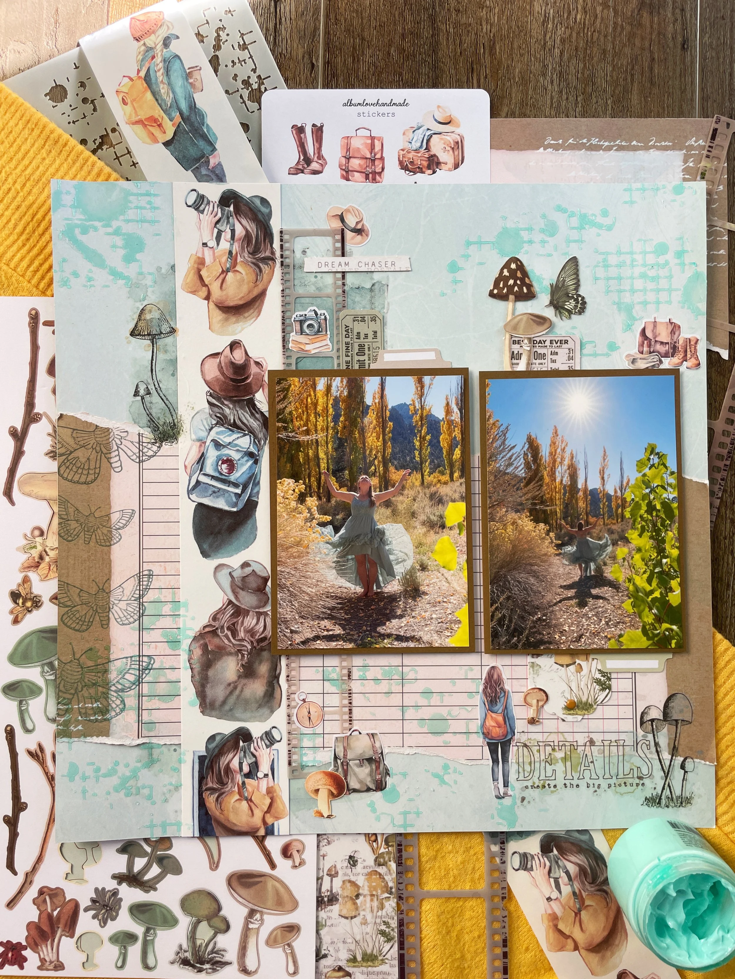
Scrapbook Challenge

Kooza

Florals With Shades Of Wine

Hi everyone! I’m here with the 4th layout of 2025! Last year my husband and I went to see Cirque du Soleil when they came to town with their show Kooza. It was my first time every seeing them live and as a former dancer, was something I had wanted to see for a long time! Since the show was not in Vegas and was a traveling event, they set up a huge circus tent which was really fun to go inside of. The show had acrobats, contortionists, clowns, mimes, tightrope walkers and more! There was a red carpet area out front where my husband and I were able to snap these fun photos to remember the evening.

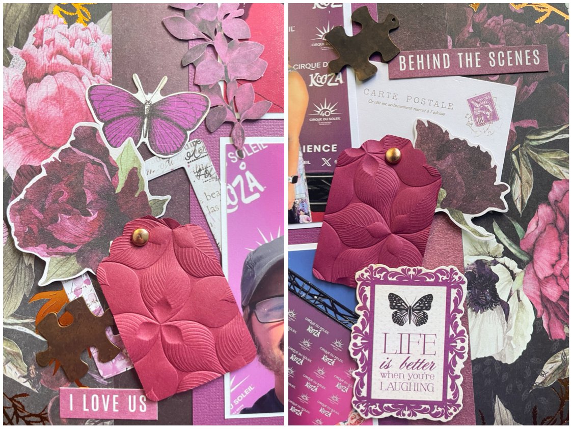
I started with some beautiful double-sided paper from the Prima Marketing Midnight Garden stack. I loved the copper accents and how the deep wine colors matched the backdrop in my photos. I cut the paper into three pieces and flipped the center panel so the other side of the paper showed. I then added a piece of plain wine-colored cardstock from the Splash stack by The Paper Studio so my photos with white mats really popped. I added tiny strips of washi from the Moonlit Garden collection by 49 and Market to make it look like the photos are taped down.

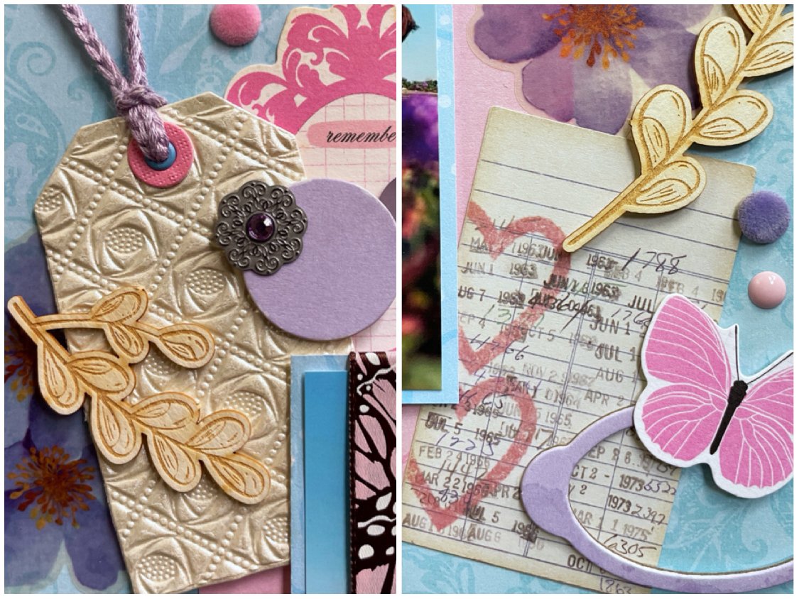
I found some paper scraps in shades of wine and burgundy and used my Mary Uchida punch to turn them into tags. I then ran them through my Sizzix Big Shot inside an embossing folder to give them some texture. Using some foam tape, I layered embellishments from 49 and Market, Simple Stories and Kaiser Craft, popping up some of the embellishments for dimension. I added in two little bronze puzzle piece charms and some phrase stickers by Heidi Swapp. Lastly, I made the title Kooza (the name of the show we saw) with an alpha die by Echo Park Paper Co.

I made this page using sketch 410 from the Cherry on Top weekly sketch challenge. As you can see, I added a lot more embellishments to my page and changed the title placement, but kept true to the basic structure of the original sketch.

This page was also made for the January Mood Board challenge which had two absolutely beautiful inspiration boards this month. The pulling items for this page, I actually struggled a bit to find products, scraps and papers that were the right color, but I found enough to create a cohesive page. The three inspirations I pulled from the board besides the colors were the following:

  • All the texture on the berries and yarn. I added texture with an embossing folder. Too bad a didn’t have one that looks like the berries!

  • Text surrounded by filagree. I used a tag that had text and an elaborate border.

  • Dark red flowers. Both my background paper and some embellishments I used feature flowers so dark they are almost black!

That’s all for this week! Thank you for joining me and I will return with another page as soon as I can. I’m having so much fun with all of these January challenges!

Scrapbook Challenge

Beautiful Wild Flowers

Letting Your Background Paper Make A Statement

Hi scrappers! I’ve had the house to myself for a few days so I’ve had some time to scrap! For this page, I used a beautiful paper by 49 and Market that already has so many pretty details, that I had a hard time putting anything on top of it. I ended up using minimal embellishments and let the paper speak for itself.

I layered two paper scraps under my photo, one with a torn edge. Along with that, I places a six inch paper doily with inked edges, a pre-embossed piece of paper from albumlovehandmade, and some ephemera from the Tim Holtz Field Notes and Thriftshop packs. I finished up with a few label stickers with distressed edges, some wooden embellishments, and little metal and fabric circles. I bought these years ago from a brick and mortar scrapbooking store that is sadly now out of business. By the register they had a big punch bowl of all kinds of odds and ends and you could fill a little paper bag which they would charge by weight. You never knew what you were going to find there!

I used sketch 643 from Sketches in Thyme but made some tweaks. I did keep the titled photo placements, the use of a doily, and some twine.

This page was also made for the January Book Lovers Challenge. The challenge was to use 5 of something on a page, four of something, etc. down to 1. I used the following items:

  • 5 fabric buttons with Xs

  • 4 burnt edge stickers

  • 3 butterfly ephemera

  • 2 wood circle embellishments

  • 1 paper doily

That’s all for this week! I feel like I’m off to a good start scrapbooking in 2025! Here’s hoping I can keep the momentum for a while!

Color Dare Design Team Challenge #634

Big Things Often Have Small Beginnings

Purple, Pink And Blue

Hi everyone! I’m back with Color Dare with a new color palette challenge! Read on to see how I made a page in pastel shades of blue, pink and purple!

I used some blue paper from the DCWV Be Mine stack. The paper in this stack is nice and thick and perfect for supporting a page with a lot of embellishments. It also had a white space designed into the paper for me to put my title. I used some Kaiser Craft ephemera from the Violet Crush collection as my title and added some 49 and Market Color Swatch Lavender Laser Cut Elements around it to make it more interesting.

I used a piece of pink paper from the Bo Bunny 6 X 8 Botanical Journal pad along with a scrap of blue patterned paper to double mat my photo. I played with placing elements in-between the mat layers and used some foam tape to pop my photo up to make that easier. I used some shimmery embossed paper from a junk journal pack with a tag die cut, but running the paper through my Big Shot machine flattened the design a little bit. I guess I didn’t think that one through!

Various elements were layered including some floral stickers, P13 Chipboard, buttons, and a cute little library card with hearts from the Simple Stories Simple Vintage Love Story Ephemera pack.

Here is the color palette for Color Dare’s challenge #634. These pretty pastels would work so well for photos from an Easter celebration or a baby shower. I chose to pair it with a photo taken out in the desert when all the spring flowers were in bloom. Come join us and show us how you used our colors this week!

This page was made using sketch 409 from A Cherry on Top’s Weekly Sketch Challenge. I kept a circular element on the right, a tag with fiber on the left, and then built out the page with more elaborate clusters from there.

The Video Game challenge this month was short and simple. Make a page that’s mostly blue! I chose the bright blue paper for my background because it matched the color of the sky in my photo.

That’s all for this week. Thank you for visiting and more ScrapAttack content can be found on Instagram and YouTube if you are looking for more video content showing how I make my pages.

Scrapbook Challenge

Lavender Boots

Shades of Purple

Hi scrappers! Welcome to the first page of 2025! I used some photos taken in from of the Los Angeles Museum of Contemporary art were they have a famous art installation of lots of lamp posts. O was also wearing my favorite pair of lavender boots!

For my background, I used a page from the Dusk Ink Drops stack by Craft Consortium. The design has a marble-like quality that is so cool! I used paper scraps from my stash to double mat my pictures and since I didn’t have scraps big enough to make all three the same, the photo in the middle was matted with a different set of scraps. I used some hexagonal washi tape with gold accents to make it look like the photos were taped onto the page with washi, and added some mixed media circles with a Crafter’s Workshop stencil and Vicki Boutin Creative FX paste.

The title was made using paper scraps and some Sizzix alpha dies, and Lavender die cuts by Stamperia were perfect embellishments for this page, especially the boots!

I used sketch 408 from A Cherry on Top Crafts. To create the blank space behind my photos, I gently dry brushed some acrylic paint to tone down the pattern so my photos would pop. I added some Altenew enamel dots in roughly the same places as the sketch too.

That’s all for this week! I’ll be back in a flash with another page soon. If you’re looking for a scrapbook challenge to spark some inspiration, check out the monthly one I host here where the challenge this month is to use woodgrain paper as the background for your project.

Scrapbook Challenge

Sunbeam

Peony Garden Papers

Hi scrappers! 2024 has been a crazy year and I can’t believe I’m here with the very last post before 2025! Both of my cats like to nap on our dining table since the sun comes in through the blinds in the afternoon. I took these photos of one of my cats enjoying the late day sun.

This whole page was based around a double-sided paper by Mintay from their Peony Garden collection. I knew I wanted to feature the cat and floral detail on one side but the page would be too busy if I used that side in its entirety. I cut the paper into three strips an moved the center strip with the cat image to the left of my layout. The other two I flipped to the reverse side with a pink crackle pattern and used a strip of scrap paper to hide the seam. This paper is so perfect because the cat is sitting in front of some blinds, just like my photos!

From there, I used some paper scraps from previous projects that were part of the same Peony Garden collection and layered them behind my photos. I used some kraft colored paper as a mat for each photo that helped separate them from my background. The title was made using some chipboard alpha stickers by Momenta that were striped in a way that also looked a little like blinds. Besides a paper doily and enamel dots by Craft Consortium, all other embellishments were die cuts also by Mintay. I popped some up with foam tape to give additional dimension.

I used sketch 642 by Sketches in Thyme but took a lot of liberties, especially with the background. However, I kept the doily embellishment, use of butterflies, and the positioning of the title the same.

It’s time to say goodby to 2024 but I will be back in the new year with a whole new set of challenges. Thank you for joining me in my love of paper crafting!

Scrapbook Challenge

Decked Out

Shades Of Red And Green

Hi scrappers! This week I created a very Christmasy page! I seldom use all the Christmas products I have in my stash since I tend to not take a lot of photos on Christmas. Last year my husband and I went to a winter festival held at the local fairgrounds with impressive light displays and good things to eat as well as lots of photo ops! We took these selfies inside a giant light-up gazebo!

I started with some red and black plaid paper from the Vicki Boutin Evergreen & Holly collection. This paper reminds me of the popular pattern on Christmas pajamas! All the other papers used on this layout are from my collection of scraps, even the green photo mats! Since the papers and patterns are so bright and busy, I didn’t add too many embellishments, but the ones I did use are some tags from the Simple Stories Strawberry Fields collection, Mittens & Mistletoe stickers by Crate Paper, and Thickers Joyful phrase stickers which I used for my title.

I used sketch 311 from Sketches in Thyme. I loved all the layered elements and knew it would be perfect to use up scraps! Not all of the papers I used were the right size for a perfect replica of the sketch, so I made it my own and added enamel dots and Doodlebug crushed velvet brads as my circular elements.

This page was also made for the December 2024 Video Game challenge with a perfect color palette for Christmas! I liked the multiple shades of red and green and used them throughout my layout.

Lastly, this page was made for the 3 in a Row challenge at A Cherry on Top Crafts. I obviously chose the center column with red and green.

That’s all for this week! I’m going to try and get one more layout done in 2024 and then we be into the new year! Can you believe it? I’ll see you all soon!

Color Dare Design Team Challenge #632

Memorable

Florals And Lace

Hi scrappers! I’m back with Color Dare to bring you the final challenge of the year! I’m pretty sure the photos I used on this page were taken on New Years Eve one year when my husband and I went to a local restaurant to celebrate and I can’t believe the end of the year will be here again so soon!

This color combo was a real challenge for me. I’m not sure why since I have stash items in practically every color! I guess finding things that worked with my photo and the other elements on the page was a little tougher.

I used some Maggie Holmes Oo La La Paper from the parasol collection as my background and splattered it with purple and pink paint. Looking at it now, I wonder if I should have done more with the paint like create a watercolor effect behind my photos. Maybe I will experiment with that on a future layout. I added some pastel teal doilies by Bo Bunny and some scraps of pink lace print paper in the corners of the page. From there, I used some floral stickers, clear die cuts and ticket ephemera to make some embellishments clusters and used a corner rounder punch to round my photo corners, but not the purple polka dot mats.

I love this color palette from Color Dare. I chose to use all five colors but you can choose any three or more. I don’t think I ever would have put these colors together on my own but I think it turned out really pretty!

This page was also made for the December challenge at Cupcake Inspirations. I added several purple bows to my layout that I’ve had in my stash for a while. I forget where they even came from but I still have quite a few left to use up!

This page was also made for the Challenge Yourself December challenge which was anything goes!

Lastly, this page was made using sketch 639 from Sketches in Thyme. Instead of a lacy embellishment, I used lacy paper and expanded on the clusters shown in the sketch.

That’s all for this week. More ScrapAttack content can be found on Instagram and YouTube if you are looking for more video content showing how I make my pages.

Scrapbook Challenge

Silently Judging

Tan, Red and Cocoa

Hi scrappers! With the holidays rapidly approaching, I created a page using a cozy Christmas mood board, even if the photo I used wasn’t necessarily Christmas themed. This is a picture of my cat Europa who was sunning herself on our patio, and looking quite judgmental while doing so.

I started with some off-white cardstock by American Crafts. I used red and brown acrylic paints and watered them down so I could create a wash of splotchy color on my background. In some cases, I blew through a straw to spread out the paint and make a splatter effect. Since the paper isn’t super thick and got pretty wet while painting, it warped quite a bit. I tried to flatten it out later by stacking some heavy booking on it but it’s still not very flat.

Using a Vickie Boutin stencil and some pearl white stencil butter, I added some mixed media elements on top of my base. Then using a mix of plaid fabric tape, washi tape, and paper scraps, I made a criss cross pattern that I laid my photo on top of. I added some handmade die cuts and little hand stamped embellishments by albumlovehandmade and used some alpha dies by Tim Holtz to create my title. I swear the title is actually straight but with the way the paper warped, it looks really crooked in the photo.

I lifted this layout by blbabe1234 over at A Cherry on Top Crafts. I tried to emulate her painted background and the crisscross of paper scraps behind her photo.

I made this page for the December Mood Bard challenge that is all about cozy reds and browns. I also took the following inspiration from the image:

  • Fuzzy Mittens (I used fuzzy red brads!)

  • White Stars on Red

  • The words looked metallic/reflective due to the color gradient (Added metallic washi and ephemera)

That’s all for this week! Thank you for visiting and I will be back soon with a new page just in time for the holidays!

Scrapbook Challenge

Keep Being You

Pink and Green Florals

Hi scrappers! It’s been a while since a posted a page with a springtime feel. These photos were taken several years back after a heavy winter rainfall caused a major super bloom in the desert. My husband took this awesome photo, and yes, it is real. No Photoshop!

I actually built the entire color palette for this page around a sticker I was going to use as my title, but then I ended up not even using it! Instead I used some puffy stickers by Dear Lizzy, one of the word phrases being by title instead.

I created a template for the circle on this page by trying around a plate and then dry brushing several acrylic colors following the outline. I placed butterfly and floral ephemera by Aall & Create as well as some ephemera by Kaiser Craft along the curve of the circle. The sitting hippie girl in the upper right was cut out of a roll of washi stickers by London Gifts and the film strips are from the 49 and Market Rouge collection. I finished with some enamel dots by Simple Stories.

I lifted this layout by lisn2cats as part of the Cherry Lift challenge at A Cherry on Top Crafts. I turned the sketch 90 degrees to better fit my photo. I kept the butterfly theme and used my own butterfly ephemera similar to where they were placed in the original sketch.

That’s all for this week. I will be back soon with an all new layout! If you are looking for a paper crafting challenge to participate in, I host a Taylor Swift inspired one here where this month the theme is all about Christmas trees. Come join me there!

Color Dare Design Team Challenge #630

Take Me Away

Shades Of Blue

Hi scrappers! Welcome to December and the last month of 2024! I’m back with Color Dare with another Design Team project. For this page, I used some photos taken at the Blue Lagoon geothermic spa in Iceland from when I visited back in 2018.

I used some blue kanji paper from the DCWV Far East stack. I’ve had this paper pad so long that it barely holds together! The adhesive is deteriorating so it’s falling apart. I cut the paper down and and then cut it in half before gluing it down on some dark blue cardstock.

I had a large scrap of glitter paper that I used as a mat for my photos. I added some pretty washi tape with cranes from The Washi Tape Shop and then layered some geometric washi tape with gold accents on top of that. I added a holographic water sticker under my title and then embellished with some wax seal stickers, feather stickers by The Happy Planner, some Art C ephemera, and paper flowers by The Paper Studio. Lastly, I added some mixed media elements using a stencil by The Crafter’s Workshop and some Vicki Boutin texture paste.

This page was created for challenge 630 at Color Dare of which I am a proud design team member! The challenge for this week was all about the color blue! I’m not are how many shades of blue I used but it’s definitely way more than three! Join us and show us your blue creations!

I used sketch 310 from Sketch N Scrap to make this page. I added some flowers like in the original sketch and used washi instead of paper strips in place of the red and green accent strips.

That’s all for this week! Thank you for visiting and I will be back with a new creation soon.

Scrapbook Challenge

Favorite Memories

Ocean Hues

Hi scrappers! This week I used a photo my husband took while out in the waves. Talk about an awesome selfie! I matched my color palette to ocean-inspired colors.

I used some ombre blue-green paper from the Ombre Energized stack by. Colorbok as my background. This and the aqua paper I used to mat my photo were the only papers I used that weren’t scraps from my stash. The raindrop paper is something I’ve had in my stash for over a decade but it was the perfect addition to a page focused on water. I used banner punch and a few small scraps to make several pennants as well as some metal tag dies by Momenta to make the two tags on the left. I added a palm tree cut out from K & Company and used a similar stamp to add details to my tags. I finished up with some chipboard words by 49 and Market for my title and some cute turtle stickers by Jolee’s.

Video Block
Double-click here to add a video by URL or embed code. Learn more

This page was made for this month’s Book Lover’s challenge where one of the prompts was to make a page featuring water. I was inspired by the blue-green ombre of the book cover and incorporated that into the page design.

I also created this page for the monthly Cherry Lift challenge and chose this layout by Stinkerbelle to lift. I really liked how she threaded fiber through both tags and replicated that as well as used some shimmery watercolors to pay homage to all the paint splatters she had on the original page.

That’s all for this week. More ScrapAttack content can be found on Instagram and YouTube if you are looking for more video content showing how I make my pages.

Scrapbook Challenge

Life As We Know It

Embellishing A Busy Background

Hi scrappers! This week I scrapped a selfie of my husband and I at a local brewery and paired it with a fairly busy paper. I also broke out some rubber stamps that I’m not sure I have ever used before! I inherited quite a few stamps from both my mom and the mother of a friend. I don’t use stamps too often and am sure my techniques and execution are sub par, but I just so happened to have an ink pad that matched by color palette so I gave it a try!

The black and white background paper comes from the Kaleidoscope collection by Vickie Boutin. The only other papers I used on this page were scrap from my stash which includes the double mat around my photo and the white paper I stamped on and then fussy cut out with some new, pretty scissors I found on Etsy! I added some filmstrips by the 49 and Market Rouge collections but since they are semi transparent, they are hard to see against the background. I layered in some stickers by The Happy Planner and Vicki Boutin (I love the little pencils!) as well as some balloon stickers from Recollections that are actually little shakers with confetti stars inside. I used an old piece of raffia and tied it into a bow and then finished with some paper flowers and enamel dots by Simple Stories and Altenew.

I used the single page sketch from this month’s challenge at Stick it Down. To simulate the ink spray, I used some orange acrylic paint and made splatters on my background, a favorite technique of mind since I have a wide assortment of acrylic paint I don’t know what to do with. Instead of lines, I used doilies and my fussy cut mandalas. I replicated the filmstrips but embellished with stickers and other elements.

This page was made using the color palette from this month’s Video Game challenge over at A Cherry on Top Crafts. I integrated all five colors, emphasizing black and chartreuse. As stated before, color palette challenges are some of my favorites, and as a gamer myself, I love these monthly video game inspired challenges!

That’s all for now! There’s still time to participate in the monthly Taylor Swift inspired paper craft challenge I host here. I’d love to see what you create!

Color Dare Design Team Challenge #628

Lovely Adventure

Color Quad

Hi scrappers! It’s finally getting cold enough for a sweater where I live but the photos I used this week flash back to a summer vacation in the Bahamas! My husband took these photos when I was walking on the beach.

I used some off white paper for my background and then used 4 different 8-inch pieces of paper. 2 were scraps from my stash and 2 were new papers that I cut down. I found a tag in matching dark turquoise from an absolutely ancient book of cut out tags. Some square brads acted as anchor points that I could wrap thin gold string around. Heart stickers and the title come from the Maggie Holmes sticker book and a doily by Bo Bunny makes the words pop.

Instead of enamel dots, I used enamel hearts by 49 and Market and added some texture with a stencil by Aall & Create and 3 colors of stencil butter by The Crafter’s Workshop. Lastly, some seagull die cuts from albumlovehandmade match the ocean theme.

For this page, I used sketch 402 from the weekly sketch challenge at A Cherry on Top Crafts. I never have photos as small as the ones shown in sketches like this so I just cut down some 4 X 6 photos into 3 long, skinny pictures.

Come play along at Color Dare Challenges! Check out this week’s colors! I used all 4 but you can choose any 3 for your project. I added a touch of gold to my project along with the neutral background.

Lastly, this page was made for the monthly 3 in a Row challenge! I used the bottom row:

  • Distressed/Torn Edges

  • Any Shade of Yellow

  • Any Mixed Media

Thanks for stopping by! November is flying by so quickly but I will try and squeeze in a few more projects this month and share them with you!

Scrapbook Challenge

Bring The Spice

Fun With Floral Die Cuts

Hi scrappers! I’ve returned with another page that has an autumn feel. These photos were taken in November a year or two ago and is another example of why I always pack a pretty dress on trips! Who says a dress can’t go with hiking boots? I mixed these fall photos with some floral paper and lots of die cuts.

The background paper used is from Jen Hadfield’s Live and Let Grow collection. The paper is double-sided so I cut it into thirds and glued it down to some cardstock so both sides could be seen. I should have made the section featuring the florals a little wider so more of the pattern could be seen, but enough of it shows to represent the color palette. Some Vicki Boutin washi tape made a striking border between the paper sections. I included some ephemera from the same Jen Hadfield collection and then used lots of paper scraps and some Sizzix die cuts to add lots of colorful botanical elements. Using an Elmer’s glue pen makes adhering delicate little bits to my project much easier and allows me to better control the adhesive so it doesn’t get all over the place.

I used sketch 401 at A Cherry on Top to make this page. I altered the photo placement a little so more of the floral pattern in my paper would show. I used a paper doily by Doodlebug for the circular element and downsized the title by using a piece of chipboard by 49 and Market.

That’s all for this week. More ScrapAttack content can be found on Instagram and YouTube if you are looking for more video content showing how I make my pages.

Scrapbook Challenge

Pika Pika Cat

Yellow And White

Hi scrappers! In celebration of Halloween. I made a page using an old photo of my cat in a Pikachu hoodie. She didn’t really like wearing it but we were able to snap this photo before she was able to wiggle out of her little outfit!

I used some yellow watercolor paper by Vicki Boutin as my base and cut a square of American Crafts white cardstock to place on top. I splattered my background with some yellow acrylic paint and then used some paper scraps to create a triangle banner. I used more paper scraps and Echo Park Paper Co. die cuts to make my title as well as an Aall & Create die to create the squiggly accent on the left. I found an old cat stamp in my stash that I had inherited from my mom’s collection (the copyright on the stamp says 1987!!) and used a yellow stamp pad to make a little cat detail in the upper left.) I hand painted a paper doily to make it yellow to match my page and added in some butterfly stickers by Maggie Holmes. I finished with some paper flowers by The Paper Studio and a couple of clusters of enamel dots by Simple Stories.

I used this sketch from the FHP challenge at A Cherry on Top. The photo I used was a little bigger so I didn’t have quite as many embellishments as the original sketch

This page was also made for the November challenge at White…with 1. This month’s color is yellow! I added some butterflies from the moldboard as well as used paper that looks like the wall the bike is leaned against. I used yellow flowers too.

Thank you all for stopping by. I will be back soon to share another page!

Color Dare Design Team Challenge #626

Curious

Gray-Blue, Orange And Brown

Hi scrappers! Welcome to November. This week I’m back with Color Dare with an all new challenge. I used some photos of my kitty Jupiter because there were bluish and orange tones in the photos that matched my color palette.

I used some blue-gray paper from the Brights stack by The Paper Studio. I added some orange patterned paper from the Eclectic Remix stack also by The Paper Studio and tore one edge to make it more interesting. I cut up a paper doily and a rub-on by 49 and Market to place under the orange accent paper.

Using a lever punch, I created two tags with paper scraps and embellished one with a rubber stamp of a kitty face. I then colored that stamp in later with colored pencils and added a cat chipboard piece by Stamperia to the other tag. The film strip and chipboard title are also by 49 and Market. Some baker’s twine and fuzzy orange brads by Doodlebug were added as a finishing touch.

The color palette for Challenge 626 at Color Dare definitely feels autumn-inspired! Our challenges have expanded beyond the traditional CTMH color swatches so the possibilities are endless now! I made the blue-gray color my primary and added in a little brown, and a little more orange!

This page was made using sketch 400 from the weekly sketch challenge at A Cherry on Top Crafts. The doily I used wasn’t quite as big as the circle in the sketch so most of it got covered. I replicated the torn edge, the paint splatters, and made a large embellishment cluster where the space for journaling was because, as we all, know, I hate my handwriting!

That’s all for this week! November has started out with a bang and I will be back with more layouts before you know it. Want to play along in a Taylor Swift inspired paper crafting challenge? Check out November’s criteria here!

Scrapbook Challenge

Because When You Stop And Look Around This Life Is Pretty Amazing

The Longest Title Ever Meets Masculine Ephemera

Hi scrappers! I’m here squeezing in one more page for the month of October. I chose to scrap some photos of my husband on one of his trips to the desert where he likes to take photos. He took these during an especially pretty sunset!

I used some paper from the P13 Naturalist collection that featured a map of the world which seemed appropriate for all my husband’s travels. Using a stencil by The Crafter’s Workshop and an assortment of inks, I added some texture with some dotted details on my background paper.

I combined that with a strip of paper from the Colorbok Mixed Media stack that featured weathered sheet metal. Since a lot of my pages end up looking very feminine with lots of flowers or cutesy elements, I tried to create this one in a more masculine style.

I used ephemera from Tim Holtz and Kaiser Kraft along with Moonlit Garden Film Strips and stickers from a Infeel Me Sticker book. I added in some buttons and decorative brads by Simple Stories and embellished the tag I used as my title with a small piece of striped fiber.

I used this spooky sketch from Sketch N Scrap to make this page. I layered lots more elements than the original sketch to keep it interesting but kept the title in its original spot. For the strip of yellow, I used some tan washi tape with text details.

I decided to join a team challenge over at A Cherry on Top where points are awarded for each item used from list. This is what I managed to fit on this layout:

  1. Grid Paper (Background globe paper)

  2. Buttons (6 brown buttons)

  3. Ticket (Edinburgh ticket below photo)

  4. Ink (Used to make dot details on background)

  5. Mixed Font Title (Tag below photo)

  6. Office Supply (Chipboard ‘Nature Lover’ sticker with big clip in lower right)

  7. Uploaded to gallery

  8. Combined with 2, 4, 6, 8 challenge

That’s all for this week. More ScrapAttack content can be found on Instagram and YouTube if you are looking for more video content showing how I make my pages. See you in November!

Scrapbook Challenge

Joy Right Here

Autumn Greens

Hi scrappers! I’m back with another fall layout. I have officially decided fall is my favorite time of year. When I was a kid, it was always summer but I think that’s because I wasn’t in school, didn’t have a job that prevented me from spending four days a week at the beach and lived somewhere a little less humid. Now that I’m an adult with a job and a mortgage, I can confidently say I love fall the most. Give me a cozy sweater that matches whatever pair of yoga pants I’m wearing and take me to a place where the leaves turn colors!

These photos were taken near Bishop (or maybe Mammoth? I forget.) I always pack a pretty dress when we take weekend trip to the mountains since I’m always with a very good photographer (my husband) and can’t resist the opportunity of getting some shots. These ones I feel were truly magical, finding a big rock to sit on near a running stream way off the designated hiking trail. These shots are actually some of my favorites!

I started with some pretty green paper from the 49 and Market Nature Study collection. I added in a panel of green weathered wood paper from the Dendrology stack by The Paper Studio and also a scrap of leafy paper that I think was originally from the Affinity stack, also by the Paper Studio. I decided to go with an autumnal mushroom theme and found the perfect piece of ephemera from the Tim Holtz Field Notes pack. I added in some laser die cuts from 49 and Market and leaf stickers by Moking to add even more fall-themed embellishments. I finished with some truly ancient fiber by EK Success and enamel dots by Simple Stories.

This page was created using this gorgeous mood board from the October challenge at A Cherry on Top Crafts. On top of using the color palette of green with accents of reddish-orange and yellow, I was inspired by the following:

  • Mushrooms

  • Fox

  • Fiber

This page was also made using sketch 399 from the A Cherry on Top weekly sketch challenge.

That’s all for this week. Thank you for stopping by and I’ll be back soon, maybe in October and maybe in November with an all new layout.

Color Dare Design Team Challenge #624

Something Wonderful

Bluebird, Sapphire, Rosy and Sundance

Hi scrappers!  This week I created a very bright and bold page with a lot of colors and patterns. The photos I used were taken in Hawaii at sunset. You can see all the lava rock behind me.

I started with some Vicki Boutin paper. Since my photos were taken in Hawaii, the big monstera leaf design seemed to work for this page. I used a strip of pink paper from the Heidi Swapp Wanderlust stack and then used a 2 inch hexagon punch and some paper scraps. I edged each hexagon piece with white paint and then cut a tag from a piece Vicki Boutin’s Print Shop Tags paper. I cracked open some new film strip PET stickers I got from Obujo, although the page is already so busy that they don’t have much impact. I used some sparkly cardstock to mat my photos and then embellished with enamel dots, little buttons and die cuts from the Tim Holtz Field Notes ephemera pack.

I am a design team member over at Color Dare Challenges and challenge 624 features 4 colors to choose from. I used all four in my layout. I actually had a pretty difficult time with this set of colors. I couldn’t really find a background paper I really liked for this page that matched the colors and photos I had to work with. I still feel like this page turned out pretty busy, but I guess that can be said of a lot of my pages since I am an eternal maximalist.

This page was also made for the October Cherry Lift Challenge at A Cherry on Top Crafts. I chose to lift this layout by Tammey, although I turned it 180 degrees so my tag would be right side up.

I decided to join a team challenge over at A Cherry on Top where points are awarded for each item used from list. This is what I managed to fit on this layout:

  1. Ledger Paper (used in one of the hexagons)

  2. Buttons (5 tiny blue buttons)

  3. Postage Stamps (in upper right corner)\

  4. Ink (used on edges of hexagons)

  5. 6 X 6 Paper (Mustard polk dot paper came from 6 X 6 stack)

  6. Cut Apart (Yellow tag was from cut apart paper)

  7. Office Supply (Pink polka dot file tab next to tag)

  8. Something Sparkly (Glitter cardstock)

  9. Uploaded to gallery

  10. Combined with Cherry Lift Challenge

That’s all for this week. More ScrapAttack content can be found on Instagram and YouTube if you are looking for more video content showing how I make my pages.

Scrapbook Challenge

Details Create The Big Picture

Mushrooms In The Fall

Hi scrappers! This week I continued the autumn theme and made a page all about being outdoors! I brought a pretty, strappy dress that makes me feel like a forest fairy and took some photos in the changing leaves.

I actually based this page around the ledger-print paper with moths. This was a big paper scrap I had in my stash that already had the torn edges. I don’t even remember what I used the original piece of paper for but this scrap has been in my stash for a while so it was time to use it up! I paired it with some washi tape by London Gifties and stickers by albumlovehandmade that ended up pairing really well together.

I added in some rub-ons, laser cut elements and a scrap of paper from the 49 and Market Nature Study collection since mushrooms felt like they matched the autumn aesthetic. I also used some laser cut elements and a film strip from 49 and Market’s Moonlit Garden collection. I finished the page off with some Glossy Glaze and a stencil from the Dusty Attic.

I used this sketch as starting point for my page, but then made a lot of changes like I usually do. I used a large rub-on which I cut apart instead of polka dot paper and added various clusters throughout the page.

I also created this page for the October 3 in a Row challenge at A Cherry on Top Crafts. I used the center column: Stencil, Free and Washi Tape.

Lastly, this page was made for Lasting Memories and the challenge for Falling Leaves. There was also the challenge to use an item that has been in my stash for over two years and the background paper I used from Prima’s Midnight Garden collection has definitely been in my stash for at least that long.

That’s all for this week. Join me on on Instagram and YouTube for more Scrap Attack content! See you soon!