Scrapbok Challenge

Summer

Beaches And Pastels

I love summer. I love the heat and the sunscreen and ice cream. Most of all, I love the beaches! These images were taken by my husband at Laguna Beach. I really like them because they are not the typical beach photos with swimsuits and sand. It was late in the day and I was wearing some weird leggings. The light was just right and my husband took some long exposures, resulting in some unique Summer photos.

I started with perfect paper from Craft Smith's Summer Dream pad. Not only is this paperthe perfect color and matches the theme, it even has an appropriate title built right in!  I then matted it on solid pink paper and added embellishments like lace, mini tags, star brads and paper scraps.

The layout for this page comes from Stuck?! Sketches' July challenge. It really was the perfect sketch for the photos that I have and finding paper with a title corresponding to the size and placement in thee sketch was too perfect!

Lastly, I participated in Scrap Our Stash's July tic-tac-toe challenge and chose the squares "red white and blue," "stars" and "tags." It was fun taking the 4th of July themed challenge and putting a spin on it. It's still Summery, but not at all a portrayal of a patritic holiday.

That's all for now scrappers. Thanks for stopping by my page!

Scrapbook Challenge

Selfie

Butterflies, Blue and Bling

Does anybody have a problem buying things they already have too many of? For me it's books. I have an entire bookcase full, all organized by color, and while I am constantly reading them and passing the old ones on to friends or thrift shops, I keep buying them faster than I can read them. Having a dollar book store in town makes it so easy to buy ten books at a time!

But in between all the reading and recently changing jobs, I managed to get a scrapbook page done and complete a couple of challenges in the process.

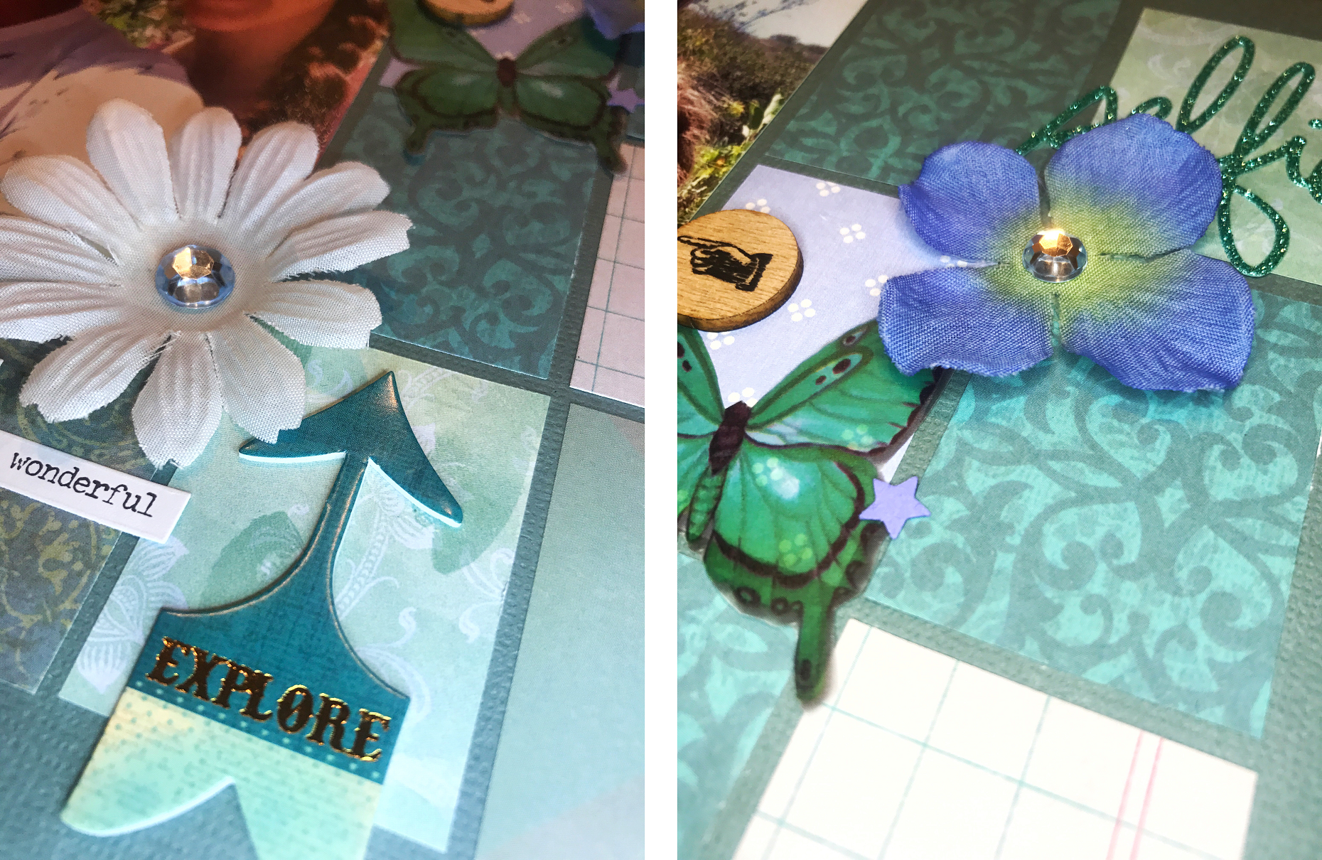
This iphone selfie was taken about a year ago at the annual Laguna Beach Sawdust Festival. I started with some blue-gray card stock from The Paper Studio's Affinity textured card stock stack. I used blue patterned paper from The Paper Studio's Affinity stack as well as some left over paper scraps that matched the color palette cut up into smaller pieces around the photo. Fabric flowers, Paper Pizazz Vellum cutouts, Momenta Mixed Media Stickers and Tim Holtz Idea-ology stickers all made up embellishment details. I used Heidi Swapp glitter stickers for the title.

The layout for this page is from Creative Scrappers' #306 sketch. Instead of six big rectangles, a did a bunch a of smaller ones around my photo.

This page was also done for Color Story Inspiration's 230th Case File.

Evidenced Used:

  • Stars
  • Butterflies
  • Rhinestones
  • Phrase Stickers

Testimony Used:

  • Tuck your story into a layered cluster

That's all for now scrappers. Thanks for visiting my page!

Scrapbook Challenge

Bright Colors

Whimsical Prints and Floral Themes

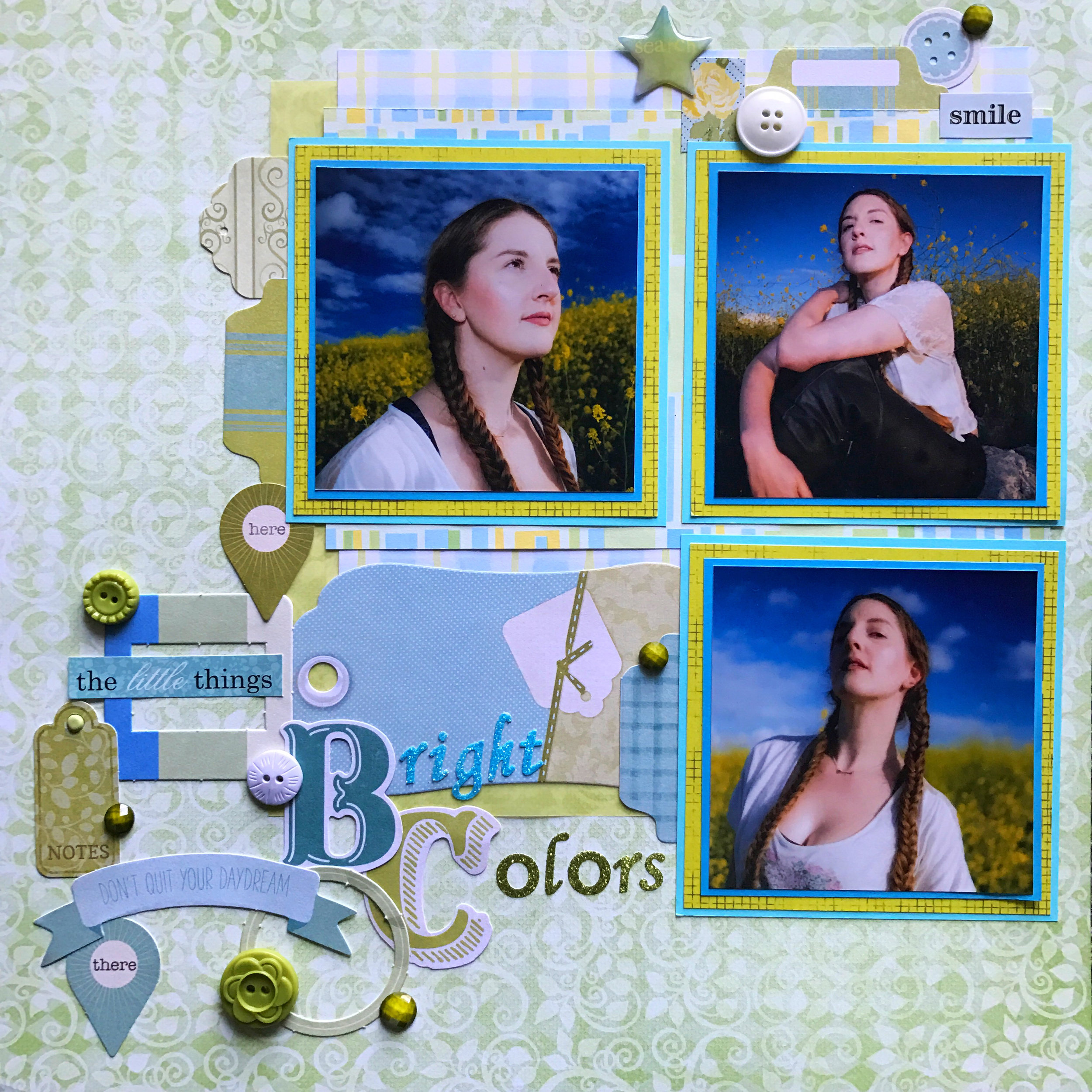
These photos were taken nearly a year ago during last year's spring bloom. I based my palette around the bright yellow of the mustard flowers in the photos.

I started with a piece of green patterned paper from Heartfelt Creation's Sugar Hollow collection. I layered numerous other squares of patterned paper and vellum in green, blue and yellow to set the foundation for my photos. I cut each photo down to 3.5 inches square and mounted them on card stock from Recollection's Blue Ombre pack and neon yellow grid printed paper from Prima Marketing's Rock Out pad. Most of the embellishments used are from My Mind's Eye Hello Gorgeous Mixed Bag. The colors were so perfect for this page!

The layout used is from Creative Scrapper's March Sketch. Once again it pushed me to use more then one or two photos.

Last of all, Lasting Memories' March challenge inspired e to use at least five different patterned papers. I thought the final result might be chaotic but keeping everything in a yellow, green or blue color family kept the page harmonious. 

Photos taken by Stan Moniz.

Scrapbook Challenge

Laguna Beach

Glitter, Metallics, And The Colors Of Autumn

As chilly, windy winter weather sets in, my trips to the beach become less frequent. Reading books in the sand is replaced by replaced by reading books under an electric blanket.  Not quite as glamours but now I have a good 4 months to eat cookies and Starbucks holiday drinks without worrying about keeping up a bikini ready body.

This photo was taken at Laguna Beach's picturesque Crescent Bay beach. Despite it being Spring, the warms tones of the photo seemed perfect for an Autumn layout. I like how this layout feels mildly Fallish without aggressively featuring cliched pumpkins, fallen leaves, turkeys or cornucopias.

I started with a subdued gray and white patterned paper from Momenta's double sided cardstock stack. This collection is unique because all patterns are in complete gray scale, providing a truly neutral selection of papers.

A taupe and gray paper from The Paper Studio's Kellerkurtz & Company stack as well as assorted scraps of plain and patterned cardstock made up the rest of the background. Each piece was outlined with a metallic gold Sharpie.

Since this page was done for the Lasting Memories' December challenge of "Glitter and Glam," I went overboard with glittery and metallic embellishments. The title was made using Dear Lizzie foam gold glitter stickers. Dark sparkle was added to the center of white flowers with Queen & Co. Deco Dots in Black, and dimensional star stickers by Jolee's Boutique and Recollections' shell brads were scattered among the flower clusters.

The color palette or this page was taken from the inspiration picture at The Studio Challenges' December post. The image of a Fall themed table setting had to inspire that created page in some way.

Keeping true to the picture, the main colors I used were various shades of gray with touches of deep orange, black, brown and gold. I applaud the non traditional take on Fall this table setting evokes and wanted to replicate the same feeling in my page with a marine twist.

Other products used:

Photo by Stan Moniz

Scrapbook Challenge

To Dance Is To Live

Layers And Lace

Some kids grow up playing soccer or laying piano or taking karate. For me, it was dance. Jazz, ballet, tap, lyrical, you name it, I did it. From the age of 4 to my mid twenties I was in class at least five days a week and sometimes more. While going through stacks of old photos, I found a bunch of wallet sized pics take on "photo day." Every year, shots were taken in that year's recital costume, and while I'm sure I had many more pictures than this, these are the ones that found my photo box.

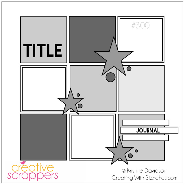
This week's layout was inspired by Creative Scrapper's 300th Sketch. Its small panels were perfect for my tiny photos.

I added five photos instead of four and changed around where the title and journaling went. A Michelle Shefveland sticker made for the perfect title. Odds and ends from my stash like Karen Foster stickers and Prima Marketing butterflies added the final embellishments.

http://artasticchallengeblog.blogspot.com.au/2016/11/our-mid-month-reveal.html

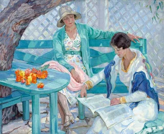
ARTastic Challenge's November reveal features The Summer House by Hilda Rix Nicholas. The page had to be inspired by the image and have a vintage theme. I drew from the color palette, using a lot of blues, grey-purples, and even a splash of orange and yellow. I incorporated a vintage feel with the aged wood and old paper patterns.