Scrapbook Challenge

Seattle Aquarium

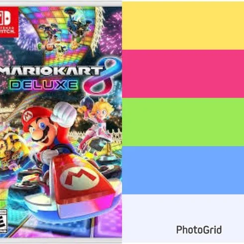
Hexagons and Nintendo Characters

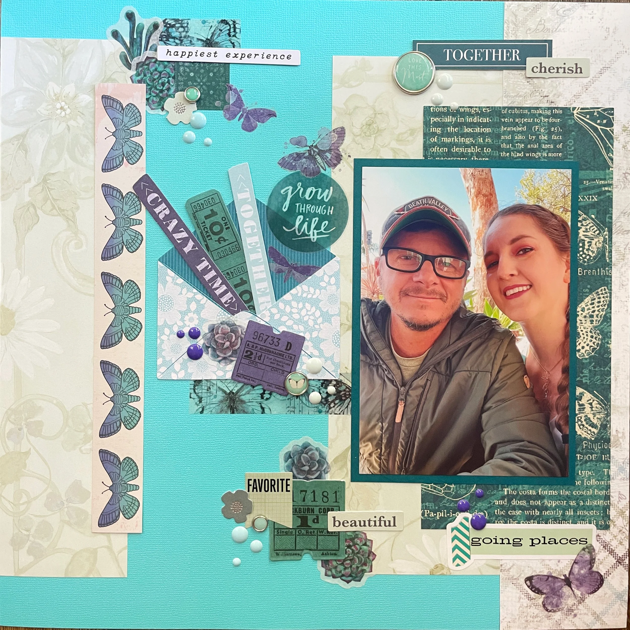
Hi scrappers! This week I made a page featuring a photo taken when my sister and I went to visit the Seattle Aquarium. I was lucky enough that our visit happened to coincide with when they were doing a collaboration with Animal Crossing, a very popular game made by Nintendo. Both my sister and I have enjoyed the many installments in the series going back to the IP’s debut on the Game Cube. The event is touring American museums nationwide and features photo ops with standees of game characters, a scavenger hunt for aquatic creatures in the aquarium and more! To see if it’s coming to a city near you, check out their page! Also, can you see the dance team child in me coming out in this picture? It’s too much.

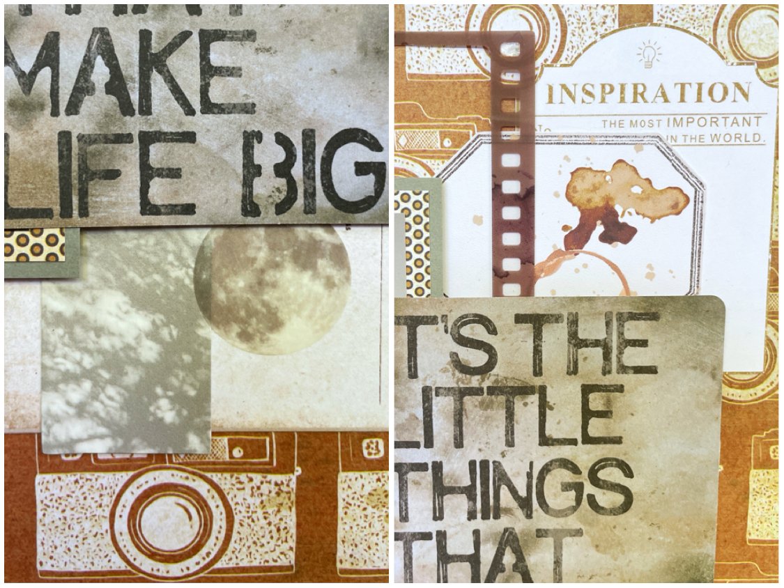
I used some pale blue cardstock from the American Crafts Spring cardstock stack as my background. I cut a piece of tiny square patterned paper to lay along the bottom and then used some paper scraps to double mat my photo. I used a 2 inch hexagon punch and a whole lot of paper scraps to make lots of identical shapes to place throughout my layout.

The big eye-catching embellishments are of course the pictures of Tom Nook and his nephews Tommy and Timmy. I found these online, and when I sent off my latest batch of photos to be printed, I included them so I would have high quality images on photo paper. I carefully cut them out and attached them with foam core mounting tape so they would stand out a little. They are characters from Animal Crossing in case you didn’t know!

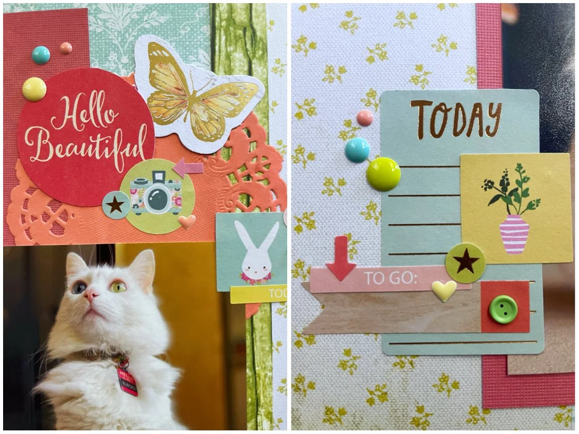
The embellishments were pretty minimal since there were so many patters and colors in the hexagons already. I stuck to mostly word stickers by Heidi Swapp and Hazel & Ruby. I also included clusters of enamel dots by Simple Stories and Altenew.

Video Block
Double-click here to add a video by URL or embed code. Learn more

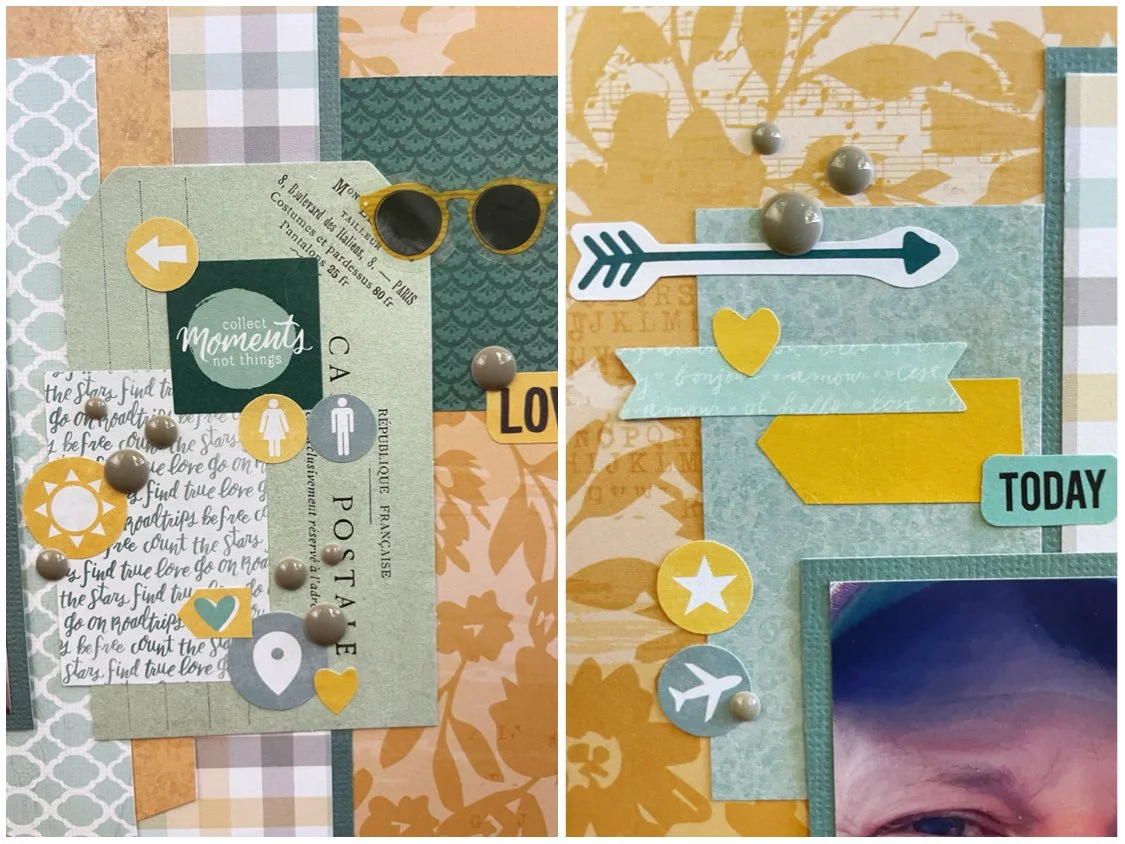
This page was made as part of a scrap lift challenge on A Cherry on Top Crafts. I chose this cute layout by lilkoala3. I happened to have a hexagon punch the same size as the original and followed the placement of the hexagons fairly closely. I moved the title a little and didn’t have a little photo to include the way the original did, but I emulated the word sticker embellishments and the use of enamel dots like the original had.

This page was also made for the August Video Game challenge and this month’s game was absolutely perfect! I was hoping this game would be chosen sooner or later since I knew I had these photos waiting to be scrapped!

That’s all for now. I’m going to try and cram some last minute entries for the month into my free time so hopefully I’ll be back in a few days with another layout!

Color Dare Design Team Challenge #616

It's The Little Things That Make Life Big

Brown, White and Gray

Hi scrappers. I’m back again as a design team member for Color Dare challenges. I chose to use a picture my photographer husband took of himself. This one was taken while he was in the water where he often photographs waves.

Since my husband is a photographer, I knew I wanted to use this Vicki Boutin Say Cheese paper as my base. I double matted my photo with a scrap of dotted paper and some gray cardstock and used an Idea-Ology pocket card as a big bold title. I then layered in some film strips and ephemera from the Nature Study Collection by 49 and Market. I broke out some pretty, handmade tags I bought from albumlovehandmade on Etsy since the brown tones matched the look I wanted. I also used some little cardboard picture cards by Moking that were all in shades of pale brown and gray

The challenge for Color Dare #616 is to use brown and white plus one other color. I obviously chose gray which is an unusual choice for me, but I felt matched the black and white photo and I also wanted to make a more masculine page. Join us and submit your own creation! I want to see the color you chose!

This page was also made using Cherry on Top sketch 390. I chose one big photo instead of two small ones, but liked where the title was since I already had a big bold title in mind.

That’s all for this week. Thank you so much for stopping by and I hope you’ll come join us at Color Dare too!

Scrapbook Challenge

Hello Beautiful

Florals With A Little Woodgrain

Hi scrappers! This week I created a triple photo layout featuring my cat Europa. She likes to sit on the patio sometimes and when she’s out in natural light, the colors of her eyes really pop. In this series of photos, it looks like she was posing for the camera!

I started with some double-sided Promenade paper from the Bo Bunny Brighton collection. I cut it into three sections and flipped on piece so both patterns would be displayed (a trick I have been doing a lot lately.) I glued it all down to a piece of cardstock and then used a large scrap of coral colored chevron print paper to mount my photos on. I also used a skinny scrap of green woodgrain paper as an accent on the right.

From there, I embellished with lots of stickers from the Dear Lizzy sticker book, some ephemera by Heidi Swapp and Prima Marketing, and used a piece of ephemera from the Hello Gorgeous collection by My Mind’s Eye as my title. Some Altenew enamel dots from the Fruity Colors collection matched the color palette perfectly.

I used sketch 389 from A Cherry on Top’s weekly sketch challenge. I liked the three panels making up the background because I knew that would be a good fit for my double sided paper.

This page was also created for the Counterfeit Kit August challenge. The kit chosen for this month had the color palette above. I really liked the colors and used just about all of them except black. They also had a challenge of making a layout featuring woodgrain and florals. This page is really heavy on the florals but I did incorporate a little woodgrain by using the strip of green patterned paper as well as a small pennant sticker in the lower left corner.

That wraps it up for this week. As always, there’s still so many challenges I want to participate in and not enough days in the month! I will be back soon with a new layout as soon as time permits.

Scrapbook Challenge

Breathtaking

So Much Purple!

Hi scrappers! This week I used a picture from a few years back that was taken in Laguna Beach in California. Since the photo already had lots of purple tones, I extended that to my page and made a monochrome layout in my favorite color.

I started with some pretty swirly paper from the 49 and Market Color Swatch Lavender collection. I used a scrap of purple cardstock from the last page I made and cut a wide strip which I decorated with some flower stickers from the Happy Planner Pressed Florals Sticker Book. I layered some frames and laser cut elements, both by 49 and Market, and then made a heart-shaped shaker using a shaker kit and die cuts sets by Sizzix. I filled it with various glitters, including some that are actually unicorn-shaped! This was one of those products that I knew I had to have when I saw it but had no idea how I was going to use it. Filling a shaker with glittery unicorns is such a fun little detail!

I used a few chipboard shapes from the Stamperia Lavender collection and then finished off with a few enamel dots. I really love how all of the different shades and tones of purple come together with my photo.

This page was a scrap lift from the layout above from the Cherry on Top Birthday Bash contest. I knew I wanted to make a shaker in place of the big heart detail on the page. I arranged some butterflies to emulate the garland that the original layout had below the photo and instead of a tag on the right, I added a frame filled with embellishments.

This page was also made for the August Picture Yourself contest which challenged participants to make a page in at least 90% of our favorite color. My favorite color is, of course, purple, so I combined lots of shades and patterns to make a very purple page!

That’s all for the week! If you are a fellow paper crafter looking for a new challenge to play along in, check out the Taylor Swift themed one I host here! I will see you all soon!

Color Dare Design Team Challenge #614

Your Vibe Attracts Your Tribe

Rainbows on Black

Hi scrappers, I’m back again with a page made for Color Dare Challenges. I chose to use a picture taken at an old, historic movie theater. The picture was taken at a low angle to show the beautiful light fixture on the ceiling that looked like a giant star. The light created a little rainbow blur in the picture so I decided to run with that theme and make an incredibly colorful page.

I knew immediately I wanted to use the scrap of rainbow print paper that had been in my stash literally since the early 2000s. I can’t even remember the original project I used the first half of the paper on, but was finally able to use up the rest of it! I like how it looks like pastel or colored pencil art. I pasted in on some black cardstock by American Crafts so the colors would really pop and paired it with some lavender paper from the AC Spring stack since it was a color present in the patterned paper scrap.

I used a handful of embellishments by Memory-Place and Vicki Boutin. I especially love the butterfly die cuts from Aall & Create since they are so vibrant. I added in a few stickers from the Color Study Sticker Book by American Crafts and finished off with stenciled clusters of stars. I used 6 different colors of Stencil Butter along with an Aall & Create stencil.

Challenge number 614 at Color Dare is also a collaboration with Double Trouble. The ask was to use at least three colors from the ice cream image at Color Dare paired with the recipe at Double Trouble. I ended up using just about every color possible and completed the recipe with some tweaks. To use only two embellishments on my page would be too minimalist for my taste so instead I used two types of embellishments: die cuts and stickers. The three layers on top of my black cardstock are papers, photo and embellishments and my single image is, of course, my photo.

I used sketch 302 from Sketch N Scrap and rotated it 90 degrees. I used one photo instead of two.

That’s all for now. Thank you for stopping by and I’ll be back soon to bring you the last few scrapbook layouts of the summer!

Scrapbook Challenge

In The Garden

Peachy Florals

Hi everyone! This week I created a page using some photos from several years back. My husband and I went to a commercial flower farm where they open to the public a couple weeks during peak season. They had several props you could take photos with including this old tractor. The pictures came out so pretty!

I used some paper from the DCWV Copper Luxury stack. I feel like I’ve been using this stack a lot lately! Thesis another collection of double-sided papers so I used my usual trick of cutting the paper into threes and glued all panels on some black cardstock. I used black simply because I have a ton in my stash and I don’t use it very often so I might as well use it up somehow.

I cut a washi ticket sticker to use as a border on the right of my accent panel and then used a large scrap from stash that is from the same collection of papers so the colors matched perfectly. I then added in some circles and rings made from handmade paper as well as a tag and some animal die cuts, all by albumlovehandmade.

I actually used a stamp on this layout which is something I never do. I feel like I’m not very good at it because the image didn’t come out super clear. Maybe my ink pad is too old and dried up! I stamped the image of birds on a wire on some white cardstock and used a Marvy Uchida punch to make a tag. I stamped one of the paper circles as well but it didn’t show up very well. Why am I so bad with stamps??

Lastly, I opened up some pink and team floral stickers by The Paper Studio that I have had for years and years and added three of them to the layout as well as some enamel dots by Simple Stories.

This page was made for the August 3 in a Row challenge at A Cherry on Top. I had started out meaning to complete the middle column with Green, Free and Stamping. I realized after the page was done I had accidentally completed most of the board! I was only an animal embellishment and some torn paper away from a full blackout!

I also used sketch 387 from A Cherry on Top’s weekly sketch challenge. Didn’t have a collection of smaller photos so I used two big ones and added a ton of extra embellishments as usual.

That’s all for this week. Thanks for stopping by and if you are looking for another paper crafting challenge to participate in, you can check out the monthly one that I host here. See you all soon!

Scrapbook Challenge

Wander & Grow

Mixed Media And Moths

Hi everyone! This week I scrapped a beautiful photo my husband took of me at a lake during an autumn sunset. The reflection makes this such a cool photo and he even captured a bird flying near the moon.

I based this entire page around the beautiful moth-print paper by Fancy Pants Designs. The paper is double-sided so I cut it into three parts, making the middle part an accent panel and the other two a more subdued background. I added some strips of 49 and Market’s Moonlit Garden Washi tape as well as a narrow strip of rust-colored paper from by collection of scraps. I also used some laser cut elements and wishing bubbles also from the Moonlit Garden collection as well as some film strips and chipboard words from the Nature Study collection that I used to make my title. I added in a couple of teal doilies made by Bo Bunny and then splattered all my clusters with some white acrylic paint. Lastly, I used some mint green glossy glaze with a stencil by The Crafter’s Workshop to add some color and texture.

This page was made as part of a scrap life challenge over at A Cherry on Top. I lifted the above layout I liked the doily accent and kept that inky version. Since I was only using on photo, I turned the spot where her second photo was into a framed cluster.

This page was also made as part of the August Grab 5 challenge. I chose the following 5 from a list of options:

  • White Paint

  • Film Strip

  • 3 Buttons

  • Chipboard

  • Texture Paste

That’s all for this week. Thank you for stopping by and taking a look at my page. More ScrapAttack content on Instagram and YouTube if you are looking for more video content showing how I make my pages.

Color Dare Design Team Challenge #612

Cat Yoga

Sapphire, Lagoon and Sundance

Hi scrappers! I am back again with a post featuring a page I made for Color Dare Challenges. I used some photos of my sister I took when we took a cat yoga class together. I highly recommend doing this if you get the chance. It was so much fun and all of the cats at this location were up for adoption!

I had recently purchased a 12 X 12 paper grab bag from A Cherry on Top. I received lots of soon-to-be-discontinued papers for a fraction of the price. This double-sided Royal paper by Bo Bunny was one of them. I cut the paper into three pieces and mounted it on some basic black cardstock, showing both sides of the paper. I used some goldenrod cardstock to mat my photos and used a new die cut by Lawn Fawn to make a scalloped border above them.

I added some 49 and Market striped washi tape but adhered it to some white paper first to keep the colors vibrant. I had some tiger striped paper scraps which I added behind my title, above my photo and to the top of the page. I like how the animal print fit the theme of the page! I layered some vellum pieces on top of a vellum tag, but used the same white paper trick so the colors would pop. A few pieces of ephemera from the PhotoPlay Cat Lover collection were in the perfect shade of blue and I added a few more cats by using cat-shaped brads by Eyelet Outlet.

I created some circular elements using some Sizzix die cuts and some bright blue paper scraps and added a few puffy stickers both by The Happy Planner and The Paper House. I scattered a few enamel dots around the page as a finishing touch.

This page uses sketch 386 from the weekly sketch challenge at A Cherry on Top. This page design provided the perfect opportunity to showcase both sides of my patterned paper.

August’s first challenge at Color Dare involves a tic-tac-toe challenge! I chose the right column with Sundance, Lagoon and Sapphire. Please join us and share your project created using three colors from this grid. We’d love to see what you create!

Lastly, this was made for the Grab 5 challenge where my project has to include five items from a monthly list of options. I chose the following:

  • Rings

  • Puffy Stickers

  • Baker’s Twine

  • Striped Paper

  • Washi Tape

That’s all for this week! Thank you for visiting and you can find more ScrapAttack content on Instagram and YouTube. I’d love to see you there!

Scrapbook Challenge

Sweet Baby Love

Tans And Browns

Hi scrappers! Thank you for joining me again for another scrapbooking layout! My past dozen or so layouts have been colorful and bright so this week I made something a little more subdued in tones of tan and brown. My cat Jupiter is also various shades of brown so I used some photos of her looking out the window as the subject of this page.

I used some wood print paper from the Dendrology stack by The Paper Studio. I tend to use this stack a lot since woodgrain seems to go with everything! It worked especially well on this brown-toned page. I rounded the corners of a square of white cardstock with a Marvy Uchida punch and then used some scraps of some P13 paper I had. I used the opposite side on a previous page and this time I featured the gray-brown leaf side. I love the little ladybug details! I added some matching ephemera from the same collection as well as some ephemera by Asuka Studio. I used up several tiny paper scraps by making a banner with a pennant punch and added a large cat sticker by Recollections. I cracked open some botanical chipboard by P13 and used up some burlap and paper flowers had in my stash. My title was a mashup of stickers, chipboard tiles and ephemera.

This page was made using sketch 385 at A Cherry on Top Crafts. I really liked the little banner details and the circular element around the title. I used a paper doily instead to keep the round shape and replaced the scalloped detail on the bottom with a piece of brown washi tape.

This page was also made for the July White with 1 challenge. I loved their cozy mood board and was inspired by the following:

  • Bunnies (Bunny Brads)

  • Logs (Border Paper)

  • Words “Sweet” and “Love” (Used in Title)

That’s all for this week! Thank you so much for paying me a visit. I host a Taylor Swift inspired crafting challenge every month and this month is all about black cardstock backgrounds. There’s still a few more days to play if you want to join in!

Color Dare Design Team Challenge #610

I Feel The Happiest Here

Desert Tones And Handmade Embellishments

I used some dusty green cardstock as my background and sponge painted some pink acrylic over it to break up the solid color. I cut a broad strip of Mirabelle Floral paper by The Paper Studio since it had the same green shade as my background. I added in a scrap of green paper with a torn edge and double matted my photo with more paper scraps.

I found a pretty piece of handmade paper by Albumlovehandmade that worked well and then proceeded to layer lots of embellishments! I had two separate packs of Golden Desert ephemera that were perfect for this page and I used one of them for the title. The ephemera even had Joshua trees on it, just like my photo! I also used some Heidi Swapp Carefree ephemera by American Crafts since many pieces had the same peachy pink tones as my floral paper. The white tags, green diet shapes and floral and butterfly stickers are also all by Albumlovehandmade. I really love the products she lovingly handcrafts so you guys should absolutely check out her store!

I added three large decorative brads by Teresa Collins and wanted some other bright pink elements to match the trim on my photo and handmade paper. I used a stencil by Aall & Create and some stencil butter by The Crafter’s Workshop and created some botanical elements. I had to be really careful with my texture paste placement since I wanted one “branch” in each section and the pattern with other branches was all pretty close together.

I am proudly part of the design team over at Color Dare Challenges and this page was made for challenge 610. I used all colors but Lagoon in my project. I hope you’ll join us and share your own creations using this color palette!

I used sketch 384 from the Cherry on Top weekly sketch challenge. I only used one photo and added ephemera Rostand in for the two smaller ones.

Thank you for stopping by. I am busily working on my next project and will be back soon to share it with all of you!

Scrapbook Challenge

Love This

Big Decorative Tag

Hi scrappers! This week I chose to scrap this photo of my kitty Jupiter. Her eyes look so big and bright in this photo! She was sitting on my husband’s office chair looking very cute so I napped a picture with my phone.

I started with some purple paper from the Over the Rainbow stack by Craft Consortium as my background. I cut down a piece of pretty teal vintage camera paper by P13. The pattern on this paper is so cool but then I ended up covering most of it. Oh well. I added in a giant tag from the Vicki Boutin Sweet Rush collection and added some vibrant flower die cuts by Aall & Create. The title comes from a sticker out of the Amy Tangerine sticker book and I added a wreath around it as well as some other punch out elements from the 49 and Market Plum Grove collection. I made two little banners using a Fishers squeeze punch and added in some enamel dots by Simple Stories and Altenew.

I used the sketch from this month’s Sketch with a Twist challenge over at A Cherry on Top Crafts. The twist was to create a banner like the one in the sketch. I made two using some baker’s twine and some small brads.

This page was also made for this month’s Video Game challenge. This was the color palette provided, inspired by the cover of this Spyro game! Purple and teal are some of my favorites, but I never would have thought to pair them with orange and yellow. I really like how the finished page turned out.

That’s all for this week! Thank you for stopping by andI will see you all soon!

Scrapbook Challenge

Wild Dreams

Animal Print And Layered Ephemera

Hi everyone! I was digging through my collection of photos and found these great shots taken by my husband. We were in the desert and it was a very windy day!I think these shots are so unique!

I started with some bright yellow cardstock. One side of it was a little creased so I knew I would need to covert up. I did so using some giraffe print paper from DCWV’s Gone Wild stack and cit a piece on a diagonal. I used a narrow strip from my scraps stash to cover the edge between the two papers and used various scraps and some ephemera from a couple of junk journal packs to layer behind my photos. I also used some Tim Holtz Field Notes ephemera and some translucent floral stickers by Mind Wave. I used up some paper flowers by Prima and affixed them with some bronze brads by Recollections. I added some chipboard words by 49 and Market and some chipboard feathers by Scrapmatts. I finished by scattering some rhinestones and some yellow and orange enamel dots by Craft Consortium.

I found my own sketch for this particular layout. This one came up on Pinterest. I rotated it 90 degrees and used three photos instead of two.

This page was also made for challenge 709 at Lasting Memories. The challenge was to use a technique or product for each letter in the word “winter.”

  • W - “Wild” in title

  • I - Insects

  • N - Nature Theme (bugs, bird, feathers and flowers)

  • T - Tag

  • E - Enamel Dots

  • R - Rhinestones

This page was also made for the newest Cupcake Inspirations challenge which was all about Jungle Animals! I used animal print, rather than the animal itself and I don’t think giraffes technically live in the jungle, but I see them grouped in with jungle animals all the time so I hope it counts!

That’s all for this week! You can find more Scrap Attack content on Instagram and YouTube. I’d love to see you there!

Scrapbook Challenge

Life Is Good

Vibrant Colors With Black Outlines

Hi everyone! This week’s page features photos taken on a trip to Hawaii several years ago. We went in summer when the waters were much calmer. Usually we go in winter when the waves are so huge I can barely get in the water!

I found some glittery, embossed paper from the Gone Wild stack by DCWV. This collection is all different animal print. I think this one is supposed to be scales of some sort but it reminded me of the surface of water and the color worked well with my photos.

I cracked open my new Over the Rainbow stack by Craft Consortium and cut some two inch strips of yellow paper. I glued it all down on some black cardstock as well as some narrow strips of black along the teal paper and around my photos. I liked the contrast of the bright colors with the black and the outline really made everything pop!

From there, I embellished with some ephemera and stickers from both the Vicki Boutin All Good Things and Color Study collections. I also used some stickers from the Vicki Boutin sticker book. I also threw in some Amy Tangerine travel stickers and used my Sizzix Big Shot machine with a Momenta die cut to make a little tag. I also used an embossing folder on a paper scrap to decorate the tag and added an eyelet and some braided fiber. Lastly, I scattered some little yellow and orange buttons around the page instead of enamel dots for a change.

I used sketch 300 from Sketch and Scrap. I liked the bold outline around the edge of the page and the center paper piece. I also outlined my photos too.

This page was also made using the color palette and prompts from case file 438 at Color, Stories, Inspiration. I used the following “evidence” prompts:

  • Solids

  • Circles

  • Numbers (on the washi tape strip on the bottom third of the page)

  • Flowers

  • Plane

  • Different Font

This page was also made for the MMC challenge at A Cherry on Top Crafts. We were provided a list of tools and techniques to choose from. I used the following:

  • Punch (Circle in upper right)

  • Die Cut (Yellow Tag)

  • Embossing (Blue paper on tag)

  • Shapes Buttons

  • Decorated Tag

  • Fiber (Braided orange fiber on tag)

That’s all for this time! I love the beginning of the month because there’s so many new challenges to participate in and I always feel so inspired! I’m always looking for new scrapbook challenges so drop a link to your favorite!

Color Dare Design Team Challenge #608

Make A Life You Love

Mist, Seabrook And Honey Butter

Hi scrappers! I’m back again with another page made for Color Dare Challenges. For this layout, I used a picture of my husband and I taken on vacation in Bimini, Bahamas. You can’t really tell how gorgeous our surroundings were or even how incredible the sunset was, but you can tell I had gotten a lot of sun! My incredibly pale skin isn’t made for life at that latitude, but that is what SPF is for.

I started with some yellow floral paper by Bo Bunny and then added the plaid paper by Recollections. I matted both my rectangle of plaid paper and my photo with some dark teal cardstock from the Affinity stack by The Paper Studio. I found some 6 X 8 paper in the same yellow tone from the Bo Bunny Botanical Journal stack and cut it on a diagonal. I did the same with a scrap of light teal lattice print paper. From there, I embellished by layering stickers from Dear Lizzy and Amy Tangerine sticker books.

Color Dare Challenge 608 provides these 5 colors to choose from, I had totally intended in including Royal in this since purple is my favorite color, but I found that Recollections paper that showcased Seabrook and Honey Butter so perfectly. The paper looked so good with the Mist colored cardstock that I decided just to leave the page with these three colors as well as some gray and white. Head on over to Color Dare and give the challenge a try. We’d love to see what you create!

This page was made using the sketch for the June Sketch with a Twist challenge. The twist was to use enamel dots (which feels like this challenge was custom made for me since enamel dots are my jam.)

I usually don’t have diagonal paper pieces in my layouts (since I know I’m less likely to use the triangular scraps that result) but I like how this looked! I added my own spin by layering lots of stickers in clusters to add some interesting details.

The deadline for this challenge has been extended to 7/6 so you still have time to enter your own take on the sketch!

That’s all for this week! Thanks for stopping by and taking a look. I’ll be back soon with a whole new page!

Scrapbook Challenge

Spread Your Wings And Fly

Pastel Faries

Hi again scrappers! I’ve been on a scrapping binge lately and have yet another page to share! These photos were taken at a birthday dinner last year and I love how the purple and green in my dress ended up working with the papers I used.

I started this page a very unusual way because I wanted to challenge myself to use up some paper scraps. I sort my scraps into two large drawers, one for patterned and one for plain papers. I used a random number generator for each drawer and pulled out paper scraps until I got to the generated number. I told myself that no matter the combination of one plain and one patterned scrap, I would use them both on a page.

The combo didn’t end up being too crazy. I drew a light blue patterned rectangle and a small strip of gray cardstock. I ended up using both just to the right of my photo. I also used a second scrap of the same patterned paper beneath my title. From there, I selected other scraps that would work like the pale lavender cardstock and the floral print paper to the right as well as the mat for my photos. Even the two stars were out of my scraps stash. I had used a punch to make them ages ago and never used them but now they have a home.

The teal and purple floral print behind my photo is actually fabric tape from the 49 and Market Viken collection. From there, I picked out photos that matched the color scheme and I placed it all on some purple-gray cardstock from the American Crafts Neutral stack. I used some watercolor washi tape, Kaiser Craft die cuts and some enamel dots to complete the page.

I used this week’s sketch over at A Cherry on Top Crafts. This sketch was simple and worked well with the scraps I had pulled. Rather than a piece of ephemera to the right of my photos, I used my paper scrap and decorated it with washi tape, stickers and ephemera.

I also created this page for Cupcake Inspirations. Since it was an Anything Goes challenge, I decided to implement my weird method of paper selection and see what I came up with!

That’s all for now. If you’re looking for a new paper crafting challenge to participate in, check out the one I run monthly at A Cherry on Top inspired by Taylor Swift. I just posted the new one for July. Hope to see you there!

Guest Design With Sketches In Thyme

Look On The Bright Side

Pink Lemonade

I scrappers! I’m back this week with a a page created for Sketches in Thyme. I am thrilled to be a guest designer for them this month and hope you will head their way and take a look at all their sketches. They really inspire me when I’m making pages!

Started with some basic pink cardstock from the American Crafts Spring collection. I knew I wanted to make the lemon paper from Recollections my main focus so I cut a large piece and used some hot pink cardstock by The Paper Studio as a mat. I used the same paper to mat my photo. The lemon paper was double-sided so I used the reverse side with green dots as an accent stripe.

I created a shaker with a kit by Sizzix containing shaker panes and accompanying die cuts. I added in little cocktail stickers by Jolee’s Boutique to match my photo and sprinkled in both chunky and fine glitters in shades of pink before sealing up the shaker.

My title was a tag from the Shimelle Glitter Girl ephemera set but I added the pink floral paper over the top to make it match my page better. I also used stickers from the Shimelle sticker book in little clusters. Lastly, I added some mixed media with a Vicki Boutin stencil and The Crafters Workshop stencil butters. The stencil had the same shape as lemon wedges so I felt it was perfect! I layered a larger circle stencil over the top and masked off areas with a paper towel to control where the stencil paste went. I’d never tried this technique before but I think it turned out pretty good!

I used this text from Sketches in Thyme and stayed pretty faithful to it. I turned the smallest circle into a heart shaker and added some additional clusters and embellishments to make it my own.

I was also inspired by Case File 437 over at Color, Stories, Inspiration. I liked the color palette of pink, yellow, white and green as well as the lemony theme. I used the following “evidence”

  • Lemons

  • Floral Pattern

  • Leaves

  • Pie-Chart Shape

  • Small Dots

  • Cursive Font

  • Mixed Media

  • Circles

  • Sprinkle Small Bits (Glitter in Shaker)

That’s all for this week! Thank you all for stopping by and another big thanks to Sketches in Thyme for having me guest design this month!

Scrapbook Challenge

You Do You

Tropical Colors, Rub-Ons And Mixed Media

Hi scrappers! This week I delved into my stash of scraps. In fact, all papers on this page except for the background paper were all scraps. I used a selfie I took on a Hawaii trip several years back because I liked how the water looked with the teal background paper.

The background paper I used is from the Rock Out Bro stack by Prima. I liked the fun combo of bright yellow on teal and the pattern in subtle enough that I could mix it with other patterned papers without it looking too crazy. The page was actually based around the palm tree tag from the Vicki Boutin Sweet Rush collection and I pulled patterned paper scraps I thought would work with it. I especially like the little sea turtle patterned pieces. I mixed in some rub ons by Aall & Create, cutting them into smaller pieces to scatter around the page. I also used a stencil by the same brand with some Vickie Boutin texture paste in BlueBerry Sour. I finished with some chipboard stickers by Carta Bella since they were the perfect summer embellishments!

This page was created using sketch 382 over at A Cherry on Top. This was the perfect page to use up some little paper scraps. Since I didn’t have a scrap piece of paper wide enough to go behind my photo, I used three different strips side by side.

This page was also made for this month’s Video Game Challenge. This month, the inspiration pic is Mario Kart. I used all five colors on my page.

This is my first time creating in a challenge hosted by Counterfeit Kit. I love the concept of this challenge! They choose a collection every month and challenge you to use comparable items you already have in your stash to make a project with a similar feel. I love the summery feel and bright colors of this 49 and Market collection. I pulled a bunch of items from my own stash as seen below, although I didn’t even end up using most of what I pulled. This was made specifically for challenge #2, Color Explosion, which I think I definitely achieved. There are so many colors on my layout!

That’s all for this week. Thanks for playing along and I will see you soon for another summer-inspired page!

Color Dare Design Team Challenge #606

Grow Through Life

Journey, Royal, Glacier and Capri

Hi scrappers! I’m back again with a Design Team project for Color My Heart Color Dare Challenges. For this layout, I used a selfie taken of my husband and I at an outdoor arts festival.

I started with some basic aqua blue(Capri) cardstock from the Splash cardstock stack by The Paper Studio. The only other new piece of paper I used was the pale green (Glacier) floral paper by Colorbok. All other papers were out of my stash of scraps!

I didn’t start this page with the intention of a butterfly/moth theme but that’s how it turned out since two of my chosen paper scraps featured them already. I added some small pieces of washi tape as well as some rub-ons by 49 and Market that both featured butterflies. I used an envelope embellishment by Paige Evans that already had a slit cut in it so I could slide in some Viken ephemera and make it look like it was spilling out of the envelope. I added a few succulent washi stickers and enamel dots by Altenew to finish the page.

I used this beautiful color palette from Color Dare Challenges. The challenge requires using at least three colors but I used all four since I love how they look together. I hope you’ll join us and submit your own creation!

I used a sketch from the My Mood Challenge over at A Cherry on Top Crafts. In addition to the sketch, the challenge was to use a photo of something close up. Since this is a selfie and I have short arms, I’m going to say this photo is pretty close up.

That’s all for this week. I’m going to try and sneak in a couple more pages for the month of June. I’ve been on a roll lately! It feels so good when all I want to do is create!

Scrapbook Challenge

Make Today Fun

Orange and Green Citrus

Hi scrappers! Welcome back to another scrapbook creation. This one is quite summery and features lots of citrus. Farmer’s markets near me are now full of summer fruits like peaches and cherries and making this page makes me want to sit down to a big bowl of fresh fruit!

The photos I used were taken on a trip to Catalina which is a small island off the coast of California. It’s about an hour ferry ride from the mainland and has fine dining, hiking and is a destination for scuba divers!

I started with some solid minty green cardstock and splattered it with some acrylic paint by Apple Barrel. I used some fantastic paper from P13’s Fresh Lemonade collection and cut a stripe for the left side of the page. This was one of those papers where I had no idea how I was going to use it but I knew I had to have it because it is just so pretty!

I then used some orange washi strips by 49 and Market (and strategically covered the seam between them) and then some skinny green washi by Create 365. I raided my stash for anything citrus and found some absolutely ancient Mrs. Grossman stickers along with some boxed stickers and a washi tear pad by Mo Card.

I added in chipboard in various shades of green from 49 and Market’s Plum Grove and Viken collections and also happened to have some circular stickers from the same collection as my citrus paper. I used them to decorate my large chipboard piece and added in some puffy stickers by Simple Stories. The title is from the Kid at Heart ephemera pack by American Crafts and scattered in some flower shaped brads to finish off the page.

This page was inspired by this absolutely amazing retro mood board provided for the monthly Mood Board challenge over at A Cherry on Top Crafts. The majority of the page had to be orange and green, which I think I have covered. I was also inspired by the following details:

  • citrus (duh)

  • stripes (vellum piece between my photos)

  • the word “love” (used twice on the page)

I used this sketch from Challenge Yourself’s June sketch challenge. I turned it 90 degrees and used only two photos instead of three.

I love a good tic tac tow challenge so this page was also made for the June 3 in a Row challenge. I chose the bottom row:

  • Any Shade of Green

  • Washi Tape

  • 2 Patterned Paper

That’s all for this week. Thanks to all who stopped by to check out my little corner of the internet. I will be back soon with another page!

Scrapbook Challenge

Play Today

Mixed Media Rainbow

Hi scrappers! This week I put together something quite colorful. I used a photo of my cat Jupiter playing with a fuzzy ribbon on a string. The ribbon is rainbow colored so I paired that with a vision I had of created a ROYGBIV watercolor background.

I started with some Vicki Boutin mixed media paper. This paper is much thicker than standard cardstock so when I got it wet, it didn’t wrinkle and warp as much as normal paper would. I didn’t have pigmented watercolor paints so I just used acrylics since I have lots of those. Once I let the paper dry over night, I added some Paige Evans rainbow striped paper and some fabric tape by 49 and Market as a divider between the two.

I used several pieces of ephemera from the Vicki Boutin Sweet Rush collection since they were bright and colorful. Part of the title is made up of chipboard letters of an unknown brand so old that the adhesive wasn’t really sticky anymore. I also added in some hot air balloons by Memory-Place and puffy stickers by Echo Park Paper Co. I also added in a very old paper frame that said play time and place a washi cat sticker inside it as well as around my title. Lastly, I scattered some enamel dots by Simple Stories around the page.

I scrap lifted this layout by Karen C. This page was made for the June Grab 5 challenge at A Cherry on Top. Since June is often associated with weddings, the criteria was as follows:

  • An old product (paper Play Time frame)

  • A new product (enamel dots)

  • A blue product (cat washi stickers, hot air balloon)

  • Borrowed (scrap lifted) layout

  • Use the word “Love” (journal stickers in upper left)

That’s all for this week. If my fellow card makers and scrapbookers out there are looking for a new monthly challenge, join me for a Taylor Swift inspired challenge and play along for the chance to win a Cherry on Top gift card. This month, it’s all things outer space and extra terrestrial. Check out the challenge HERE.